SlideMagic Blog

Frequent updates about all things presentations since 2008. Subscribe to never miss a post.

RSS
all posts

Search results for “web design”

·Advertising

Should you conform?

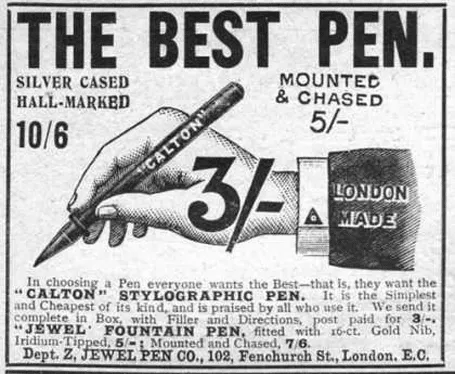
Early last century, there was a common practice in advertising: “This is what an ad should look like.”. Think about this when your boss tells you: “This is what a presentation should look like.” in response to your effort to do it in a different way.

For more of these wonderful vintage ads, visit vintageadbrowser.com

·Concepts

Look at these synergies!

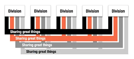
Here is an alternative to a circle-like composition of a holding company and its subsidiaries.

·Concepts

Billboards

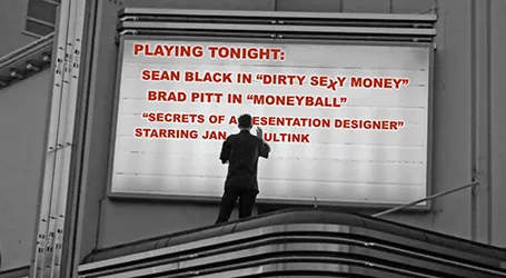
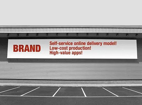
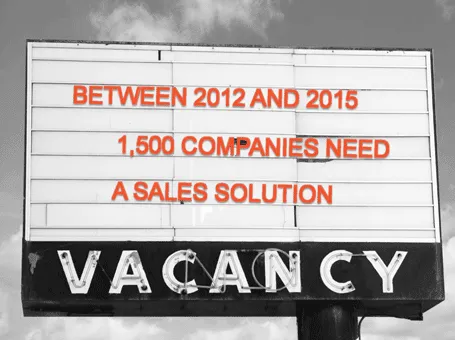
Maybe a bit overused, I still applied the billboard concept in a number of presentations recently.

·Art

Paper, an iPad drawing app

I would love to use hand drawn graphics in my presentation, but I never got to drawing and sketching on a computer. Any tools without a direct screen feedback loop (the mouse, drawing pads, and even the Wacom Inkling) simply do not work for me, and I think a screen like this are very expensive and generate additional clutter in my workspace.

The iPad could solve this, because it has a touch-sensitive screen. As a result, hundreds of drawing apps have popped up in the app store. Drawing apps are different from note take apps. The latter require wrist protection, a good way to organize notes. Drawing apps require brushes, color, pens. Like with writing apps, most drawing apps come loaded with features that just confuse me.

Hence, I was happy to discover Paper by 53, a minimalist drawing app (one of the readers pointed it out to me in a my recent review of iPad note taking apps). Paper just cut down the drawing tools to the bare essentials, and the result is actually good I think. The app is free, but this version comes with one drawing tool: the ink pencil, if you want to get a pencil, a marker, a pen and a paint brush (water colors) it will set you back $8 in in-app purchases.

The pencil is the tool I actually use most. There is a big drawing problem with the iPad screen: it is not pressure sensitive, and varying stroke width is the key feature what makes writing with an ink pen so great. Paper solved this with adjusting the stroke with depending on your speed as you move the pen over the screen. More confident, fast strokes, will appear bolder. (The pen tool works the other way around, moving it slowly creates heavy ink, moving it fast produces a thin line). I love the simple cartoon style sketches that this app produces, and I am looking out for a first client situation where I can try out a cartoon-style presentation (like the one below) for real.


Continue reading →
·Data visualization

Sugary drinks

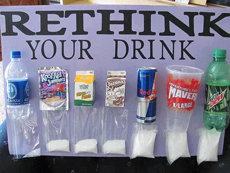
This photo posted by Carolyn McDowell is much more powerful than a bar charts with the sugar content of soft drinks

·PowerPoint

Hard stats on effective meetings

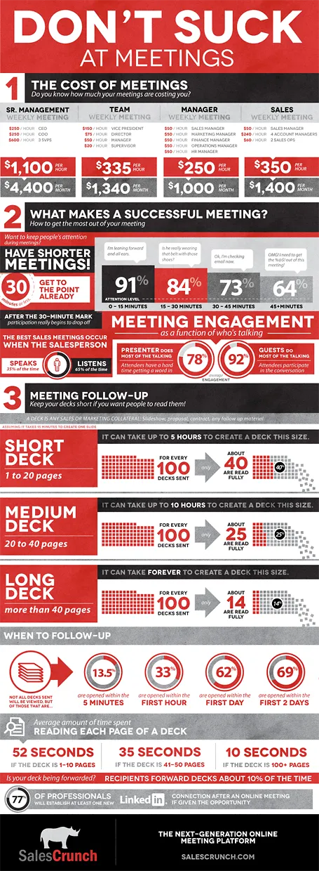
SalesCrunch (disclosure a client) is an online meeting platform that gives your real, hard statistics about how effective your meetings are: how many people pay attention, what % of your presentation is read, etc.

They analyzed the aggregate statistics of their entire client base and boiled the data down in an infographic. The key points will not surprise regular readers here: shorter meetings are better, shorter decks are better, and listening is better than doing all the talking. But for the first time, everything is backed up by hard data. Download the high-res version of the infographic here.

·PowerPoint

What is my client work?

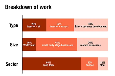
For a client proposal, I had to go back over the past 12 months and see what is the sort of work I do. Here is a breakdown in number of projects (can still be different from hours spent). The majority of my work is in investor and business development presentations for the high-tech industry (including biotech and medical devices).

·Concepts

Trees!

Photographs with a strong perspective are always the most interesting ones to use in a presentation. See the example below. Strong lines leading to a bright spot that almost makes you squint. When adding PowerPoint objects make sure to align them properly with the flow of the image.

·Concepts

Reinforcing loops

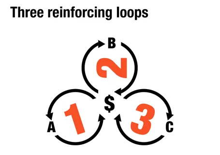
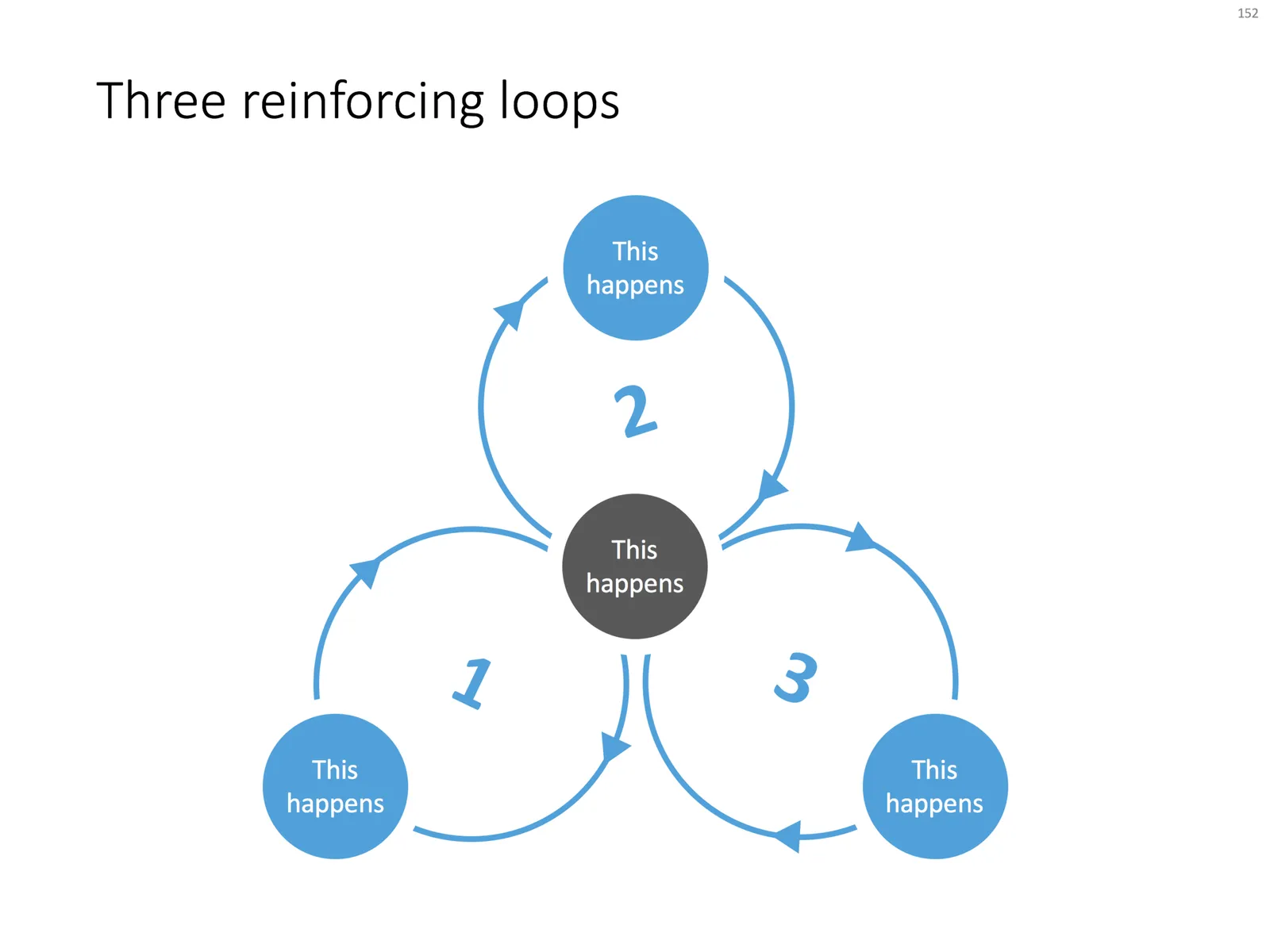
At McKinsey, we used to call this Business Dynamics, mapping reinforcing and opposing forces using arrows. The concept is borrowed from systems theory in mathematics and physics. These circles can make a great chart to show the main growth drivers behind your business.

The notorious US army spaghetti chart is a more complicated execution of the same principle. Contrary to many critical review, I actually liked it as a visualization of the incredibly complex situation over there.

UPDATE: There is now a PowerPoint slide template with 3 reinforcing loops available in the template store.

·Concepts

Rigorous deal selection

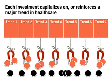
A U.S.-based healthcare-focussed venture capital fund only invests in a company if it pushes forward on of seven trends in healthcare. The page below tries to visualize that.

The point here is only about the rigorous selection, the trends themselves get explained on separate slides, and the portfolio companies get discussed somewhere else in the presentation. After the presentation, institutional investors should remember that the fund is very picky in investing their money, “remember that magnet slide?”