SlideMagic Blog

Frequent updates about all things presentations since 2008. Subscribe to never miss a post.

RSS
all posts

Search results for “mckinsey”

·Design

In defense of the U.S. Army spaghetti slide

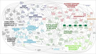
This PowerPoint slide by the U.S. Army is making the rounds on the Internet to ridicule ineffective presentations that stifle creativity and decision making.
The article in the NYT

does not actually talk about this busy slide specifically, it attacks the use of bullets points and the fact that the majority of time spent by staff in corporate/army headquarters is wasted on producing PowerPoint slides. Seth Godin is repeating today once more why bullet points are bad for you.

The spaghetti slide itself is not that bad, at least that is my opinion.

It makes the point that things are complex, that issues are related, all contributing to a highly unpredictable cause and effect sequence. Almost like the myth of chaos theory, and the butterfly in China that can cause a hurricane on the other side of the planet. Pretty good slide to visualize that.

I guess the source of the slide must have been some management consulting report that applied the technique of Business Dynamics to a complex problem (I recognize the many loops having used the tool in my previous life as a McKinsey consultant).

What is Business Dynamics? Business Dynamics tries to apply the physics of systems theory (electronic circuits, weather, ocean waves, etc.) to business. Complex problems consist of a number of forces. Forces influence each other. Forces can be good and bad, some cancel each other out, some reinforce each other. Everything is related to everything.

In some cases it is possible to model all these forces in a computer program and you get your hands on a very powerful tool: software can make simulations of what happens if you give the system 1 shock by studying the 2nd, 3rd, 4th, 7th order effect of your action.
Continue reading →
·Design

A daily dose of framework napkins

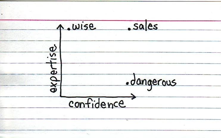
Yesterday’s post about Venn diagrams led me to a blog that I seem to be the last person on the planet to discover:Indexed. Jessica Hagy posts a napkin-style framework everyday. Sometimes funny, sometimes with a valuable insight about life or an unusual way of looking at things. Here is an example:

Venn diagrams, but especially 2x2’s, are very popular among McKinsey, BCG, Bain, and other management consultants. “We have put the world into 4 buckets, so now we understand it”.

For solving problems they are great, and I have used hundreds of them in my 17 year (oops) as a management consultant. All issues are on the map, how we can we move from one box to another?

But take a step back and think when you want to use these frameworks in a big keynote presentation. To illustrate my point: look at the drawings on the Indexed blog, and check which ones do you get in a second. Tricky isn’t it?

My advice: use these 2x2 frameworks only

  1. if you want to show movement of dots in the boxes. For example you can use the same framework in a few slides to show changes in strategy, or the positioning of a company
  2. if you want to highlight how your company/idea differentiates itself from the competition (by being in the top right box).

If you just need a structure to list 3 items, try to find a simpler way to visualize things.

Still, add Indexed to your RSS reader, it’s great fun.

·Design

What about this: the presentation subtitle?

Here is a new idea. Zen-style presentations with large images and a few words in a big font do not stand very well on their own. Maybe we should apply something from the movies: add subtitles to a PowerPoint slide.

  • Crammed in a small black box that blends in with the black frame of the projector
  • A small font that can be read when sitting in front of a screen, but blurs away when viewed from a distance (when a presenter is explaining the chart)
  • Unlike notes pages, the text appears on the slide itself (in PDF, in SlideShare)

It’s like reading a newspaper page:

  1. You read the small print under the images first
  2. You read the headlines after that
  3. You read the actual text last

An example below, click on an image to get a larger picture.

Interestingly, this concept is very similar to the “lead” in the ancient McKinsey exhibit format.

Another problem that would be solved by this is to make the information captured in a presentation searchable. In particular large knowledge firms (such as management consultants) struggle with archiving the knowledge that is hidden in PowerPoint presentations with little text.

·Design

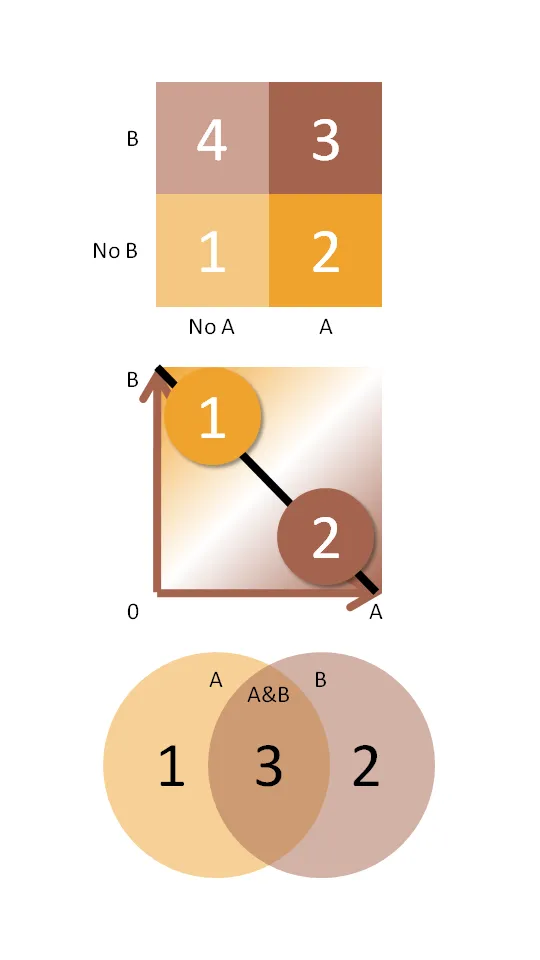
Chart concept: the 2x2 matrix and other grouping techniques

McKinsey and other management consultants love 2x2 matrices (and obviously 3x3s). Personally, I think they are often overused (framework overload).

Not every categorization can be crammed into this framework.

  • The axes need to be logical
  • The groups needs to lead to 4 categories, i.e., leaving one or two boxes as “not applicable” does not make sense
  • They work particularly well when you want to show things moving from one category to the other
  • They are good to show that something stands out (from for example the competition) by popping up in the top-right corner

Here are some other techniques to group items on a PowerPoint slide using line and venn diagrams:

  • Diagram 2 - “you cannot have it both ways”
  • Diagram 3 - “the best of both worlds”
·Design

Not all presentations are "Zen" - different formats for different settings

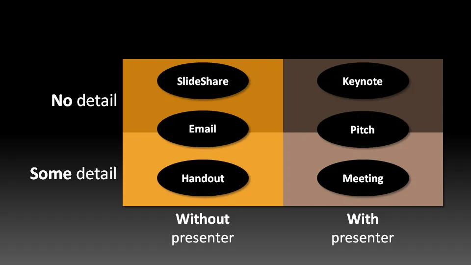
Not all presentation settings are the same. A “Presentation Zen” slide show with stunning images and the incidental word on a slide is great for a keynote, but might be a bit too much to discuss last quarter’s financial results. The 50 page deck with bullet point slides might be serve better as a printed business plan than the key communication tool for a 20 minute VC funding pitch. I have tried to describe 6 presentation scenarios and categorized them according to:

  • Whether the  presenter is present or not
  • The amount of detail/data inside the document

Here we go (click image for bigger picture):

  1. The key note is the classical “Zen” presentation. Huge fonts, dark background, few words, large images.
  2. The pitch is similar to the key note, with the difference that it might be shorter, and does contain some more data to answer questions from the much smaller audience.
  3. The meeting presentation is probably done on a light background, and contains much more facts and details. Over-simplified slides with beautiful pictures do not work in the small conference room with people ready to go through raw material. McKinsey and other consulting firm’s presentation often fit in this box.
  4. The slideshare (or online) presentation is something relatively new. People see it typically in small windows, i.e., fonts should be big, pictures should be nice. The audience of this presentation is highly impatient, clicking rapidly to reach the end, and aboning your presentation if it is not interesting enough. No animations here.
  5. The email attachment is similar to the key note presentatation with an important difference that it needs to stand on its own, titles need to explain the messages in the charts. Some animation could be used here (sparingly though). Detail is less than the handout.
  6. The handout contains the full detail, the full text. It should be prepared on a white background (people will often print it) and use no animation (again, does not come out in print). For VC pitch situations, the good handout makes the business plan “brick” obsolete (hardly anyone reads these anyway).
Continue reading →
·McKinsey

What do consultants mean when they say "you're not MEESEE?"

MECE (pronounced “meesee”) stands for mutually exclusive, collectively exhaustive. Management consultants (McKinsey, BCG, etc.) use it a lot. What does it mean? In simple language, a text is MECE where are no holes, no overlaps. For example, the following structure is not MECE:

  • Prices …
  • Volume …
  • Revenues …

Revenues is the result of prices x volume, there is an overlap in this list. Why does being MECE matter? If you want to analyze a problem, it is important that you get all the component structure of the problem right: you need to get them all on the radar screen, and there should not be any dependency between the components. For example if you concluded that “costs are not the issue” and close the analysis here, you don’t want it to re-emerge somewhere else in your problem solving effort. Why does being MECE matter in PowerPoint presentations? If you want to tell the audience a story  you don’t want to confuse them by bringing up points again in an unclear structure. The logic should be clear. Should you apply it blindly in your PowerPoint presentations? No. MECE stories can have the perfect logical structure, but can also be boring. For example, in order to be complete, you need to address the rest of the world aftering discussing the most exciting markets US and Asia, even when they are not relevant. Be MECE when designing a story line structure, then adjust to make your presentation interesting and compelling.

·Books

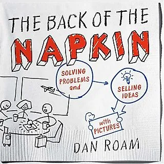
The strategy consultant's review of The back of the Napkin by Dan Roam

We talked about sketching chart ideas on paper before, but Dan Roam takes visual problem solving to the next level in his book The back of the Napkin. This book was an interesting read for me not only because of the presentation concepts discussed, but also because The back of the napkin aims to provide a complete framework to solve business problems. (The key frameworks can be downloaded here for free). I think the book did really well on the presentation front, the goal of a generic strategic problem solving kit is not really reached. Dan does a great job convincing us that we should use our drawing/visual thinking skills that most of us have been neglecting since we started formal education. On top of that he provides practical guidelines to get going

  • Have the courage to use a more informal drawing style (away from the computer) to get to the essence of problems, focus not on form but on content
  • Help us think about what type of drawings are best to be used in which situations (who, what, when, why, etc.) and to what audiences (the visionary CEO, the detailed operations manager)

As a problem solving tool kit, he provides useful tools but falls short of providing a generic solution framework for all business problems (which impossible anyway I think).

  • Dan takes the “S-type”/“sensing” approach to problem solving, spread out all data, put in on the walls, digest it all to see the bigger picture. A way of data processing very similar to the human brain sizing up a new environment. This is actually a useful and fresh approach compared to for example strategy firms such as McKinsey, that apply a very targeted data gathering approach focussed on key questions/issues that have been identified earlier.
  • Another take away for me were diagrams that try to summarize all relationships in a problem. Plot a variable on the x axis, one on the y axis, start adding bubbles in different sizes and different colors to analyze 5-6 dimensions in one diagram. Useful for solving problems, less for communicating results to a “cold” audience that is confronted with the material for the first time.
  • I do think however that the book does not provide a simple step-by-step guide to solve problems, you need guidance for this. Running problem solving brainstormings around a white board requires a strong moderator, and picking the right diagrams requires experience. Hiring Dan’s firm would probably do the trick, but the novice will find it difficult to apply the techniques after having read the just the book.
Continue reading →
·McKinsey

First content, then structure

It might sound obvious, but it is not. Consulting projects start with a structure to lay out all the questions that need to be solved (let’s look at the market, let’s check our competitive advantages, etc. etc.) Some branches of theses “issue trees” (I made hundreds of them at McKinsey, Google “McKinsey issue tree” and you get a lot of examples) might turn out to be dead end streets, some branches might have to be expanded, re-written later on in the project. As more analysis comes in, the solution of the project will emerge, documented alongside the structure of your initial workplan. At this point I would say: cut, take a break, throw away the structure. Now that you have something to say, worry about how to say it. With the benefit of hine sight, build the structure that tells your story from scratch. Problem structure does not equal presentation structure.

·Keynote

3 things with 3 things each

Management consulting stories are always divided in 3 or 5 components (optimally starting with the same letter), and each of these is then divided into 3 sub components as well.

Connect, communicate, control. And to achieve connect we need to aggregate, accumulate, and accelerate. This works reasonably well in documents for reading (if the verbs are chosen meaningfully and not using a dictionary looking for words starting with C).

Verbal pitches are a bit different though. A human, person-to-person story is flatter, more linear. It is hard to go up one level, down to the second point if we do not have the hierarchical structure in front of us. Also, using too many words that start with a C make you sound like a consulting report, not like a genuine speaker.

Listen to yourself: if it sounds wrong it probably is wrong.

·Keynote

Do you have it all?

Business presentation design requirers a combination of skills:

  1. Content story: the strategy consultant. Somehow all the raw material, content need to be in place. All in a logical order, no holes, no overlaps, all the items of check list need to be ticked off: need/problem, solution, market, competitors, business model, financials, etc. etc.
  2. Slide layout: the designer. Colours, fonts, look and feel, white space, layout, image cropping/scaling/positioning, diagramming.
  3. Data visualisation: the strategy consultant. Challenge one: pick the right message you want to emphasise from the thousands of options that a data set gives you. Challenge two: actually emphasise it with the right chart, the right colours, the right rounding.
  4. Pitch story: the movie director. Now take all the structured, analytical, and boring base material, and turn it into an exciting, emotional, convincing 20 minute pitch. (Note the difference between content story and pitch story)
  5. Outside reality check: seasoned business executive. What are the weaknesses in the story, what are the difficult (and/or obvious) questions the audience will ask, what elements of the story are totally obvious?

I was trained in 1 and 3, got 5 through the years, taught myself 2 (clean, good enough, but not at the level of a master illustrator), and trying my best at 4.

Many professional designers in the market will lack 1, 3, and 5: but they will still do fabulous work on presentations that have less hard core business content.

Many corporate executives lack 2, 3, and 4. They also will have trouble with number 5: being able to look at their story from a true outside perspective.

Continue reading →