SlideMagic Blog

Frequent updates about all things presentations since 2008. Subscribe to never miss a post.

RSS
all posts

Search results for “web design”

·PowerPoint

On becoming an independent designer

From feedback I understand that many of of the readers of this blog are in fact independent (presentation) designers as well. Some have already made the jump and started their own business, some are still pondering whether to do it. Here are some reflections on the process that I went through, and some of the things I learned.

Becoming an independent business is not easy. It takes time until you have figured out what the setup is that works best for you. What type of projects, what type of clients. Through a process of trial and error you get to where you want to be, slowly. Allow time for this process to happen, and realize that you will be constantly moving direction (I still am).

Small businesses tend to under-invest. Old software (or maybe even pirated software!), slow computers, small screens. All this is a tax deductible business expense/investment, leverage it to do better work and compete with larger firms.

Optimize your workflow. Use gmail with clever filters to make stay on top of email. Use dropbox to access your files anywhere from any device. Use freshbooks to track time and do your billing. Enjoy your freedom from the IT purchasing department and pick the right productivity tools.

Minimise businessn meetings. Social meetings with friends are fun and energizing. Business meetings are most of the time a big time sink. Drive to meeting, park, small talk, discuss business, small talk, drive. That was an entire morning wasted, and now that the day is partly gone, you probably won’t start that big creative piece of work that you still have to do.

Continue reading →
·PowerPoint

The presentation design market

Last week I attended a Creative Mornings presentation by John Maeda in New York. He is the head of the Rhode Island School of Design and a well-known designer, artist, and author (more information about him here).

He made an interesting point about the graphics design industry. What caused the creation of the graphics design industry as we know it today? The fact that in the 1950s and 1960s, it became customary for publicly traded companies to have well-designed annual reports for their shareholders.

I think we are seeing something similar in presentation design. The bar is rising constantly. Presentations, and videos of presentations are being shared online and are getting wider and wider audiences. Corporations start seeing the value of good slide design. Enterprises will start allocating budget to it.

I do not think this investment will solely go to the design of PowerPoint slides. The corporate story needs to be brought out consistently in presentation slides, documents that can be shared online, videos, and the web site. A new discipline in graphics design, and a new design market is emerging.

·PowerPoint

Video of my SalesCrunch webinar is up

Here is the video of the webinar on presentation design I hosted together with SalesCrunch last week. The focus was specifically on sales presentations.

·PowerPoint

I will be hosting a webinar this Wednesday

This Wednesday, 29 June, at 15:00 EST I will be hosting a webinar about presentation design. Maybe useful for those who were not able to join my NYU presentations. The event is hosted by SalesCrunch, details on how to register are here.

·PowerPoint

Minimalist design environments: Byword

Even more than visual design, writing text can easily be interrupted by clutter and screen distractions. Yesterday’s launch of iA Writer for Mac prompted me to have a look around for minimalist word processing tools. This review in The Next Web led me to Byword, which I am using right now to write this blog post.

It is a liberating experience, especially now that I do not have worry about the HTML formatting of my text that up until now destroyed all sense of lay out in my blog posts.

I am waiting for the day that a similar tool will appear for slide design as well, but I guess it will be a bigger challenge since visual design requires a much broader set of tools than simply writing text.

·PowerPoint

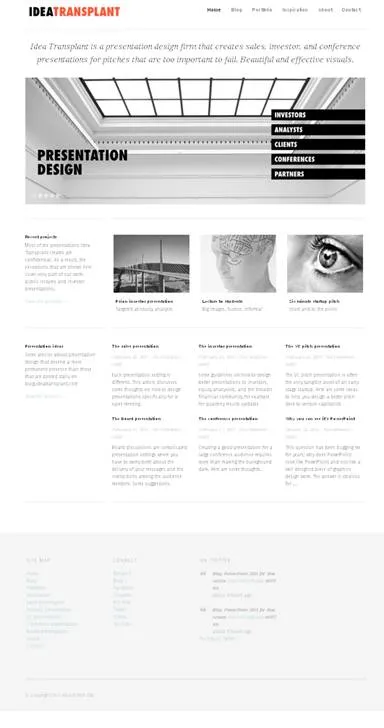
New web site!

Finally, I am happy with the design of my corporate web site. The previous one was still too cluttered, but now I have reached the appropriate level of minimalism.

·Books

Recommended presentation design books

What are the best books about presentation design and public speaking

Some good books about presentation design, public speaking, graphics design, and art. If you click on an image, you will be linked through to Amazon where you can buy the book. We use affiliate links and receive a small commission when you purchase a book through this site.

You can find reviews of presentation design books that I posted on the blog here.

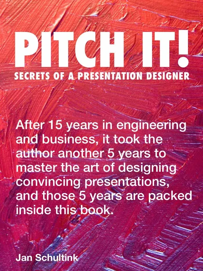
Pitch It! by Jan Schultink, my own book about all things presentation design. The book can be accessed free online here.

Presentation Zen by Garr Reynolds started the revolution in presentation design, transforming bullet point slides into visuals with images. Read my review here (2008).

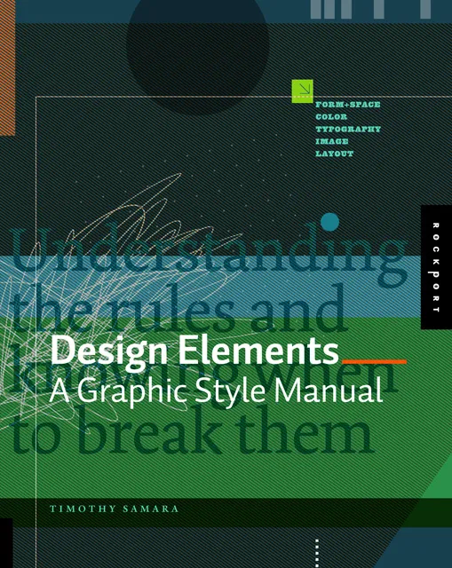
Design Elements by Timothy Samara takes you through the basics of layout and typography. Read my review here (2010).

Resonate by Nancy Duarte has good instructions on how to design a captivating story that gets your audience to do something, take action after they walk out of the auditorium. The iPad version is free. Read my review here (2010).

Slide:ology by Nancy Duarte is a good general introduction to presentation design and delivery. Read my review here (2008).

Continue reading →
·Images

Poster design goodness

Some interesting visual concepts in a Core77 poster design competition. I borrowed the image by the winner Miryam Melkumyan, you can see all entries here.

·Books

Book review - Design Elements

Recently, I have picked up a lot of books about graphics design and typography. Design Elements: A Graphic Style Manual (affiliate link) is a book that takes all the basic principles of graphics design one by one. It is built around 20 reminders for designers. Reminders and not rules, because designers have the opportunity to break them (see the cover of the book with 2 paragraphs of text put on top of each other).

Most books about graphics design use an incredibly complex language to describe visual concepts. This books is no exception. Rather than try to translate the text into concepts, I skimmed the prose and focused on the many beautiful illustrations, images, examples, and their explanations.

Things that I was reminded of (not as a graphics designer, but as a designer of business presentations in PowerPoint):

  • Think of which fonts you use (I am u-turning on earlier assertions that you should only use standard fonts in PowerPoint to avoid technology issues)
  • Pay attention to the style consistency across pages in a presentation beyond just colors. Other things to watch are placement of objects, style of images, the way images are displayed, etc.
  • Make sure your slide looks elegant, maybe even by reducing the font size somewhat and creating more white space around the slide. Margins do not have to be set at 0.4 inch all the time.
  • Use color carefully, instead of “which color of the scheme have I not yet used on this slide”-type thinking, think about the distribution of light and dark, ask yourself where color is needed, and then pick the one that supports the slide message best.
  • Try to incorporate rhythm in the design of a slide.
Continue reading →
·Design

Designing a minimalist Twitter page

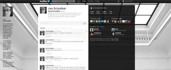
I gave my Twitter page an overhaul. Designing a Twitter page is tricky:

  1. On small screens the side bar on the left gets eliminated
  2. A twitter stream is a cacophony of links, icons, avatars, buttons

Here is the approach I took:

  1. Minimize the use of distracting colors that only add to the chaos of avatars and links
  2. Use a background image that gives a sense of open space, with a light source from the top, and minimal visual distractions
  3. Invert the colors of the right side bar: really dark semitransparent background, with a white font (it will look a bit weird in the Twitter style editor). I find it very hard to get any color to look good here, because the semi-transparent setting will make any of your choices look pale.
  4. The same is true for links, I struggle to find good link colors and as a result set them light grey. Most Twitter links are shortened URLs that people do not need to read anyway. The alternative would have been to pick a very bright one with high contrast, but that would only add to the cacophony of the page.

What do you think?