SlideMagic Blog

Frequent updates about all things presentations since 2008. Subscribe to never miss a post.

RSS
all posts

Search results for “mckinsey”

·Keynote

How did she spot that?

When I just started out as a junior analyst at McKinsey I always wondered how my project manager was able to spot a mistake or inconsistency in my slides in a second. I had been working on this all night (sometimes literally), build all the spreadsheets, mastered all the detail, and in she comes and says after a few seconds: “that number looks wrong to me”, and yes, there was a bug in my analysis.

The secret is take some distance from your work. Look through the slides without connecting them to your Excel sheet. Sales numbers on page 3, should be the same as sales numbers on page 16. A soft drink can is unlikely to cost $50. Simple checks and a cool head.

If you do not check your slides, your manager, or your client will for sure.

·McKinsey

You are not presenting slides

Back in the old days at McKinsey, my first project manager explained to me that I was supposed to “present the slide ” (Exhibit in McKinsey speak) to the client. This involved taking the audience (a small conference room) through all steps of the analysis.

And also we found… And then we found… And also we analysed… And also the team discovered…

Presenting a slide is probably still useful in internal team meetings among management consultants or scientists, but in most story-driven business presentations slides are there to support you in a subordinate role rather than claiming the lead role. The slides run in the background, as you tell your own story.

·Creativity

Always beautiful

I try to keep ugliness completely out of my design work. Ugliness tends to spread like a virus that wants to take over your work.

Even if you make a quick mockup or even a paper sketch of a slide, it should look orderly, balanced, clean. This is what I learned on my first day at McKinsey, when a client walks in you should be able to talk her through the hand-written deck.

·Keynote

How did you become a designer?

I get asked this question frequently by people who are considering a career change. Here is my story.

The first 10 formative years of my career were spent with McKinsey, a strategy consulting firm, working in the London and Amsterdam offices with projects pretty much in every country in Europe. My stay there was a bit different than the norm: 1) I stuck around for about 10 years, versus 2-3 on average, and 2) I did not specialise in one industry (banking, consumer goods, etc.), but rather did a functional specialisation: mergers and acquisitions, usually on the sell side. In short, I helped big Fortune 500 companies sell themselves to other big Fortune 500 companies. As a result, every project that I worked on was in a different industry, and I had to adjust rapidly to understand a completely new field of work (beer, pet food, DIY retailing, petrol retailing, grocery, retail banking, asset management, insurance, private equity, e-commerce, mobile payments, postal services and logistics just to name a few). Little did I know then, how useful this skill would come in a decade later in a briefing for a new presentation design project.

After leaving the Firm, I moved with my family to Tel Aviv where I started out as an independent strategy consultant. Soon, I got in touch with the Israeli high tech industry. The small startups could not afford (and probably did not need) me as a strategy consultant for 6 months but saw value in my PowerPoint slides for meetings with potential investors (these charts were still B&W, highly organised, full of consulting speak at that time). It was here that my gradual transformation to a presentation designer started. Gradual is important here, I think no freelancer figures out exactly his professional niche from day one. In my case it probably took around 2-3 years to stop calling myself a strategy consultant.


Continue reading →
·Keynote

The 2-line slide heading

In some presentations, I use a template with a 2-line slide title, giving me more screen real estate to spell the key message of a chart. The format is very similar to exhibits I drew at McKinsey, where the message of the slide was written in a paragraph that could span 2-3 lines of text in point 12 font above the chart headline.

When to experiment with this format? Smaller audiences, lots of complicated data charts, chart messages with nuances that are hard to capture in a newspaper-style article heading.

Oh, and when you use the longer headlines, there is not reason to re-write that same sentence in a big bubble or box on the right of the chart.

·Data visualization

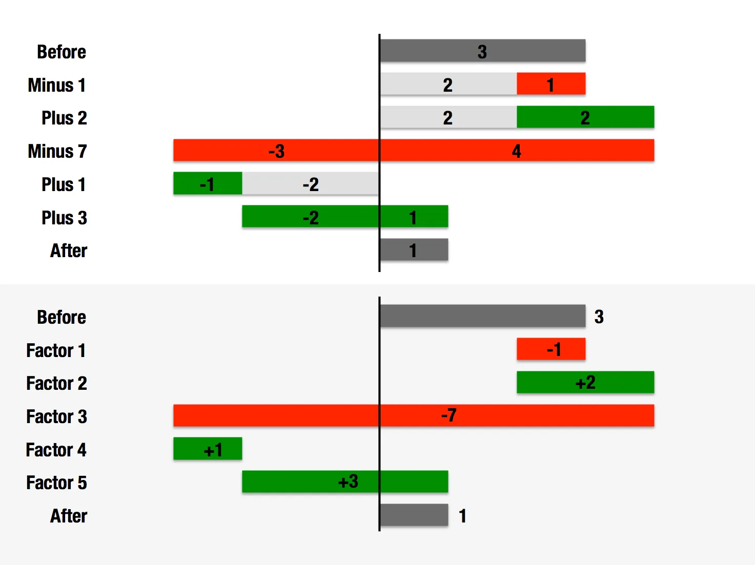
Waterfall chart with negatives

My post about

how to create a McKinsey-style waterfall chart

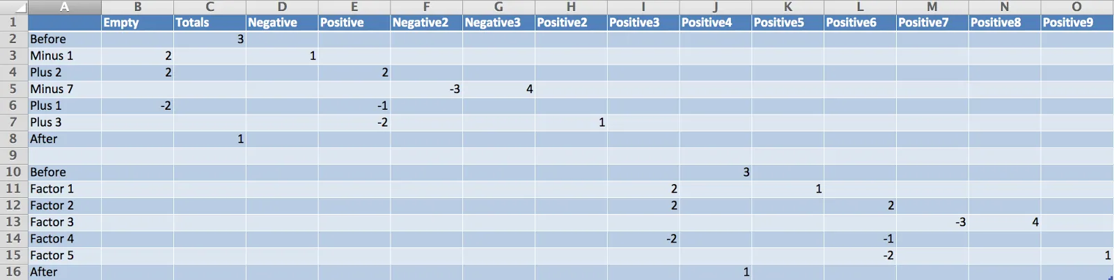
is one of the most read on this blog. The method I showed breaks down when there are many negative numbers involved. The solution is a manual one, sketch your waterfall on a piece of paper, fill in all the numbers, and fiddle with colours until you get it right. Remove the automated data labels and put text boxes with the values instead. See the example below.

·Keynote

Out with the action verbs

At McKinsey, I was told to write my documents with action verbs: create strategy, draft business plan, begin execution, monitor progress. It is the correct way to write things, but space on a slide is scarce. More and more, I find myself violating the rule and writing the absolute minimum amount of words to get the idea across, every increase in font size is a plus.

·Delivery

1996 presentation training

In the bottom of my office drawer I just found a small card with personalised suggestions for better presenting that I had to fill out after a communication training at McKinsey all the way back in 1996. All the usual things are there: stance, eye contact, etc.

But one things stands out and is so 1996/McKinsey: “Introduce the slide before putting it up” (remember we were still in the time of the overhead projector). McKinsey slides were incredibly busy and filled with data, so plopping that overhead sheet on the projector without warning would overwhelm the audience.

Instead, we had to introduce the message of the slide, show it, talk people through the various elements of the slide (what is on the axes, what the line means, etc. etc.), and maybe repeat the key point one more time.

Now 16 years later, my approach has completely changed. When you put up a slide, it should be completely self explanatory, cutting out unnecessary clutter and spreading out content of multiple slides if needed.

·McKinsey

So what?

The first day of your career at McKinsey, you learned about the concept of “So what?”. It meant asking yourself what the real point of a chart full with analysis was, and writing that down as the title.

A so what should be meaningful, and not simply stating a fact for example instead of “We are making a loss in France”, maybe it should read: “It is time to leave the French market”

Once you established what the so what of the chart is, you could then go on an cut down any facts, data, or analysis that was not essential to make the point.

If you identified the key messages correctly you would be able to understand a document by just reading the headlines, the content of the slides just backs up what the title says.

A useful day-one concept, I still use it pretty much every day.

·McKinsey

Presenting the slide

A decade ago when I just started my career at McKinsey, I always was very excited when I was asked to “present the slide” to the CEO of a client. Presenting the slide: the slide was primary, the presenter was secondary. There is nothing wrong with that. When designing your slide deck, just realize that this is the audience setting you are designing for.