SlideMagic Blog

Frequent updates about all things presentations since 2008. Subscribe to never miss a post.

RSS
all posts

Search results for “web design”

·Design

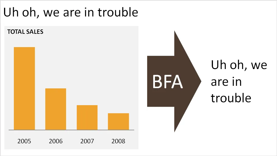
No need to put that huge "message arrow" on you slide

An excellent post on the “Tekst en Communicatie” blog by communication expert Louise Cornelis. It’s in Dutch, so I will translate.

Louise discusses what she refers to as “the big f*cking arrow” or “BFA” (not all Dutch on her blog). A huge arrow in the middle of the slide, pointing at a block of text with the chart’s conclusion. Apparently “BFA” has become a well-known acronym among chart designers in The Netherlands.

Her (and my) recommendation: get rid of it and stick to a clear title headline.

·Colors

New startup - do you still need to bother with a logo?

I encounter this situation often when designing fund raising presentations for new startups pitching to VCs. “Oops, what about our logo?”. My answer is usually don’t bother, instead invest time to find a suitable color scheme.

  • Getting a good logo designed is expensive

  • It takes time for logos to become brand icons. First you need a brand story/experience, only then can customers connect it with your symbol. Read Seth Godin’s post (great quote “the iPod didn’t need a logo”).

  • Logos are not important for the look and feel of a presentation, colors are. If a client insist, I will put them in 8pt at the right bottom of the page. Think about what drove logo design in the last century: they needed to fit on a building, a letter head, a form, a black and white fax. Because the user could not manipulate colors, fonts, images like we can today, it was the only “interesting” graphic on an otherwise boring piece of paper without an identity. These times are over.

Forget about logos if you are short of time, or short of cash. Pick some nice colors instead. Worry about your logo later.

·Design

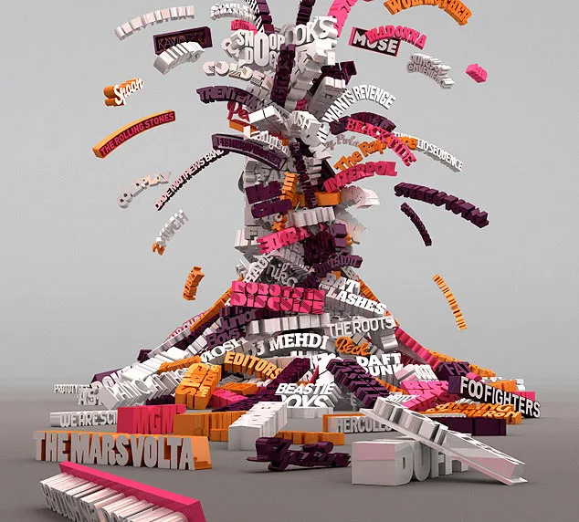
3D font city - 5 years from now in PowerPoint?

Graphics design has always been ahead of mainstream PowerPoint in terms of graphical abilities (colors, images, drop shadows, etc.). On the front page of Digg Design today an interesting collection of 3D typography put in one place by Naldz Graphics .

A taste of things to come! Wouldn’t it be interesting to navigate around in a 3D city of buildings made of words to support your presentation?

(Image by Serial Cut, advertising for the Zune marketplace)

·Data visualization

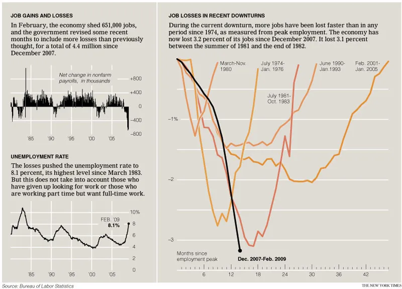
Data visualizations - how bad is this recession compared to previous ones?

The only up side of economic turmoil is probably that there is plenty of data available for interesting visualizations. The New York Times posted this chart: (click for a larger picture)

I like it because the designer gave some thought about what metric to put in. He/she could have shown a times series of GDP growth, absolute unemployment, or unemployment rate to name just a few. That’s why I do not like these automated PowerPoint chart wizards, it makes you skip the step of actually thinking about what metric really makes your point. (And more importantly, what are the 15 metrics you can get rid of without changing anything to the message of your slide).

Via Junk Charts, an excellent source of data visualization discussions. For more frequent updates about the financial crisis (including many data visualizations) follow Paul Kedrosky.

·Advertising

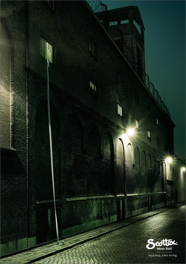
PowerPoint lessons from a toilet paper ad

I am learning a lot from print advertising. I am learning a lot from the adgoodness blog.

Especially in fund raising presentations I design for startups that are going to pitch to potential investors, I am spending a lot of time/effort in finding that one image or visual concept that really nails down the idea in one big bang. Almost to the extent that the following slides are not required anymore.

Consumer marketing is all about focus on one single and clear consumer benefit. Here is a(nother) great example. Food for thought when designing your next presentation.

·Colors

PowerPoint template colors and color blindness

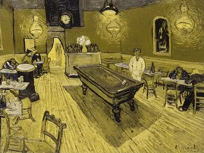
My Vincent van Gogh color set from a few days ago is not very good for people suffering from red-green color blindness.

Use Vischeck to test your own templates. To do so, you need to “save as” a PowerPoint page as “PNG”.

A side-benefit of this test is that you get sense of what happens if someone prints your presentation on a black & white printer. (But hey, the B&W white test is the easiest of all: print preview)

Somewhat related: an earlier post about designing presentations with people suffering from dyslexia in mind.

Via Richard Garber. A more elaborate post on Vischeck and PowerPoint in this post on the Indezine blog.

·Colors

Color mismatches in corporate PowerPoint templates ("Skype" example)

Skype has a beautiful and very strong visual identity. Things start OK on the first page of this presentation by its COO at CES 2009. Then the color coordination gets weaker. Off blue. Pink’s too bright. No greens (Skype’s green “call” button is very strong visual icon returning in the monochrone rainbow).

PowerPoint templates go beyond page 1.

I am sure Skype’s template is OK, the default colors are probably not set in such a way that they are easy to use for people without a degree (or passion) in graphics design. Like in almost all corporate PowerPoint templates, too much screen real estate is devoted to the brand/logo. With its strong blue colors Skype could actually afford not having a logo at all on its presentation pages. People will recognize the company regardless.

Skype COO Scott Durchslag at CES 2009

·Advertising

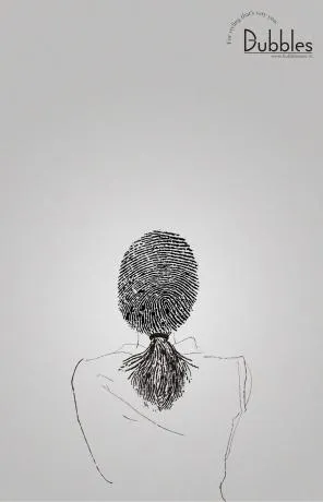
"Signature" advertising for a hairdresser

Unusual. An well-designed ad for a more or less local hairdresser/spa. Like a good slide:

  • You get the point instantly
  • Understated, elegant, and lots of white space

I like the small light-source-behind-the-model effect, I will experiment with it in my next presentation using a radial-gradient with very close color shadings.

Still, there is something “criminal” associated with a finger print (as people suggest in the comments of Ads of the World, where I found this image).

·Advertising

Visuals - 30 Christmas ads from around the world

Not much time to write elaborate blog posts over the holidays. Some interesting visuals on Digg Design - 30 unforgettable Christmas ads today (here is one to them):

·Design

Create your own buttons and lights on a metal skin in PowerPoint

Inspired by a post on slide:ology today linking to a set of newly released PowerPoint templates with examples of what graphical effects PowerPoint can produce, I decided to start posting some of my own favorites.

Many logos of Web 2.0 companies are examples of how not to use these graphics capabilities: add a “bevel”, “reflection” and “drop shadow” and the result must look good. In graphics design, most of the time, less means more.

But sometimes these effects can help. In my case a client needing to explain software functionality. We decided to go for the metal “HiFi component” look with buttons that can easily activate functions. (Click image for a larger picture)
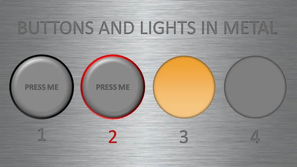
  • Metal skin: an image purchased from iStockPhoto
  • Metal text: a big font in a similar, but slightly darker color than the background with an interior shadow applied to it
  • Button 1 and 2: a circle with a heavy outline (red or black), a simple “bevel” applied to it, but in the tab “3D options” of the bevel functionality I increased the depth to 20.
  • Light 3 and 4: a circle without an outline, with an central interior shadow and a color gradient running from a full color to a slightly faded color.

Let me know in the comments if you are interested in the detailed instructions.