SlideMagic Blog

Frequent updates about all things presentations since 2008. Subscribe to never miss a post.

RSS
all posts

Search results for “web design”

·Design

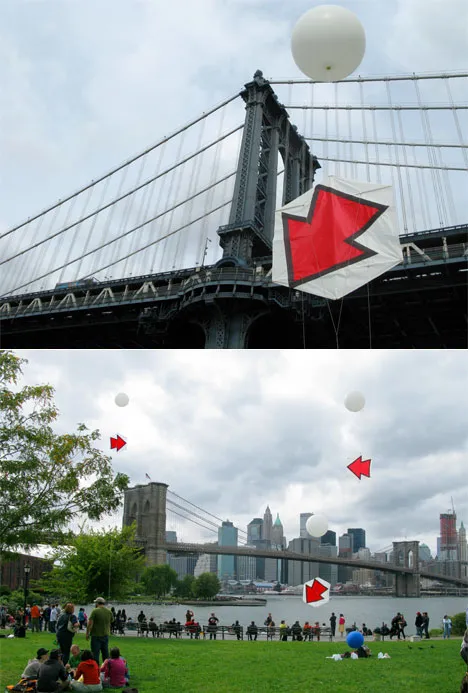
If you need arrows to point at what's really important...

…on your slide, you might as well re-design the entire slide just around that message.

This image of kites with red arrows highlighting random elements of a city landscape reminded me of dense bullet point slides with last-minute arrows added to make sure that the audience does not forget to get the point…

Details on this art installation here on the Core 77 design blog. See one of my earlier posts on a similar subject.

·Cartoons

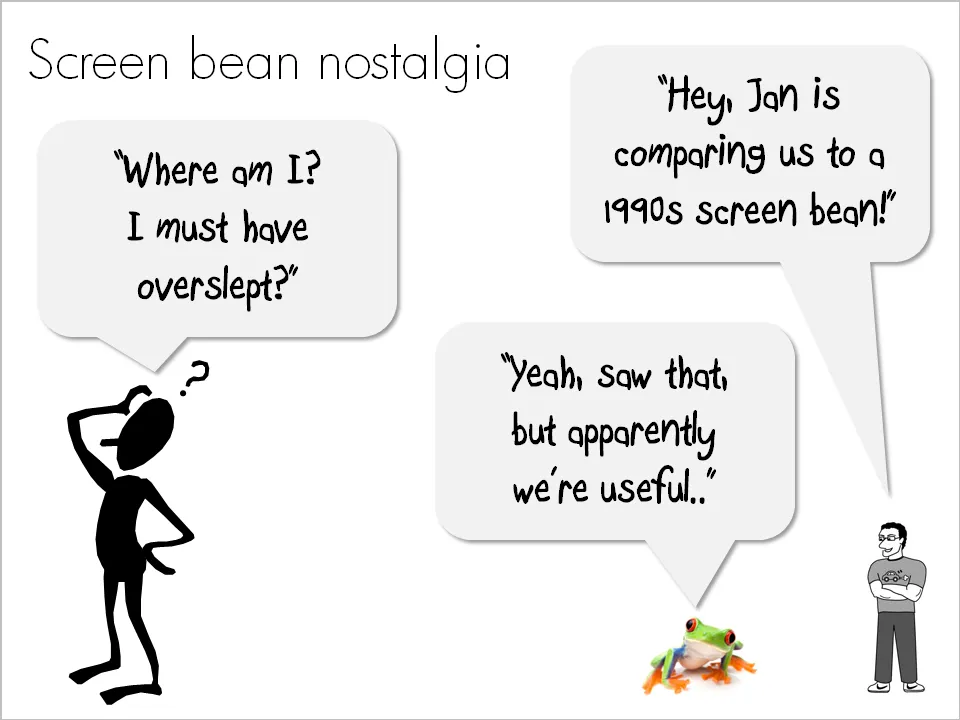
Screen bean nostalgia...

A number of good things have happened in presentation design over the past few years. Yesterday, I came across one of these screen beans that used to feature prominently in many corporate presentations in the 1990s. I am very glad people are not using them anymore. (But I must admit that deep in my heart there is a bit of screen bean nostalgia…).

There is a modern reincarnation of the screen bean character though. A small cartoon with a text balloon placed on the border of a slide. He/she often makes a side comment that adds to the overall message. Garr Reynolds uses them very successfully, Google explains the technology behind the Chrome browser using comic characters, just to name a few.

Farewell my friend Mr. Screen Bean…

·Books

Book review - "Influence - the psychology of persuasion"

The book Influence: The Psychology of Persuasion by Robert Cialdini was added to my Squidoo lens with presentation resources (thank you anonymous reader!). I finally managed to read it. The book aims to teach anyone who needs to influence other people (that includes presentation designers like me) to leverage learnings from the field of psychology.

Like most business classics, the real-life case examples are really valuable; the attempts to draw generic conclusions and insights from them somehow make less interesting reading (although they still are valuable). Just a few examples:

  • A jeweller selling all his slow-moving inventory by accidentally doubling its consumer price
  • Charities harassing people in airports by offering them a flower as a gift, and “forcing” them to contribute a few dollars to the cause
  • Cults and mass suicides
  • Normal people willing to give 220V electrical shocks to other people in the name of science
  • How you can make sure that a crowd of bystanders actually helps you when you need them (spoiler: ask a very specific person to do a very specific thing, crowds usually think that help is already on its way)

The six principles discussed in the book (where possible I added lessons specifically for presentation design)

  1. Do a favor, cash in later.
  2. Get people to commit early on. Presentation use: have people write an objective down on a piece of paper as a group exercise, construct an argument in stages, have them buy into something small early on before the big idea comes later
  3. Social proof, we do what we think others do. Watch out in presentations to make cases like “100m Americans have not signed up to donate blood”. It might just backfire.
  4. We say yes to people we like, we like people who are similar to us. Find a connection with your audience early in the presentation, even if it is a very weak one (“my nephew went to high school in Springfield”)
  5. Use authority. Establish your credibility early in the presentation, as specific as possible. OK: “I am a VC with firm x”. Better: “I personally invested $300m in 35 early stage tech deals”. Quote sources for the analysis and data you are using in your presentations
  6. Scarcity, we like things that are hard to get
Continue reading →
·Design

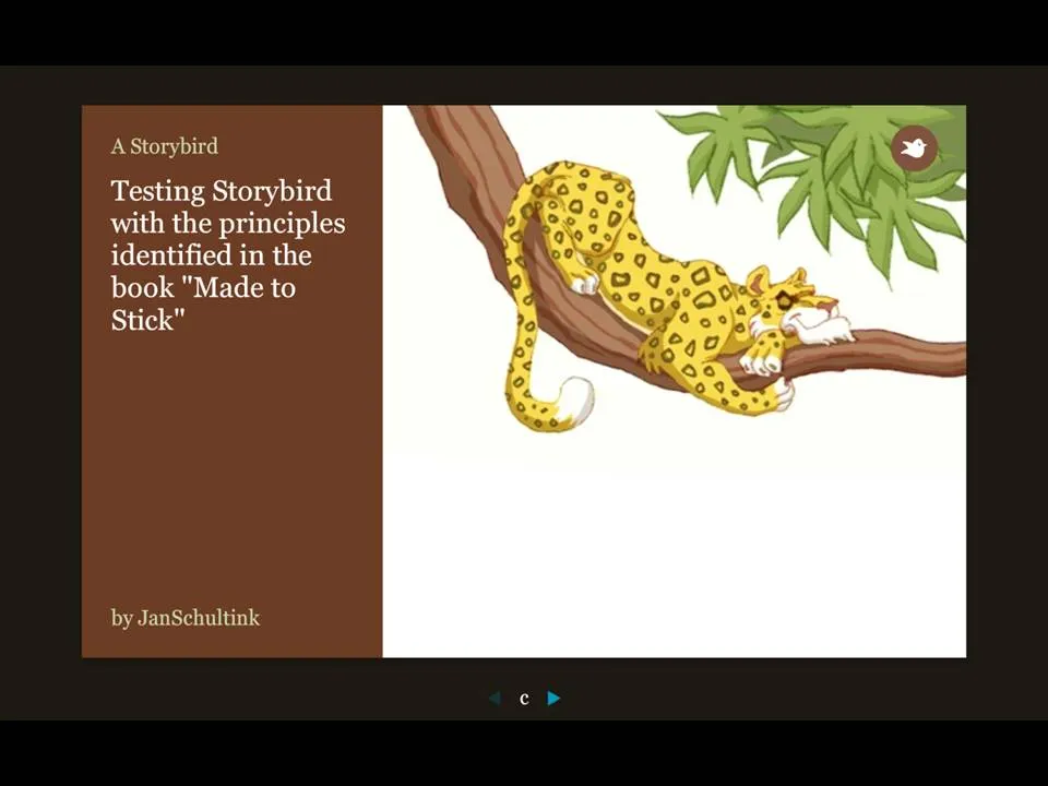
Storybird - collaborative story telling for familes and friends

More and more online presentation tools are popping up. A recent one is Story Bird. You select artwork from an artist and are offered a simple interface to weave images of your choice together into a story.

The service is targeted at family/children and works well. Narrowing down the degrees of freedom (artwork in a consistent style, simple page layout [image + big font text]) makes it easy to create and share professional looking stories. You can invite others to collaborate with you as well.

Maybe the biggest application of this service is in education? There is a business presentation version of this application possible as well. Replace the image bank with non-cheesy useful presentation images (you only need a few hundred to cover most business presentations) and you have an alternative template to the PowerPoint bullet points. “Ayne can make Presentation Zen-style presentations”). Cutting the available slideware tools to the minimum helps focus the presentation design amateur on the story.

My first creation can be found here.

Via Orli

·Design

Intimate 1 on 1's: the PowerPoint/napkin hybrid presentation

Seth Godin nailed the perfect format for a one-on-one presentation in a recent blog post.

  • Full-blown PowerPoint presentations are overkill in an intimate coffee chat
  • Taking an empty note pad and sketching the entire presentation from scratch while you are talking is definitely more intimate, but also high risk. (A bit like the concept used in the book “The back of the napkin
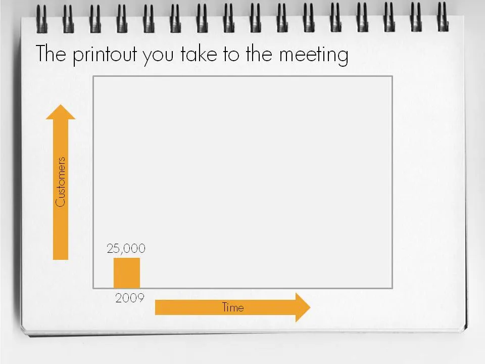
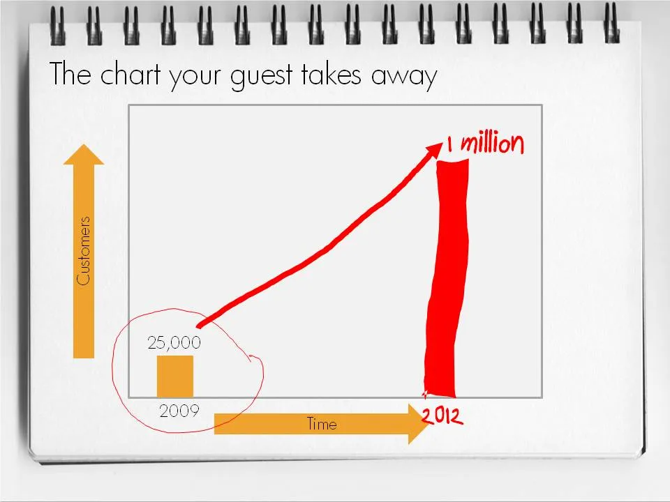
  • Seth’s hybrid of a print out of PowerPoint slides with key numbers, circles, and marks missing is the perfect compromise. Hand-write the key missing pieces during the meeting. Your meeting partner will remember them better, and he can take a nice and personal “coloring book” home.

This type of presentation is ideal for short 15 minute coffee chats with venture capitalists where you try to pitch for a more in-depth meeting.

To make a hybrid napkin presentation, I suggest that you actually design all the slides, including the version with the comments and drawings put on them electronically so that the story flows logically and it is easy to prepare for the meeting. Just before your presentation, you decide which slides to print or not.

·Books

Book review - "A whole new Mind"

Slowly, I am catching up on reading presentation-related classics. This holiday I read through Daniel Pink’s A Whole New Mind.
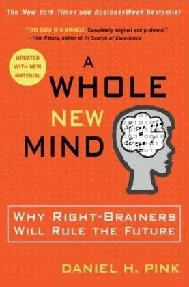
The subtitle of the book: “why right-brainers will rule the future” is an overly simplistic summary of the main idea. The book’s content is more nuanced. In the “conceptual age” 2 skills are essential:

  • Solving problems in a way that nobody has ever done before
  • Persuading other people, spreading ideas [here is where the link to presentation design comes in]

Why? In current society, supply of goods and ideas is overwhelming. In order to stand out you need to develop a unique edge. The only way to get this edge is through developing “right-brain” skills such as desgn and story telling. “Left-brain” skills such as accounting, diagnosing a patient, applying legal rules are repitive and can increasingly be automated or outsourced to countries with much lower labor cost. A whole new mind is a mind that has a combination of left-brain and right-brain skills.

Some additional thoughts:

  • I think that people will have to learn the boring, repetitive left-brain skills in order to reach the next level of creativity. You need to read and write in order to write a book. You need to understand financial accounting in order to solve a strategy problem. You need to understand how large corporate structures work in order to deliver a presentation that convinces the Board. For example in the field of presentation, I think it is actually the entry of left-brainers into the field that was traditionally dominated by “creatives” that is causing the changes that we see now.
  • There will always be a large number of repetitive left-brain jobs that will not be automated/outsourced, and unfortunately a large group of people that have to do them.
  • It is hard for people to cut themselves free of left-brain corporate environments econcomically. Academia pay is poor. There are only so many spots available at companies such as Google that give their employees free time to work on whatever they want. Not everyone can build up skills that can be marketed in a freelance model profitably.
  • The most successful engineers, accountants, lawyers, surgeons had the combination of left and right brain skills that Daniel is talking about.

Continue reading →
·Design

Presentation lessons from cluttered French brasserie placemats

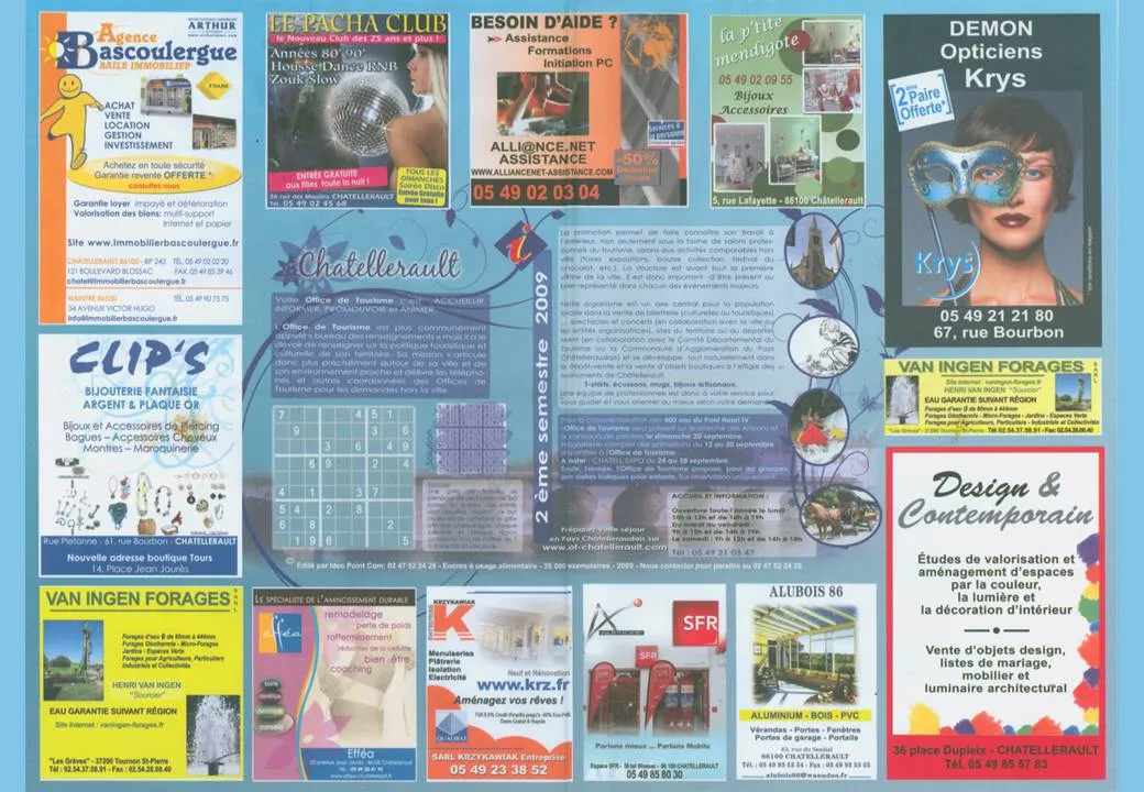
I just returned from a beautiful and relaxing family holiday in western France (apologies for limited posting and replies to comments). My 2 year old son’s fondness of cars required us to venture to the car museum in Chatellerault. (About the only thing to see in this town).

Lunch was in a local brasserie (not recommended). The placemat (click on the scan below for a larger image) reminded me of the slide sort sorter view of many poor PowerPoint presentations. Ads screaming for attention by using big, colorful and different fonts. With as much information crammed into it as possible.

Few got it right with some exceptions. The power of pictures does work in France as well. Many men will be drawn to the Le Pacha Club, fashion-conscious women might check out the Krys optician. I was disappointed with the interior design study institutue though (bottom right).

·Design

Maximizing screen real estate in PowerPoint

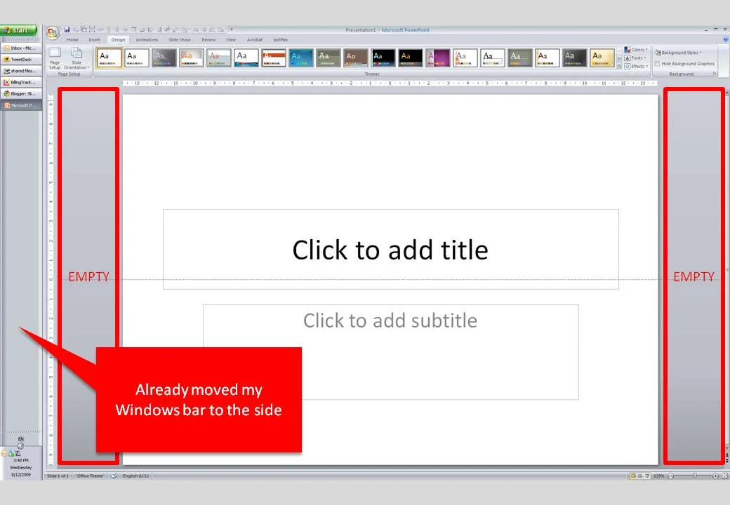
Many people have 16:9 computer monitors by now. Most of the time, we still design slides in 4:3 or A4/letter mode. As a result, a lot of space is available on the left and right of the PowerPoint slide in editing mode.

PowerPoint, like most software, is designed for the 4:3 screen by adding the ribbon and status bars at the top and the bottom of the screen. A lot of screen real estate is wasted. Adobe does a better job, tool bars are positioned to the left and to the right of the work area.

I already moved my Windows bar to the side. Is there a way to do the same thing with the PowerPoint ribbon? I don’t think so. A feature request for PowerPoint 2010.

·Design

Reflections - if you really have to use them, use them right

I am not a big fan of the reflections that are used frequently in “web 2.0” logos and PowerPoint graphics. The fact that PowerPoint enables a feature does not mean that you have to use it. As an example see a logo that Visa uses to build a relationship with small business customers.

  • Both logos would look much nicer/cleaner without the reflection
  • In the left image the reflection is not correct, the 3D compartment of your brain tells you “something’s not right here”. I am sure it was not the intention of the designer to create a logo in the style of Escher.
·Design

"Nothing on a slide should be placed arbitrarily"

Alignment*. Nothing should be placed on the page arbitrarily. Every element should have some visual connection with another element on the page.*

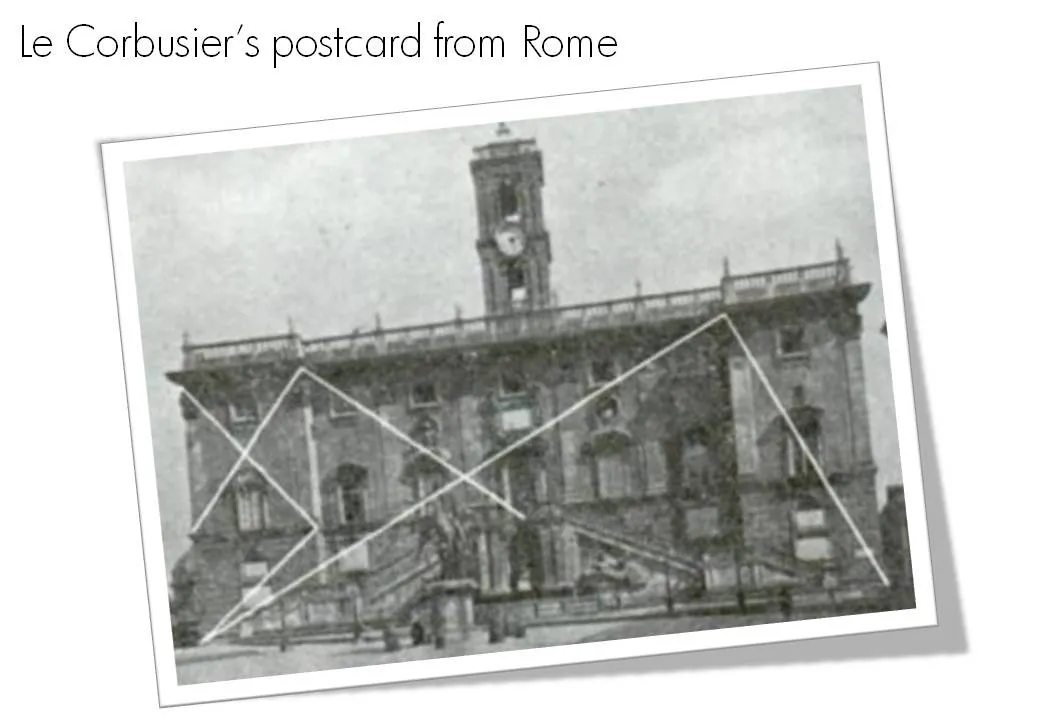
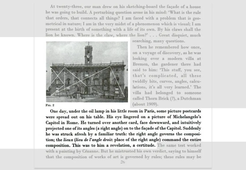
So very true, this quote from Robin William’s book The Non-Designer’s Design Book. Architects such as Le Corbusier are the masters in planning the proportion and alignment of objects on a facade.

The above image and quotes were taken from page 26 of Le Corbusiers’s The Modulor 1&2. (Click on the page 26 Google books link or the image to read the text)

Not that you have to be like them. But still remember from now, whenever you have the option to position a shape or a text box on a slide, why not think for a second where to put it, align it with something?