SlideMagic Blog

Frequent updates about all things presentations since 2008. Subscribe to never miss a post.

RSS
all posts

Search results for “web design”

·Design

Google's latest investor presentation (part 1)

Quarterly results presentations are in the public domain, designed for an external audience. Below is the presentation that Google used to communicate the results for the first quarter.

These types of presentations are usually prepared under great time pressure, as there is very little time between the moment the accountants are producing the figures and the communication to the analyst community. Unfortunately, this impacts the quality of the presentation (form, not content).

I will use this presentation to provide some suggestions on how to improve corporate presentation design. Not that I am picking on Google (Skype was an earlier victim), this presentation is just a typical example of most analyst presentations I see.

Analyst presentations are slideocuments: they need to be packed with a lot of financial information and the audience (equity analysts), usually know the company and its financials very well and are keen to see this quarter’s update of last quarter’s figures that are already sitting in their spreadsheets. So, adding large images with huge font text is not really appropriate here. Also, I will forgive the use of bullet points in these documents. Still, the quality of the slideocument can be improved.

Let’s look at the opening page. The one thing I like is the minimalist template that Google uses: a tiny logo at the bottom right of the page. Great.
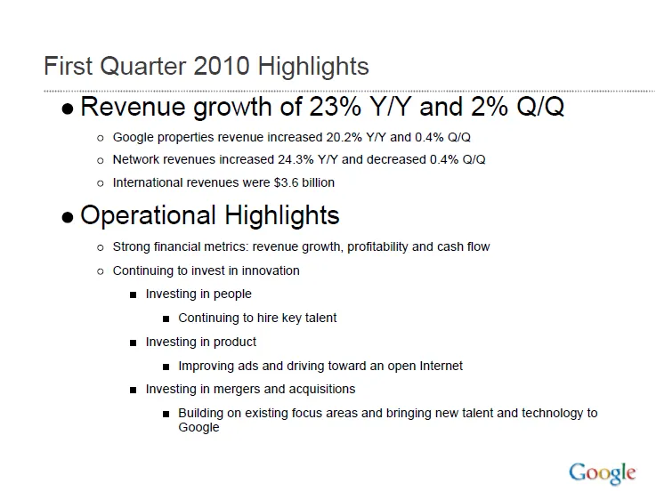
Some improvement suggestions:

  • Break it in two pages, one addressing the financials, one the operating highlights
  • Use horizontal bar charts to highlight the growth rates year-on-year and quarter-on-quarter
  • On the second slide, do not use bullets if you just need to make 1 point
  • Try to make the sentences shorter
Continue reading →
·Design

A VC investment case in the public domain

The Internet opens up everything, including investment cases by venture capitalists. If you are working on a presentation to pitch your startup to a VC, read Mark Suster’s recent post on his investment in Burstly. Here is the full content on how he convinced his partners to back him with the investment. Valuable input when you design your pitch deck. Mark is not the only one, many VCs now run blogs, given very good transparency in how their mind works. Much better input than what their portfolio looks like and/or the standard blurb on the VC’s web site. Every VC is different, every VC pitch is different. Do your homework before opening PowerPoint.

·Design

Image sequences to set your audience's mood

Presentation designers can learn from film directors. Inserting a sequence of good (and real) images can take your audience from the conference hall to a different place. Beautiful and sad at the same time, click through some of these urban decay images to get the feeling: here, here, here, and here.

(Image by Yves Marchand & Romain Meffre)

·Delivery

Gaining the confidence to tell your story, your way

The more you practice, the more you rehearse, the more you get on top of your story. And the more comfortable you get with your material, the more confident you get in delivering it. Confidence goes beyond getting rid of fear of public speaking, confidence enters chart design and story telling as well.

  • The confidence to get rid of “business school”-style structuring frameworks: let’s talk about the market, let’s talk about the competition, let’s talk about the distinctiveness, etc. and only spend time on those issues that really matter for your particular story, in the order that best fit your specific situation
  • The confidence to use personal stories and case examples to illustrate your point
  • The confidence to make your charts more minimalist and more abstract
  • The confidence to insert blank/black/white slides inside your presentation to have the audience just focus on you

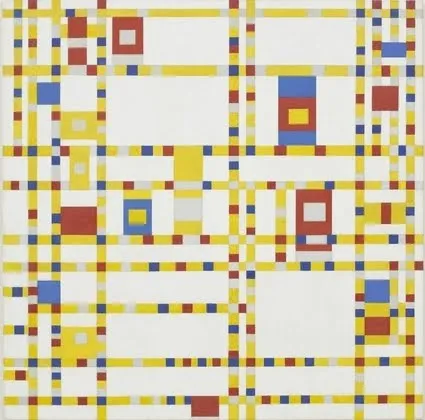
It is a bit like the abstract painters of the last century: having the confidence to communicate emotions and ideas without relying on realistic techniques. For example Piet Mondriaan’s Broadway Boogie Woogie painted in 1942-1943.

The pulse of a Jazz beat, and the energy of the New York traffic squeezing its way through the city’s grid all captured in one painting without showing Jazz bars, Times Square neons, and/or New York traffic jams.

·Design

Overlaps in PowerPont (redux)

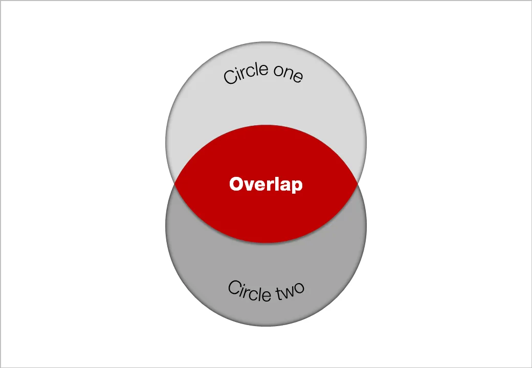
Another technical post today, giving another approach to creating Venn-like diagrams without the color limitations of semi-transparent shapes.

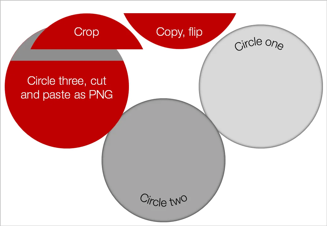
  • Draw an extra shape exactly the same size as the others, in the color you want
  • Ctrl-X it away and paste it back in as a PNG (paste special, PNG)
  • Crop excess bits away
  • Overlay them

Blog visitor AdamV provided a link to this Microsoft PowerPoint 2010 feature that will make it very easy to combine, intersect and subtract shapes.

UPDATE February 2018: I have now added several designs for PowerPoint Venn diagrams on the SlideMagic template store that make use of PowerPoint’s shape intersect function.

·Design

Immerse yourself in photography

As a child I already loved flicking through magazines, just to look at pictures. The Internet makes it so much easier to absorb vast quantities of visuals. Simple add a huge amount of photography-focussed RSS feeds to your Google Reader and hold down your finger on arrow-down, only to lift it when an image instantly touches you.

Not that I am hunting for images to use in presentations, often they are not right, often they have copy right restrictions. But still, immersing yourself in images improves your slide design skills. It is a bit like the best way to learn a language: surrounding yourself with it (maybe Hebrew is the exception to the rule though).

The most interesting images are often not the most professional ones. Stunning sun sets, volcano eruptions, can be beautiful but do not touch you on an emotional level.

I recently added the RSS feed for ffffound to my Google Reader: a community image book marking site with a large readership. Images are picked by random users (most of them with a good eye for photography), as a result you get a frequently updated image stream full of surprises. As an example, here is an image I found today on the site:

Yay!Everyday is another example of image highlighting site, worth following.

·Colors

Lighter shades for bright colors

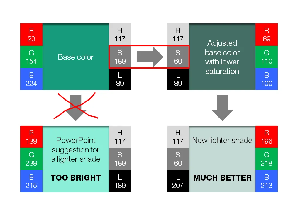
PowerPoint 2010 gives you the option of a spectrum of different shades of the same color. This is great to design charts with a consistent color scheme.

However, if your template contains colors that are highly saturated, the suggested lighter shades of your color will be too bright to use as neutral color nuances. Here is how you can fix it. (Click on the image for a larger picture.).

  • Create a new base color by reducing the saturation (in laymen’s speak: make it more grey).
  1. Open the color in your color template (format shape/fill/solid fill/color/more colors)
  2. Switch the color model from RGB (red, green, blue) to HSL (hue, saturation, luminance).
  3. Reduce the (S)aturation value, while keeping all other variables the same.
  • Use a lighter shade of this new base color instead and save this as a new color in your color template.

If you are interested in learning more about color theory, you can browse through some earlier posts on the subject of color or go straight to this one.

·Books

Seth Godin's Linchpin: "the good guys can win"

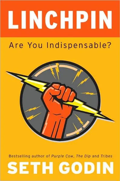
This post will be slightly off-topic: Seth Godin published his latest book yesterday: Linchpin (affiliate link) and I think it is important that as many people as possible absorb the ideas that it contains.

Seth’s books have evolved over the years. What started with insights about marketing (he is the one who opened up our eyes to the fact that anonymous spam email campaigns are not effective), is now moving into the area of leadership and in Linchpin even broader: what is the purpose of the time you spend day in, day out. 

If there is one unifying theme in all his books it would be: “the good guys can win” (came up with this while listening to Leonard Cohen’s song “Everybody knows”). You can be successful by doing remarkable things, without a need to cheat, interrupt, or lie.

The book opens with a grim analysis of history. Over the past 100 years we have built a society (education, advertising) that trains people to be cogs: cheap, willing, replaceable, numb, insecure people that man the production lines and purchase the stuff that the factory churns out.

It is time to escape the trap and change. It’s urgent. Not changing will get you fired, and/or bore you to death, and/or rob you of your dignity, and/or paralyze your abilities and talents as you live and work in constant fear. On top of that, all of us own so much stuff that we do not even know what to do with it anymore.

Continue reading →
·Design

SpiderPic - price comparison shopping is coming to stock images

By now everyone knows that using professional images in your presentation is far better than ripping images from Google image search or clipart: higher quality photographs, isolated subjects on a white background, detailed search capabilities including required colors or available white space for type, and last but not least: no copy right infringement issues.

With the increase in popularity of stock images also came a backlash: many photographs were so cliche and/or over-used that designers increasingly start to look at other image sources with creative common licenses (I like Flickr a lot).

Price is another issue. Online stock image sites used to charge around $1 for each image. At that price you could afford to buy volumes and volumes of images, try them and discard them if they were not appropriate. Prices have gone up significantly recently, requiring a change in the creative process: design your presentation with low-resolution comps and only buy your images at the very last stage of the project.

Technology is about to put new power in the hands of stock image buyers. Many stock image sites contain the exact same image, but offer them at different prices. Differences in price are the result of general pricing policies (driven by the strength of the brand of the stock image site) or sophisticated dynamic pricing algorithms, setting image prices based on the number of downloads/views (more popular images become more expensive).

SpiderPic is a price comparison search engine for stock images and let’s you decide from which source you want to buy the image. You key in the search term, the site presents the available options, and once you select a candidate it lists other sites that offer the image (and at what price for what resolution). Once you made your selection you are linked through to the relevant stock image site to complete the purchase transaction.

Continue reading →
·Design

How I wrote a recent presentation

I kept track of the phases of a recent presentation design project:

  1. Quickly racing down an existing PPT, checking out the client’s web site (“what is it that they do exactly”?)
  2. Break
  3. Listening to the full pitch via screen sharing software: PPT on screen, client on the phone. Asking naive questions all the time, jumping back and forth between slides and web sites, interrupting the presentation all the time (some people might get offended)
  4. Jotting down all impressions immediately after that, to make sure that I do not lose the richness of the discussion (especially comments and ideas that do not appear on a slide)
  5. BIG BREAK including a night of sleep
  6. Putting together the template, setting fonts, colors, spending time on finding a perfect and beautiful image/graphic for the front page (yes, open up the slideware!). Thinking about a style of images, the style of presentation. Most people might embark on some analogue story boarding exercise here, but I find it useful do dive into the detail of color codes to get my mind focussed.
  7. Break
  8. Start designing a few absolute killer charts that are instrumental in getting the story across without worrying where they exactly fit in the story. In VC pitch presentations, these are usually charts describing the pain that the world-without-this-great-invention is suffering. These will be the most important charts in the presentation.
  9. BIG BREAK
  10. Going analogue to design the overall story of the presentation on a piece of paper
  11. Filling in the blanks with slides, starting on page 1 and working my way through to the end. Finishing each slide to final quality (i.e., I do not create quick PowerPoint dummies)
  12. BIG BREAK
  13. Look at the draft again, make some small changes and send it off to the client
  14. Here is where the regular iteration process with the client starts. Feedback, correction, feedback, correction.
Continue reading →