SlideMagic Blog

Frequent updates about all things presentations since 2008. Subscribe to never miss a post.

RSS
all posts

Search results for “web design”

·Art

Every slide starts with a sketch

Painters first make a sketch before starting the final painting. Presentation designers should do the same. I have a big pile of old print outs that is my unlimited source of scrap paper. An important slide can take 5-10 page-filling rough sketches before turning to the PowerPoint editing screen.

I always carry one of these beautiful notebooks (affiliate link) with me to capture an idea that pops up in my head. Yes, a notebook and not an application such as Evernote on my iPhone because the idea is most of the time a sketch or a scribble. Hard to do in digital format.

The end of my most productive/creative days are always marked with a full paper trash can next to my desk.
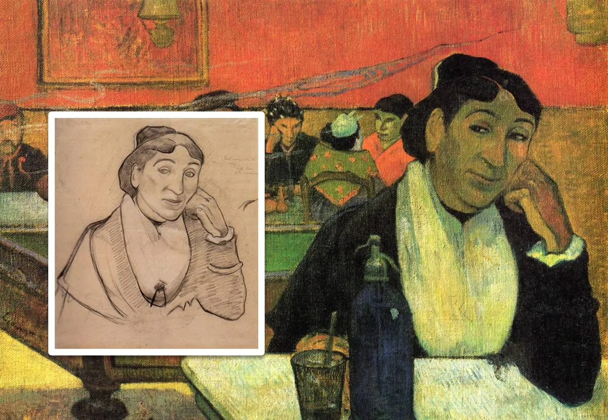
The painting is Gauguin’s night cafe, info about him and Van Gogh painting at this location here and here.
·Design

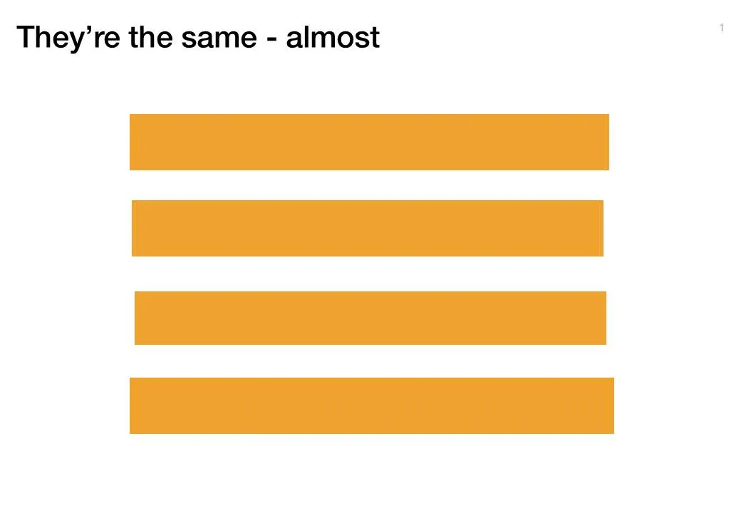
Almost the same size is not good enough

Making similar boxes the exact same size, and exactly aligned matters a  lot in slide design. The brain gets distracted when object alignments is just a bit off.

Usually the slide starts out OK, ctrl-C/ctrl-V a bunch of objects and they are all exactly identical. Over time, things start to degrade. Accidentally resizing things a bit, moving a box a bit, etc.

You need to train your eye to spot the imperfections. The quickest fix is usually to select a group of objects, select “format” and then give them all the same size in centimeters (hight, width, both). In the Arrange / Align menu you will tools to spread objects out evenly.

Little effort, big result.

·Design

Visual Bee: attempt at PowerPoint automation

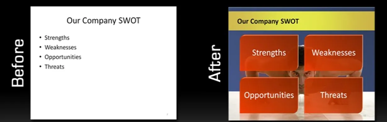
Visual Bee is an Israeli startup that offers a plugin for PowerPoint that can improve slides automatically. At the click of a button it does 2 things:

  1. Transform list of bullets into shapes that are distributed evenly over the slide
  2. Analyzes the words in your bullet points and picks an appropriate background image

The user can choose from a number of styles, that will be applied consistently through your document.

The style of the transformed slides is not exactly my personal favorite (“standard” stock images, lots of effects), but having said that, they do look a lot better than the original bullets. The best results are achieved if the original slide is actually already in pretty good shape. For example in the bullet slide above, the words have been cut to an absolute minimum. The tool will work less good when applied to dense slides.

As a professional designer, I would value a tool that automatically creates harmonious structures of 4, 5, 6, 7 objects. Fitting shapes around a pentagon is tricky.

For the non-professional designer, maybe the best thing that this tool does is to encourage you to improve the quality of the input slides: cutting text without worrying about the layout of the slide.

·Art

Unstretch that screen

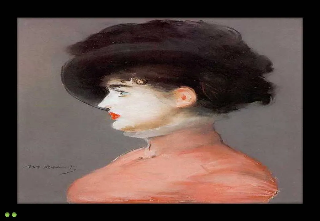
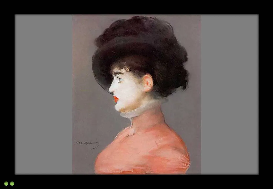
More and more presentations are given on plasma/LCD screens with a wide aspect ratio. Most PowerPoint presentations are designed for a narrow 4:3 ratio (a traditional computer monitor). Most of the time, the screen will automatically stretch you image to create a bigger picture. I never understand this habit: the distorted proportions look horrible. (Judging by my own experience, this is how most people watch TV nowadays as well).

My advise: set the screen back to the narrow aspect ratio. Doing this on your computer is often tricky, the best way is to take the remote control of the screen and fix it there. A smaller picture is much better than a distorted picture.

The painting is Manet’s Portrait of Irma Brunner.

·Design

Constantly checking readability

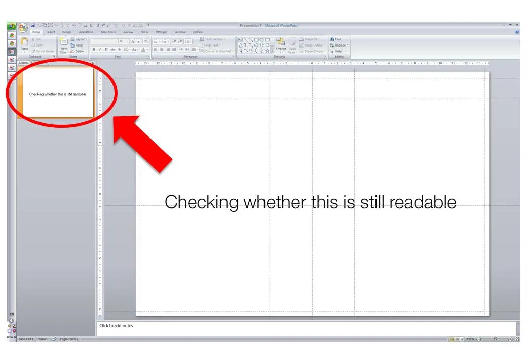
When I design my slides I usually leave the outline pane open on the left side of the screen, so I get a sense of what an audience member sitting in the back row might see when the slide gets presented.

·Design

BP logo contests

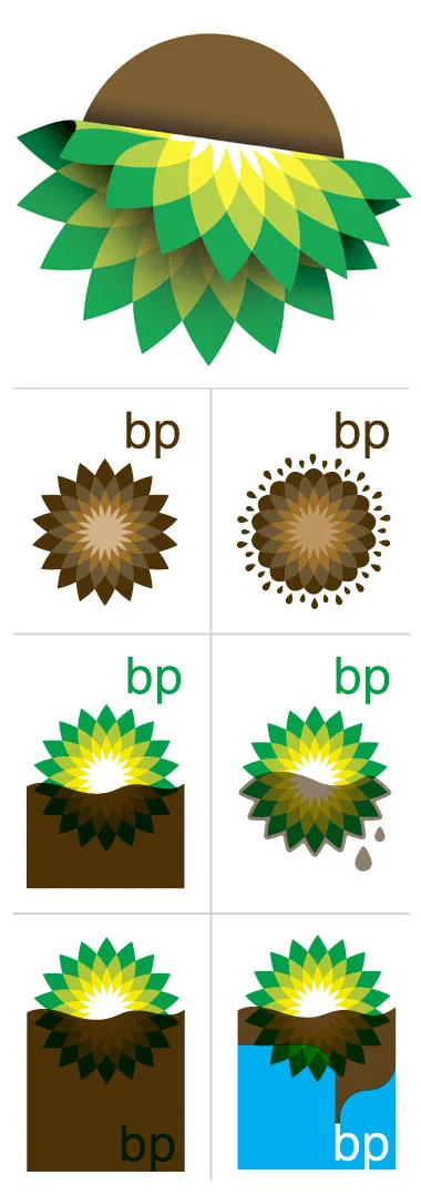
The BP logo was a very powerful one: an environmentally green flower/sun beaming with lots of positive energy. (Apparently it is based on the symbol of Helios, the personification of the sun in Greek mythology).

The fact that it was so good is proven by the enormous number of logo redesign contests that are being conducted now after the oil spill disaster. See this Google search.  Here is one that offers a $200 bounty (still accepting entries), and here is a Flickr page with the entries from a contest organized by Greenpeace. The illustration below is taken from Draplin Design.

It is good to see that graphics design can spark so much emotion. Just a shame that is not a more positive one.

·Design

Useful: 2010 calendar PowerPoint template

I do not use standard Microsoft PowerPoint templates very often, but I must admit that I was pleasantly surprised by this 2010 calendar template on the Microsoft web site. That saved me a lot of time in designing a kick off presentation for a new project. Tons more here.

·Design

Unstage

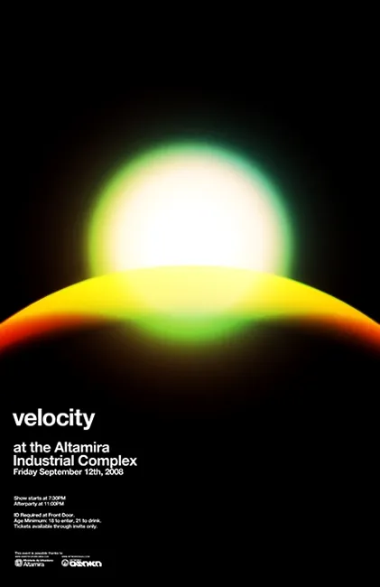
Most presentations are written by people without a professional graphics, design, or art background (including me). While it is almost impossible to catch up on the technical skills of these professional illustrators, it can pay off to take a daily dive in their work. The blog unstage (link here) is an example of a daily source of information that you should add to your RSS reader. Example below: a poster by Network Osaka. (I find poster designs especially useful as a source of ideas for slides.)

·Design

De-cluttering spaghetti charts

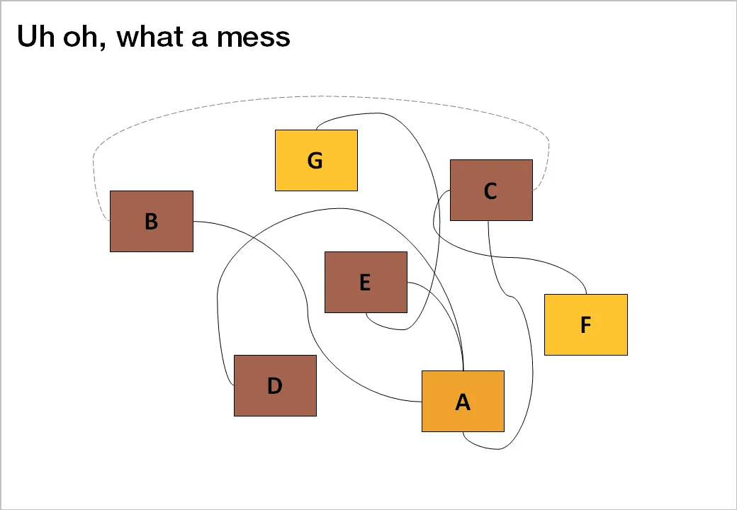
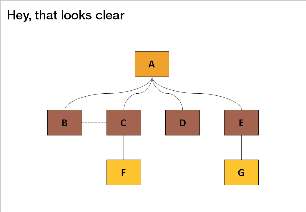
Sometimes, complexity is a visualization issue. When you design your slides, save the audience some work and do the disentangling for them. Example: there are 2 approaches to drawing a technology architecture:

  1. Start with the boxes, then draw the links
  2. Start thinking about the links, then draw the boxes

The second approach always gives a better result.

Thank you Jared Chung for emailing these charts to me in response to the post about the U.S. Army spaghetti chart (in a slightly different context though).

·Design

HTML5 and presentations

HTML5 is a major revision of the HTML language that powers web pages (Wikipedia link for the details). You can find an example of a presentation designed entirely in HTML5 here. Use the cursor left and right keys to navigate between slides. The presentation does not have a good design, but it gives a flavor of the capabilities of HTML5.

Could HTML5 become the default file format for all presentations, decoupling software that creates presentations, environments that display them, and sites that build a social infrastructure for sharing on the web?

  • As file sizes become larger, and internet connections become always available, a “in the cloud” file format for presentations becomes more likely
  • I expect the position of Microsoft PowerPoint to go down somewhat, as smaller niche presentation design tools make inroads (Prezi, etc.)
  • New devices with touch interfaces will add a whole new dimension to animations in presentations, HTML5 seems very well suited to deal with those.

I am curious to hear the perspectives of readers which a stronger technical background than mine.

Thank you Eyal Sela for suggesting this link.