

SlideMagic Blog

Frequent updates about all things presentations since 2008. Subscribe to never miss a post.

RSS
all posts

Search results for “projector”

The typos that matter

The tweet “ruin a band’s name by changing one letter” is spreading at the moment. Everyone makes typos, including me on this blog. And typos are hard to spot, especially for people who are totally immersed in their writing efforts. They stop seeing the individual words, they somehow become a placeholder for a specific thought. “Ah, this paragraph covers the competitive positioning”.

In my early years at McKinsey as an analyst, it was my task to correct graphics designers who were working on the team’s slides. I was never really good at it, and always wondered why the senior partner could walk in, look over my shoulder, and catch one. I would never have been a good lawyer.

Certain typos are more important than others. Typos on page 1, sit there for everyone to see on the projector when the room fills up over the course of 30 minutes. Typos in the potential client’s name are never helpful. Typos that turn around the meaning of an entire sentence (forgetting ‘not’ for example) are an issue. And typos in financial data can be catastrophic.

If these financial typos are completely disconnected from reality, you probably get away with them. Buying an oil refinery for $25 rarely makes sense. But if values are close $3.3b versus $3.5b (oops, number from the previous model), it gets trickier. It’s “just” $200m… (That same senior McKinsey partner would always go to the last page to check the fee number in the project proposal).

Always double check that acquisition bid or price list and maybe cover yourself with some small print somewhere.
Continue reading →
·Delivery

When you got your story really memorised

Some more learning from last week’s music performance. When you think you have something memorised, you actually still have a long way to go.

Here is the process I went through with a pretty simple song, still it took time:

  1. Hit the right chords when reading the chord letters on a piece of paper
  2. Hit the right chords when starting the song from scratch, without paper
  3. Consistently getting the chords inversions and finger positioning right (rather than making them up each time you remember to place a chord)
  4. Being able to do the above with random interruptions, without starting from the start: a mistake (by you or a band member), a quick start-stop to rehearse a certain piece
  5. Not thinking at all about chords anymore, just hitting the right thing based on the lyrics, music you hear around you.

When you wing a story on the fly, prompted by a slide that you see on the projector, you are at stage 1 when it comes to presentation preparation, and have 4 more steps to go.

Photo by Wes Hicks on Unsplash

Phone laptop convergence - 2019

Another blog post by an experienced technology user predicting the future where tablets and other mobile devices will take over from laptops. I disagree.

I think there are vastly different user segments in technology. Fred is a senior executive who is at the receiving end of a huge inflow of pitch decks, is probably on the road a lot, and has dozens of deal negotiations running in parallel most of which go via email. Tablets work great here.

Bloggers/journalists who can work all day from a coffee shop are probably best equipped with a tiny laptop or tablet with keyboard. Management consultants posted at a client out of town need a heavy duty work horse laptop with the biggest screen possible. Traveling salesmen need a device with lots of storage and good connectors to projectors. Developers need a high powered laptop with a big screen.

And… designers and analysts, they actually need a desktop… Having a calm creative space to create a new presentation. A big canvas to map out a new spreadsheet model. Being able to pull data from multiple sources you have open on your screen.

My own setup is a laptop, but it is hooked up to a big monitor. The laptop is just an insurance for the odd trip out of the office where I still need to access my data and/or make emergency edits / solve an issue for a template store customer.

You can see when people are working in the wrong device. The analyst making mistakes in the company valuation as she insists on working on that latest super thin/light laptop. The spelling mistakes in important emails written hastily on a mobile phone.

Continue reading →
·Hardware

Set up stress

This post on AVC describes a common situation: technical problems when setting up a presentation. Different computers and different screens (dimensions, operating systems, resolutions, cables, plugs) make it unpredictable what happens when you connect the 2.

This a particular problem in marathon meetings, where a large number of presenters show up one after the other. It is a time waste for the audience and a concentration breaker for the presenter.

The solution in the post was an interesting one: use Zoom (or another web conferencing service) locally (i.e., standing in the same room). This eliminates the need for hardware connections and allows presenters to line up, solve any technical issues before they are due on stage.

In the absence of such a solution, my recommendation would be to always carry a USB stick with your deck around (in PowerPoint and PDF), just in case. Ultimately portable projectors will be compact and capable enough that everyone who has a high-stakes presentation to pitch will carry one around.

Photo by Jeremy Yap on Unsplash

Story evolves - the chart did not

I often say that slides are a safety net for the presenter in the early days of a presentation. After a number of runs, the presenter becomes confident enough to deliver the story pretty much without slides. Putting up the next slide is merely a mental placeholder that triggers the next point in the story.

As a presenter, you might fail to notice that after a couple of months your story can change/drift, and the actual slide that you put on the projector no longer back it up completely.

It is good to do an objective 10,000 km check up now and then, maybe with the help of a person who is not that immersed in the story as you are.

Cover image by Vincent Botta on Unsplash

Using bullet points...

Reading out endless slides with endless lists of incoherent bullet points is the ultimate disaster presentation. But bullet points can happen to the best of us, and I admit that I am still designing bullet point slides here and there in my client work. But not all bullet point slides are born equal.

When to use bullet points. Bullet points are a list or a ranking of some sort. When a product has 3 features; it is fast, cheap, and beautiful, or an agenda has 5 discussion points, or a project plan has 4 steps, or you have 3 key priorities for next year, it does not make sense to spread each point out as a different slide. The message of the slide is: we have 3 competitive advantages, which is different from: 1) we are fast, 2) we are cheap, 3) we are beautiful.

A bullet point chart is often a set up for more elaboration to follow. We introduce the 3 points, then immediately click through to the next 3 slides that will take each of these points in turn.

When you know you should not use them. There are a number of pointers that tell you your bullet point slide does not express a message of a list or ranking, but rather it is a list of speaking points.

  • The points are merely paragraphs in a story. And then this…, but that…, taking into account this…, we tried these…
  • The points are not roughly the same length, bullet 2 is 3 sentences, bullet 5 is 2 words, the bullets are not similar
  • Related to this, the bullet points start to become complicated sentences / stories in their own right, you are not able to understand them in a second.
  • Again, related to this, you are in the wrong territory when your points take a lot of time to explain. Bullet one: “we are fast” followed by a 10 minute elaboration on acceleration times of competing vehicles with the “we are cheap” and “we are beautiful” still on the projector is the wrong slide for the message.
  • Most of my bullet point slides have 3-5 points, with 5 already pushing it. If you need more, you are writing speaker notes, instead of designing a slide.
Continue reading →
·PowerPoint

How to format tables in PowerPoint

Tables can carry more data than a data chart and as a result can be less effective in a presentation. For some situations though, there is no point trying to avoid using a table in PowerPoint. For example, when investors want to see the quarterly numbers, they expect to see a table.

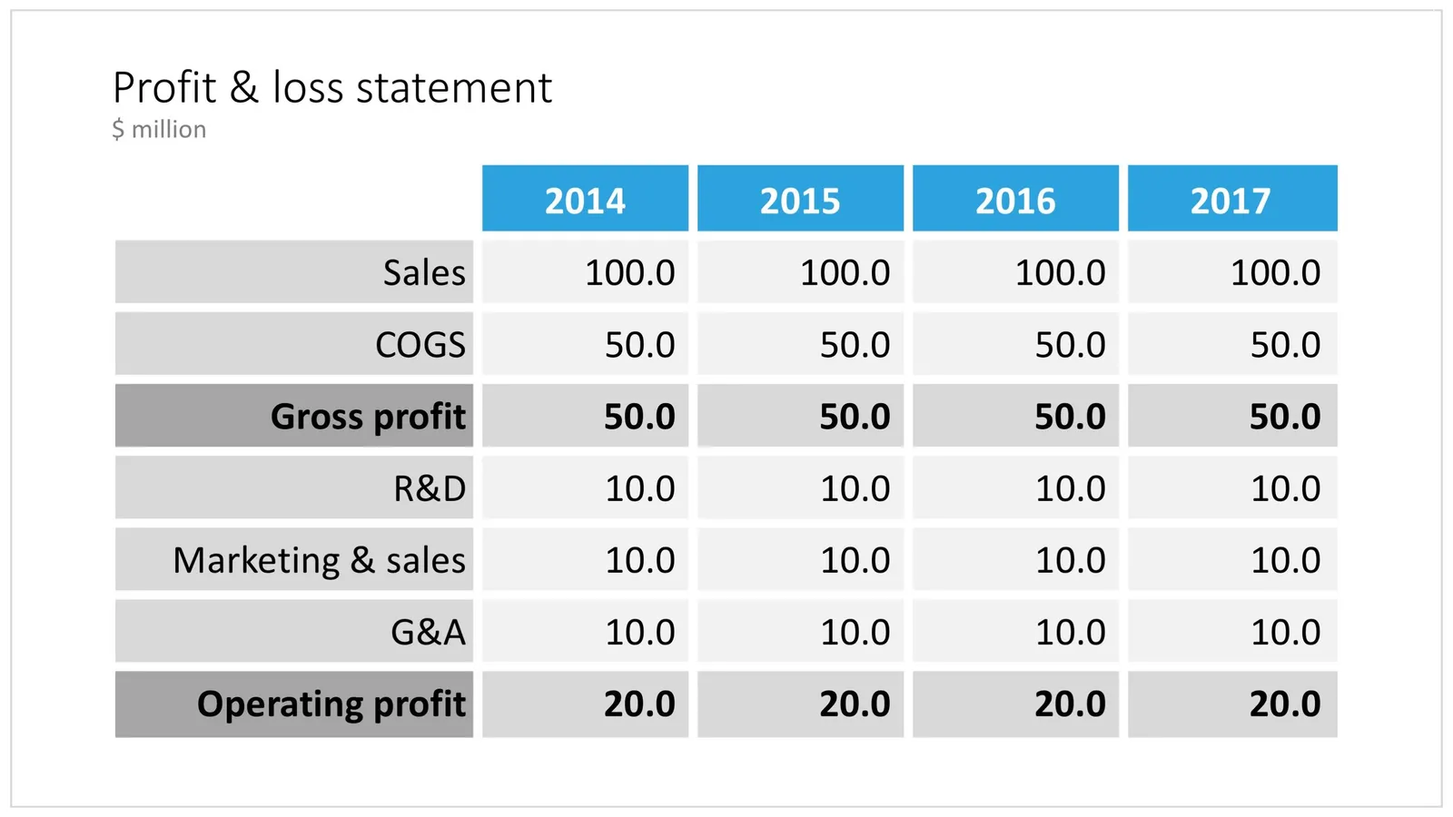
The way you format tables can make a huge difference in how your chart looks. When done well, a table can actually be an effective presentation slide. Have a look at the simple P&L table below.

 A PowerPoint table to present a P&L

A PowerPoint table to present a P&L

This might look like a super simple slide design (it is), but a lot of thought and little tweaks have gone into its design. Let’s take them one by one:

  • Colours have been adjusted to your own colour template, not the standard PowerPoint colours
  • Fonts have been matched to your current template (table can be stubborn sometimes and stick to Arial)
  • Instead of dark lines around boxes, I used lines that match the background colour, making cells a light colour of grey to stand out (or dark, black if you use that background)
  • Totals are bold, and a bit darker
  • The row labels are right aligned
  • The row labels are a bit darker than the cells
  • The data cells are right aligned
  • Numbers are rounded to the same amount of digits, so the dots line up
  • There are not too many digits in the table, enough to convey the data, but not too much to make it cluttered. If the numbers get too big, switch to thousands or millions.
  • There is a bit of inset in each cell, the text does not touch the edges
  • All the rows have the same height
  • All the data columns have the same width
  • The column headings are centered
  • The unit of measure is put at the top of the chart, not repeated inside the data values
  • The table covers the entire frame of the presentation template
  • Double check by hand/calculator: the numbers add up…
Continue reading →
·Layout

4:3 or 16:9?

“What, it is 2017 and you design a deck in 4:3 format?”, I got these questions a few times. Here are the pros and cons of both formats.

A 16:9 or widescreen aspect ratio will give you a nice image on an LCD conference room monitor or desktop/laptop screen with the black bars on the left and right

A 4:3 aspect ratio will look better on projectors, which are still used in many larger presentation rooms. Also: 4:3 looks better when decks are printed, a habit that is still very common in the financial services industry where people like to take notes, look in detail at data tables, (and probably want to take an opportunity to quickly flick ahead if the presenter is slow/boring).

And personally, I like the design freedom of a more even design canvas (4:3) better than the wide screen version, which forces me to make horizontally stretched slide designs. (A cheat: put the headline across a number of lines to the left of the slide and use the imaginary 4:3 canvas to the right of it for your slide content.

So, here you have it. I don’t think 4:3 is old fashioned for presentations (it is for movies), it just depends on the most likely presentation context you expect.

In my presentation app SlideMagic, I used a 4:3 canvas, but use the extra horizontal space of a 16:9 screen to add your “explanation boxes” that you can slide in and out. When set to “out”, the presentation becomes 16:9 with a more detailed description of the slide in case you send the document ahead of a meeting and the recipient will open/read it without you being there to explain it.

Continue reading →

The print and VGA versions

The number of screens on which your presentation will be viewed is expanding:

  • Laptop screen (office)
  • Mobile device (airport)
  • High quality desktop screen (the one the designer is using)
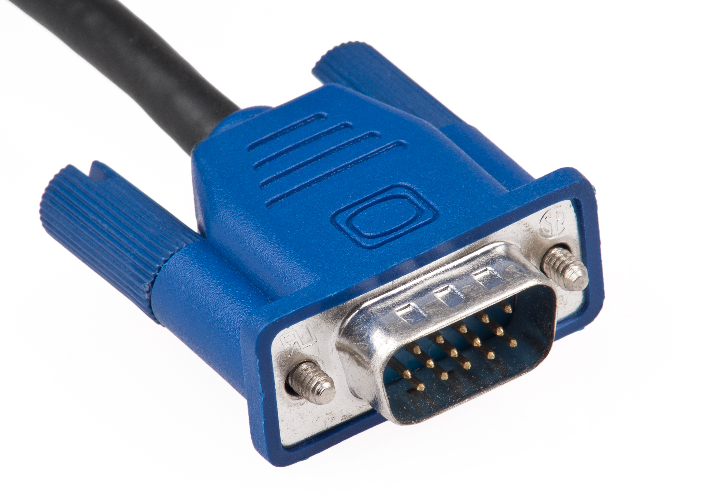
  • Crappy VGA projector (conference room)
  • Old Plasma screen (conference booth)
  • Super High Definition giant LCD monitor (CEO office)
  • Crappy office paper printer (old school manager giving handwritten comments)
  • High quality paper printer at a print shop (investment bankers)

Do a test run on one of these devices if that is the one that is critical to your presentation, and adjust colors accordingly. The result might be a presentation that only looks good on that display, you have to keep separate files. The crappy office printer version has gray shadings that are far too blunt for the HD monitor, the crappy VGA project version has no thin fonts.

Image via WikiPedia

Bad 1990s design habits

Below a repost from 3 years ago, an blog post I put out on a Medium publication that I am taking down. Putting it out here to preserve it.

You can design better presentation slides by getting rid of engrained habits that can go back decades.

Sometimes I work with teenagers to teach them about presentation design. To my surprise, they often are much better students than “grown ups” who are supposed to benefit from decades of business experience. Here is a theory why.

Transparencies for overhead projectors encouraged you to copy pages out of a book and uncovering paragraphs or key points bullet by bullet. Moving to PowerPoint, people just kept writing these bullets.

The first visuals that you felt compelled to project to an audience were data charts: lines, bars, columns. These type of graphs needed to have a title in the top left and a source at the bottom. Most slide designs today use a big title at the top left, other typography on the page is almost never bigger than the title. Very rarely, people leave the title out all together.

Pictures are low resolution and take a lot of memory, hence you can only put in small images in a presentation document that you need to email someone.

PowerPoint was created as a mouse-based drawing software, rising alongside Microsoft Windows. Everything could be dragged, and resized easily to fit. Cropping an image was tricky. The first plasma TV screens confirmed to us that it was OK to stretch an image out of proportion, as long as it fitted whatever you needed to fill easily.

Continue reading →