SlideMagic Blog

Frequent updates about all things presentations since 2008. Subscribe to never miss a post.

RSS
all posts

Search results for “cliches”

·Video

Corporate videos

As a presentation designer, I get to sift through a lot of corporate introduction videos, most of the time, I am looking for some decent still images that I can use as a background for an introduction slide about a customer or strategic partners.

A lot of money is going into these videos. Sophisticated motion graphics, upbeat music, soothing voice overs.

Most of these are hosted on YouTube, so you get a sense of how many people actually watched them. In most cases: a few thousand at best, but many have far, far fewer views. The majority of which is probably the creative team and the people reviewing drafts at the client.

Why? I do not have scientific evidence, but here are some possible causes:

  • There is actually not that much information in these videos, except for the usual buzzwords about helping improve the environment and making the world a better place. An analyst who wants to know what the group is all about, can spend the 3 minutes it takes to watch the video better in other places on the web site.
  • (Related) These videos are full of stock video cliches: pretty board rooms against a view over the park, happy families running in that park, a drone going up the corporate sky scraper.
  • In the case of conglomerates, a large part of the video is spent on justifying the existence of the group, what ties them together? This is a hugely important issue for the conglomerate management, but for the student, investor, journalist, customer, potential employee, it does not merit 50% of the 3 minutes.

Continue reading →
·Investor presentation

How to write a good cover email pitch

Cover emails that introduce a presentation are very important. It is the first thing the recipients sees. And given that more and more emails are read on smartphones that are not very good at handling attachments (still), they have become more important.

Here  are 2 poor cover emails:

  • One that says too little: “Please see the attached business plan”
  • One that says too much: the whole pitch cramped into the body of the email with out the visual support of your slides

The enemies we are fighting: getting ignored (the email is not opened), or getting deleted/archived before the whole message has had a chance to come across.

What can you do better?

  1. A good subject line. If it is a cold email, use the full space you have, almost like a Tweet. Good subject lines intrigue, they don’t have to  tell the whole story. Good subject lines tell more or less what you want.
  2. Write who you are, how you got to the recipient, what you do (no intriguing here, super factual and super short, let the recipient put you in a box) and say what you want.
  3. The body of the email is all about intriguing. Unlike when you are in the room where you can stand in front of the door to prevent people from leaving, here, it is you versus the mouse click:
  • Think very hard about what the intriguing aspects of your story are. Every pitch has usually only one, or two. (A completely counter intuitive approach to solve an issue, a truly unique team, etc.)
  • Forget about the classical business plan story line, you need to get these intriguing aspects across as soon as possible, BUT think of a story flow that allows you to do that. In most cases you need to educate the recipient a bit before you can deliver the key surprise.
  • As you add more content, think hard: does this line increase my chance of a response (pick up the phone, click the attachment, write a reply)? Sometimes the best is to keep things short. Cut buzzwords, cliches, any baggage.
  • Look at the typography, line breaks, paragraph lengths. Do the right things pop out?
Continue reading →
·Images

But that image does not exactly match?

Not every image that is used in advertising has a functional objective. Take fashion ads, for example, sometimes the product is missing all together.

  1. Images that show something highly specific: a product, a medical condition, a location
  2. Images that show a relevant scene or background: people tapping on their mobile phone, a driver in a traffic jam, calm bamboo forest, a sunset
  3. Images that make a visual metaphor: a prisoner in a cage, a cat chasing a mouse
  4. Images that just set the mood of the presentation

I use 1. and 4. more, and 2. and 3. less because they often lead to visual cliches.

Art: “[Self-Portrait, Yawning](https://en.wikipedia.org/wiki/Joseph_Ducreux#/media/File:Joseph_Ducreux_(French_-_Self-Portrait,_Yawning_-_Google_Art_Project.jpg)” by Joseph Ducreux, 1783

·Delivery

Do not overdo it

A VC complained a about a Prezi presentation today: a combination of motion sickness and impatience (using 30 slides to make a totally obvious point that could be made in 1).

There is nothing wrong with Prezi if it is used right:

  • Use zooming effects to support your story: zoom in on a technical diagram for example, hop in and out of a time sequence, focus on parts of your product, highlight different areas of a map. Zooming for the sake of zooming is not helping anyone.
  • If you are in a small meeting, leverage the non-linear navigation to have a good interactive discussion. Random story sequence shifts for a big audience makes everyone miss the plot.

Everyone knows that 30 slides with 1 message is better than 1 slide with 30 bullet points. However, obvious points can still be made in 1 slide. I see a lot of presentations on Slideshare that use one spectacular photograph after another to [click] make [click] a [click] totally [click] obvious point (especially social media and/or mobile cliches).

·Investor presentation

Surprise? Hardly anyone reads annual reports

An interesting post by investor relations consultant Dominic Jones: very few bother to read a company’s annual reports.

It is easy to understand why. Annual accounts consist of 2 parts. One, the financial data. This is read by those who need them (analysts). Two, an attempt by the company to sell its strategy to investors. Here is why this section does not work:

  • The pages are written in a verbose PR style, full of buzzwords and cliches.
  • The pages contain verbal description of financial data that is much better displayed in graph or table form. “Europe grew by 5%, Asia grew by 10%”
  • Long-hand text does not work very well to communicate business strategy, and the annual report is no exception
  • The slick, polished, permanent look of the annual report instantly reduces its credibility. The audience likes real, genuine, authentic stories.

A lot of money is invested in the layout, design, and printing of these annual report. Is this money not better spend by improving the quality of that earnings announcement presentation PDF that everyone IS reading?

·Concepts

So how many different types of slides are there?

I think there are 4 different type of visuals,  Have I forgotten any? (The images below are taken - out of their context - from previous posts on this blog)

  1. Big picture, big emotion slide. A huge image of a squeezed orange “the competition is killing us!”, a big picture of an audience asleep “presentations are boring!”, swimmer dives in the pool “let’s go for it!” (lot’s of cliches here, but I have seen many good ones as well). These slides are an emotional shortcut, they unlock an idea/feeling that is already present in everyone’s brain quickly.

  1. Location port, a big image of a place, a street, a country, a customer. Pretty much like a movie director opening a film to bring us to a different time, a different place. An image of the interior of a messy store is much more powerful than a list of bullets: isles are not straight, labeling is unclear, lighting is poor.

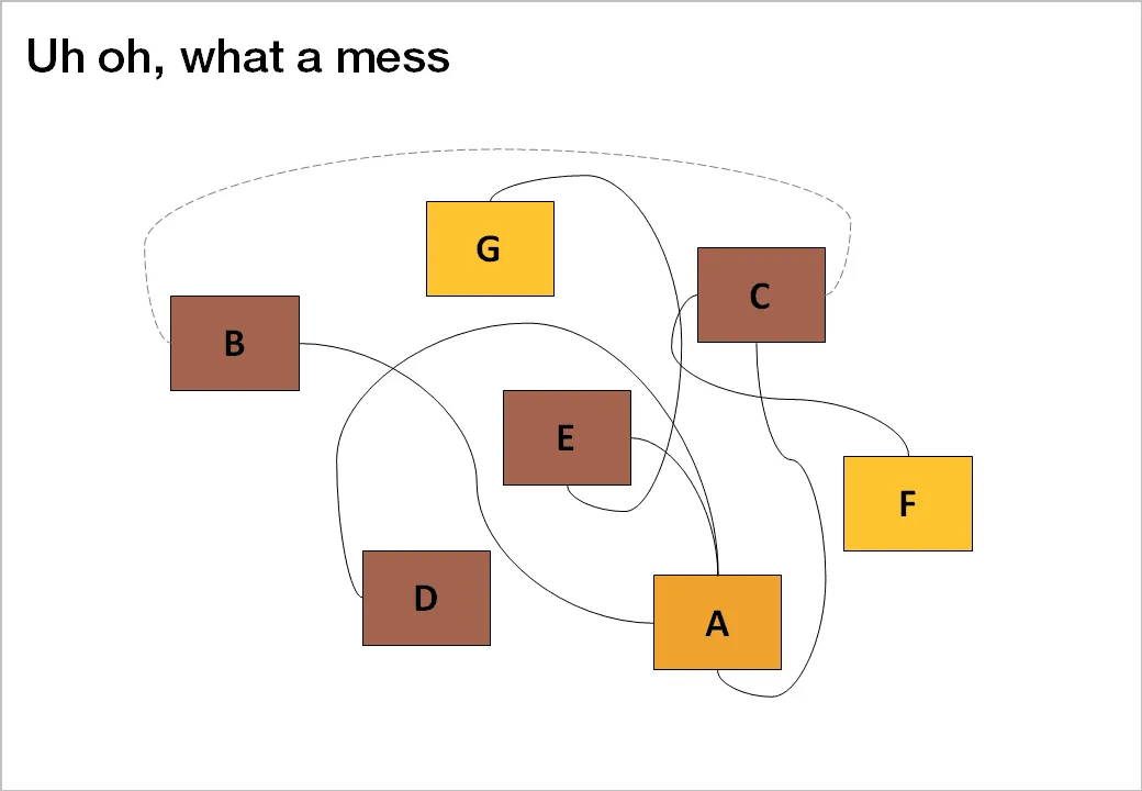
  1. Relationship slide. Shapes/boxes with text, arrows, to show how issues are related, impacting each other, are dependent on each other, sit in different places on the same map.

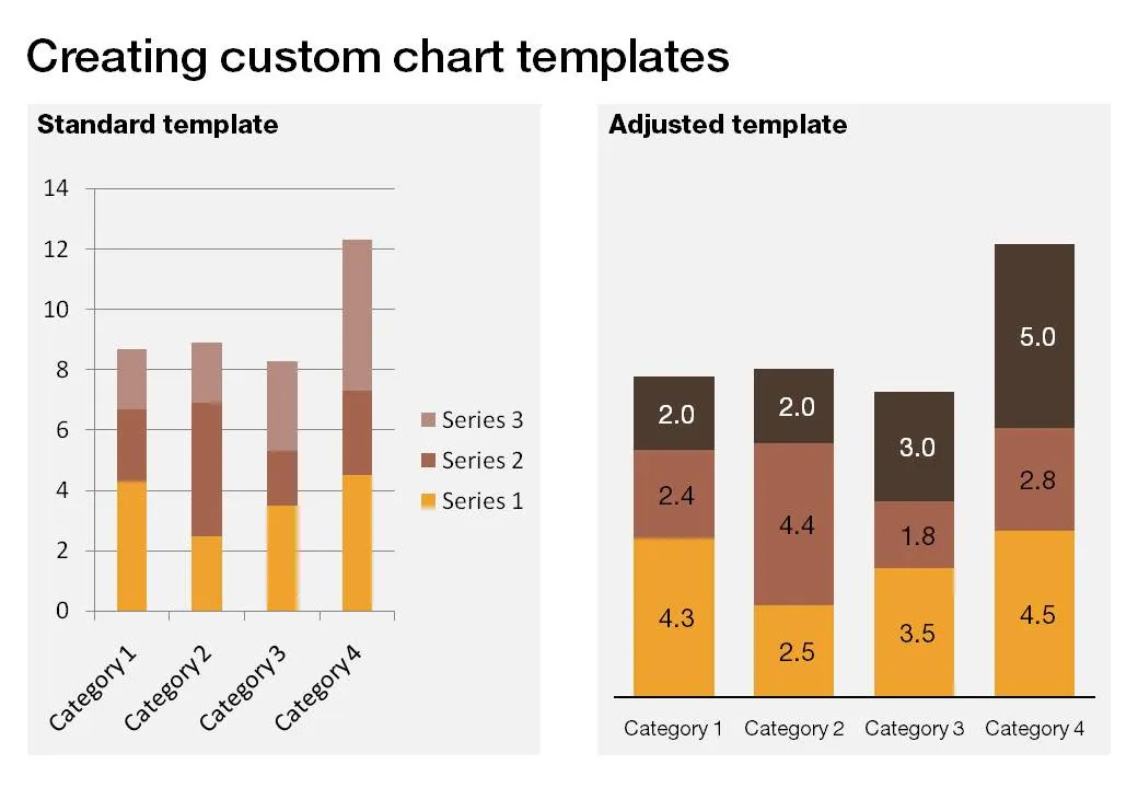
  1. Data chart showing us a trend, or comparing numbers.

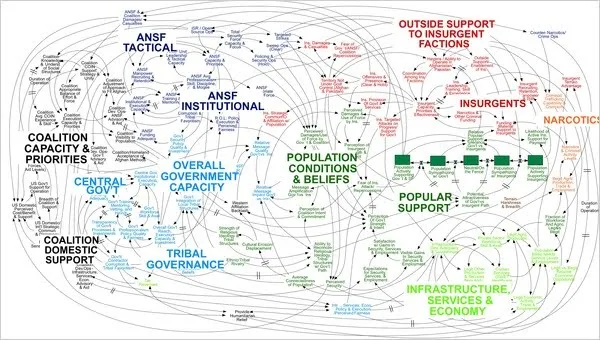
An incredibly dense relationship or data chart should actually be in the “location port” category, the U.S. army spaghetti chart is an example: it is not so much about understanding the chart in detail, rather the viewer understands immediately that “it’s complex” (earlier post).

Continue reading →
·Design

Simple shapes, powerful message

This image tells 2 things:

  1. Have the courage to deviate from standard visual cliches
  2. Simple shapes can still convey a powerful message

The image was added by Robin Benson and taken from this book:  Graphic Design, Referenced: A Visual Guide to the Language, Applications, and History of Graphic Design (affiliate link)

·Design

Chart concept - umbrella

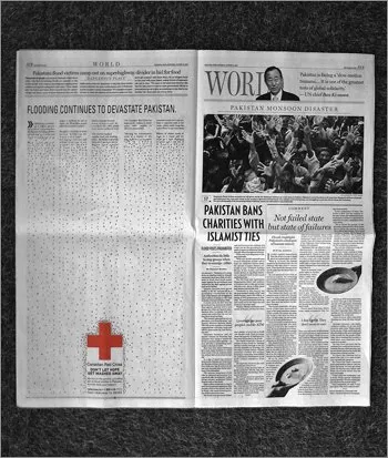
The umbrella protecting you against falling misfortune is powerful visual concept, albeit maybe even a bit cliche (earlier post in defense of cliches). This Red Cross ad uses it very well. Bigger image here. (Via Frederik Samuel’s blog)

·Concepts

Chart concept - shark!

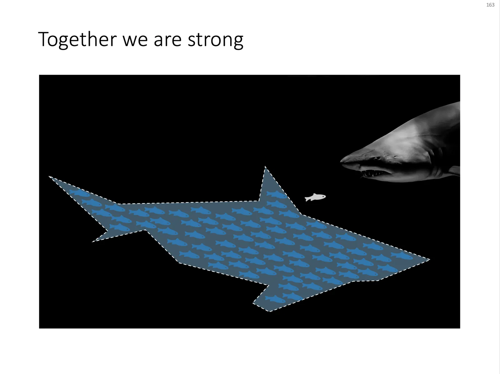
Some might consider it a cliché, but I found it still useful: the school of fish swimming in formation to create the illusion of being a shark. For when you need to visualize how many smaller/weaker entities can work together to become very strong as a group.

An image like this can easily be created by searching for “fish silhouette” or “shark silhouette” in a stock photo site. Resize the small fish, paste them over the shark’s silhouette, and off you go.

Inspired by a scene from the movie Finding Nemo:

UPDATE: I have now added a slide with many fish forming a shark on this concept in the SlideMagic template store.

·Design

In defense of clichés (sort of)

I came across two interesting links about clichés last week.

  1. Seth Godin: point to a cliché and do the exact opposite (blog post). From a presentation perspective the most interesting tip is the “secret weapon” he points to: a book full of clichés: Dictionary of Cliches (affiliate link)
  2. Nikki Smith-Morgan pointed me to this wonderful list of 101 cliché images.

I now realize that I have been reinventing the wheel over the past few years. I am guilty of using many of visual concepts, and even have posted many of them on this blog. I agree that some of the images are really worn out (#1 example the handshake), but not all 100 other images are equally bad in my opinion.

Especially in everyday corporate presentations, getting people to use images instead of bullet points is a huge win, even if the images that are picked are somewhat obvious. It is the beginning of a path moving away from bullet points. I was there 5 years ago, but every day more and more people join the movement. Clichés are a good way to start. A cliché is a visual shortcut that can prove useful in corporate presentations when used wisely. “Wisely” means picking a beautiful image. (Yesterday I was guilty of a tunnel with light at the end for example).

Obviously, the big keynote address is a different story from tomorrow’s management review meeting.