SlideMagic Blog

Frequent updates about all things presentations since 2008. Subscribe to never miss a post.

RSS
all posts

Search results for “web design”

·Images

Images from the past

The majority of stock images are boring, why not look for real ones? The Internet offers now some interesting ways to get your hands on images from the past, great to transfer your audience to a point back in history. Here are a few of my favorite sources:

The images used here:

Creative commons images on Flickr, search by date
Vintage ads, watch out for copyright
Vintage magazine covers
Vintage websites (duarte.com ~2000)
·Books

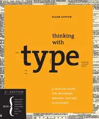
Book review - "Thinking with type"

Regular readers will have noticed that I am reading up on typography lately. Some basic understanding of typography can improve the quality of your presentation designs dramatically. The book Thinking with Type (affiliate link) by Ellen Lupton is one of the most useful ones I read so far. Clear explanations of all the basic concepts with great examples. It comes with great online resources on the Thinking with Type website, covering a lot of material of the book. (See the type crime section, and how I use the wrong quotation marks all the time on this blog).

Earlier reviews of typography books:

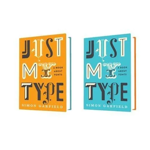
  • Just my type, stories about the most important fonts and their designers, useful information, entertaining reading (and great dinner party stories).
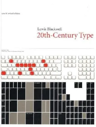
  • 20th century type, a more scientific overview of fonts and designers of the past century.
  • 1000 fonts, just what the title says
  • Design elements, a broader review of graphic design concepts
  • Bibliographic, an overview of classic graphic design books
·Art

Going beyond the presentation screen borders

A long introduction to the post today. You can skip the plot sideline and go straight to the end if you want.

It seems that many visual artists that somehow documented the thoughts behind their work reach higher levels of fame. One example is Vincent van Gogh, who through the letters to his brother Theo gave us a lot of background on his art. Vincent van Gogh spent some time in this white house in the same street I grew up in the Dutch town of Hoogeveen, and it is striking to see how his descriptions of the place, the features and character of the people still applies today (except for that people there have moved on from living in huts). His subsequent transition from the cold/dark Netherlands to the bright Mediterranean is another interesting parallel I share with the painter.

Vincent Van Gogh, farm house in Hoogeveen

Recently, I have been reading a biography about Robert Irwin, an American artist starting off with expressionist paintings to move on to minimalist, large art installations. The book Seeing Is Forgetting the Name of the Thing One Sees (affiliate link) provides lots of his personal perspectives behind his own work, but more importantly about art in general. I have changed the way I like at art after reading it.
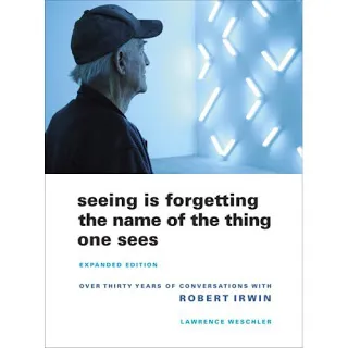
Irwin wonders why art ends with the frame of the painting. He wonders why art ends with the room the painting/installation is exhibited. Art and beauty is all around us, we just need to be able to perceive it.

“But paintings are like what you can barely make out through a keyhole compared with the richness of perception that’s just waiting there in the world to be experienced all the time. […] It’s strange. With food, for instance, people seem to understand what’s involved: you savor the taste rather than just feed the body. But people have a hard time understanding that it should be the same way with visual experience.”


Continue reading →
·Books

Book review - "Just my type"

Most books about typography and graphics design are nicely illustrated reference books full of theory. Just My Type: A Book About Fonts (affiliate link) by Simon Garfield is different; through a number of stories and anecdotes you a get a wonderful introduction to the history of typography.

It is a great read: both informative and entertaining. A more extensive review of the book in the New York Times. I purchased the book for my Kindle/iPad to save delivery time and charges to Israel. If you live closer to Seattle, I would suggest you buy a paper version to get a better view of the font examples inside the book.

·PowerPoint

Juggling personal brands

No presentation insight today, but some musings about my personal branding. Skip if you are not interested.

The URL www.stickyslides.com might be down today as a result of scary shifting and moving of my online properties. Things should propagate over the next 24 hours back to normal. It is all the result of a personal branding project. I am a strategy consultant, so here are the recommendations:

  • Jan Schultink, used as my Twitter handle. I do not have a name like Steve Jobs, so chances are that if you do not happen to be a native Dutch speaker you will find it hard to remember, spell, and pronounce my name.
  • Axiom One, the name of my company. This name was picked without much thought from a dictionary (I was still in the “A” section). Axiom was trade marked in Israel I think, so we added the “One”. There are thousands of companies called Axiom in the world (even a few are called “Axiom One”, and the connection with what I actually try to achieve in the world is zero.
  • Sticky Slides, the name of this blog (renamed already once from “Slides that Stick”). I like the name, it covers what I do, still it comes across more as the title of a high school newspaper rather than a serious presentation design firm in discussions with CFOs of publicly traded companies. BUT I have built a lot of equity with the 1,000 or so blog posts in the archive
  • Idea Transplant, the name of my shiny new company web site. It covers what I do (better than Sticky Slides), unique, serious, and fun at the same time. No brand equity what so ever.
Continue reading →
·PowerPoint

Marketing speak

The blog “Things real people do not say about advertising” is a collection of pictures with imaginary people responding to advertising. Amusing to read, and reminding us that we are designing presentations to real people that are totally not interested in marketing speak.

This contribution was suggested by Paul Alex Gray.

·Books

Book review: 20th-Century Type

The book Twentieth-Century Type (affiliate link) by Lewis Blackwell gives a history of type fonts developed in the last century. I found it useful because it puts all the names of the fonts that sit on your computer into a historical time line:

  • Books copied by hand in the middle ages
  • Metal setting: serif fonts
  • Bauhaus aesthetic and sans serif type
  • Photo setting, advertising, display fonts and using fonts as elements in abstract compositions
  • Desktop publishing

Professional graphics design has made quantum leaps because of technology. I find a mirror of this in my own personal development in design from starting to experiment with typography in the time of WordPerfect to 2011 where I am getting interest in applying poster design concepts into PowerPoint.

·Images

The Sartorialist

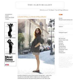
I am not sure to what extent people who read presentation design blogs also have a large number of fashion design feeds in their RSS reader. I follow one: The Sartorialist, the blog of Scott Schuman who wanders around city streets with a camera, taking pictures of regular people wearing interesting creations.

Browsing through his site will show you how poor staged stock images are, and how much more emotionally powerful images of real people can be in your presentation.

To the left is a small screen shot of the web site. Photography on The Sartorialist is under copyright, so you can use the site only for inspiration. Use Flickr to search for relevant images with a creative commons license.

Update: below a mini documentary that came out just today.

·Design

Dropbox beats YouSendIt / Google Docs / Office Live

PowerPoint designers are struggling with big file sizes that consume storage and make it hard to email documents. I have discussed solutions such as YouSendIt and Google Docs before (here). Recently, I switched to Dropbox:

  • Seamless integration with all my devices (desktop, laptop, mobile phone, tablet)
  • Seamless integration with these devices’ operating system (you do not notice it is there)
  • Two solutions in one: 1) sharing big files 2) always access to your own files
  • Nice extra 3) a service that keeps history of your files so you can roll back a version in case a file got corrupted or you made a horrible design mistake.
  • Minimalist design interface

The Dropbox pitch to venture capitalists from 2007 pretty much still holds.

YouSendIt requires sign in all the time, and all the advertising and branding does not look very professional. Google Docs is still hard to integrate with Microsoft Office. Office Live does not integrate fully with the Windows operating system. It also suffers from feature overload: I do not always want to create a full virtual team room with calenders and contact lists, just sharing files is enough.

If you sign up with this link for your free 2GB account, you get 250MB of bonus space (disclosure: and I get another 500MB). You see, they know how to market as well. The regular link is here.

The last word probably has not been said about this subject, I wonder whether the conclusion still will be the same in January 2012.

·Design

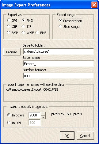
A tool for exporting PPT images

I find it easier to create visuals in PowerPoint than Adobe software. However, the image export functions in PowerPoint are not very sophisticated. It is hard to set resultion/DPI, choose format, set the exact image size, and/or control the naming of the exported files.

PPT ImageExport does all of this. The software creates an add-in in your ribbon. This is not a very sophisticated piece of software, but it has proven very useful for the design of my new company web site. A full license costs $30.