SlideMagic Blog

Frequent updates about all things presentations since 2008. Subscribe to never miss a post.

RSS
all posts

Search results for “web design”

·PowerPoint

Emailing presentations without verbal explanation

A presentation designed for a large audience with big images and few words cannot stand on its own without verbal explanation. Ideally, you would design two separate decks; one for the big audience, and one for emailing. But, constantly updating two presentations in parallel is time consuming and prone to errors. Here is a work-around.

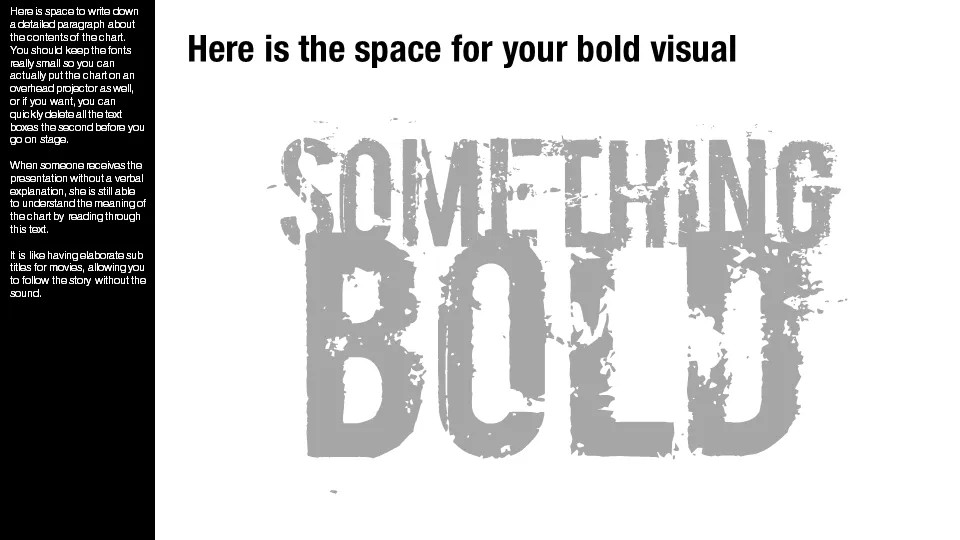
Design your presentation for a 16:9 screen and add a text column on the left side. Put the full narrative of the slide in a tiny font. The email reader gets the full explanation of the chart. The big audience will see a blurry bar on the left of the slide, clearly distinct from the larger visual. You could go further and quickly delete the text bars a few seconds before you go on stage.

Not perfect, but good enough.

·PowerPoint

Back from New York

No major insights regarding presentation design today as I am getting myself organized after returning from a fantastic week in New York. I really enjoyed the 2 speaking events at NYU, and want to thank Sean Black from SalesCrunch for inviting me. Sean will publish the content of the 2 evenings in chunks on his site.

I also would like to thank venture capitalist Mark Suster (author of Both Sides of the Table and one of the “3 musketeers” of VC bloggers together with Fred Wilson and Brad Feld) for spontaneously agreeing to introduce the first event (on VC pitching) in person.

I enjoyed my week tremendously, met great people, and am really impressed by the buzzing startup scene around Union Square in New York. If you were in the audience and would like to connect and/or have additional questions, do not hesitate to contact me.

·PowerPoint

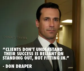
"Clients don't understand their success is reliant on standing out, not fitting in"

I came across this quote by the fictional character Don Draper (Mad Men) on the Advertising is good for you blog. It does apply to some of my presentation design projects, especially when there is some resistance to let go of the common bullet point approach.

Image via Wikipedia

·PowerPoint

My new Macbook Pro setup

So I replaced my computing infrastructure over the past week. Things are moving fast in the world of IT.

  • Laptop. A few years ago having decent graphical power still restricted you to using desktops. No longer. I have gone mobile. (Maybe motion graphics will make me regret it later). No I can use those little downtimes in between meetings to do actual useful work, rather than catching up on email or Twitter.
  • 17", I compared screen sizes and concluded that as a visual designer there is no avoiding the extra weight and size to get a decent size screen
  • Apple. Strangely enough it is actually the physical interfaces that convinced me. A nice machine to touch, nice keyboard, nice track pad. Something you spend the majority of your day on. Interestingly, a hardware decision, not a software one.
  • Cloud. It was surprisingly simple to move to a new environment when all your critical data resides in the cloud: email on gmail, files in dropbox (affiliate link), clients and invoices in Freshbooks (affiliate link), contacts in Batchbook. Everything is in sync on my new machine, and the legacy infrastructure that I continue to use as backup. 1Password synced via Dropbox to keep track of all the accounts
  • Virtual Windows/OSX blur. None of my clients use Keynote, and PowerPoint on Mac is simply not good enough (see a comparison between PowerPoint 2010 for Windows and PowerPoint 2011 for Mac). So in comes Windows, but I totally do not notice it. I use Parallels to create a virtual machine, and my Windows applications run in a Window as if I am working on a Mac. All data is shared and file management happens via OSX. It requires beefing up the hardware though. I put in 8GB of memory, of which I allocate 5GB to the Windows machine. The big customer segment for Parallels is actually hardcore gamers who want to port their favorite graphics-intensive games to the Mac. As a result, performance of a Windows virtual machine is actually very good. There is only a slight delay when you switch over.
  • Adobe alternatives. Adobe software is incredibly complicated and bloated. I need basic photo editing capabilities to resize images for the web and take out backgrounds out of images. Pixelmator is a beautiful Mac app that can do all these things (and much more) in a beautiful user interface. The same with Illustrator, I need it to edit stock vector diagrams nothing more. I could not find an alternative for Mac yet and as a result kept my old Windows CS3 installed (I see no need to upgrade). It is interesting to see that I started to look at user interfaces to decide my software, not so much the features anymore (same story as in hardware).
  • Legacy software. Some of my clients (mostly the large ones) are still running PowerPoint 2003. Hence I actually installed it in parallel to my production software PowerPoint 2010. (It took some time to dig up those old CDs).
·PowerPoint

Mindmapping on the iPad: iThoughtsHD versus DropMind

Triggered by the iPad touch interface, I started to use mindmapping for the first time in presentation design. Mindmapping is a process in which you jot down ideas and the connections between them quickly, and edit, clean up, and move things around later to get a more organized picture. I must say, it works a lot better than my previous approach: the pencil and a piece of paper. Especially since it is a lot harder to lose that piece of paper with your notes on it.

I purchased 2 iPad apps: iThoughtsHD and DropMind. iThoughtsHD was designed specifically for the iPad, and is the cheaper of the 2 ($10 versus $50 for DropMind). The DropMind app is an extension from an existing suite of desktop and web applications. The latter probably explains why it took a relatively long time for DropMind to come out with the app, a working iOS 4.2 version only appeared last week in the app store.

When reading my impressions remember that I am a light-weight mind mapper, just using it to structure ideas for a presentation. Reading around on the Internet it looks like mindmapping is a whole design approach taking things much further than I do.

For the purpose I use it for, iThoughtsHD works perfectly fine. The interface is straightforward and clean, and it is every easy to export mindmaps to PDF or sync them using a Dropbox account.

DropMind’s user interface looks a little bit more sophisticated with more graphical options. When you buy the iPad app, they also offer a perpetual license for the desktop client, and the web app. You can exchange mindmaps between the applications. There is a wide arsenal of tools available that I did not yet have time for to explore. The one drawback I found is that when you export a map to PDF or JPG, the resolution seems to be very low (not an issue with iThoughtsHD). I think this is a bug, or maybe I did not configure the settings correctly).


Continue reading →
·Delivery

No thank you, we will just ask questions

A story. I just finished designing a sales presentation for a client that is pitching in a major mobile-related services tender. I started off with minimalist slides for a standup presentation that would be perfect to support the facts that were all written down in the tender submission documents. Rather than focusing on the details of the system specification, I focused on the track record of the company, the many reference installations, the experience in preparing for a successful launch.

Then came the call: “Don’t bother to present, we will email your slides to everyone involved and just use the time to ask some questions.”

It is actually understandable. The tender issuer can read product documentation, read web sites, and is overloaded with (the same) facts about the industry from all the companies competing for the tender. It would be have been polite to let a tender candidate speak, but it is not the most efficient use of the time.

So, I u-turned on slide design, as I feared that many of the tender committee participants would not bother to read through the full documentation and would rather rely on a PowerPoint file as preparation for the pitch. I added more slides, and added explanatory text on the slides.

Lesson learned: with these multi-million dollar tenders, stay in close contact with the person organizing the pitch meetings to make sure that you carry the right type of presentation document with you.

·Delivery

I will be speaking in NY 5-6 April [details]

I will be speaking in New York on 5 and 6 April (click the bullets for full details):

The events will take place from 18:30 to 20:30 at the NYU Stern School of Business. Tickets are $25, but readers of this blog can get a 40% discount by applying promotion code  “ideatransplant”.

I am honored to be invited by Sean Black, CEO of SalesCrunch, the organizer of these events. SalesCrunch is a social selling platform in which online presentations play a central role. The business has 3 elements (my seminars are part of #3):

  1. CrunchConnect  makes it easy to share sales presentations with prospects. Moreover, it tracks to what extent they are viewed and how effective the presentations are. The service blends web conferencing, presentation sharing, social networking into one platform that salesforces can use to interact with prospective clients.
  2. CrunchTrainer uses presentation sharing to create a powerful online salesforce training tool
  3. SalesSchool is a community that organizes events about sales-related topics, my 2 seminars are an example of these.
·PowerPoint

Prezi not a PowerPoint killer?

I stumbled on this post on the Dutch Presentatie Blog: 3 reasons why Prezi is not a PowerPoint killer. In short (and in English):

  1. Non-linearity is great for conveying information, it is poor for building up the suspense of a story
  2. Dramatic zooming effects take away attention from the speaker to the screen (the blog speaks jokingly about “Prezi motion sickness”)
  3. The graphical capabilities of Prezi are (still) poor (colors, fonts, shapes, data charts) when compared to other applications

I must say, I tend to agree with the assessment for the traditional stand-up presentation. Does that mean Prezi should be written off? I am not sure either. Where it could be useful:

  • In the hands of highly specialized designers, rather than the mass market. It could be the basis for a great way to let people discover a product or service interactively on a web site. It would be expensive and time consuming to develop, but once it’s there it should provide a great return on investment.
  • For the mass market, maybe the product should be simplified to create a basic web-based presentation tool with great ability to embed things into web sites and blogs. With the advent of HTML5, I think we are going to see a dramatic shift in how web sites look. And there will be a huge market for a simple tool that can create great web content. Obviously here it is open to competition from Sliderocket, Google Docs, and others (a PC World review of PowerPoint alternatives via Tony Ramos).
Continue reading →
·PowerPoint

The cliff

I have seen many presentations likes this one:

  1. Stunning slide
  2. Stunning slide
  3. Boring slide
  4. Boring slide
  5. Boring slide
  6. Boring slide
  7. Etc.

A shame. It shows that the designers of these decks understand slide design. Why not push it through to the entire presentation?

A great image of the Mohr cliffs by Christmas w/a K

·Investor presentation

Good VC pitch presentations

A copy of a new section I wrote for my corporate web site.

In the very beginning, the only asset a startup has is often the VC pitch deck. Here are some suggestions for designing good VC pitch presentations. In the end I will list some of the resources you can tap in. There is a lot of information and advice available about startup pitches.

Different pitches for different meetings There are different investor presentations in a fund raising process. There is the line up in a big conference where everyone has 1 minute to pitch (not very effective). There is the 10 minute phone call, the 20 minute coffee chat. The first meeting at the VC office, the presentation to the full partner group. Prepare your story and deck for each situation. As you go through the investment process funnel, your story will shift from talking about what the company is about, to how the company will do it.

Do a pitch without a deck Practice a 20 minute pitch without slides in front of a friend. Record yourself, listen to your self. What sequence did you use to tell your story? What examples did you use? Where did you have the urge to take a piece of paper and sketch a framework? Where were you tempted to open your laptop to show a detailed chart with financials? All this gives you a clue about the sort of visuals you need to support your natural story.

It is about you When an investor looks at entrepreneur, 50% of the attention will go to the content of the presentation, the other 50% will be spent on making a personal assessment of you, the presenter. Are you a good person to work with, who takes input from a Board? Do you have a sense of realism? Are you fired up for the roller coaster ride or hedging by keeping your day job? Can I trust you? Can you actually sell? Can you pull it off? These are all questions that cannot be answered by the slides you are presenting, they are answered by reading in between the lines.

Continue reading →