Posters in Amsterdam
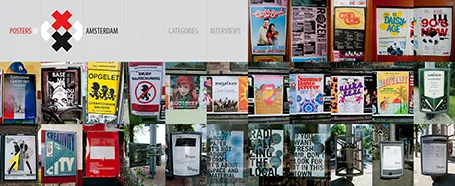
The summer is here: time to slow down a bit and look around for design inspiration. The site Posters in Amsterdam by Jarr Geerlings enables you to walk around the city without physically going there.


Frequent updates about all things presentations since 2008. Subscribe to never miss a post.
The summer is here: time to slow down a bit and look around for design inspiration. The site Posters in Amsterdam by Jarr Geerlings enables you to walk around the city without physically going there.
An interesting post by investor relations consultant Dominic Jones: very few bother to read a company’s annual reports.
It is easy to understand why. Annual accounts consist of 2 parts. One, the financial data. This is read by those who need them (analysts). Two, an attempt by the company to sell its strategy to investors. Here is why this section does not work:
A lot of money is invested in the layout, design, and printing of these annual report. Is this money not better spend by improving the quality of that earnings announcement presentation PDF that everyone IS reading?
For most images I use in PowerPoint, I use Photoshop to extend the background and create more white space for type. You can only do this when the edges of the image have a nice neutral pattern background.
Stock photographers crop their images to get more interesting compositions. The result is that many images will have hard cut offs that cannot be extended. Here is my call to stock photographers: let the designers of the final products do the cropping for you and make the full version of your file available as well.

Maybe stock photography sites should do for images what they already do for vector files: offer a ZIP file for download that contains multiple items: one example crop that creates a nice thumbnail to drive sales on the site, and the original that designers can work with.
Image via iStockPhoto.
Update: Linda Lor linked in the comments to her video on how to extend images in PowerPoint without the help of Photoshop. I am embedding it here:
Google is going through a design metamorphosis and launching a lot of new products and features. Designers should take note of a new series of 180 free fonts. Many of the free fonts available are the kind you would use to spice the invitation for your children’s birthday party, and they usually are not presented on a web site that allows you to search and compare them.
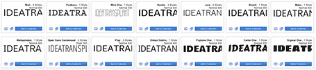
Not so with Google. Most of the fonts are for serious use and are viable replacements for Arial, Calibri and Times New Roman. Also, there are some good extra black ones for headlines and titles. The search interface is great, enabling you to select styles and test out words, sentences, and paragraphs.
You can check the new Google fonts out here.
Computer screens have gotten bigger and bigger, and I suspect that most users will use the extra screen real estate to keep multiple windows open on their desktop. One for email, one for Twitter, one for PowerPoint, one for Skype. Designers do not have this luxury to spread everything out in front of them, they need a big calm design environment with minimal distraction. My PowerPoint or Keynote screen is always set to the maximum.
I used to work with a laptop in clam shell mode in my office: the laptop is closed, and a big external monitor is used as a display. For copying and pasting, inserting Excel charts in PowerPoint, I was constantly moving windows around. Until yesterday, as I looked at the closed laptop screen.
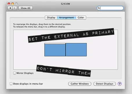
So now I created a dual monitor screen set up. My slide design application is up full screen on the large monitor, and my laptop screen is used as a collection bin for all kind of bits. It has been a liberation. My 17" laptop actually is big enough for the little side apps that I am running in that screen. Great.
If you are on a Mac, here is how to do it:
The Impact label font by Tension Type can work great in a presentation design. It is open source, you can download it here at Dafont. It also comes in a white reverse version.

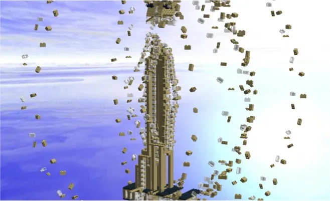
Recently, I needed to find a good visualization of modularity in a presentation. Lego is a nice concept, but maybe a bit cliché. Not if you use this really cool LEGO design tool: LEGO Digital Designer. It is a full 3D design environment in which you can create any LEGO object you want, and even submit it to LEGO to buy a box with the pieces plus a build instruction. It comes with a large online library where people can upload and download designs.
Here is an example of the Empire State Building. You switch on an animation of how the building is built up as the bricks fly in from all directions. Great stuff.

If you are in to LEGO, here are some earlier posts about it. Christoph Niemann uses LEGO to model New York city. This ad visualizes the power of imagination that kids have, but grown ups seem to have lost.
I do not agree with the design approach of the majority of free template databases on the web. Many of these sites are built to attract Google traffic and host cluttered templates that seem nothing more than a more colorful extension of Microsoft’s standard bullet point opening screen.

Presentationmagazine.com fits somewhere in the middle. Managed by Jonty Pearce, It hosts some standard PowerPoint templates that I would not use in a design, but also has a number of useful articles.
The really useful content of this web site however is its library of free editable PowerPoint maps. You can download them and color states, countries and continents with your own colors. An excellent resource.
The presentations I design for conferences are in the public domain (these are the ones you will find as examples on my web site). Almost all other ones are confidential. Fund raising pitches for startups (although I think most startups could actually be better off sharing these stories with the world), sales presentations (same here), and last but not least, quarterly results presentations to the stock market (incredibly sensitive a week before the announcement, completely public 5 minutes after).
I have started to beef up the security of my IT infrastructure, especially for these earnings announcement. The biggest risk is not so much becoming the victim of a crime, it is human error. Forgetting your laptop somewhere, typing in the wrong email address and sending a highly confidential document to the wrong person.
Here are some basic steps you can do to beef up your security.
Daniel Higginbotham has set a little web site with a useful recap of some important design principles. He called it www.visualmess.com. Worth skimming through. Now that I get to think of it, I am actually in the cleaning business…