SlideMagic Blog

Frequent updates about all things presentations since 2008. Subscribe to never miss a post.

RSS
all posts

Search results for “web design”

·Keynote

Wireframing in Keynote

I have started to wireframe my PowerPoint/Keynote killer in… Keynote. Presentation design software is excellent to make mock up web sites or mobile applications, no need for special software. You have all the shapes at your disposal and can add basic interactivity with hotlinks that point to other slides in your deck. You can design icons yourself or use standard packs such as these, or these to make things look even more real.

·Keynote

iPhone mock ups

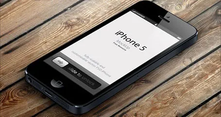
Many high-tech presentations involve some sort of show casing of a mobile phone app. This site has a number of iPhone mock ups that could work great in presentations. With elementary image editing skills, you can take a front-facing image and past your device screen shot in. More advanced Photoshop users can probably get the 3D tilting to work.

The full list of iPhone mock ups are here on Design Beep.

Someone suggested this link on Twitter, but I forgot who it was… If it was you let me know and I will give you credit.

·Books

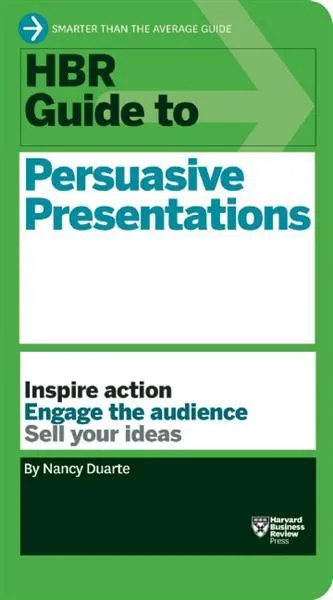
New book by Duarte

Nancy Duarte is probably the only person in the world that has managed to create a very large business in the presentation design market. As a result, she is a true authority on the subject because of here experience with designing presentations ranging from the high profile money-no-issue keynote presentations to the day-to-day high volume make-overs of slides for internal management meetings.

Her new book HBR Guide to Persuasive Presentations is different from the previous two (Slide:ology and Resonate): it is far more practical. Out goes the glossy paper, the beautiful diagrams, the client case examples, and instead we have a highly useful list of tips and tricks that can help you make better presentations the moment you put the book down. Almost every paragraph starts with an action verb, a recommendation of something that you can do better.

The book covers a wide range of subjects related to presentation design, from analysing your audience to building an online social media following for your decks, but the core of the book is in story and slide design. Some new ideas that I got out of the book:

  • Create two endings in your presentation, if you run out of time you can always stop at the first one
  • Pick the right type of slide: walk-in slide, title slide, navigation slide, bullet slide, big word slide, quote slide, data slide, diagram slide, conceptual slide, video slide, walk out slide
  • Ideas how to translate words into diagrams.

One point of disagreement, the book advocates using a 10% rule for executive summary slides, so a 50 slide deck needs 5 summary slides (5 minutes), and 45 appendix slides. Pretty much what we tried to do at McKinsey. I increasingly try to shorten that executive summary to one super short summary, and follow it to a slightly longer story that encapsulates the entire story, hoping to be able to hang on to senior management attention for maybe 10 or 15 minutes instead of 5 when the cross fire of questions begins and your slide presentation in the conference room basically ends.

Continue reading →
·PowerPoint

First impressions of Windows 8

Although I have switched to a Mac, I dip into the world of Windows now and then on a virtual machine, for such things as running .EXE CD ROMs with medical images on them, or editing a chart for a client still on PowerPoint 2003. The latter is no longer necessary, and that is a good thing, since Windows 8 is no longer supporting PowerPoint 2003.

So, I took the plunge and installed Windows 8 on my Parallels 8 virtual machine. I ignored all the scary warnings on the Parallels web site and managed to get a perfect install.

As a non-Hebrew speaker in Israel I always have an additional issue when installing new software. Trying to change the system language on a computer without being able to read most of the text on the screen. Gambling, plus comparing English and Hebrew screen shots finally did the job, but my computer science undergraduate degree came in handy. Not something for novice computer users as languages for application screens, keyboards, user accounts and welcome screens all seemed to be controlled in a slightly different way.

OK, back to the software. I will not describe the ins and outs of the new operating system here, but stick to my personal impressions. Detailed descriptions can be found in other reviews.

I really like the new Microsoft graphical look and feel of the new Metro interface. It is calm and clean, with simple clean graphics without shadings, gradients, drop shadows and near-realistic leather or paper effects. Some of the tiles on your home screen update in real time with weather, stock market information and a flow of pictures of your facebook and Twitter friends. I switched these live updates off, too distracting.


Continue reading →
·Keynote

Uniform logos

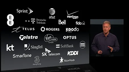
A page full of logos in different colours can look cluttered. Apple re-did their partner logos in white on black in their recent product presentation. I am not sure whether all the graphic designers that were behind the logos would agree to this, but it sure looks better. I would have taken the slide design one step further though, and organise the logos in a rigid grid.

·Keynote

Stick to your grid

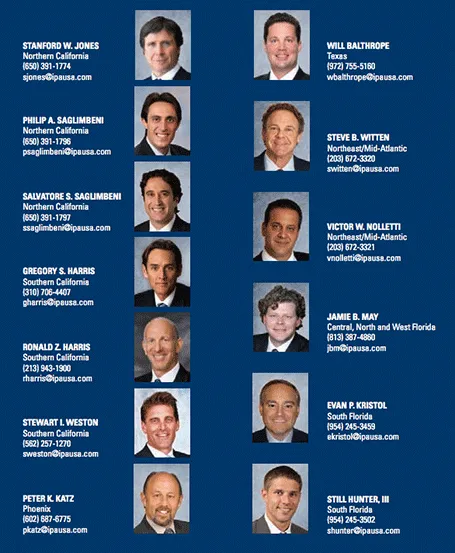
The grid is the imaginary set of horizontal and vertical lines along which the objects on your slides are aligned. Breaking the grid is a key tool that designers use to add an interesting tension to a page layout. But in most cases, it is better just to stick to it. See the example below, your eye will immediately pick up that there is something wrong with the layout of these head shots.

·Images

News photos for bargain prices

Prices for celebrity and news photos are incredibly high (check some of them on Getty Images). Why? Because the licensing options are set for high-volume print runs or web sites. Usually, presentations are different. The audience is relatively small (rarely above 100) and most presentations are a one-off event. So, producers of news and celebrity images are missing out on the presentation design market.

Enter a new web site: slideshots.com. It is a database of AFP images with EUR 2 licensing options for use in presentations. A great alternative for over-sued and cheesy stock images. And the license looks pretty flexible, even for use online on platforms such as SlideShare.

·PowerPoint

PowerPoint 2013 mini review

Everyone can install a preview of the new and upcoming Microsoft Office 2013 free of charge. Follow the process outlined here, and take into account some of the health warnings by Geetesh Bajaj (be especially careful with Outlook). I installed my version on a Parallels virtual PC on my Mac and limited my mini review to PowerPoint.

Probably on purpose, Microsoft made very little changes to the menu structure of PowerPoint. Anyone using PowerPoint 2010 will feel at home immediately. Everything stayed in the same place. The look and feel of Office 2013 has improved a lot: clean lines, fewer gradients, fewer shadows, light fonts. The UI radiates calm and good taste. Almost a bit too calm, as it can be hard sometimes to see the contrast of white slide backgrounds against the background of the design canvas. But overall, very good.

Microsoft has made the 16:9 aspect standard in PowerPoint 2013. This will work well with modern computer monitors, but I am actually not a big fan of designing slides in 16:9. It works great for movies, but for visuals I find a wide screen somewhat limiting. Also, old VGA conference room projection screens have a 4:3 ratio, and more importantly, I do not expect tablet devices to go to a 16:9 screen ratio.

If there is one criticism for Microsoft, it would be the bullet point template: it is still there. You insert a new slide, and the bullets are waiting for you to be filled in. The entire slide master is still the messy collection of bullet point-based slide layouts with big page numbers and dates on every page. Maybe with PowerPoint 2016, this will be eliminated…

Continue reading →
·PowerPoint

Office 365: not there yet

I signed up for a trial of Microsoft Office 365, the cloud-based version of Microsoft Office to see whether it could be a work-around to get the Windows version of PowerPoint to run on my Mac. (There are a few bits missing in the Mac-version of PowerPoint).

Not every Office user is the same. For the corporate user that needs access to files on any device, plus the ability to make some small edits to Office documents that are created on desktop applications, the Office 365 offering makes perfect sense.

But Office 365 is not ready yet to become a core design platform. I tested only PowerPoint, and ran the web app in Google Chrome on Mac OSX, please correct me if some of the limitations were due to hardware/software issues:

  • The availability shapes and functions in PowerPoint are extremely limited when compared to the desktop version. Now, I am all in favor of cutting PowerPoint features but here basic elements were left out (creating data charts  or cropping pictures for example)
  • Fonts are a big issue, if purchased custom fonts that are installed on my computer, but they are not present on Microsoft’s Office 365 server, so your presentations become garbled
  • The preview of slides are low-res and slightly blurry (I am using a 2500 pixel monitor), only when you click to edit an object does the full resolution kick in.

In a few years from now, Microsoft Office applications will run smoothly across devices and platforms, we need a little bit more patience.

·PowerPoint

Re-discovering Smart Art

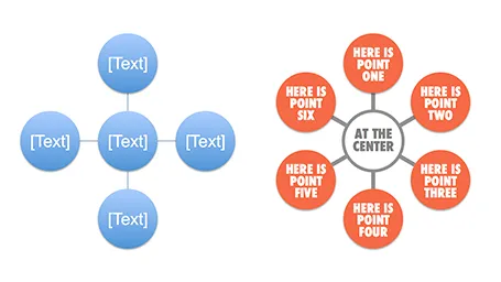
Smart art inside PowerPoint is a semi-automated template engine for diagrams. It easy to add and remove boxes/bubbles, edit text. The idea is good, but I have not used them a lot:

  • The standard out-of-the-box formatting is ugly
  • Although there are many frameworks to chose from, none of them usually really work for my particular presentation problem
  • I have seen them too many times in presentations where designers simply dump in a smart art graphic to replace a bullet point chart (the result is still a bullet point chart that looks a bit different)

Recently, I have started to use smart art in my presentations, but in a different way. I use them to position objects on a slide by picking only the very basic configurations and reformat the slide items heavily so you can hardly recognize it is a smart art object anymore. An example below:  

Well, I said before: your PowerPoint is really good PowerPoint if your audience cannot tell it is PowerPoint…

More about smart art on the Microsoft site, or over at the PowerPoint Ninja blog.