SlideMagic Blog

Frequent updates about all things presentations since 2008. Subscribe to never miss a post.

RSS
all posts

Search results for “web design”

·Concepts

On the way to average

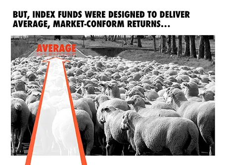
I designed the chart below for a sales presentation for an asset manager who is about to go on a roadshow to pitch a new investment fund to potential distribution partners. Yes, you saw that right, I did use a reflection effect.

·Keynote

Use that style guide

If your company logo was designed by a professional designer chances are that somewhere in the bottom drawer of the marketing department you can find a complete graphical style guide that goes with it. Usually, it gets only used for commissioning other design work (brochures, web sites, etc.), and hardly any PowerPoint user knows of its existence.

Ask for a copy and use it to inspire your presentation design. See what colours the designer recommends, there might be more than present in the logo. See how pages are laid out. See what fonts and font colours are used. Lots of inspiration.

And yes, the section for the PowerPoint presentations in these style guides is usually pretty bad. Professional designers are not used to working in PowerPoint (an inferior product in their minds). Beautiful design work gets reduced to Arial, heavy top banners and watermarks. So, use the design inspiration of the first pages of the style guide to create your own PowerPoint template that fits it. Hopefully the marketing communications department lets you get away with it.

·Keynote

New Keynote - first impressions

Together with a whole range of other product updates, Apple released a new version of iWorks (including Keynote) last night. I installed the Mac OS X Mavericks (warning, this will take your computer down for an hour) and played around with the new software. Observations in random order.

All iWorks apps are now free for people buying new Macs. iWorks was already a lot cheaper than Microsoft Office, but now the economic argument against enterprise adoption has been removed completely. Still, the huge installed base of both Windows hardware and PowerPoint with its familiar user interface will make it hard for Apple to make an inroad here.

What could help them is the cross platform compatibility. As of today, there is one file format both for desktop and mobile versions of keynote. I still do not fully understand iCloud, where my files are, where things get saved or not, but the duplication of a file when opening it on your mobile phone is gone. A step in the right direction, but not all the confusion has been removed.

Apple has also launched their suite of iWorks web apps. You can now edit and present Keynote presentations right from your browser. You can simply share a link to the presentation with your co-workers, rather than sharing heavy email attachments. More than one person can edit the live presentation. Many other services offer this feature, but personally I find it a bit scary when I loose control of how makes what edits (including deletions) in the master document. Anyway, that the feature is available does not mean that you have to use it.


Continue reading →
·Keynote

Using Prezi sensibly

For people bored with PowerPoint, Prezi can be an alternative presentation design platform. It is web-based, has powerful zoom effects and enables non-linear presentations. I would suggest to keep the following in mind when using Prezi for a business presentation:

  1. Stick to a linear story line, especially for larger audiences. If you have 20 minutes in front of 500 people, it has hard to get your message across using a random and unpredictable flow.
  2. Use the Prezi zooming and moving effects where you really need it, and not just for spectacular slide transitions. The audience will get motion sickness, or worse, will start giggling when you discuss your very serious business topic.
  3. Try to bring the look and feel of your Prezi in line with your regular PowerPoint colours. You will not have time to design Prezis for every presentation you do.
·Images

Cheating with headshots

Pages with headshots of people are always a pain to design: the names and titles of people can vary greatly in length.

I spotted this neat trick in a promotion email for this book. People with long titles have been moved to the bottom where a 2 line job title does not break the grid. Also, the right column looks a bit wider than the first 2 to me, again creating a bit more breathing space for long names and/or titles.

Now, hopefully your CEO has a short name (she always wants to go first).

·Data visualization

Infographics that try too hard

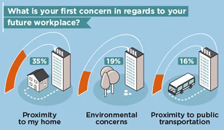
Many (maybe even most) infographics focus primarily on a cute visual concept and forget about the data they need to communicate. The result: pretty pictures that are impossible to understand.

First, focus on the data and think what you want to show: a trend, a comparison, a ranking, a contrast. That should be the basis for the design of your graphic.

Then, remember that cute icons can be as hard to understand as a bullet point: sometimes it can be more effective to write down the words “home” and “work” than trying to come up with illustrations of a house and an office.

Clients often request a cool infographic to get their message across. My response is to stuck to a more traditional presentation format, but if they insist on an infographic look, to go more creative on colors, shapes, and especially fonts at the expense of technical compatibility and the ability of everyone in your organisation to edit the slides for their own needs.

The WTF Visualizations blog is full of bad infographics, enjoy! (Via Daria)

·Advertising

Overdoing special effects

Image manipulation software can do a lot, but most of the time it is used over the top. All that technology causes most ads to look worse than those elegant compositions from the 1960s.

First of all there are the clear Photoshop disasters such as this nice composition below (via the PSD blog).

One step up, designers get the technical execution right, but the chosen concept just hurts the eye (via Ads of the World).

Finally, it possible to get it right, but in most cases these compositions are beautiful illustrations rather than image manipulations. The only difference with the 1960s is that the analogue pencil has been replaced with an electronic one (via Ads of the World).

·Investor presentation

Investor infographic

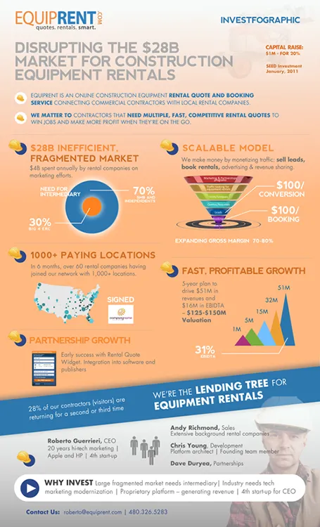
Equiprent is raising money, and put together an infographic to attract the attention of investors (found it on the Cool Infographics blog).

What I like about it:

  • One page Executive Summaries are boring and yes, this is a much better way to grab attention. Equiprent is realistic and does not think that this graphic is landing them the investment. Its sole purpose is to get a 5 minute phone call to discuss the next steps in the fund raising process
  • The company is not afraid to get the fact that they are fund raising out in the open: it says so, it shares their suggested valuation, and it states how much they are raising in return for what % of the company. I feel that the benefits of publicity and reaching more investors outweigh the drawbacks (putting some of your company secrets out in the open). The fund raising process can be much more open than hush hush discussions in small venture capital meeting rooms.
  • The infographic itself catches the basic points of an investment pitch, if an investor is convinced that all the claims are true, she will for sure invest in the venture.

Some feedback on where it can be improved:

  • From a design perspective: some objectives on the page can be aligned better
  • Content-wise: maybe the fragmentation point can be beefed up more. It is the core argument of the pitch. I have no immediate suggestion how to do it better though
  • Financial projects look impressive, but have little credibility without the accompanying assumptions
Continue reading →
·Keynote

Viewer churn

The big challenge of website design is people clicking away to more interesting places. when you send a pitch deck without verbal explanation, you have the same challenge. Will your prospective customer or investor make it all the way to the end? Maybe presentation designers can learn from web designers?

 I was brainstorming this with a client the other day. We were thinking about how to include a fake demo in the presentation. Demos always look better with the biggest possible screen shots. The result however, is a very large presentation and the viewer might not make it to the end. A possible solution: add big PREVIOUS and NEXT arrows to the left and right of the screen, maybe a counter (Demo slide 4/12) and a bit SKIP button to keep the viewer on board.

Just a random idea, I need to think more about how to add navigation that is actually useful inside a presentation.

·Keynote

Preaching to the converted

Most sales presentations go on and on and on about an issue that the client might already be convinced of. Worse, if you present slide after slide in an amateurish format making the same point, your client might actually start to doubt what she believed when entering the meeting room.

That is time and slides wasted. More time efficient and effective ways to tackle this:

  1. A couple of really professional and serious looking slides with the highlights, plus an invitation to visit your web page for all the details
  2. Discussing the weakness of your competitors verbally and informally: it is hard to put this on paper. Suggest your client some tough questions to ask when they meet the competition. Note that this is actually a presentation design challenge, without creating the actual slides. You need to have this story prepared, maybe even with the help of a “spontaneous” flip chart sketch

Now spend the time you gained on the issues that really matter: are you expensive, is it hard to switch supplier, etc.? Preaching to the converted is never a good use of time.