

SlideMagic Blog

Frequent updates about all things presentations since 2008. Subscribe to never miss a post.

RSS
all posts

Search results for “mckinsey”

·Data visualization

How to create a waterfall chart

I am learning a lot from the search bar in my template store, especially those searches that (still) deliver zero results. “Waterfall” is one of those.

Waterfall charts are the secret weapon of McKinsey and other strategy consultants. They are great to explain the source of change between two values (last year, this year for example). In Excel they are tricky to make, especially if values zoom up and down the zero axis.

In an earlier blog post (all the way back in 2008, nine years ago…), I explained the basics of creating waterfall charts in Excel. The secret is to make blank series in a stacked column chart that create the requires offset for the delta values.
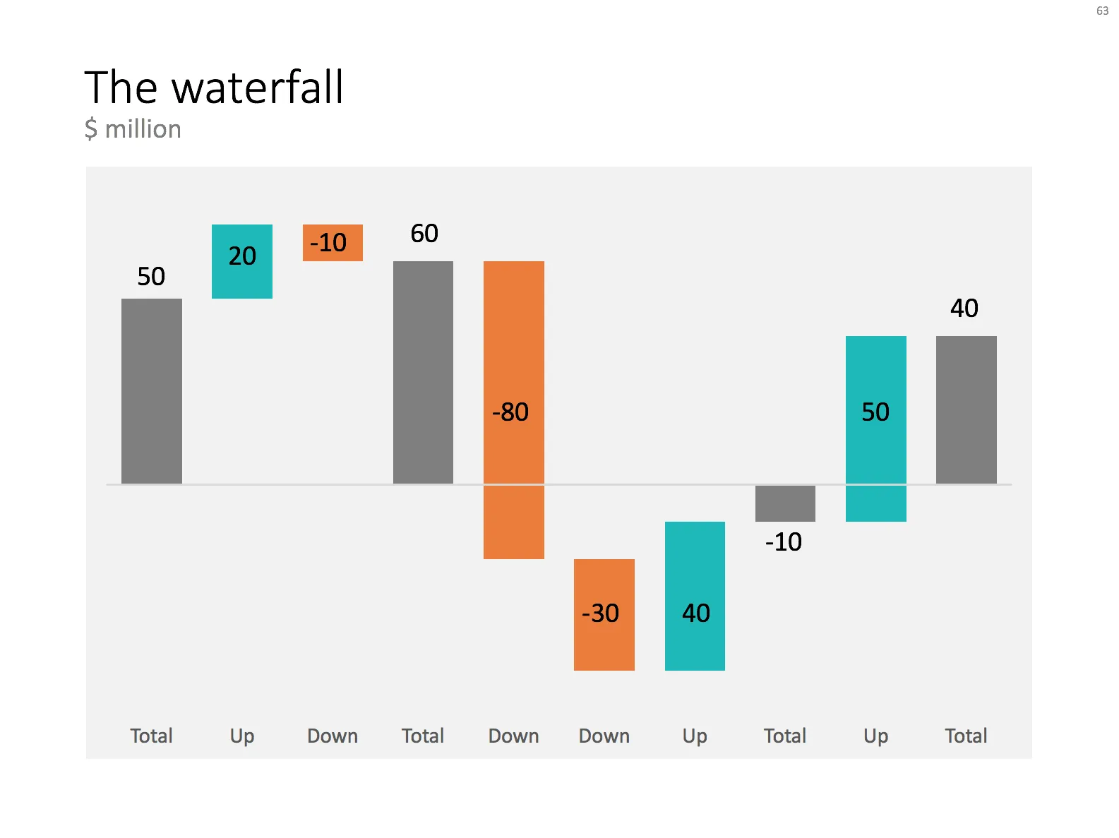
For my store, I am working on an automated tool that creates waterfalls. It is still work in progress though, I want to to be very robust.

In the mean time, I have added a manual version of the waterfall to my template store. I created the general layout, fixed the colours. Still you will have to do some calculations and adjustments to make it fit your specific set of numbers. Also, you will need to add data labels manually. But with a bit of fiddling, you should get a good result.

Work in progress.

·Story

When the problem is not the story

All my clients want that presentation that uses story telling and captivating images to hook its audience emotionally and gets them to sign an investment check right here, right now.

But sometimes that beautiful story is not the issue. Ideas can be pretty simple to describe, the market size easily understood, what is left is the concern that company can actually make it happen.

Business models, cost structures, go-to-market routes, hiring plans, product releases, all “boring stuff” that pretty much only can be captured in McKinsey-style tables. Ah, that annoying presentation designer who keeps on pointing out inconsistencies between the slides.

These cases also highlight why certain companies can do incredibly well in big audience pitch competitions, but fail to raise money from professional investors scrutinizing the details in small conference rooms.

·Images

Dramatic reduction in stock image use

Stock image sites were a great discovery when I started getting into the presentation design business in the early 2000s. In fact, they might have pushed me over the edge in becoming a designer. All of a sudden, I discovered that combining McKinsey-style professional slides with carefully chosen stock images you could make some powerful sales and investor decks.

All of this happened at the same time when very fundamental books by the likes of Garr Reynolds and Nancy Duarte were published, TED talks were taking of, presentations were changing!

Looking back, and looking forward, I see that my presentation style has changed. The biggest change: far, far fewer (premium) stock images. How come? Post-rationalizing:

  • I got much better and assessing the setting in which the presentation would be delivered. And very rarely do I design presentations for a massive keynote or TED Talk. Most of the time, these are decks that will be presented in a small conference room, to a small audience. And more importantly, the first “punch” that these decks need to deliver is in the email inbox, when an investor or potential customer decides to keep on clicking (or not). More and more, I am starting to design these presentations for the impatient attachment clicker, and less for the live audience. This means: fewer images, and yes denser content. It is cumbersome to maintain 2 versions of a document (one for sending, one for presenting), so in practice the live audience is suffering a little bit at the expensive of the email attachment reader.
  • Investor and sales audiences have evolved. Pitches have a high degree of similarity, they all follow a similar pattern, companies are addressing similar types of problems, pitching similar types of technologies (investors are increasingly specializing), so I see less need to “wow” the audience with dramatic new concepts (self-driving cars) but rather focus more on the nuts and bolts of an innovation. Investors are clued up, and look for the substance, quickly clicking through the pretty pictures.
  • The premium stock image sites are collapsing under their own success. Image banks are diluted with designs that are somewhere between an actual clean photo and a finished design concept. Quality is technically good, but artistically “cheesy” and staged. Opening these sites as a designer makes you instantly feel that you are “in the wrong part of the Internet” And I am sure that even the layman designers gets totally confused when browsing these image sites.
  • Free alternatives to paid stock image sites are popping up everywhere. If you need an image of the tip of an iceberg, you can find pretty decent ones on Google Image search (use the labeled for re-use option), WikiPedia or one of the many free stock image sites (that try to lure you into buying premium images that are often not better).
  • And finally, I think it is a matter confidence and experience, where I somehow found a personal design style that involves fewer images.
·Data visualization

Tedious number updates

I am not a believer in copy-pasting Excel numbers into PowerPoint. Excel is for analysis, PowerPoint for presenting, and presenting numbers is different from analyzing them. The charts I use to present are often so simple (only one data series, rounded digits) that I tap them in by hand.

There is an exception though. If you are the junior analyst on the team, and you are the last step in the “supply chain”, i.e., constantly updating charts with new versions of numbers that roll out of the spreadsheet, it might be time to change working practice. Personally, I remember many McKinsey projects I did as an analyst where I designed a model in week 1 of a project, and ended up updating numbers on slides for weeks after that.

In these cases, add a worksheet to your Excel file, and pull the numbers from the analysis. Apply all rounding, i.e., if the chart or table requires millions, divide by 1e6. For tables, put all numbers in the right order, invert rows, columns if required.

You can go further and actually create objects in Excel that can almost literally be copied into PowerPoint. Create data charts, fix fonts, colors, etc. exactly as in the PowerPoint file. Format Excel cells exactly as the table in your PowerPoint document.

The cost of this effort is time: it will take some effort to get it right, but it will pay off in subsequent number update rounds, and it can prevent you from making mistakes in last minute model changes.

Continue reading →
·Creativity

Business document production workflows

Production of documents and reports inside corporations is a hugely inefficient process, because of a number of reasons:

  • Using the face-to-face meeting format to discuss small text edits
  • Do zero preparation for such a meeting, and start reading analyzing the text with the junior analyst in front of you
  • Because of this lack of preparation, completely upend the start of the presentation because critical bits are missing, without reading things to the end
  • Having too many people involved: lots of captains on the ship giving contradicting input
  • Refusal of senior managers to make tiny text edits directly into the text themselves

I remember this from my early days as a junior analyst at McKinsey. Fight 1 hour of traffic to drive to a meeting with a senior client and/or partner. Listen to small talk, get send out to make paper copies, multiple people making edits to slides with pens, make copies again, back into the car, in the office at your desk failing to read the hand writing, going back and forth via fax machines until you get it right. Technology has moved on a bit, but document editing is still pretty much the same today.

When I start to work with a new client there is usually a small adjustment process, especially when we are on different continents. Am I a junior analyst who needs paragraph by paragraph instructions? He is 7 hours ahead, but hey, I am the client and get to set the meetings. Better schedule frequent update calls to make sure he stays motivated to press on.

Continue reading →

Start with action verb?

Back at my days at McKinsey I was taught that every item in a list should start with a an “action verb”: “Agree next steps”, “Build customer list”, “Sell unwanted subsidiary”. I am no longer sticking to this principle:

  • In many case you need to invent a verb that just add words and line breaks to a text box without adding meaning. If the viewer will understand it without the verb, it is OK.
  • Worse: this search for action verbs is a major cause of consulting speak with repetitive use of similar verbs: highlight, identify, uncover, map, etc. etc.
·Investor presentation

Interview questions

Back at McKinsey, doing recruiting interviews was an integral part of a consultant’s job. I interviewed hundreds of candidates, mostly back at my business school (INSEAD). When interviewers ask a question, they are most of the times not trying to figure out whether you can produce the 100% right answer. Instead you want to check out:

  • How a person is thinking and reasoning
  • Whether something that is claimed is actually true or not, by forcing the conversation into some sort of depth/details
  • What the integrity of the person in question is, is she lying/talking her way out of things or willing to admit that she does not know
  • How it is to work with someone.

Potential investors or customer will do the same. If you copy some fancy charts, or put in some buzzwords / hollow statements, a few questions will quickly lay bare your actual understanding of a situation.

“[Approach A] is much better than [Approach B]” “Really, I did not know that?, can you give me a few examples of companies that tried Approach B and failed recently?”

Solution one, don’t put the charts in. Solution two, read up and do your homework and form your own opinion.

·Story

Usually one thing is special

Back in the 1990s at McKinsey, a very senior Director told me that while the Firm does high quality work across the board, in ever project there is usually one insight, one piece of analysis, one original idea, just one, that stands out and makes all the difference. And that one insight is enough to break a deadlock where the client or other consulting firms could not solve the problem.

In sales and investor pitches that is pretty much the same. Yes, smart phone use is growing, yes the team consists of a bunch of very smart people, yes security is a major concern of enterprises. People have seen it before. But that one unusual combination of technologies, or that completely new approach to a problem that is interesting.

Show why it is so tricky to solve. Show the solution. Show why it is so clever.

Image from WikiPedia

·Creativity

It is not your fault

Back in the days as a junior analyst at McKinsey you would often see a deck or listen to a presentation that you would not understand completely. Being 23, I usually kept quiet and assumed that this was my problem, not the presenter’s.

Now at more than double that age, I still have the same issue: I often don’t get why something is so special, so unique, so difficult to do from reading a slide or listening to the presenter. My IQ has not changed much (it probably got worse), and yes I have learned things, but the biggest difference that I have gained the confidence to know that it is not my fault. It is OK to ask a question that might sound trivial.

Photo by Matthew Paul Argall

Wordy quotes

Copy-pasting full paragraphs from authoritative sources (academics, Harvard Business Review, McKinsey Quarterly) to support your point do poorly in presentations:

  • A presentation is not a legal court battle where every word of an expert is examined in detail to see who is right. People don’t bother to read a big paragraph of text on a slide
  • Quotes have been overused, Google is filled with quotes from random people claiming almost any point you are looking for
  • Text is often a secondary interpretation of some graph or statistics. That graph or statistic, the primary source, is much better visual material to make your point
  • Quotes are always almost years old, out of context. “A Harvard Professor said this in 1995 in a study for an airplane manufacturer” is not very relevant for an Internet startup in 2016.

Image from WikiPedia