Cool - font designed by following car movements
iQ font - When driving becomes writing / Full making of.
An unusual approach to font design. You can download the font here. Via Swissmiss. If you are into design, you should follow her blog.


Frequent updates about all things presentations since 2008. Subscribe to never miss a post.
iQ font - When driving becomes writing / Full making of.
An unusual approach to font design. You can download the font here. Via Swissmiss. If you are into design, you should follow her blog.
A while ago I posted a fairly critical review of the abuse of the Skype PowerPoint template. The first sentence of my post however was: “Skype has a beautiful and very strong visual identity”.
Spot on. Browse through this document with guidelines for creating documents in the “Skype look”. You can learn from it even if you are not designing for Skype. Beautiful graphics. Nicely written to give you directions but leaving you enough creative room to make your own designs.
Colors in data charts. This 2003-2007 compatibility issue drives me crazy. Many of my clients still use Office 2003. Does anyone have a solution?
I have to change every color manually using RGB codes to set them permanently to the correct value in 2003.
There must be a better way to do this! Let me know if you know.
McKinsey and other management consultants love 2x2 matrices (and obviously 3x3s). Personally, I think they are often overused (framework overload).
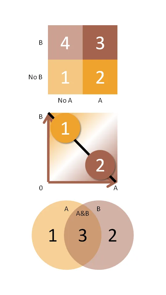
Not every categorization can be crammed into this framework.
Here are some other techniques to group items on a PowerPoint slide using line and venn diagrams:

Presentations to analysts and investors are very important for publicly traded companies: they have a direct impact on the share price.
In this interview for the McKinsey Quarterly, Gartner CFO Christopher Lafond lays out his investor relations strategy:
Note: (free) registration to the McKinsey Quarterly might be required to read this article.
Google released its Q3 2008 results yesterday. Besides the usual reports, a PDF was released to support the earnings conference call with investors (someone uploaded it to slideshare, see below).
Google Q3 2008 Earnings Slides
Investor presentations are very important and can greatly influence the share price of a company. The remote conference call format makes it even more challenging to control the presentation delivery. It is a shame to see that even the world’s most resourceful companies like Google invest so little in these documents.
The presentation gives the impression that after the hard work to meet the publication deadline someone thought last minute to knock up some slides to accompany the conference call. There is clearly an opportunity to rais the bar here.
Posted on TechCrunch today. A presentation of VC firm Sequoia to portfolio companies. You can click through it in a few minutes. From a presentation design perspective, not great (i.e., not all slides are perfectly designed with many bullet points, but what do you do if you have to put something together quickly), but not completely bad either. The content is slightly depressing though for startups trying to raise money (many of my clients). CEO_ALL_HANDS_10-7-08_FINAL - Free Legal Forms UPDATE: someone making fun of this presentation here.
I updated an earlier post with VC pitch templates available on the web:
When helping startups to pitch for VCs, I often need to include a slide with a technical architecture in a presentation. These diagrams are complex to make. Cisco makes life a little bit easier by putting its entire icon set as a free download online (link). They are ready to be copied directly into PowerPoint. The images are not that pretty, but they are functional. A smart move by Cisco, many potential clients will use these icons to design their network requirements before entering the vendor selection process P.S. Technical diagrams that use these type of icons often end up in a handout, or the appendix section of a presentation. I will post my thoughts about technical architectures that need to play a central role in a pitch presentation later.
Many of the startup clients I serve are keen to show off their customer list. Almost all of them do it using a page full of company logos scraped of web pages. Why do most of them look so bad?
Some guide lines on how to let them look better, some of which are easy, some of which take more time: