The slides I used for my presentation at BizTec
Recently, I spoke for the finalists of the BizTec business plan competition in Tel Aviv on how to pitch to VCs. The slides were an adaptation from an earlier talk on the same subject. Here they are.


Frequent updates about all things presentations since 2008. Subscribe to never miss a post.
Recently, I spoke for the finalists of the BizTec business plan competition in Tel Aviv on how to pitch to VCs. The slides were an adaptation from an earlier talk on the same subject. Here they are.
Finally the business plan is ready. You Googled and asked around to make sure everything is inside: the market pain, the technology solution, the team, the market size, the competitive differentiation, the financial forecast, the intellectual property and patents. The result: 150 pages of PowerPoint.
Do not use this business plan to present the business plan. OK, you used PowerPoint, but not to design a presentation. You used PowerPoint to write a document that is not suitable to put on a projector screen.
How can you figure out what presentation you do need? Invite a friend over without any knowledge about your business venture. Take an empty piece of paper or a white board. Start telling your story. Scribble things on the white board. If need, zoom deep into the business plan PowerPoint file and put one chart on the screen (i.e., an overview of the competitors). After 30 minutes take a step back and see:
Here is the outline of your investor pitch presentation.
Quarterly results presentations are in the public domain, designed for an external audience. Below is the presentation that Google used to communicate the results for the first quarter.
These types of presentations are usually prepared under great time pressure, as there is very little time between the moment the accountants are producing the figures and the communication to the analyst community. Unfortunately, this impacts the quality of the presentation (form, not content).
I will use this presentation to provide some suggestions on how to improve corporate presentation design. Not that I am picking on Google (Skype was an earlier victim), this presentation is just a typical example of most analyst presentations I see.
Analyst presentations are slideocuments: they need to be packed with a lot of financial information and the audience (equity analysts), usually know the company and its financials very well and are keen to see this quarter’s update of last quarter’s figures that are already sitting in their spreadsheets. So, adding large images with huge font text is not really appropriate here. Also, I will forgive the use of bullet points in these documents. Still, the quality of the slideocument can be improved.
Let’s look at the opening page. The one thing I like is the minimalist template that Google uses: a tiny logo at the bottom right of the page. Great.
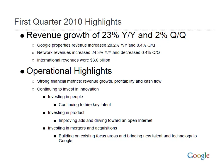
Some improvement suggestions:
Startups that are pitching to venture capitalists for funding often start off with a barrage of product benefits, the great qualifications of the team, and the remarkable patent that you secured for the entire world (well, excluding Japan, but that is not a really important market anyway, and we have a way around this black spot on the globe through working with a great distributor we know there who happened to be my room mate while I studied biology, molecular biology to be more precise, in Oxford).
Pause, rewind.
What is it that your company does? “Aah, now I understand more or less in what part of the world I am in.” And your audience is ready to put the rest of your messages in context.
The Internet opens up everything, including investment cases by venture capitalists. If you are working on a presentation to pitch your startup to a VC, read Mark Suster’s recent post on his investment in Burstly. Here is the full content on how he convinced his partners to back him with the investment. Valuable input when you design your pitch deck. Mark is not the only one, many VCs now run blogs, given very good transparency in how their mind works. Much better input than what their portfolio looks like and/or the standard blurb on the VC’s web site. Every VC is different, every VC pitch is different. Do your homework before opening PowerPoint.
The best way to prepare a presentation is to practice on a complete (but intelligent) outsider. Even (maybe especially) if your audience consists of industry experts.
You see this often in pitches of technology startups to venture capitalists for fund raising. The entrepreneur is an expert. The VC audience knows a thing or two about technology. Buzz words, generic truths, and jargon fly through the room. The message did not come across…
Any intelligent person should be able to understand your story in 15 minutes, even if she does not have any background in your specific field of expertise. If she does not get the point, it is your fault, not hers.
Time is precious when pitching to a venture capitalist (VC) for funding your startup. Don’t waste it on things the VC is already convinced of. Examples:
One important note about common beliefs though: they could be wrong! If your perspective deviates from what everyone else is copying form each other, you (obviously :-) ) should spend time/slides on it.
Mark Suster is a venture capitalist (VC) who is quietly building one of the world’s most-read blogs about entrepreneurship and VC investing. I suspect most people who read my blog subscribe to other blogs in areas such as (graphics) design and public speaking. Most of these blogs (including this one), are run by people who write presentations. Mark’s blog is different.
I think anyone who is interested in presentation design should follow his blog. See his impressive list of posts about pitching to a VC. Or read his most recent post about not failing when presenting to large audiences. Full of great lessons for presenters and presentation designers, that are not only relevant in the world of VC fund raising.
Pitching to VCs is a great case example to learn about presentations in general:
This question was asked by David Semaria on Mark Suster’s excellent blog “Both sides of the table”, a must read for anyone who needs to pitch to VCs.
Here is my take on the question why TED presentations are so “polished”:
You can argue that it can be hard to sometimes to meet point number 1. Number 2, 3 and 4 are all about practice, your presentation can benefit from it too. There is no excuse not to practice, practice, and practice.
After a first review of Prezi and pptPlex I started to get into a more detail with Prezi. One of the applications of these zooming tools is to create an effect of a perpetually zooming canvas. (There is a series of children books that uses this effect brilliantly.)
You can see my Prezi creation here (put together very quickly). Zoom out with your mouse to get the full picture. All images were taken from iStockphoto.