SlideMagic Blog

Frequent updates about all things presentations since 2008. Subscribe to never miss a post.

RSS
all posts

Category Typography

·Typography

PowerPoint conversions back to Arial

I changed the font that SlideMagic uses for PowerPoint conversions from Calibri to Arial as of version 2.6.22.

The thought behind Calibri was that when converting slides to PowerPoint, I wanted to stick as close as possible to the box-standard Microsoft format as possible, and Calibri is the standard font for Microsoft Office applications. SlideMagic users “complained” that the PowerPoint conversions did not look very similar to the beautiful originals. So I made the change.

Helvetica (especially thin variants) looks more elegant but gives compatibility issues on Windows machines. Hence Arial it is….

Obviously when you convert your SlideMagic .magic files to PDF, you get the exact same look & feel as in the SlideMagic app. This is the workflow we should aim for. SlideMagic .magic files are the source code of your documents, PDF is how you share the result with external audiences.
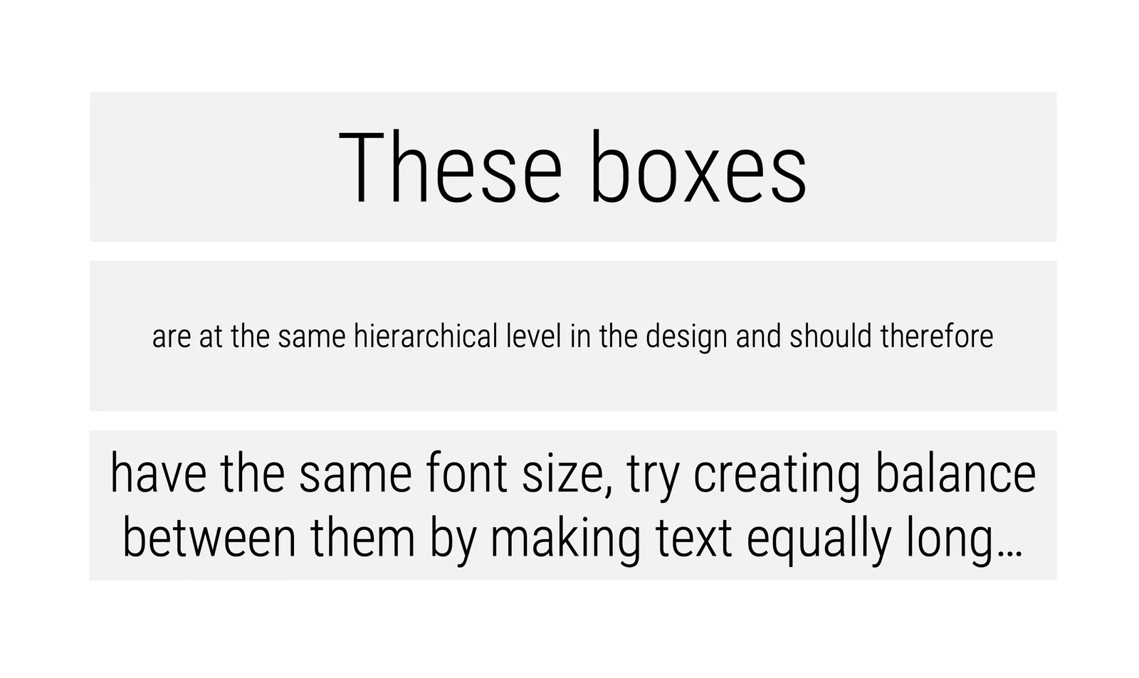
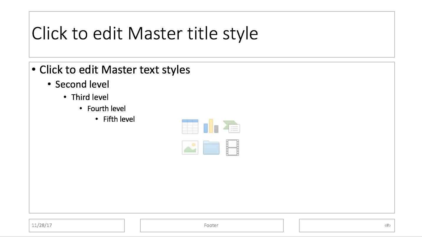
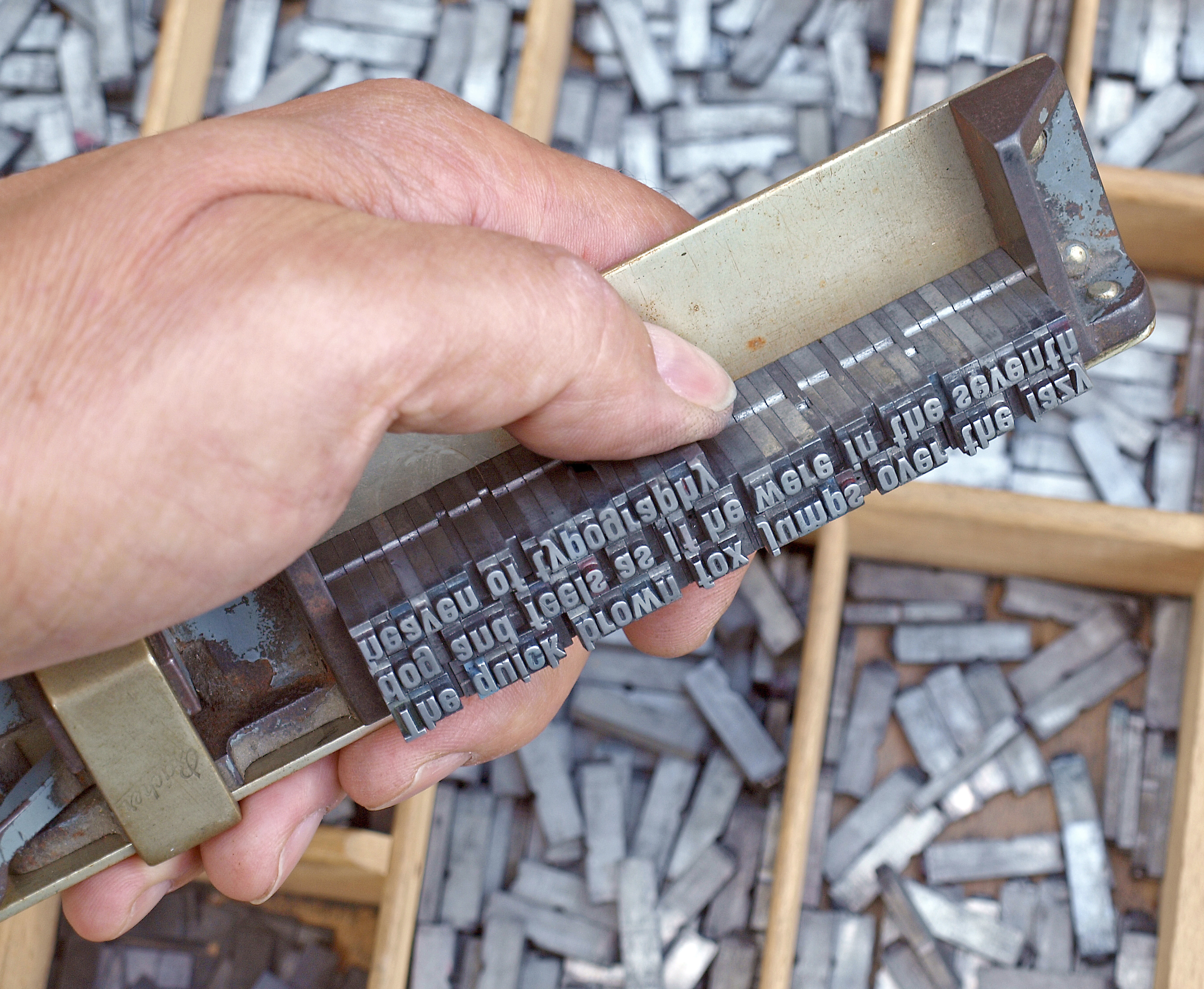
Photo by Natalia Y on Unsplash

·Typography

Font or typeface?

Seth Godin in hist latest blog post:

And yes, there’s a mustard analogy in everything you do. In how you shake hands, in the typeface you use in your presentation (and whether you call it a ‘font’), in the volume you choose for your voice when in conversation.

Yes, there is a difference between “typeface” and “font”. Typeface refers to the style of a character, (Helvetica), font is the specific instance of that typeface (Helvetica 12 bold italic), which corresponds to a specific drawer with letters printers once used.

As someone who presents himself as a professional designer, I should be a purist, but don’t tell anyone, but I use the word “font” all the time. It sounds better is shorter, and an issue that is relevant for me recently: “font” is easier to fit in a dropdown menu of an application than “typeface”.

Photo by Mr Cup / Fabien Barral on Unsplash

·Typography

Font sizing

When people submit their SlideMagic documents for conversion to PowerPoint, I still have to peek inside for a second for a quick manual operation. Here is the most common design mistake I see: different font sizes in boxes that are part of the same list or grouping.*

Yes, bigger fonts are better, but in case of lists, it is the lowest common denominator that determines their size. Slide design is like formatting headlines in a print newspaper: you need to edit text to make the message clear, but also to fit things in the typographical constraints.

  • Users in te app are warned beforehand about this.

Cover image by Andre Benz on Unsplash

·Typography

2 types of typos

And they say different things about you:

Type 1. You could not be bothered to invest the extra time to weed out obvious mistakes (and I am sometimes actually guilty of this on this blog, when jot down a quick idea).

  • Small typos with a red underlining from the spell checker
  • Obvious grammar mistakes resulting from incorrectly rewriting a sentence.

Type 2. Mistakes which you did not catch because you did not detect them yourself.

  • Picking the wrong word in the wrong context (words that sound the same but mean something different)
  • Less obvious errors in grammar.

When an investor reads your investor deck, she will probably forgive you, depending on the context. Sloppy “type 1” errors are OK in small informal notes, but leaves her wondering whether you would have the drive to weed out any source possible reason to lose a pitch in high-stake, all or nothing, efforts. I see many type 2 errors in documents by entrepreneurs who are non-native English speakers, and here it might trigger the “ultimately we need to get a US CEO” knee jerk reaction, as she is worried that you are not “presentable” enough to represent the company to potential big clients and/or future investors.

Better have that “all or nothing” deck checked by a native speaker.

Cover image by Ben Hershey on Unsplash

·Typography

Small differences in font sizes (don't)

Visual emphasis is important in graphics design: it creates a sense of hierarchy, what should be viewed first, and what are less important details. In many draft presentations I see, people use tiny variations in font size to create emphasis. For example, the first sentence of a text block might be in font size 16 rather than 14.

This approach does not work. The viewer will hardly notice the difference in font size, and worse, small differences in font size give the text block an unbalanced look when seen from a distance.

It would not be fair to blame the amateur designer for this though, the standard PowerPoint bullet point template has this font size hierarchy baked in.

So, what is a right way to do it?

  • Try to avoid having to resort to this, make your text blocks short enough so they can stand on their own
  • Use white space and location on the slide to differentiate headings from other text blocks
  • For headings, pick other differentiators: bold, all caps, and use the style consistently through your presentation.
  • Inside a text box: subtle use of bold and color (main text dark grey, emphasis black) works great
  • Another don’t: underlining, on a computer screen it almost looks like a correction (or a hyperlink from the 1990s)
  • For major headings (such as slide titles), it is perfectly fine to use font size as a tool, just make it a big size difference when compared to other text elements on your slide.
·Typography

Text balance

Shapes, their sizes, and the layout grid set the balance of a slide. But text as well and is often overlooked. Watch out for these:

  • One word that drops to the second line
  • A very long word that makes a sentence break halfway the page
  • 3 boxes in a row, 2 with little text, one crammed with characters
  • Long descriptors in column headings that break line after line after line

The solution in these cases is not reducing the font size, reducing the margins, it is redesigning your slide layout and content:

  • Take out filler words
  • Replace long words (management, manufacturing) with shorter ones
  • Splitting a point in 2 points that are more balanced
  • Making a sentence actually longer to restore balance
  • Flipping the rows and columns of a table
  • Using a different shape (circles and long text do not go together for example)

Art: Jean-Honoré FragonardThe Swing, 1767

·Typography

Letter spacing in PowerPoint

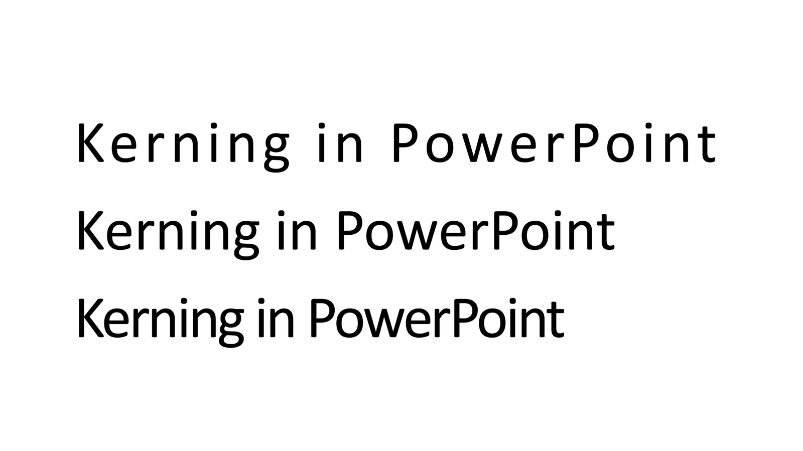
Kerning” is tweaking the spacing between characters in a word. Not to be confused with line spacing, tweaking the vertical space between lines.

Line spacing is important in presentation design. When you use very large font sizes, PowerPoint adds too much wide in between lines, you need to trim it.

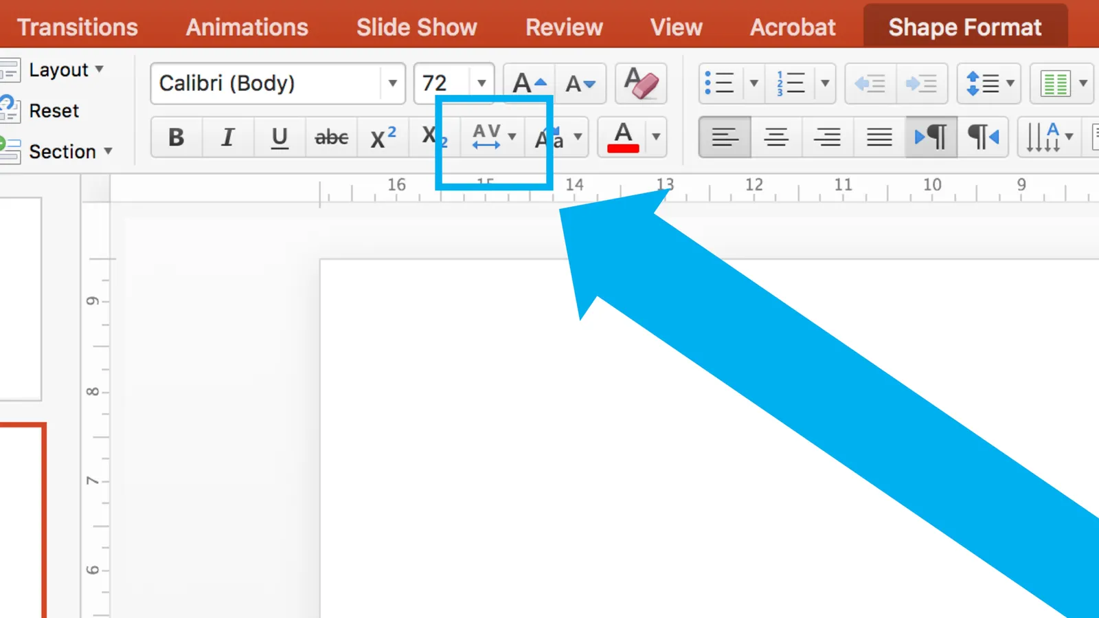
As an amateur designer of PowerPoint slides for a business presentation, you probably never need to worry about kerning. The one exception is cleaning up the mess that other users and/or templates have created. On the Mac, select all the text on a slide, click the little-used icon shown below, and set things back to “normal”

Cover image from WikiPedia

·Typography

The largest amount of text

The eye wants boxes on a slide to be equal in size. That is why I am always battling with the box with the largest amount of text, it determines the shape size and/or font size of all the boxes on the chart. Here you need to be a newspaper front page layout designer/editor and cut down the text of that box carefully without diluting its meaning. It will improve the look of your entire slide.

I really don’t like the word “management” for example. You need it a lot in business presentations and has all these wide letters, which makes it hard to fit.

Image from WikiPedia

·Typography

Quotation marks in presentations

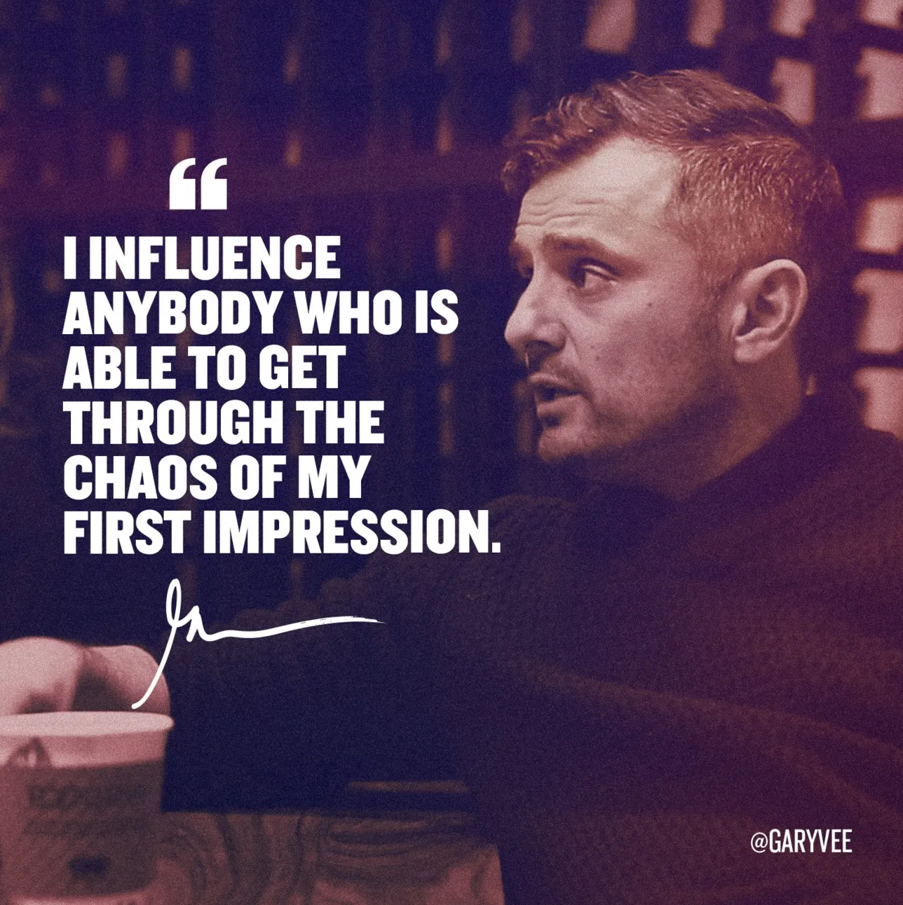
Quotation marks never come out right when you use large, bold, typography. Below is a nice idea by the designer of Gary Vaynerchuck. One huge, big, quotation market centred across the text. Note that the quotation mark is in a far bigger font size than the rest of the text.

·Typography

Lining up text, lining up text boxes

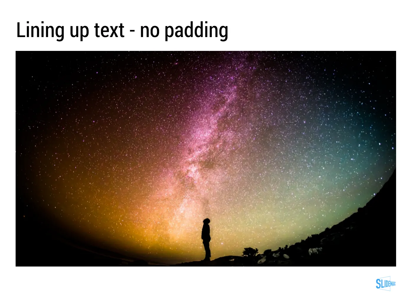
A post for the purists today. In PowerPoint, a text box and a rectangular coloured shape with text line up the same way: you hover them across the slides and “snap” lines appear that encourage you to line things up with items above or below. To do it correctly though, you need to make a small adjustment.

 A text box with a transparent background: line up the edges of the text (without padding) to the object below

A text box with a transparent background: line up the edges of the text (without padding) to the object below

 A text box with a coloured background: line up the edge of the box with the item below

A text box with a coloured background: line up the edge of the box with the item below

With my presentation app SlideMagic, you don’t have to worry about this. I remember “arguing” with my developer why this was an important feature :-)