SlideMagic Blog

Frequent updates about all things presentations since 2008. Subscribe to never miss a post.

RSS
all posts

Category Story

·McKinsey

First content, then structure

It might sound obvious, but it is not. Consulting projects start with a structure to lay out all the questions that need to be solved (let’s look at the market, let’s check our competitive advantages, etc. etc.) Some branches of theses “issue trees” (I made hundreds of them at McKinsey, Google “McKinsey issue tree” and you get a lot of examples) might turn out to be dead end streets, some branches might have to be expanded, re-written later on in the project. As more analysis comes in, the solution of the project will emerge, documented alongside the structure of your initial workplan. At this point I would say: cut, take a break, throw away the structure. Now that you have something to say, worry about how to say it. With the benefit of hine sight, build the structure that tells your story from scratch. Problem structure does not equal presentation structure.

·Story

Persuasive sales story - buying a rug in Turkey

Guy Kawasaki re-discovered this post about persuasion tactics in the Middle East. Worth thinking about when crafting that sales presentation that has the message “buy our product” written on every slide, starting with slide 1, rather than taking a bit of time to establish a relationship with the prospect and get him in a receptive mood.

·Investor presentation

Startup pitch advice available on the web

There is some useful material available on the web for entrepreneurs seeking to pitch their startup to potential investors. I will use this post to bookmark a few of them. Some of these are great, some of these are less good. Anyhow, here we go:

To be continued/updated later.

·Images

PowerPoint tracker pages - empty screen real estate

Tracker pages - they originated in the days of the overhead transparencies. You would take the content page of the document (very detailed bullet points), make a number of copies and draw a red arrow with a pen to the left of each menu item. I don’t like tracker pages, it’s a sign that either your presentation is too large, or the structure of your story is so unclear that you need a forced framework to remind the audience how many menu items they still have to sit through. “Pause” slides can help though. With a huge font, you cant put up a question, take a break in your story, build up excitement. What to do with the white space in the background. These type of slides are a great opportunity to insert images that do not fit into the presentation story, but offer great additional background. For example, in a company presentation of a consumer goods manufacturer, I used high-quality, page-covering images of typical Israeli supermarkets, bars, cafes, etc. Put a little white line in the background with subject, time and place. Other ideas (all related to company introduction presentations): close-ups of random employees, office locations that give a sense of the city you are located, etc.

·Story

How to start your presentation

The first slide of a presentation is even more difficult to construct than the last one. The worst introduction slide is a list of bullets that tells the entire presentation story - in a boring way. Because the presenter wants to be quick, generic, hollow statements are used:

  • "we have a great team
  • “we will have $100m revenues in 3 years”
  • “our architecture is scalable and flexible”

The audience has heard them before, these messages will not stick. Moreover, they can read faster than the presenter can speak, so after having read the first slide, it’s time to check email on your mobile or take a call in the corridor… Staying in the context of a start-up pitching for fund raising, what should be included in an introduction slide (could be more than 1):

  • Who are you? People are trying to figure you out in the first seconds
  • What is this company about “roughly”
  • A teaser or interesting story that gets the audience interested in hearing the actual presentation

Then the (short) presentation itself should do the work of delivering the messages, not the summary slide. Exception. I have seen good presenters get away with a bad opening slide. They put it up and start presenting a compelling story about their company, not using the PowerPoint presentatino at all!

·Story

Why write a heavy business plan that nobody reads?

Many of my start-up clients that go into a fund raising round want to develop a “heavy” (i.e., many pages) business plan in reality is nothing more than expanding a 30-page PowerPoint presentation into 100 pages of full text. “The potential investor asked for it”. A waste of time.

  • People don’t read it
  • It takes a lot of time and money to write it
  • It takes a loft of time and money to update it
  • Nobody updates it

I prefer maintaining and updating a good PowerPoint presentation with a special appendix (not to be presented on a big screen) that provides more detail on financials, workplans, etc.

·Story

The 60/20/30 rule of PowerPoint?

The relationship between the number of slides and the length of a PowerPresentation presentation is changing. Seth Godin claimed to have gone through 154 slides in 54 minutes “without a sweat”. At a rate of 1 slide every 3 minutes, we could change Guy Kawasaki’s 10/20/30 rule (10 slides, 20 minutes, font 30 or bigger) into 60/20/30. The “10” refers to the number of ideas you can handle in a presentation, not the number of slides. Obviously slides need to look completely different for a presentation like this, nothing like the bullet point loaded “overhead projector transparencies” we still see in too many presentations today. UPDATE: Today I stumbled on this interesting blog posting by Andrew Abela that clearly separates 2 types of presentations: ballroom-style (big audiences, beautiful graphics, few words, high page turnover, the 60 i.s.o 10) and conference room-style (the classical consulting project final report full of dense facts and figures).

·Concepts

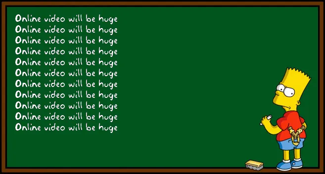
Chart concept - skipping over a cliche

There is no need to preach to the converted. Obvious points do not need your time, energy and PowerPoint slides. If you have to spend 1 slide, do it almost as a place holder, and add a bit of humor if you can to “pooh pooh” the cliche point you are just making. Next slide! I often use the above image for this using Addletters that allows you to put in any text you want.