SlideMagic Blog

Frequent updates about all things presentations since 2008. Subscribe to never miss a post.

RSS
all posts

Category Sales presentation

·Creativity

From memory

I realised that I hardly look back at my notes from a briefing meeting when designing a presentation. The big story is designed from memory, only for facts I need to revert to my scribbles.

I guess that your brain gets used to recording stories when you design presentations for a living. When I listen to someone (more important than seeing an existing presentation) I record the information by creating a story flow in my head that is more memorable than scribbles on paper.

·Concepts

On the way to average

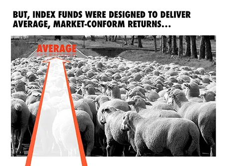
I designed the chart below for a sales presentation for an asset manager who is about to go on a roadshow to pitch a new investment fund to potential distribution partners. Yes, you saw that right, I did use a reflection effect.

·Keynote

Presentation design phases

Every presentation design effort goes through a similar process flow:

  1. Brainstorm of the content, sketching, scribbling
  2. Designing the big idea
  3. Creating the bulk of the content
  4. Small tweaks

You need to think about these phases when designing a presentation for a big deadline. Often, critical data for slides only becomes available at the very last minute. And most of the time, stakeholders only start to focus on the presentation in the last minute, and only when they see slides that are ready. The result: a lot of stress and sleepless nights. So what to do?

Early in the process, move from phase 1 to phase 2 and start crafting the critical slides that convey the most important ideas of your presentation, with imperfect data, maybe even without data at all. It forces senior management to get out of the blah blah blah zone, and gives specific input on the story line. When phase 2 is completed, nobody will be nervous anymore that the project might not come up with a good end result. Everyone is calm.

I find that a long-hand story board written in a word processor is equal to phase 1.5: people will react to it and give input, but when you turn that into slides, the whole thing can go upside down again. Push for phase 2 early, and do not get stuck in 2 pages of bullet points.

Now the bulk of the sweat work is phase 3. There is no reason to postpone that to the last night, you can prepare 98% of most business presentations with incomplete data.


Continue reading →
·Design

Look serious

It is difficult for a startup to sell to a big company. Even if your solution is really innovative, large companies prefer to work with financially stable, large companies.

The look and feel of your sales presentation can add to that nervousness in the under belly of a big-corporate purchasing officer. Looks to avoid:

  1. Amateurish layouts with childish colours and water cooler fonts such as Comic Sans.
  2. Overly cute, touchy feely, retro look and feel, especially when selling in a male-dominated corporate culture (sorry).

Now we all know that the a slick visual deck full of stories and very little text will do great in these meetings (option 3), but, there is one surprising other option (4): the big corporate, lots of bullet points, serious, boring slide deck. Purely from a look and feel perspective, you will fit right in with all the other technology vendors, unlike option 1 or 2.

If you cannot pull off option 3, option 4 is still preferred over option 1 or 2.

·Keynote

16:9 layout

The 16:9 format was invited for movies not for presentation slides. Over the past 500 years, there is hardly any print work in a wide 16:9 format. Text that spans a wide column is hard to read, and most diagrams, paintings, visual concepts are more square than rectangular.

If you want to design slides in a 16:9 format you could consider breaking some of the slide design conventions. Examples: putting a multi-line slide header at the top left or even bottom left of your slide, saving up valuable vertical slide real estate. Or maybe even simpler: leave a lot of calming white space on the left and right of your slide.

·Keynote

The big picture first

Doing the product spec slides of your sales presentation is relatively easy. The big picture, how you position yourself versus the competition is harder. It is tempting to start with the easy bits and worry about the difficult things later. Still, I suggest to take on the positioning first since all other slides will depend on it. Moreover, it is the overall product concept that you are selling, not the features of individual products.

·Keynote

Imagine your audience - literally

Yeah, yeah, we know that our audience matters and we should take it into account, but in practice, most of us dive straight into designing the slides.

Thinking of your audience is especially important for sales presentations. I have had a few clients situations where I was asked to help design decks that are used by a sales force that targets small business owners.

In those cases I actually imagine the actual/real owner of a restaurant or pharmacy who I have seen recently and wonder what it would take to convince her.

·Keynote

Market research lingo

Questions in market research surveys are long and wordy, partly because you need to make it unambiguously clear to your participants what you want them to answer, and partly because marketeers want to put their own language into the mouth of consumers (see a previous post).

When presenting the results of market research I often chop down these sentences to the bare essential. It makes them easier to digest. A small footnote sends people to an appendix where they can read the full prose.

·Keynote

Technology lecture vs value pitch

Two approaches to pitching your product. I prefer #2

  1. Engineering approach: explain the layered product architecture and the solution process, and after this theory lecture you can make a perfect logical case about why your product delivers this great value to your customer.
  2. Customer-focussed approach: highlight the big issues the customer has (to get that nodding head), go through the benefits that your solution offers and only hint at the technical magic that allows you to deliver them. If the customer is interested, you can do pitch #1 in a second meeting.
·Images

Project pictures

Many business presentations contain pages with images of projects: real estate, solar farms, factory installations. Usually, they are small, low resolution, many on a page, and backed up by a dense paragraph of explanation.

To make your presentation look better: do the opposite. Stretch them across the full page, use high res images, use 1 image per page, and set a brief explanation text over the image.

The audience will not notice that you clicked through 7 slides when discussing your project portfolio. For them, it is just one slide.

Another way to show off your portfolio is to use the images throughout the presentation on separator and title pages that mark the beginning of a new section in your story. So, you have 1 image on your portfolio slide with the explanation that is 1 of 35 buildings. The audience gets a sense of the other 34 throughout the presentation without talking directly about them.