SlideMagic Blog

Frequent updates about all things presentations since 2008. Subscribe to never miss a post.

RSS
all posts

Category Presentation

·Investor presentation

Writing for skimmers

Busy investors do not have (want to make) time for long verbose cover letters/emails for your presentation. Write for a skimmer:

  1. Keep it really short
  2. Cut out all management buzzwords and padding (synergies, engagement, strategic, flexible, ROI, etc.) that everyone else is using and which have become verbal white noise. Use conversational, human language
  3. Say how you got to her (our dads were in high school together)
  4. Say what you want early on (advice, money, intro to someone), and ask for a very specific next step.
  5. Prioritise interesting content of the pitch (unusual facts, case example, unexpected advantage over a well-known competitor (2x as many users as Facebook, etc.) over a well structured, complete, business school essay. You are not trying to get a grade for your mid terms, you are trying to get a follow up phone call.
  6. Make it highly/relevant/specific to her: complements portfolio company x, y, z, matches what you spoke about at a conference last week.
  7. Use typography to break the text, to make it easier to speed read: big concept, 3 (short) supporting bullets, another concept, supporting bullets.

·Keynote

Writing in a box

Newspaper headline writers are masters in packing a lot of information in very few words, link bait bloggers write titles that people just have to click on.

In day-to-day business presentations, you might not have time, energy, budget to come up with an artistic visual master piece on every slide. The biggest difference to the quality of your slides might simply be your writing.

  1. Cut words that add no content: in order to, etc., avoid passive sentences (Harry was seated on by a bird), management cliche verbs (monetize/strategize/analyze/incentivize)
  2. Avoid long words (small/narrow boxes create uneven line breaks)
  3. Think carefully where you break a line, do it manually
  4. Work with labels, introduce a short catchy name for a more complex strategy, option early on in the presentation, so you do not have to repeat the enter-the-Indian-market-first sequence all the time.
  5. Stay within the constraints, if you have 2 lines, do not make it 3.
  6. Emphasise the contrast between a series of boxes and cut text that is common to all of them: entry in China, launch in India, Japanese entry: becomes China, India, Japan
  7. If you have to, write exceptions or other details in a tiny footnote
·Keynote

Over edited

You write that paragraph, again, and again, and again. Share it with the team, incorporate the input, re-write, again, and again. In the end, you probably got a politically correct piece of prose, but at the same time you killed of the spontaneous, raw enthusiasm about why your company/idea is so great.

Maybe say the pitch out loud one more time and just write down what comes natural to you?

·Investor presentation

Meet me in Anchorage AK

I will be “presenting about presenting” in Anchorage, Alaska on August 14, at 17:30. The talk will be about how to pitch your ideas to investors. Details of the event can be found here on the page of AK Entrepreneurs Meetup community. Drop by if your are in the neighbourhood!

·Presentation design

From social media war to dialogue

I live in a tense part of the world and have observed many discussions on social media where people trying to convince others they are right. I convince people for a living, so I am jotting down some thoughts below on how to engage in these discussions, and hopefully turn war-like exchanges into dialogues.

In order not to have this post hijacked by a political discussion, I am leaving my political viewpoints out here. Here we go in no particular order:

  1. Be polite, correct, calm, composed, rational. Nobody believes a screaming maniac.
  2. Listen, listen, listen and look for a very specific mistake, misconception that can be corrected. Generic statements that answer another point then the ones raised are not useful and ignored.
  3. Set your ambition level. You are unlikely to correct someone’s fundamental beliefs in just 1 paragraph.
  4. Realise that your most important audience might not be the person you are interacting with, but rather the many more that glance over the comments, the secondary audience is bigger
  5. Make your point very personal, human, and show that there is a normal person on the other side of the line
  6. Nobody likes to see more detail of gory images or screaming graphics
  7. Be short and to the point, on social media, nobody reads long paragraphs. If your text is longer, add lots of paragraph breaks
  8. Be sure to engage/correct a big opinion leader with lots of followers/readers: polite, super short, very specific fact to correct a very specific mistake/misconception
  9. Use sources that are credible, close to the opposite site of you. Linking to a highly biassed patriotic web sites full of the wrong flags is not going to make people read them
  10. Highlight facts or details that are not widely known/used in the media
  11. Try not to start with me, me, me, but start with the opposing viewpoint and show why it is causing a problem. Understand the stereotype that the other side might have of you, and try to soften it (you can even refer to it directly).
Continue reading →
·Data visualization

Middle East friendships

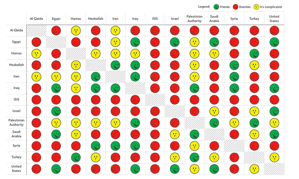
Slate created a beautiful map showing the complexities of the friendships in the Middle East:

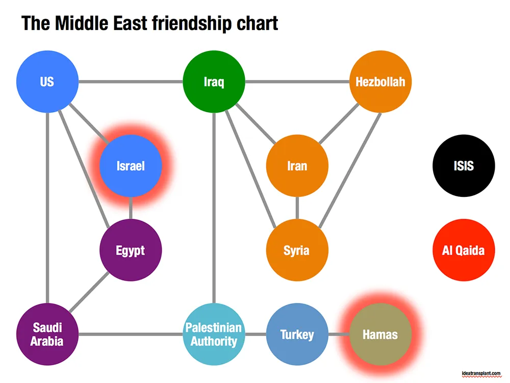
Go to the original here and click on each of the smileys for additional information. The message of this chart is clear: it is complicated. The same information can be displayed simpler by focusing on the just the green relationships. The following pattern emerges, highlighting among other things why it is so difficult to get Israel and Hamas to communicate.

·Images

Overwhelming images

Images are much better than words to amplify a message, but sometimes they can be too distracting. If people are staring in awe at this stunning photograph you found, they might just forget for a second about the message you are showing/talking about.

Image source

·Images

Twitter goes PPT

Twitter is keen to find ways to become more accessible to a broader audience, beyond the tech-savvy early adopters. The answer so far: images. Images grab the attention better than obscure hashtags and @ reply’s, and - sneakily - provides a way around the 140 character limit on a Tweet.

The results, lots of poor visuals. This large headshot is an attention grabber, but I am not sure whether Twitter users will take the time to read through the dense bullet points.

·Keynote

Problem - solution

Most presentation design projects can be split up in components, you can even have different people work on the individual bits. Two components go hand in hand though: convincing/reminding the audience of the problem, and presenting your solution. The way you portray the problem should guide the way you show the solution. In fact, the best way to show the solution is the highlight the problem.

·Keynote

I cannot read the footnote!

It is in tiny font, it has a light grey font, nobody can read it!

Perfect.

If the legal department insists on using footnotes, then they should be designed in such a way that someone who stands with her nose against the screen can read them. If you want to read them, you can, if you do not want to, you do not have to.