SlideMagic Blog

Frequent updates about all things presentations since 2008. Subscribe to never miss a post.

RSS
all posts

Category Presentation

·Advertising

Teflon headlines

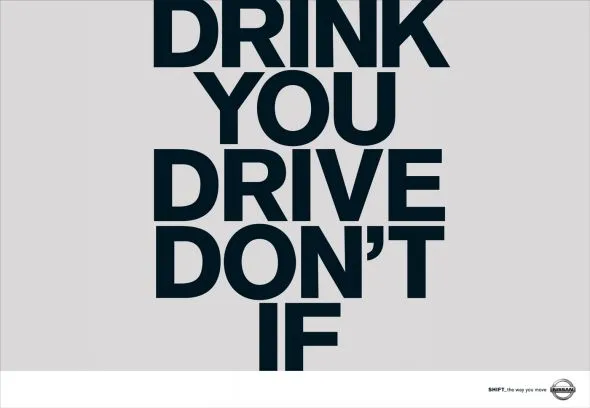
This ad is a good example of how your brain adjusts reality to what it thinks it should look like. I read this sentence the first time as “Don’t drink if you drive”, a familiar slogan.

I find myself doing the same thing when reading headlines full of buzz words and jargon in PowerPoint slides. Skim over it, and see whether there is something more interesting to be seen on the rest of the slide. A teflon headline, it definitely did not stick.

Try this book “Brain Rules” if you are interested in finding out more about how the brain processes information. Ad via Ads of the World.

·Design

If you can't explain it, you don't understand it

The best way to prepare a presentation is to practice on a complete (but intelligent) outsider. Even (maybe especially) if your audience consists of industry experts.

You see this often in pitches of technology startups to venture capitalists for fund raising. The entrepreneur is an expert. The VC audience knows a thing or two about technology. Buzz words, generic truths, and jargon fly through the room. The message did not come across…

Any intelligent person should be able to understand your story in 15 minutes, even if she does not have any background in your specific field of expertise. If she does not get the point, it is your fault, not hers.

·Data visualization

One of my investor presentations in the public domain

Almost all presentations I design are highly confidential. Presentations of publicly traded companies to stock analysts are an exception. Recently I supported Psion in designing their 2009 preliminary results presentation.

Most of you will remember Psion as one of the pioneers of PDAs and the Symbian operating system. After some M&A transactions, Psion today is a leader in the field of rugged portable devices used in ports, in warehouses and by police forces, just to name a few customer segments.

Back to the presentation:

·Design

VC pitch: don't spend time/slides on the obvious

Time is precious when pitching to a venture capitalist (VC) for funding your startup. Don’t waste it on things the VC is already convinced of. Examples:

  • Common beliefs, i.e., in 5 years from now people will be downloading dramatically more data to their mobile devices than they do today. This can be conveyed in 1 slide, or you can spend 15 minutes on it, showing all possible research that point to the same answer.
  • Specific VC beliefs. If a VC has told you in previous meeting that she is a true believer of - let’s say - the software industry moving into the cloud, you can save yourself the effort of trying to convince your audience of that point. Someone else did it for you.

One important note about common beliefs though: they could be wrong! If your perspective deviates from what everyone else is copying form each other, you (obviously :-) ) should spend time/slides on it.

·Design

Beyond images that just show things

Most stock images are descriptive: search for “ice cream truck” and you get what you asked for. The position the image puts the audience in, is at least as important (maybe even more important) than the object it represents. Look at this image of the inside of the Notre Dame cathedral in Paris (Wikipedia link). Six images stitched together to create the sensation of small child looking up to the ceiling of this vast place. It puts the audience inside the image.

Image credit: eso-teric, visit his site for a larger picture. I linked to these images as a source of inspiration (earlier post), check copy right restrictions before using them in an actual presentation. Found via TwistedSifter.

·Animations

It is still hard to do it right in Prezi

Here is a Prezi-presentation (see earlier posts) with some facts about the growth of data sent over mobile networks. Praise for Byte Mobile to experiment with different presentation formats. Here: Prezi is used in the following way:

  1. Animated slide transition
  2. Zoom in on the title with the message of the chart
  3. Zoom in on the data in the chart
  4. Zoom in on the foot note with more detailed explanations

Bytemobile Mobile Minute Metrics - Feb 2010 on Prezi

For me, this is not yet the best way to use the power of Prezi. But if you ask me what is the right way, I must admit I do not have an answer yet.

·Animations

More motion graphics about the size of the Internet

Another motion graphics video, again about the size of the Internet. This time by graphics designer JESS3. My opinion remains unchanged:

  • Beautiful graphics, and a beautiful color scheme
  • But (moving) text is not the best way to visualize the billions and millions

I do however like the slowly moving time line with the launches of social networking sites over the years towards the back of the video.

Found via Nancy Duarte.

·Advertising

Subtle light effects in fonts

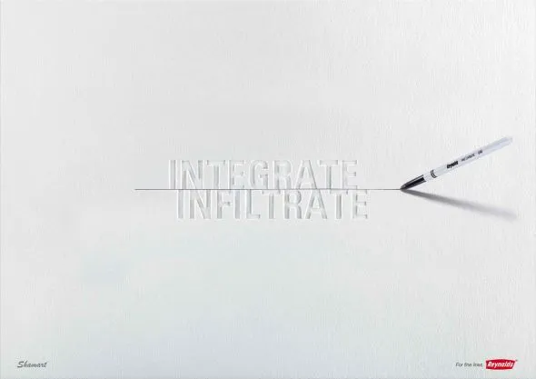
Inspired by this ad, here is how to create the effect of fonts that seem sunk below the surface in PowerPoint 2007 (as shown in the last 2 images).

  1. Choose a background color
  2. Enter text, preferably in a fat font (I used Helvetica Neue Heavy in this example)
  3. Select the text, go to format, text effects, shadows, and pick inner shadow with light from the top
  4. In text effects, pick a text fill that is just slightly darker than the background

Via Ads of the World

·Design

Off topic - amazing Rube Goldberg-style video

I have always dreamt of using a Rube Goldberg-style animation in a presentation (earlier post). Watch this video.

·Delivery

Gaining the confidence to tell your story, your way

The more you practice, the more you rehearse, the more you get on top of your story. And the more comfortable you get with your material, the more confident you get in delivering it. Confidence goes beyond getting rid of fear of public speaking, confidence enters chart design and story telling as well.

  • The confidence to get rid of “business school”-style structuring frameworks: let’s talk about the market, let’s talk about the competition, let’s talk about the distinctiveness, etc. and only spend time on those issues that really matter for your particular story, in the order that best fit your specific situation
  • The confidence to use personal stories and case examples to illustrate your point
  • The confidence to make your charts more minimalist and more abstract
  • The confidence to insert blank/black/white slides inside your presentation to have the audience just focus on you

It is a bit like the abstract painters of the last century: having the confidence to communicate emotions and ideas without relying on realistic techniques. For example Piet Mondriaan’s Broadway Boogie Woogie painted in 1942-1943.
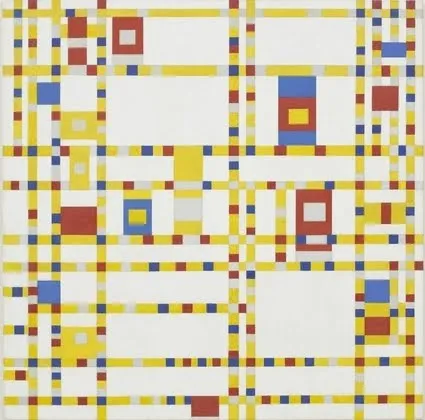
The pulse of a Jazz beat, and the energy of the New York traffic squeezing its way through the city’s grid all captured in one painting without showing Jazz bars, Times Square neons, and/or New York traffic jams.