SlideMagic Blog

Frequent updates about all things presentations since 2008. Subscribe to never miss a post.

RSS
all posts

Category Presentation

·Design

You are better at line wrapping than PowerPoint

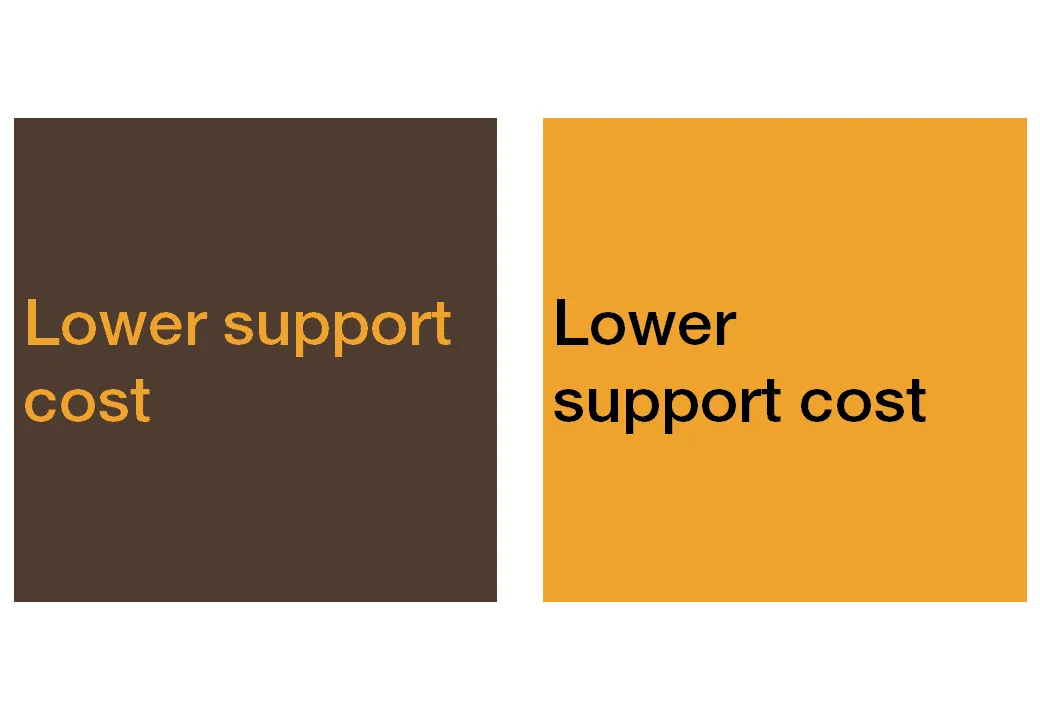
When you starting using fewer and fewer words on a slide (keep up the good work!), line wrapping becomes more important. Make sure that words that should be connected, stay connected, and enter a manual SHIFT+ENTER if you need to deviate with the automatic option.

·Design

Image sequences to set your audience's mood

Presentation designers can learn from film directors. Inserting a sequence of good (and real) images can take your audience from the conference hall to a different place. Beautiful and sad at the same time, click through some of these urban decay images to get the feeling: here, here, here, and here.

(Image by Yves Marchand & Romain Meffre)

·Design

Google Docs as an alternative to YouSendIt

File sizes are getting out of control. YouSendIt is a tool to overcome size limitations on email attachments, but it has one big drawbacks though: confidentiality. If you do not sign up for the premium version, anyone who gets her hands on the file link can download it.

One solution is Google Docs. Recently, Google updated the service and it is now possible to upload and download files that are not in Google’s propriety format. Plugins such as OffiSync create a seamless integration between Microsoft Office and Google Docs. The advantages:

  • Tighter security
  • The ability to maintain one master document that you iterate, rather than emailing multiple versions of the same presentation around.
·Design

Presentations versus spreadsheets in the cloud

I am making radical shifts to the way I work with my IT infrastructure. Over the past week, I have moved many of the software tools I use “in the cloud”.

  1. I stopped using Outlook and are now managing email through gmail with a custom domain (tagging, search, excellent spam management and the Outlook PST files simply became to big to manage locally)
  2. My client invoicing is now run via Freshbooks (affiliate link), enabling clients to log in directly into my system
  3. I am experimenting with Google Docs and Microsoft Office Live to set up shared workspaces with clients
  4. And last but not least, I started to experiment with spreadsheet and presentation software in the cloud.

I am learning a lot here, and get lots of inspiration for new blog posts, but let’s talk about one thing at a time: how likely is it that presentation software such as PowerPoint will move into the cloud. Unlike spreadsheets and databases, I am not that optimistic.

At first sight, it seems like the benefits of going into the cloud should apply to presentation software as well: access from anywhere, group collaboration, easy sharing, no more file size issues with storage and email.

There are two aspects to cloud processing: online storage and collaborating with shared files using online tools. Online storage is incredibly useful for presentations, files get increasingly big/harder to email. It is the online collaboration that is the problem.

  • Unlike a spreadsheet, the design and look and feel of a presentation are paramount. If the fonts are a bit off, if you cannot position the object exactly as you want it, if you cannot use all the colors you would like to use, you are in trouble. Moving back and forth between PowerPoint and online editing tools will drop a few formats here and there.
  • Collaboration on presentations is different than collaboration on a spreadsheet. Presentations are very personal. Having someone else edit my slide, add a bullet here and there, change the title disrupts the design process. I welcome input, but like to keep control of the pen. (To contradict myself: the one exception might be the slideument, where slideware is used as a vehicle to write a document rather than prepare graphics for a presentation.
  • The number of toolbars, shortcuts, functions you use in a presentation program is far greater than you use in a spreadsheet tool. At least, that’s the case for me. I have created incredibly large and complex Excel files basically using “+” “-” “*” “/”“sum” and some basic formating. A presentation design interface is more complex, and people will find it more difficult to migrate. This is why Prezi is having trouble taking off.
  • After a presentation, the slide document often starts to live its second life, becoming a source for “Frankensteined” follow-on presentations. 99.9% of people who Frankenstein use PowerPoint.
  • The sharing element is different for presentations and spreadsheets. Some presentations are aimed at getting the widest possible audience, just uploading them to a tool like SlideShare (without group editing capabilities) is enough, while this is almost never the case with a spreadsheet, that needs to be edited in a small group that can access the confidential data.
Continue reading →
·Design

Optical illusions - the brain just sees what it expects to see

Another example of how the brain just fills in the missing blanks . Unless you are one of the 0.7% of people who suffer from schizophrenia, you are unable to instruct your brain to see the hollow side of the rotating mask.

Remember the lazy visual brain when designing slides. The brain tends to follow lines in the reading direction, and sometimes finds it hard to spot the word “not” in a sentence, just to name a few examples.

I can recommend the book “Brain Rules” if you are interested in learning more about how the brain absorbs (and does not absorb) information.

Thank you Orli Naschitz and Dep for pointing me to this.

·Design

Retro formats

Here is an unusual presentation format. Hand-draw your slides, photograph them, and paste them back on slides. I like it.

Let Out the Creative Beast

·Design

Frankensteining a slide deck

Frankensteining”, what a brilliant verb! Most people have been tempted to stitch together a slide deck quickly by yanking slides from old and/or other people’s PowerPoint presentations.

  1. Open all presentations, go to slide sorter mode
  2. Copy and paste any slide that looks vaguely relevant into a new file. It is even cooler when you know this little trick on how to preserve formats when copying slides across.
  3. Re-shuffle the order of the slides and add agenda tracker pages
  4. Skip the bit about practicing
  5. Done in 1 hour and 34 minutes

It will not be surprising that the end result is not a good presentation. It is not your story, you do not completely understand it, and if you do not understand it, the audience won’t either.

The better way to Frankenstein:

  1. Sketch your story on a piece of paper
  2. Add simple slides to support the key elements of the story
  3. Go back to the graveyard of old slides to add backup slides where you need them (“here is the full architecture of our global CRM system, as you can see it is really complex” [* click next slide *])
·Delivery

Boring conference panels

The panel session with the CEO of Twitter bored the audience in a recent on-stage conference interview. And Mark Suster recently wrote another excellent post about conference panels.

I have sat through so many boring panels in business conferences here in Israel. The boring panel recipe:

  1. Try to find as many prominent individuals as possible to feature as speaker on the conference invitation flyer
  2. These people are busy, so you do not require a lot of preparation from the panelists
  3. Get a verbose moderator: long panelist introductions, long questions, [short answer], long recaps of the answer

An easy way to fill 45 minutes, but not a very good way for the audience to spend its time. You cannot wing a presentation, you cannot wing a discussion panel. I wonder why it is that most people go to conferences to meet people in the coffee breaks.

·Design

Why school text books are so boring

School text books and many business documents are written with the content creator in mind. Organized in sections, a clear structure nicely summarized in a detailed content page (or a PowerPoint agenda tracker). We make a point, provide supporting arguments, repeat the point, go back to the tracker page, open the next section, repeat. Perfectly organized, perfect logic. Studying equals forcing your brain to memorize a sequence of bullet points against its will. (“Hey, the first letters of each point make the word A-P-P-L-E when I swap the last 2 bullets!”)

Stories are sequential, they are not designed to reference back to later by jumping to section 3. Stories have no tracker pages. Stories arrange their points in such a way that they are most interesting and memorable, maybe the most important message does not come first. Stories use analogies.

I am not advocating to abandon all structure in presentations. But still, have that school text book in mind when designing your next series of slides. Maybe your 30 minute presentation should be a story, maybe your 200 page final document should be a text book.


·Data visualization

Putting data labels where they work best

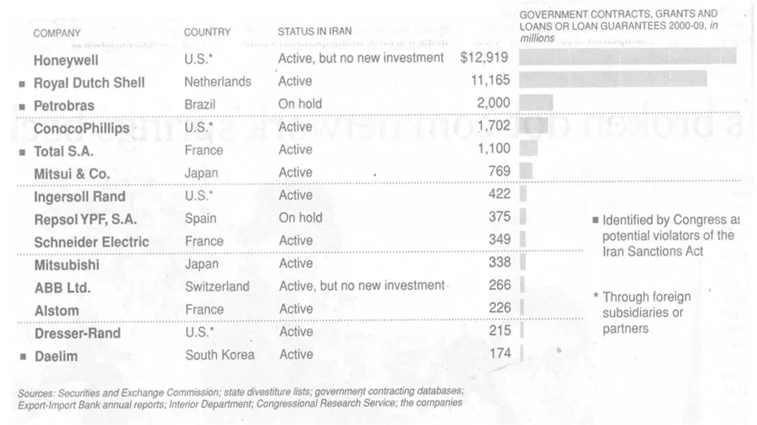
In consulting firms such as McKinsey, there are very strict rules about formating slides. Data labels for example are always placed outside the horizontal bar. The chart below (ripped out of its context from this NYT article) uses a different approach:

The data labels are placed next to the horizontal bars where you would expect the axis labels to be. I am fine with this approach. The relative size of the bars gives a global view of the order of magnitude of the values, and for whomever is interested the data labels provide the exact values.