Re-post: cutting words and still say the same
An excellent list of words you can lose on a slide here.


Frequent updates about all things presentations since 2008. Subscribe to never miss a post.
An excellent list of words you can lose on a slide here.
A semi-transparent background shading greatly improves the readability of chart titles. See how to do it here.
If you are not running PowerPoint 2010 (review), then the 2nd line of a bullet point will always come out wrong. Here is how to fix it.
Waterfall charts can X-ray a complicated story. Here is an explanation about the technicalities of creating one in PowerPoint, here is an example of an application.
When Frankensteining a deck (i.e., stitching a new presentation together from old slides), there is nothing more annoying then slide formats that go crazy when pasting in slides. Here is a trick to avoid this.
One of the best-kept secrets of PowerPoint is the selection pane, that allows you to remove overlapping objects from a slide temporarily to make it easier to edit layers. Details here in a previous post.
PowerPoint makes it possible to morph text in a circle, read the details here in this earlier post.
Over the next few weeks I will be spending more time with my family, and less online (similar to what I guess many of my readers will do). Posting frequency will drop, and I will be re-posting some earlier post that I think could be useful for readers that have only joined this community recently.
These little annoyances in presentation design, the word “management” is one of them. You need it very often, it is relatively long, and it does not look good/readable when hyphenated. How many slides got a 2nd best design because of this word…
Painters first make a sketch before starting the final painting. Presentation designers should do the same. I have a big pile of old print outs that is my unlimited source of scrap paper. An important slide can take 5-10 page-filling rough sketches before turning to the PowerPoint editing screen.
I always carry one of these beautiful notebooks (affiliate link) with me to capture an idea that pops up in my head. Yes, a notebook and not an application such as Evernote on my iPhone because the idea is most of the time a sketch or a scribble. Hard to do in digital format.
The end of my most productive/creative days are always marked with a full paper trash can next to my desk.
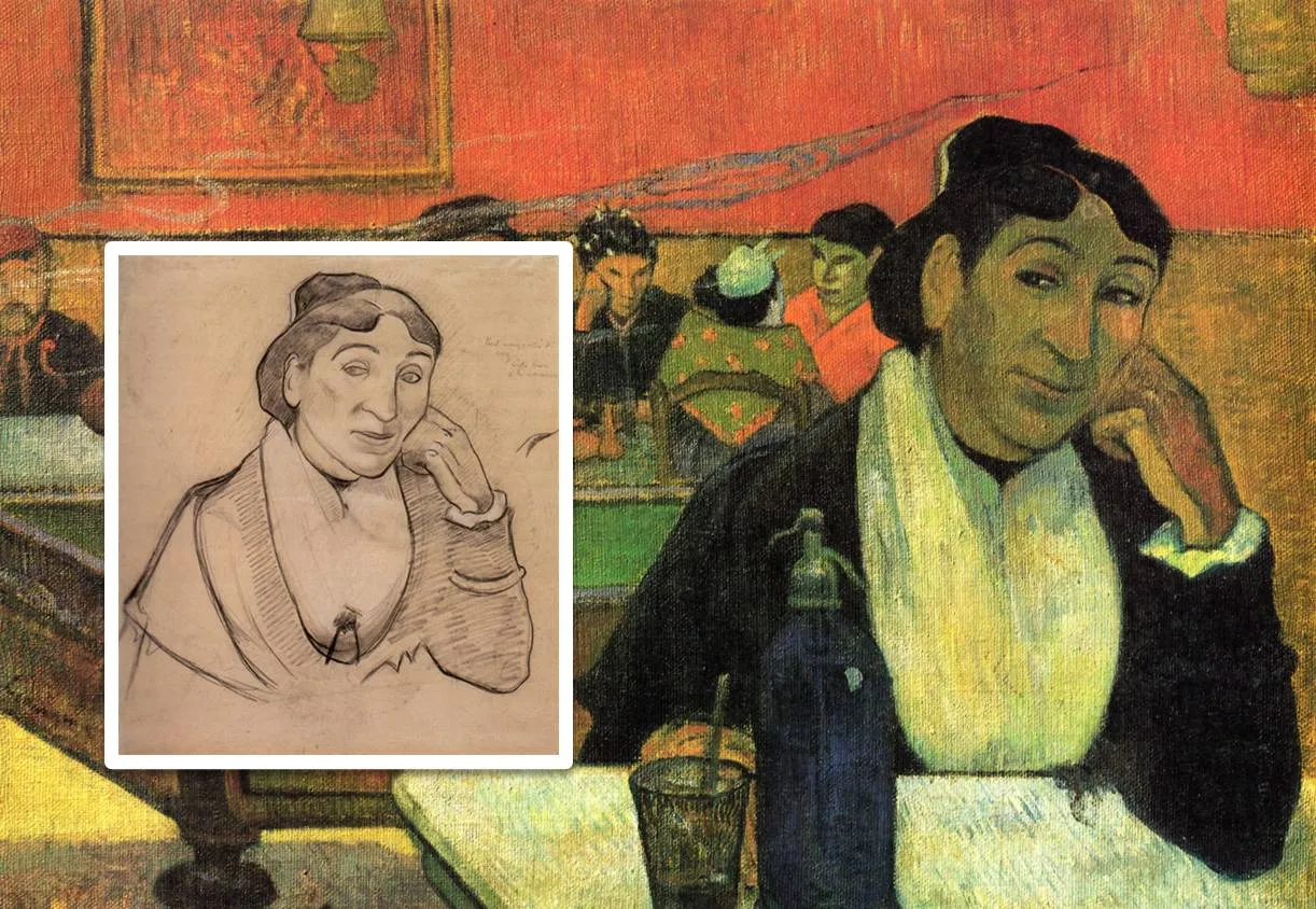
The painting is Gauguin’s night cafe, info about him and Van Gogh painting at this location here and here.