SlideMagic Blog

Frequent updates about all things presentations since 2008. Subscribe to never miss a post.

RSS
all posts

Category Presentation design

·Books

Book review - The visual dictionary of typography

The Visual Dictionary of Typography (affiliate link) is a nice little book that explains 250 concepts in typography, each using a visual example. Dictionary is the wrong title, this is not a reference book, but rather something to browse through and explore. I stumbled on many terms that I have never heard of before. On the other hand, the book also contains some entries that are a bit forced: music for example.
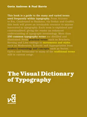
Here are the entries for the letter V to give you an example of the contents:

  • Vector
  • Vernacular
  • Vertical alignment
  • Virgule

All in all a nice little book, I would get it in print rather than as an eBook.

·Delivery

[VIDEO] Here is live audience interaction for you

·PowerPoint

The presentation snowball

Sometimes it is a enough for a good slide deck to make a small difference in order to win the big prize. Take fund raising for example.

  • A good slide deck gives you a slightly higher probability of getting through the email screen
  • Better slides lift your confidence just a tiny bit when presenting
  • When your presentation is better, you get more meetings, you get to practice more, your story gets better, you get more meetings

Even a small difference can have a big impact.

·PowerPoint

[VIDEO] NYU presentation on VC pitching

After the introduction presentation by venture capitalist Mark Suster, the people over at SalesCrunch are now starting to post the videos of my own NYU presentations online. Yesterday number 1 (out of 7) went up, and it provides a much needed audio track to my slightly cryptical slides.

·PowerPoint

Speaking at the Technion in Haifa next week

Just a heads up that I will be speaking at the Technion university in Haifa next week June 1. My presentation will be part of BizTec’s Annual Pitch Competition. I will be talking about how to design effective fundraising pitch presentations to venture capitalists and other investors. The details of the event can be found here.

·Art

Art Authority for Mac

I reviewed Art Authority, this great art catalogue for iPad earlier, and I just bought the same application for the Mac.

The bad news, the user interface is a lot worse than the iPad. You browse art in finder windows, sometimes via HTML pages.

The good news, working with the images is a lot easier. Since a good keyword search mechanism is still missing, a very large monitor makes it easier to browse icons of paintings. You can have multiple thumbnail windows open, and leave them open for a long time.

Ten dollars well spent. Twenty dollars well spent if you buy the iPad app as well.

·PowerPoint

Tilting Google maps

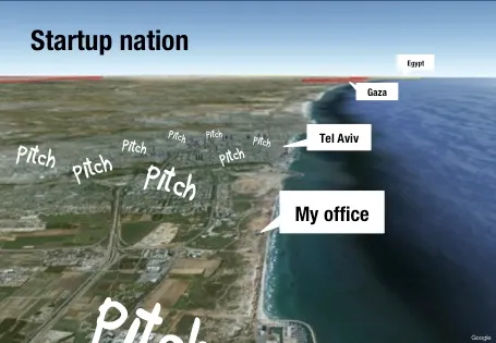
Someone asked me how I managed to create this image of my office location in a recent presentation.

The secret is in an earlier post about tilting Google maps. Pay attention to the angle that the satellite camera took when taking images closer to the ground. Rotate the image in such a way that shadows look natural.

·PowerPoint

Presentation design and web design

In many of my presentation design projects, the content of the presentation is already 80% available on the client’s web site: a startup with an exciting new technology, the strategy of a big Fortune 500 company. But it clearly does not a good job at explaining the messages in an interesting visual way. (Otherwise you could just put a modified version of the web graphics as the background to your presentation).

Over the past years, we have learned a lot about effective design of presentation visuals. Maybe web design is next, and can learn from this process? Fewer buzzwords, fewer environmental policies, less prominent contact details. If bullet points and clutter do not work in a presentation, why would they work in a web site? Instead: the web page as a clutter-free presentation canvas that tells your story.

The implication will be that, similar to presentations, we get a level playing field in web design. A good web site template that can handle big images and sliders is all you need from the technical site. That is the easy part. The difficult bit is to get the story right.

·Advertising

Photo compositions that hurt the eye

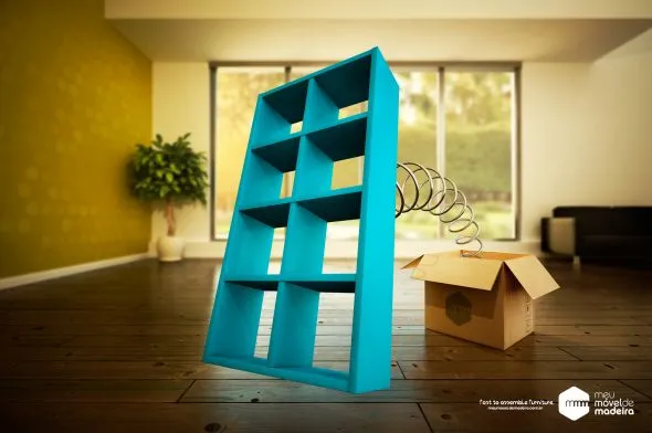
Photo editing software can do a lot, and it is getting increasingly used in advertising. This ad however shows its limitation. When you try to be photo-realistic and it is not 100% right, it just hurts the eyes. The concept behind the ad is good, the execution not.

Via Ads of the World.

·Investor presentation

Mark Suster on pitching to VCs

The great people of SalesCrunch are beginning to put the videos from my New York presentations online. First up is Mark Suster, a well-known venture capitalist from LA who introduces my presentation on pitching VCs

Mark is one of the best VC bloggers around, and I was honored when he offered to introduce my presentation in New York in person. We found out the night before that we happened to be in the same city (it is a statistically low probability that 2 people from Tel Aviv and Los Angeles are at the same time in New York).

More videos to come. Thank you Ann Lupo for the video recording and editing.