SlideMagic Blog

Frequent updates about all things presentations since 2008. Subscribe to never miss a post.

RSS
all posts

Category Presentation design

·Investor presentation

In the Valley early October

I will be mentoring at a startup event in San Francisco early October. If you are interested to catch up, contact me. The Bay area is a big place, but maybe we find a time to be in the same place. My main presentation might be open to the public, more details to follow.

Image via WikiPedia
·Keynote

Freelancing and Uber

Here is a comment I posted on Fred Wilson’s blog about the inevitable rise of market places for professional services, just like Uber did for taxi drivers and passengers.

Perspective from a freelancer.

Platforms/algorithms will do an “Uber” to many professions including probably my own field: presentation design. Competition/bidding to find effective market clearance. In quiet months, prices go down, you want something done tomorrow: pay for it.

For a freelancer, I think this is ultimately a race to the bottom (Godin speak). The only profitable way to build a freelance career is to work on a distinctive personal micro brand in a super niche segment, with an ever growing base of happy clients.

Maybe you use a platform to get started, but the winners will be able to wrestle themselves loose from the platform. Like the best freelancers today are often the ones that freed themselves from high paying consulting, advertising, or investment banking hierarchies.

·Data visualization

Readability

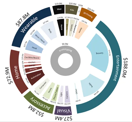
Here is a data chart that was published in TechCrunch, it shows a breakdown of crowdfunding-sourced investments in hardware.

The scattered pie chart looks nice, but is not easy to read:

  • A lot of data and many label are positioned upside down
  • The $ and M signs clutter up space
  • A lot of text is too small

Also, PowerPoint is not very well equipped to make charts like this. You see how the exploded pie points do not line up perfectly, and how the text is not curved right.

To make it readable, I would go for 2 stacked columns, one for the total categories, one for the sub categories. Put horizontal labels to the left of the totals, and to the right of the subcategory column. Use colours to link totals and subcategories together (like it is done in the above pie).

If you wanted to go fro an exploding pie as indicated above, do not explode the pieces in PowerPoint, but rather use extremely fat white lines around the elements of a regular pie to get a more organised diagram.

·Keynote

We need video!

Before investing a lot of time and money in designing a video to complement your presentation, take a step back and think why you want it, then brief the designer accordingly. Some uses of video are more useful than others:

  1. A spectacular, wow, stunning, noisy, beat drumming, flying effects filled, splash opening that leaves the audience shuddering in their chairs
  2. Customer testimonials and/or other interviews of people that are hard to bring to the presentation room
  3. An explanation/demonstration to show how your product works, is used in practice
  4. A high-paced, scripted story
  5. A funny, cute cartoon to support your message
  6. A complex animation that is hard to execute in PowerPoint or Keynote
  7. A narrated slide sequence that you can send to people you being present to explain it
·Images

Non-stock stock photo sites

A friend of mine posted a question on her facebook timeline: where to get stock images that do not look like stock images. I am shamelessly copying the list of URLs that were posted in response:

http://unsplash.com/ http://thestocks.im/ http://www.stocksy.com/ http://thenextweb.com/dd/2014/05/15/53-free-high-quality-image-resources/ http://www.caddis.co/blog/free-quality-non-stock-photo-resources-for-blogging

Post by Shira Abel.

·Investor presentation

If your edge is the team...

…well, highlight it. In most presentations the management bios are all crammed on one page in the presentation. If you are starting a company and your team is the only asset, you might as well spend a bit more time/space on it.

·Delivery

Then the usual blah, blah, blah

And after that we come in with the usual “blah blah blah” pitch. I hear this often in briefing meetings.

  1. You are offending your audience
  2. You probably do not believe in your own story
  3. You have become tired of given the same pitch all over again
  4. You are probably winging the story, a true blah, blah, blah experience for your audience

Invent a fresh approach to telling your story, believe in it, and stand for it. No more blah, blah, blah in the story outline.

·Investor presentation

The opposite of a job interview

Y Combinator, a successful early stage investor, is opening its applications for the Winter 2015 program. Their advice on how to apply successfully (2009) is full of valuable advice that I apply daily when helping people to design investor presentations.

The advice is targeted at the first phase of the investment funnel: sending in a cold email with your pitch in the hope of getting an opportunity to talk in person. Paul Graham mentions a few times that writing a pitch to an investor is different from writing a CV to an HR person in a huge company.

  1. Be extremely concise. Cut fluff, buzzwords, jargon. “every unnecessary word in your application subtracts from the effect of the necessary ones” These people read about 100 applications a day.
  2. Say what you are doing, people need to put you in some sort of box to start thinking about your idea. Even if this means that you run the risk of limiting/narrowing down the upside potential of your idea.
  3. Realise that your write-up is an excuse to figure you out, see how smart you are, how good you are at getting things done. It is not about your idea, it is about the insight you bring with the idea. Did you anticipate the obvious questions any intelligent person might have?

It is well worth to read the whole article.

·Keynote

Slide negotiations

There are different uses for a PowerPoint deck. One is to serve visuals for a live presentation. Another is a replacement for a word processor. I currently use it as a user interface design tool for a web app (the irony: PowerPoint is designing its own successor…).

In big corporations, a PowerPoint file is often the working document that different stakeholders use to negotiate on strategy, budgets, or planning. Through a series of meetings, a document iterates towards a solution that is acceptable to all parties involved. The slides do not have to be attention-grabbing, emotion-triggering, memorable calls to action.

Instead, often the most important part of a slide is the detailed footnote that summarises the compromise that has been reached after 3 weeks and 6 meetings. Others: the order in which the boxes are placed on the slide, the relative position of the boxes, dotted lines versus straight lines, preliminary versus final decisions, etc.

Use PowerPoint for whatever you want to use it, do not mix things up though. Budgeting presentations should only be used in budgeting meetings.


·Keynote

Who do you need in the briefing?

Many clients suggest to bring all experts that contributed to a project to the presentation design briefing meeting. I actually prefer to have a briefing meeting with just one person: the presenter. The experts have done the work and delivered the solution. Now it is time to focus on how to tell the story. A one on one conversation is the best way to bring it to the surface.