SlideMagic Blog

Frequent updates about all things presentations since 2008. Subscribe to never miss a post.

RSS
all posts

Category Presentation design

·Design

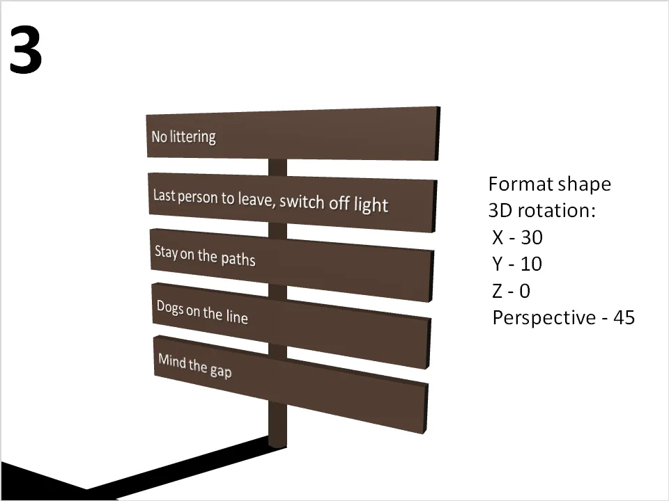
Looooong shadows to add depth

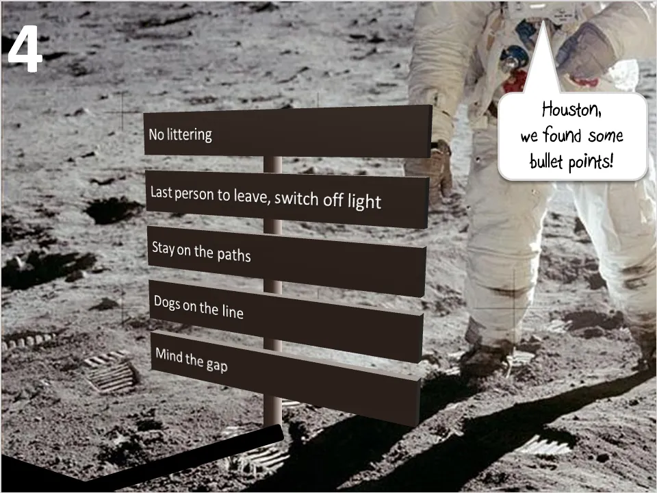
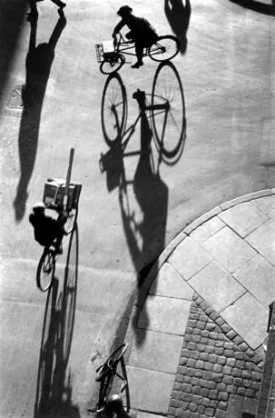
Long shadows can add great perspective to a slide. Lucky Luke needs them to show off his speed. Photographers like Heinrich Heidersberger have used them nicely in photo compositions (see the “Street Scene” image below)
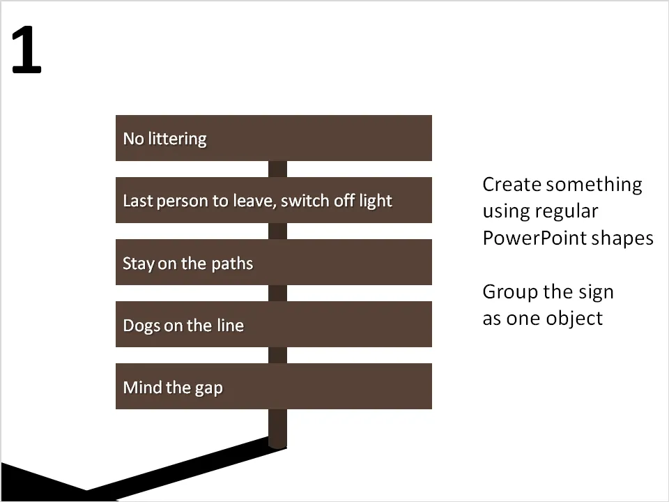
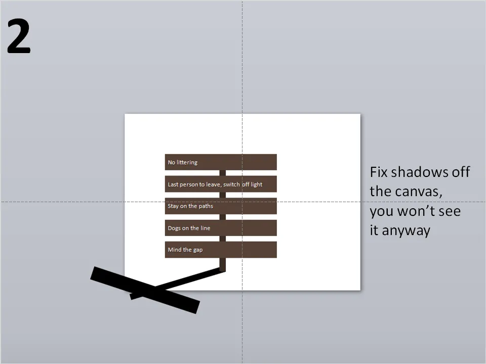
They are very easy to make in PowerPoint. I suggest forgetting about the built-in shadow functions of PowerPoint, they can be tricky control. Instead, draw your shadows using rectangular boxes. Below a chart that can be used as a setting to display the 3 (or so) key messages of a presentation on a final slide (excuse the bullet points):
·Design

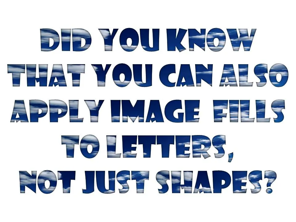
Filling PowerPoint letters with an image background

A neat trick. Select your text, go to “format” and select “text fill”. The font I used in the example below is “Showcard Gothic”.

·Design

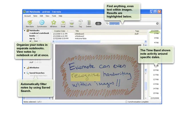
Evernote - your note pad always with you

Presentation design needs time. Squeezing out the last slides the night before the deadline will make your presentation look like, well, a document that was squeezed out the night before the deadline (most management consulting presentations). Give yourself lapse time to complete your presentation. A day of work spread out over a week gives much better results than sprinting from 18:00 to 02:00.

Most ideas come at times and places when you least expect it, and when you don’t always have a note book around. Evernote seems like a useful tool. Capture things on whatever device is convenient, but most importantly, archive it and make it searchable. This archiving is the most important feature I think. Finding notes, mobile phone images, yellow stickies, I lose most of them.

Maybe a special case of Fred Wilson’s “watch later” concept: stumbling on things when you do not have time to deal with it, putting it away somewhere for later access.

Via Lifehacker

·Design

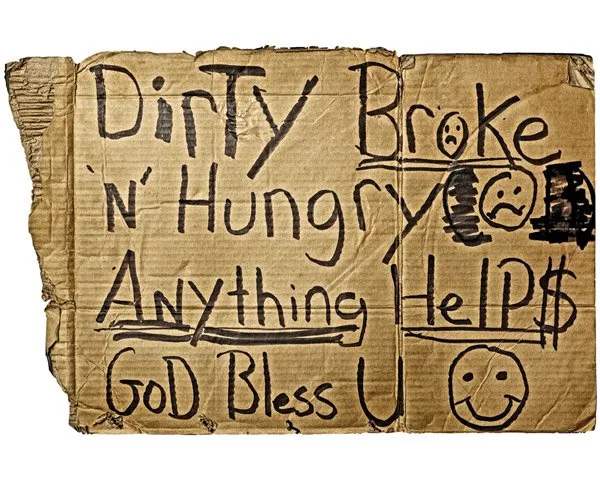
Homeless signs

Weekend reading. A site with signs and portraits of homeless people. It makes you think. You got a piece of card board and a marker (in fact that’s all you got), now write the best “pitch” slide you can…

Via Swiss Miss.

·Art

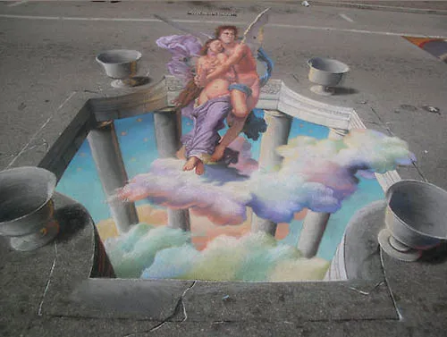
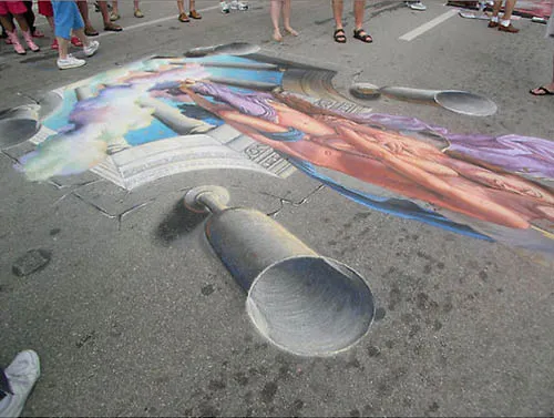
3D pavement art

Three dimensional street artists try to create the illusion of a 3D composition jumping out of a flat surface. It results in some stunning pictures. Especially interesting are the images taken not from the viewing position but from the side, giving you an opportunity to see the enormous distortion the artist applies to make his effect work.

Some 3D pavement art links:

A video how Edgar Mueller goes about making one of his creations:

·Design

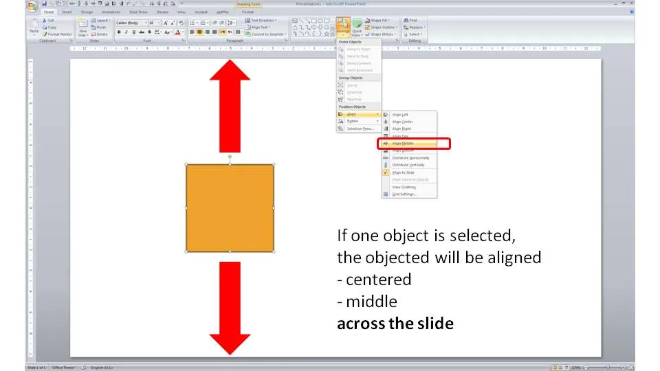
One click centering across the slide

Usually you use the align tool bar buttons (essential tool bar elements) to line up/center multiple objects. If you just select one object and hit a “Align Center” or “Align Middle” button, PowerPoint will center the object across the slide.

·Cartoons

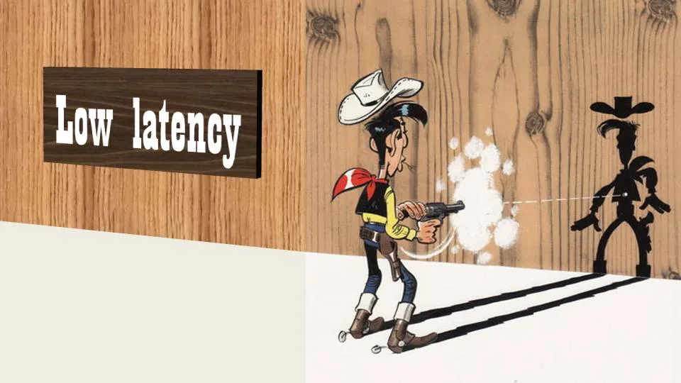
Chart concept - Lucky Luke and low latency

Cartoons can enhance a presentation. You need to strike a fine balance though with inviting a laugh from the audience, and trying to get your point across. People do not have time to read through a cartoon plot. The idea behind a slide should be instantly recognizable. Using classical cartoons can help. People have seen them before. Here is one that can be used to describe the low latency of a technology product. Lucky Luke, the man who can shoot faster than his own shadow. That’s pretty low latency.

The extension of the cartoon with PowerPoint shapes is not perfect. I used the “oak” standard texture, and the “Playbill” font to give that nice Wild West feel.

·Design

Interior shadows can be a nice change

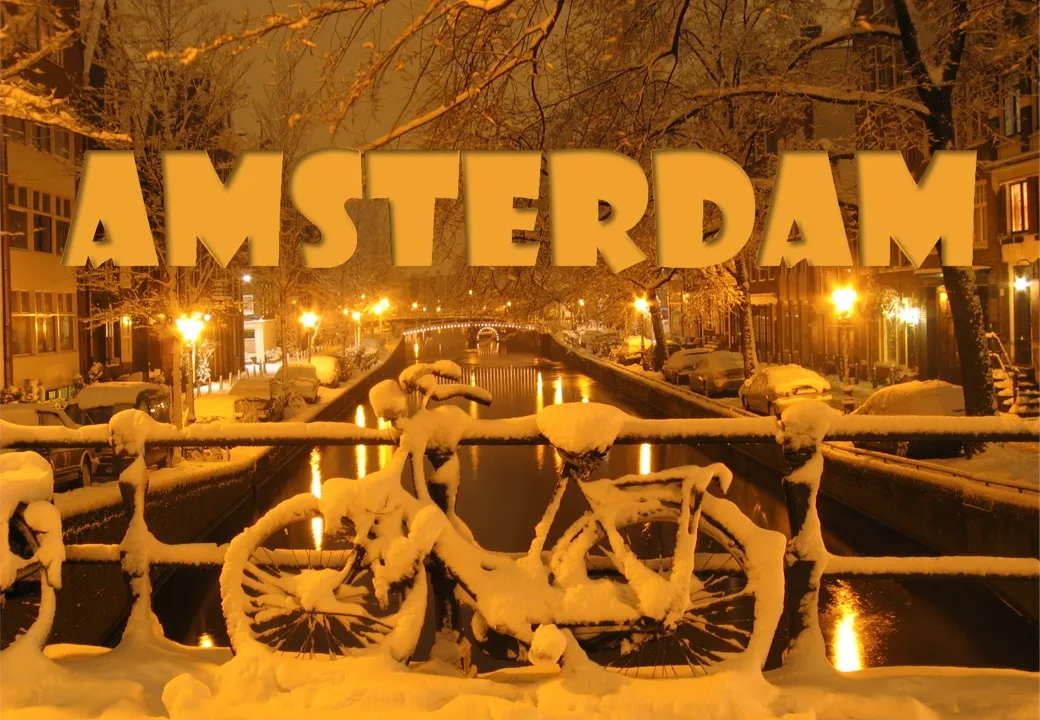
When people (ab)use shadows in PowerPoint, they mostly use the drop shadow, to make an object stand out from the canvas. The opposite, the interior shadow can give a beautiful effect as well. It makes the object, or letters fall back in the background.

See the example below of a slide taken from my presentation about fund raising presentations (explaining a bit about my personal and professional background).

Make sure the direction of the shadow is always vaguely similar to the lighting in the background, the Amsterdam street lights in this case. Use a character color that is similar to the tone of the image.

·Advertising

The blunt photo composition

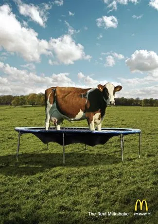
Technology allows you to create almost any photo composition. Professional use PhotoShop, but you can get some pretty good results in PowerPoint as well. As with many technology tools, the fact that they are available does not mean you have to use them.

Photo compositions that are “blunt” are more likely to invite a laugh from your audience than help you make a serious point. My opinion. What do people think? (McCow taken from Ads of the World)

For some great Photoshop creative work check out FreakingNews.com

(This post-flood New York image by Mandrak)

·Design

A professional presentation does not mean a slick presentation

Seth Godin picked a T-shirt print provider based on a clean and professional looking web site and a straightforward pricing policy because it conveyed a sense of trust. There are lessons for presentation designers here.

It is good to invest in your presentation design. Over-doing the graphics though might give a negative return on investment:

  • Highly complicated and sophisticated slide backgrounds
  • Big graphical elements in the template, repeating on every page, leaving no space for the actual chart
  • Drop shadows, bevels, glows, gradient fills, and reflections galore
  • Professional, highly detailed, illustrations exported from Illustrator into PowerPoint
  • Spectacular animations and slide transitions
  • Beautiful, but too obvious/cheesy stock images

We can all imagine a slick sales person (cars, kitchens, insurance). Do we trust them?