Steve Jobs quotes
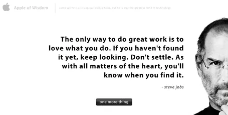
The site Apple of Wisdom is packed with quotes by Steve Jobs. Useful to spice up your presentation. Also, the site design is an example of a minimalist style blurring the boundaries between presentation slide and web site design.


Frequent updates about all things presentations since 2008. Subscribe to never miss a post.
The site Apple of Wisdom is packed with quotes by Steve Jobs. Useful to spice up your presentation. Also, the site design is an example of a minimalist style blurring the boundaries between presentation slide and web site design.
Robin Wauters of TechCrunch linked back to an old TechCrunch post summing up words that are over-used in press releases (and presentations):
The post then goes on to link to The Gobbledygook Manifesto by David Meerman Scott. All useful reminders for presentation designers.
If you are about to use one of these terms, think again and see whether you really need them. If so, please use them, if not, change them for something more original.
With the help of SalesCrunch, I have compiled an eBook of the 2 NYU presentations and the SalesCrunch webinar. Go here to download the eBook about presentation design. Some readers pointed out a few glitches to me, keep the feedback coming so I can improve it.
From feedback I understand that many of of the readers of this blog are in fact independent (presentation) designers as well. Some have already made the jump and started their own business, some are still pondering whether to do it. Here are some reflections on the process that I went through, and some of the things I learned.
Becoming an independent business is not easy. It takes time until you have figured out what the setup is that works best for you. What type of projects, what type of clients. Through a process of trial and error you get to where you want to be, slowly. Allow time for this process to happen, and realize that you will be constantly moving direction (I still am).
Small businesses tend to under-invest. Old software (or maybe even pirated software!), slow computers, small screens. All this is a tax deductible business expense/investment, leverage it to do better work and compete with larger firms.
Optimize your workflow. Use gmail with clever filters to make stay on top of email. Use dropbox to access your files anywhere from any device. Use freshbooks to track time and do your billing. Enjoy your freedom from the IT purchasing department and pick the right productivity tools.
Minimise businessn meetings. Social meetings with friends are fun and energizing. Business meetings are most of the time a big time sink. Drive to meeting, park, small talk, discuss business, small talk, drive. That was an entire morning wasted, and now that the day is partly gone, you probably won’t start that big creative piece of work that you still have to do.
Microsoft did not want to pay font license fees for Helvetica and designed its own Arial knock off. Arial definitely does not look as good as the original (earlier post here). Why? There are only minor differences in the characters.
I think the main reason is the availability of weights. In Helvetica, I like using the light and medium font weights. Arial installed on my machine comes in a blunt regular (somewhere in between light and medium), and has a bold that is too heavy.
What do you think?
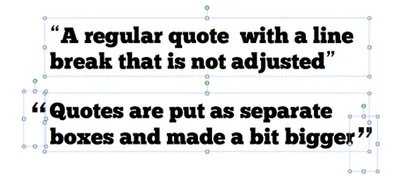
Slides with quotes can be powerful. The standard lay out of quotes is not very interesting. I make manual adjustments to increase the size of the quotes, and make sure the first quote has a small indent. See an example below.
Update January 2018: I have added quote slides in the SlideMagic template store, below is an example:
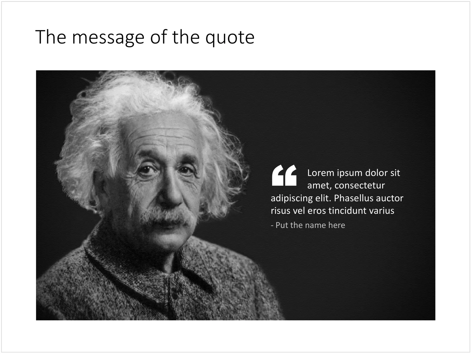
A PowerPoint slide with a quote
Presenting to an audience is no different than having a one on one conversation with someone. You can read the signals. When are people surprised, amused, intrigued, bored, confused? Pick up the non-verbal feedback and try to adjust.
You will be in for some surprises. I have been surprised many times. Slides that I thought were funny, were not. Points I thought were clear, were in fact confusing. Stories that I thought were somewhat dull (and I was considering cutting them), got people interested.
If the lighting in the room is poor, the people in first-row will probably end up being your focus group.
Over the next weeks I will be spending more time with my family, and less time at the computer. Hence, the frequency of posting on the blog will go down. But many of you are probably doing exactly the same thing, so hopefully you will not feel too deprived of your daily dosis of presentation inspiration.

What do I mean by an “icon image”? A direct visualization of the title or a concept. For example: a small image of a wallnut on the summary “In a nutshell” slide, a photo of Albert Einstein on the page that reads “Smart product architecture”, a bag full of $100 bills on the revenue model chart.
These images are similar to icons that people use in computer software or web sites. They quickly remind the viewer what it is that you are talking about. But these icons are exactly as inefficient as text in getting your message across. When the audience sees the word “smart”, or sees the small image of a brain, it still does not understand why that product architecture is so smart.
You can find a better visualization.
Maybe not such a smart question to ask, if you can read this, then there is clearly not a problem. Still, 2 readers have complained that they had difficulty accessing the site. Anyone else had trouble? If so, I am actually not sure what to do about it, I am in the hands of Google. There is always the good old stickyslides.com, but in the end all URLs forward to stickyslides.blogspot.com, the Blogger name that I registered back in 2008.