

SlideMagic Blog

Frequent updates about all things presentations since 2008. Subscribe to never miss a post.

RSS
all posts

Category PowerPoint

·PowerPoint

Screen sizes in PowerPoint

The coding of my app requires me to descend into the detail of font and screen sizes: SlideMagic 2.0 renders slides on the screen (HTML), in PDF, and in PowerPoint. It requires some fiddling to get things to look exactly the same in all three of these channels.

This post by Geetesh Bajaj explained nicely why things can go “wrong” in PowerPoint. Switching from “4:3” to "16:9 onscreen” mixes up all the font sizes. Why? Font sizes are expressed in terms of character height. The “16:9 onscreen” mode keeps the width of the screen, just makes the height smaller. The result, all text looks way too big.

Recently, Microsoft added the “wide screen” setting. This is the one to use. The height of the screen is kept the same, the width is made longer.
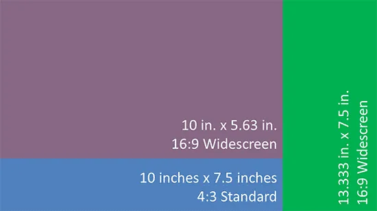
 PowerPoint screen sizes explained by  Indezine

PowerPoint screen sizes explained by Indezine

If you are never switching layouts and masters, and/or are not coding presentation software, all of this should not worry you. The only thing that matters is 4:3 versus 16:9. Still, when you have a choice, pick that “widescreen” option to make life easier. for you.
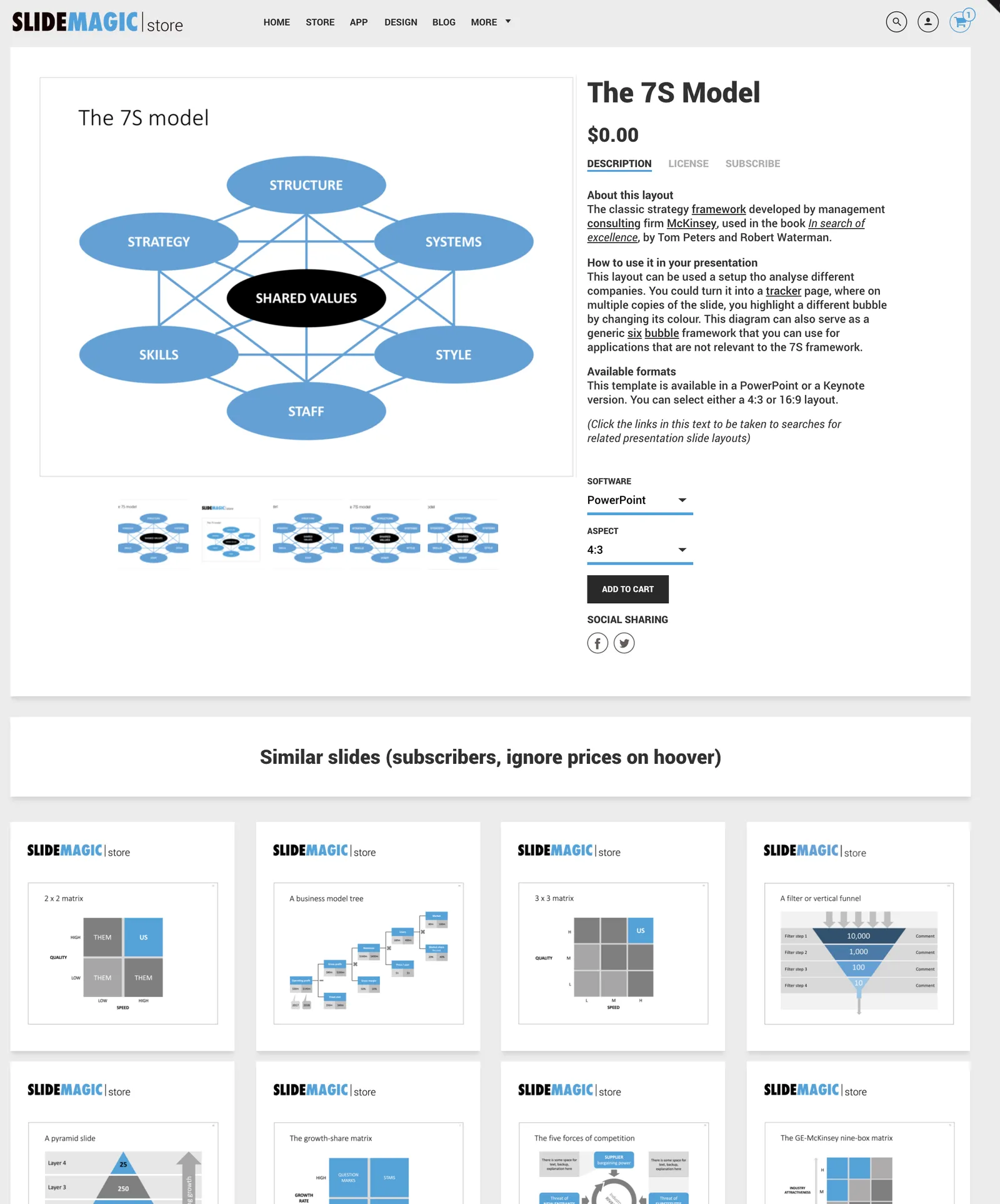
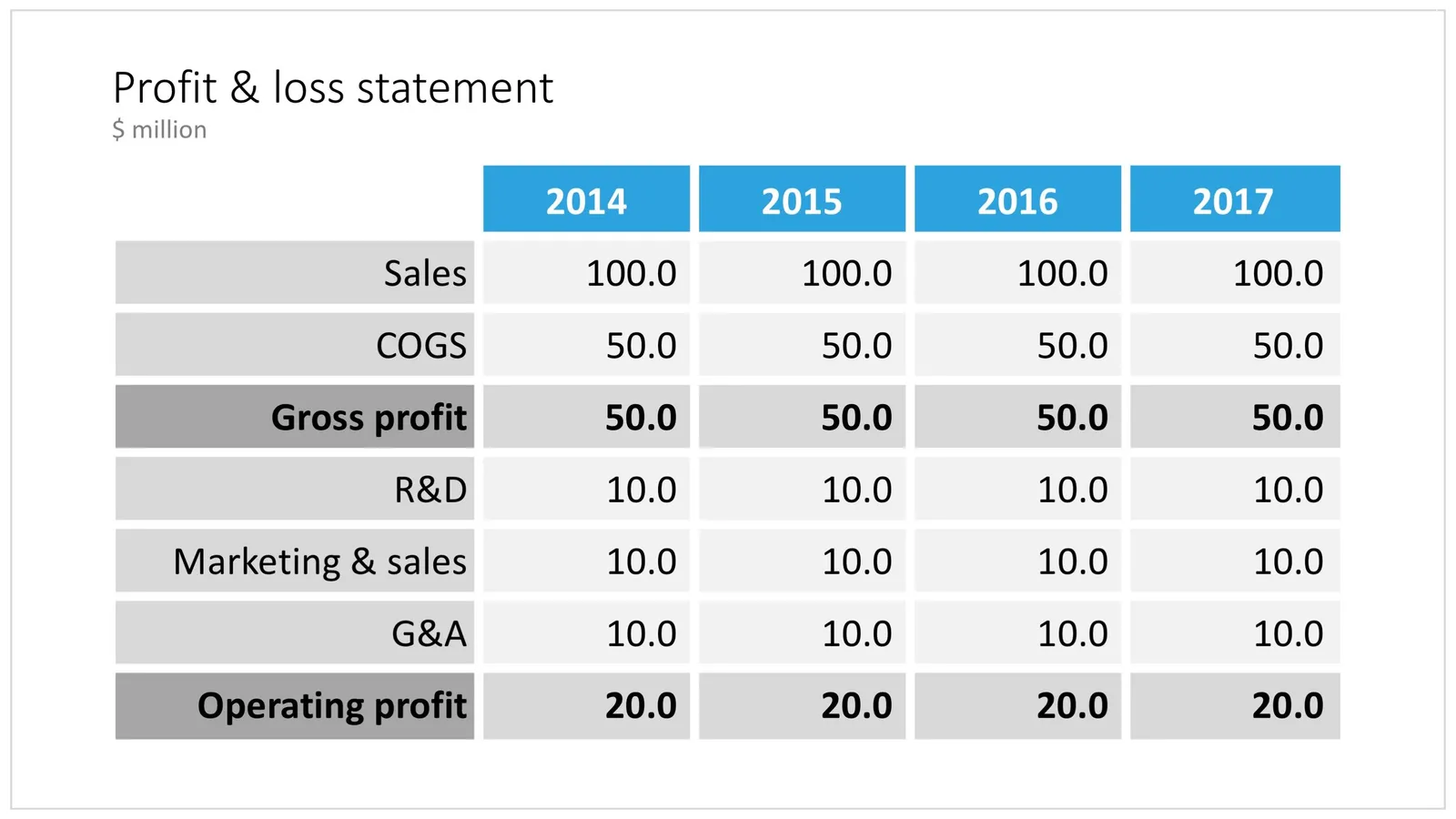
Photo by Jon Ander on Unsplash

·PowerPoint

PowerPoint on iPad review (2018)

Microsoft is on a roll, and now that I am turning temporarily into a developer, I appreciate them even more with very powerful code editors, and repeated decisions to open source their software (the entire Windows platform engine is going open source), and make other sensible decisions (moving to the Chromium browser rendering engine inside Edge).

The office apps are no exception, and I took some time to play around with PowerPoint on my new iPad.

The app looks and feels fantastic (I have something to aspire to), and all the basic design features work flawlessly. I find it easier to find my way around coming in “cold” then the keynote app for iPad. The small screen encourages you to design simpler slides, and spend less time adding stuff that is not essential to your story.

In 2018, things are still not perfect though. But most shortcomings are to blame on the iPad form factor, not Microsoft:

  • Presentation design is a creative process that needs space, a big screen, accurate placing of objects (fingers are less good here than a mouse). An iPad is just not a focussed design interface.
  • File management is still cumbersome on an iPad. Finding that deck from last week, opening a spreadsheet side by side, copying an image from the web browser, things that take a second on a computer are not intuitive on an iPad.
  • Because of the form factor Microsoft has cut down the features for PowerPoint on iPad. In itself, this is great (I am also focusing the features in my app), but, once the genie is out of the bottle, it is very hard to have the same application on different platforms with different feature sets, especially if you are working with collaborators on different devices. “Please create this bar chart”, is emailed to the analyst working on an iPad in the taxi who then discovers that data charts are not really supported. It also hard to create custom themes and colour schemes.
Continue reading →
·PowerPoint

Qwerty in software design

For a number of reasons, keyboards do not follow an alphabetical layout, including increasing typing speed by promoting the use of alternating hands, and/or preventing jams of hammers in mechanical type writers.

I feel that many of today’s presentation (and all other productivity) software is still in the ABC phase. Functions are grouped logically so you can more easily find them the first time around. Instead, they should be grouped in the way you actually use them:

  • How often are they required?
  • What features are typically used together?

The resulting user interface might not be logical, but will be very useful. Work in progress.

Photo by rawpixel on Unsplash

·Hardware

Presentations on mobile - 2018

Now and then, I go back and analyse the inroad that mobile devices have, and have not made, on mobile devices, after the state of euphoria we all had back in 2010.

As a viewing device, phones and tablets have made great progress. In a significant number of face-to-face and small conference table meetings, people are using mobiles and tablets to present theirs slides.

As a creation device though, things are not that advantaged. And now that we have apps that do  perfectly fine job at creating presentations on a tablet, we can no longer blame it on technology. Here are some reasons why it is (and will remain) difficult to create presentations on a tablet (let alone phone):

Presentation design is a creative process that requires a big, bold, clutter-free work environment. This means it will always work better with a big screen, a nice big desk to work on, and a quiet environment. Trying to type things on a small screen in a crowded cafe, or in the back of the taxi will never create brilliant presentations.

The default work setting for creating a presentation is the office, and, when given a choice, the small tablet is inferior to the laptop or desktop computer.

File management is still tricky on small screens. Having 3 presentation decks open, plus 2 spreadsheets, plus the dashboard with last quarter’s results in the BI system, plus a stock photo site, plus 4 old emails with attachments that contain slides, is by definition hard to manage on a tablet.

Continue reading →
·PowerPoint

Saying no to "send info to Microsoft"

I am a huge fan of the improvements Microsoft has been making to PowerPoint over the last few years, it now outshines Keynote.

One thing though, is bothering me: after every recent update it is very hard to say “no” to the question whether Microsoft can record every single one of your clicks to make the program even better. You can simply accept or learn more.

On a Mac, I managed to make the window go away by repeatedly clicking on the red cross in the top left corner of the pop-up window, hopefully that registered as a “no”.

·Software

Microsoft VBA versus Applescript

I am dusting of my coding skills that were pretty much put on hold in the early 1990s and have started to program macros to automate the mechanics of the template store: creating individual slides and thumbnails for PowerPoint and Keynote in different aspect ratios of these design.

Things in the Microsoft Office ecosystem run smoothly (“VBA”), for Mac, a lot less so. Applescript is a language that aims to automate pretty much everything you can do in Mac OS. It has been around for a very long time, but it is falling short.

At first sight, the language looks very friendly, almost human-like. And here is a problem: human language is ambiguous. It is incredibly hard to use it to program computers. When I look at example Applescript code, it looks very easy to adjust and re-use, but it is an incredibly pain to get it actually working and iron out the last bugs. Writing macro scripts will never be something that the average Apple user will do, so you might as well stick to a programming language that an engineer can work with.

The second problem is the what Applescript can actually do. As Apple put development of Mac OS on the back burner and gave priority to its iOS devices, the functional power of Applescript has been watered down. Old tutorials online show functionality that has been removed in later versions of Keynote.

Now, I am not saying that all esoteric features should be supported in a scripting language, but I am struggling to get the most obvious and basic one that anyone wants to use a Keynote script for: batch conversion of PowerPoint files into Keynote.

Continue reading →
·Data visualization

Years in columns, which way?

In financial statements, the most recent financial period is put first, and next to it is the previous period for comparison: 2017 - 2016. To the frustration of some accountants and CFOs, I insist on putting the years the other way around: 2016 - 2017.

  • The eye is used to moving left to right when looking at time series data
  • It makes tables match line or column graphs that are in the presentation
  • It makes it easer to compare data across 3 years or more

I am not trying to change the reporting practices for financial statements. In the annual accounts, the current year is the most important one. It needs to be accurate and is usually shown with far more digits (precision) than I would use in a presentation. A comparison to last year’s numbers is almost an extra, not the main purpose of the page.

Every financial document has its own purpose and own audience: spreadsheets, financial statements and presentation decks. And among presentation decks you can distinguish between quick and dirty documents to discuss (early results), detailed financial information for the investor community, and more generic financial slides for a general company presentation. Different purpose, different slides.

If you want you can check out financial slides in PowerPoint in my template store. Subscribers can download them free of charge.

·PowerPoint

Improved search

Slowly, slowly, I am moving closer to the goal of creating a searchable slide bank bank that is actually useful. Here are the various steps that I have gone through:

  • Designing a slide template that looks good/professional AND blends in easily with existing corporate PowerPoint templates
  • Creating a “boxy” design language that is easy to manipulate and edit, even for non-designers
  • Cutting down the universe of slides to come to a collection of basic slides that can cover almost every possible common business concept that is out there
  • Anticipate the majority of possible search queries to find layouts for every possible angle
  • And now: find a smart grouping slides that creates a really smart way of suggesting related/similar slides

Below is an example of a product page in the store now:

Now that I have automated subscriptions, plus sorted out the search algorithms it is time to clear the last automation hurdle: VAT management globally for both consumer and enterprise customers (the EU has created a nightmare for small digital content stores as it is going after tech giants such as Apple). After that, all attention will be focussed on adding more slide content.

Cover image by Anthony Martino on Unsplash

·PowerPoint

How to present to the CEO

I recently answered this question on Quora about presenting to your own CEO. I think the “what if you had to present a prototype of the iPad to Steve Jobs” is a good mind set. Your presentation should be very good, but a different kind of good than a deck for an external audience. Very clear, brief, and action oriented. (Click this link if the Quora embed is not visible)

Cover image by Farrel Nobel on Unsplash

·PowerPoint

How to format tables in PowerPoint

Tables can carry more data than a data chart and as a result can be less effective in a presentation. For some situations though, there is no point trying to avoid using a table in PowerPoint. For example, when investors want to see the quarterly numbers, they expect to see a table.

The way you format tables can make a huge difference in how your chart looks. When done well, a table can actually be an effective presentation slide. Have a look at the simple P&L table below.

 A PowerPoint table to present a P&L

A PowerPoint table to present a P&L

This might look like a super simple slide design (it is), but a lot of thought and little tweaks have gone into its design. Let’s take them one by one:

  • Colours have been adjusted to your own colour template, not the standard PowerPoint colours
  • Fonts have been matched to your current template (table can be stubborn sometimes and stick to Arial)
  • Instead of dark lines around boxes, I used lines that match the background colour, making cells a light colour of grey to stand out (or dark, black if you use that background)
  • Totals are bold, and a bit darker
  • The row labels are right aligned
  • The row labels are a bit darker than the cells
  • The data cells are right aligned
  • Numbers are rounded to the same amount of digits, so the dots line up
  • There are not too many digits in the table, enough to convey the data, but not too much to make it cluttered. If the numbers get too big, switch to thousands or millions.
  • There is a bit of inset in each cell, the text does not touch the edges
  • All the rows have the same height
  • All the data columns have the same width
  • The column headings are centered
  • The unit of measure is put at the top of the chart, not repeated inside the data values
  • The table covers the entire frame of the presentation template
  • Double check by hand/calculator: the numbers add up…
Continue reading →