Presentations are everywhere
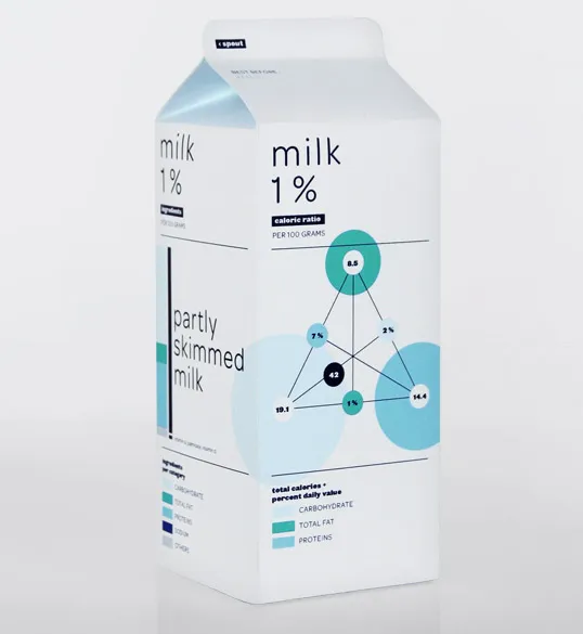
I never saw this before: infographics on food packaging. Nice work by Audree Lapierre.


Frequent updates about all things presentations since 2008. Subscribe to never miss a post.
I never saw this before: infographics on food packaging. Nice work by Audree Lapierre.
A nice video based on a speech by Daniel Pink about what makes us tick. It is being drawn for you live.
Thank you Orli Naschitz.
Many presentations are about ambition: “we want to double in size in 5 years”. That’s basically creating another company exactly as the one you have now. You can use the concept of a biological cell division to visualize this.
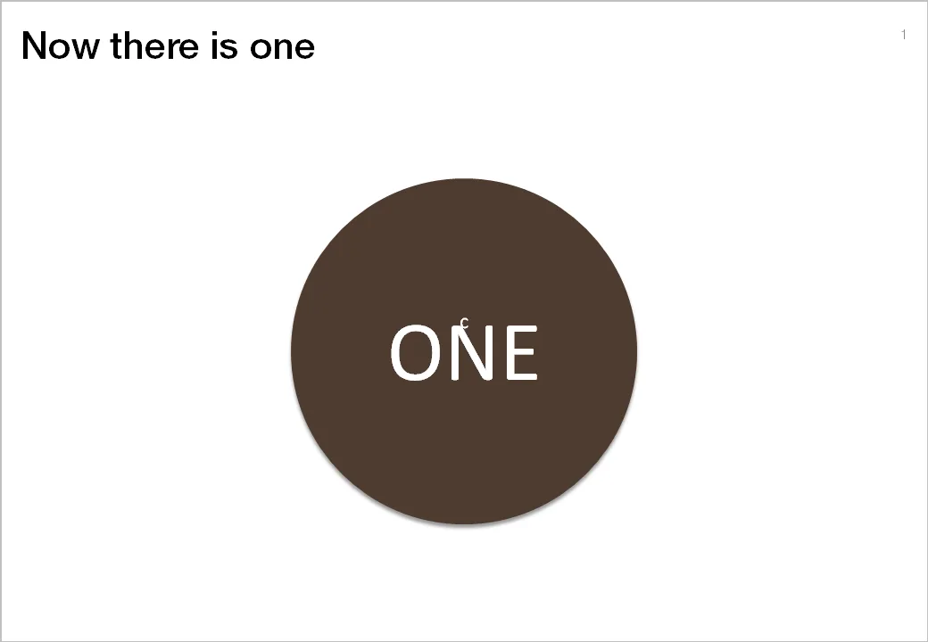

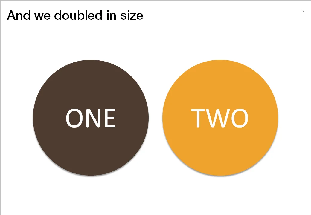
The stretching of the circle is done using the edit points function in PowerPoint. The text is stretched using the function “text effects” in the format ribbon of PowerPoint.
I do not use standard Microsoft PowerPoint templates very often, but I must admit that I was pleasantly surprised by this 2010 calendar template on the Microsoft web site. That saved me a lot of time in designing a kick off presentation for a new project. Tons more here.
Recently, I spoke for the finalists of the BizTec business plan competition in Tel Aviv on how to pitch to VCs. The slides were an adaptation from an earlier talk on the same subject. Here they are.
It is very hard to capture the sensation of a wide panoramic view in a photograph. Making a picture of that stunning view will look boring when you view it later. Not when you capture an object nearby as well.
Impressionist painters use this technique in the composition of their works. See this painting by Alfred Sisley (Village On The Banks Of The Seine at Villeneuve La Garenne). Unusually, the background of the scene is actually lighter than the foreground.

I used this lone tree in one of my own photographs of a recent visit to the ruins of the Masada fortress near the Dead Sea here in Israel.
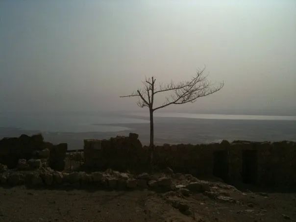
Think about this when your pick your next stock image in your presentation.
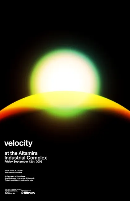
Most presentations are written by people without a professional graphics, design, or art background (including me). While it is almost impossible to catch up on the technical skills of these professional illustrators, it can pay off to take a daily dive in their work. The blog unstage (link here) is an example of a daily source of information that you should add to your RSS reader. Example below: a poster by Network Osaka. (I find poster designs especially useful as a source of ideas for slides.)
This ad about safe driving uses an interesting concept: the eye test. You can use it in a PowerPoint presentation exactly as it is used here: one variable is declining/increasing and visibility of another goes down.
Another use could be some sort of health check: “how well protected is your business?”, using a different image that repeats and gets smaller all the time.
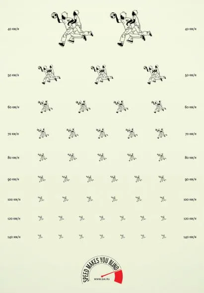
Via Ads of the world.
Tel Aviv uses a very dominant street painting scheme: red-white and you cannot park, blue-white and you can park but have to pay. The colors are so bright that the city looks like one big Formula One circuit. Why not use more modest colors? Grey blue and olive green? The picture below gives an example, freshly painted pavements (you have to re-paint often in the sunny climate here).

The same is true for PowerPoint shapes. Whenever I can, I omit the lines around shapes (shape outlines). It makes your chart a lot calmer.
Image credit: Flickmor