SlideMagic Blog

Frequent updates about all things presentations since 2008. Subscribe to never miss a post.

RSS
all posts

Category Layout

·Investor presentation

"Do you do web sites as well"?

New startups are in need of all kinds of marketing collateral: pitch decks for investors and/or potential customers, product brochures, and a web site. I think that in the beginning, people are aiming too high with the web site: super effects, video backgrounds, sparkle, and glitter.

But the experienced investor or corporate purchaser sees through the facade immediately, this is a brand new startup with hardly any customers and 6 months of VC funding left. Instead, you can build a web presence that show yes, that you are young, but that you are serious and know what you are doing.

  • There is actually some sort of web page on your URL, not an “under construction”
  • Use squarespace, Wix, or another template engine for a modern look and feel, with at least a premium enough version that it does not say “proudly built with Wix” at the bottom.
  • Make sure your branding is consistent: accent color (you don’t need a lot of it), and a simple logo (does not have to be a master piece)
  • No gmail or hotmail email addresses
  • Your LinkedIn profile actually says that you are the CEO of this company, and not a marketing consultant from 2004 to present
  • The company has an address that when entered in Google street view does not point to a residential street
  • When the site has a “news” section, or a blog, it should contain fresh articles, if not, just don’t put it on.
  • The web site should actually describe what the company is doing, without buzzword overload

Continue reading →
·Layout

The trouble with 16:9

This tweet by a highly competent designer flashed by:

It is work in progress on a presentation. You see what direction he is taking: the big headline on the left, rather than across the slide, and a paragraph of very small text.

I think this might be a format that many presentations will use:

  • More and more display devices are now wide screen (which is a great format for movies)
  • Headlines that stretch all across very wide screens are unreadable.
  • The best visual compositions / layouts are not very wide ones
  • Increasingly, we use presentations to send beforehand, without actual presenting/verbal explanation, hence the need for explanatory text

In my presentation app SlideMagic, I stuck to the 4:3 aspect ratio for slides, enabling you to put the headline across the slide, and added an optional slide out panel for plain text that turns the 4:3 composition into a 16:9 one.

·Advertising

What the template says about you

These food packaging make overs illustrate what is wrong with many of today’s presentation templates: they make you look like you are “that kind of company”. But remember, the hipster customer segment is likely to be a lot smaller than the mass market. Think about your audience, and whom you want to look like.

·Layout

Learn slide design from Teletext

In The Netherlands the old Teletext system is still up and running online. Now ported to the web and mobile apps, the 1970s clunky graphics are still there. Its designs fits 2017 actually very well:

  • Simple but consistently applied fonts and colors create a recognizable visual identity and make things clutter, distraction free and clear
  • Text space limits are really credible, so content writers need to make sure that everything fits in. The result: well-written headlines, and clear paragraphs.
  • A 3-digit menu system that is remarkably effective to get to what you want to know quickly.

Today’s presentations and web sites can learn a lot from that old UI.

·Advertising

How important is the logo?

Many early stage startups that need an investor presentation do not have a proper logo and graphical identity yet. Is this a bottleneck for a presentation?

Not really. I do not believe that you need to put your logo prominently on every page of your presentation. Hence, it is not very important in presentation design. The most important design element for a presentation is color. The color scheme will decide how your slides look.

So, pick a color scheme you think is appropriate for your business. It can be done very quickly. Every investor will forgive you if you decide to change it later. In the early days, you can simply use a text logo without any design to show your project’s name. If you are not sure, a temporary project name can be a better solution than a poorly chosen brand name. That brand you chose late at night while brainstorming with the founding team might work great for you, but could be less optimal for your target audience.

Obviously if you are launching in the market than logo, identity and picking the right color becomes (a lot) more important.

·SlideMagic

Smart row / column insertion

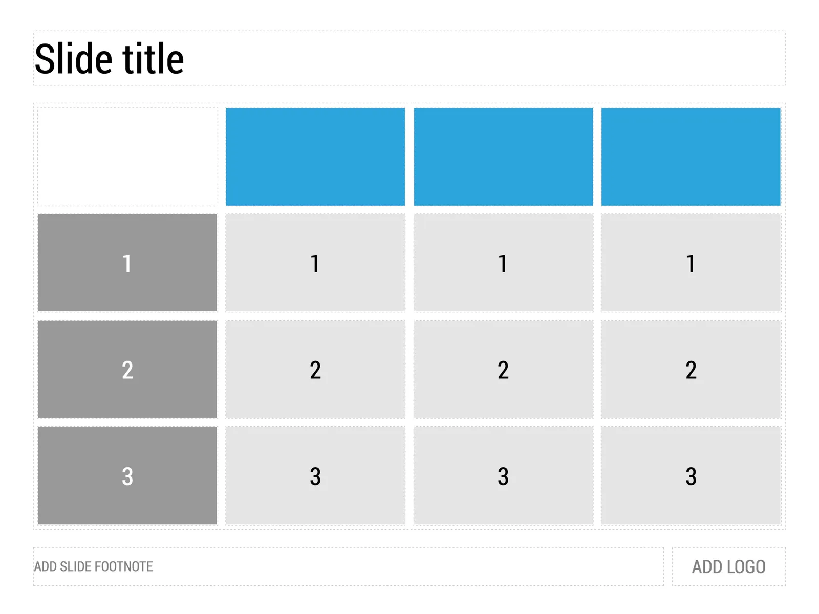
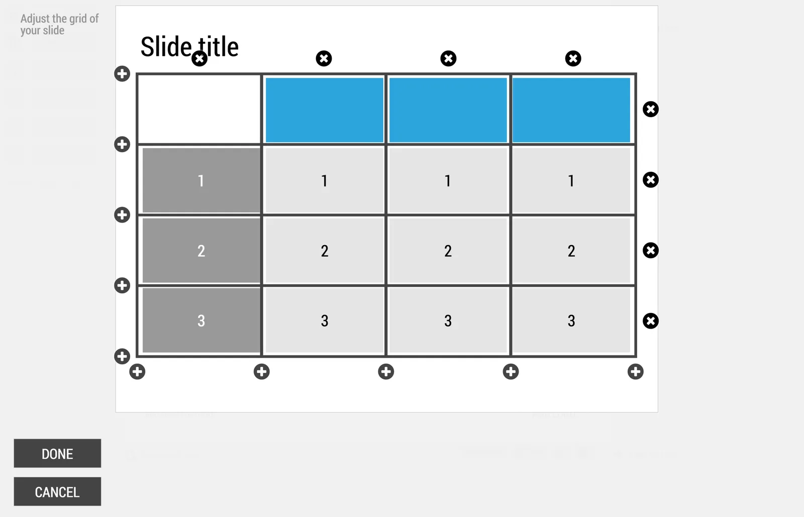
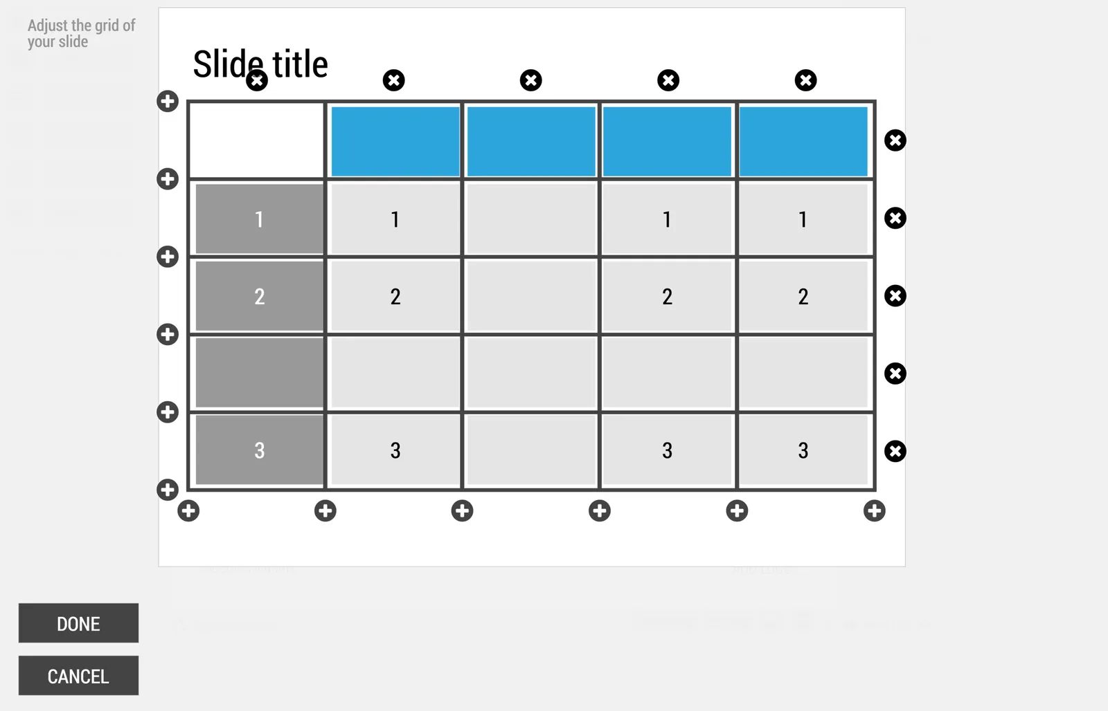
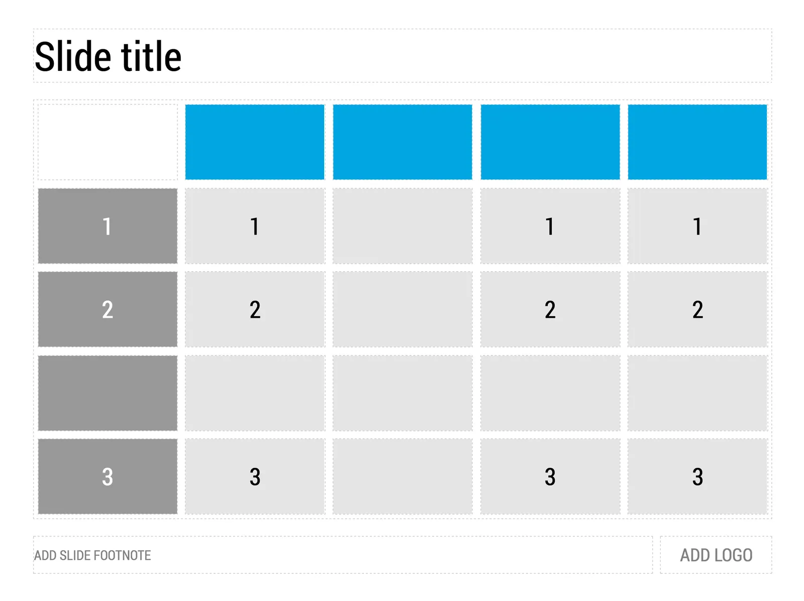
My presentation app SlideMagic is all about the grid. We have made some improvements to make the workflow (even) faster. Now, when you insert rows and or columns, it copies its design and structure from its neighbors. This will save you a lot of time in more complicated table layout with different background colors.

 1) Our starting point

1) Our starting point

 2) Open the grid editor

2) Open the grid editor

 3) Add a row and a column

3) Add a row and a column

 4) The result

4) The result

Image via WikiPedia

·Software

How to brief a presentation template designer

The traditional approach is to hand the designer a blank slide and say “we need a fresh PowerPoint template”. You will get a slide back full of supporting graphics, logos, page numbers which shows that the designer added some value.

Here is the better approach: give an actual slide with content and ask her to improve that, including the template. The likely result is a well-designed slide. Now delete all the content and see what you are left with. It is likely to be an empty page… Here is your new PowerPoint template.

Oh, and the most important part of the template design project is not the template (i.e, the blank page). It is to make sure that the standard colors and fonts are programmed correctly. That’s a programmer’s job, not a designer’s job.

In my presentation design app SlideMagic, things are easier. Upload your logo, use the color picker to select your accent color based on the logo, and you are all set.

Image by john.schultz on Flickr

·Layout

Logo cropping

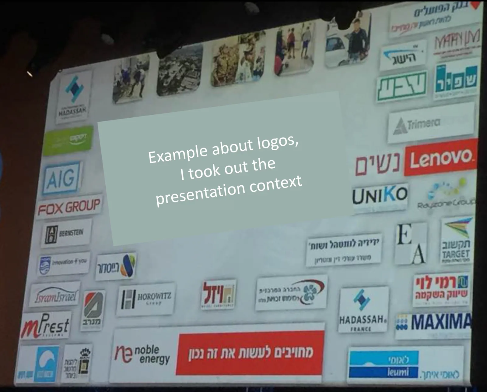
This screen shot is typical for many logo pages in presentations:

Images files are copied into the slide after which a background shading is added. The shadow creates an instant frame around the logo which is too tight, definitely not the framing the logo designer intended. Now that all logos have a box around them, the eye immediately wants everything to be distributed and aligned properly in a grid, which is impossible to do given the different sizes of the boxes. Finally, the drop shadows actually do not look good.

My approach to logo pages is to adhere to a strict grid and keep everything on a white background to give the logos space to breathe. In PowerPoint or Keynote it is a bit fiddly to line up all the logos, I usually put in a temporary table to make sure everything is lined up in rows and columns. When every logo is in its place, I delete the table.

My presentation app SlideMagic makes it easy, it is impossible not to align images in a proper grid.

·Layout

Writing text on charts

Most charts consists of 2 - 4 “boxes” with some text inside them. Text in boxes is different from text in sentences and/or paragraphs. When writing an article, you don’t have to worry about how long a line is, and/or whether it fits exactly in a certain amount of space.

Some guidelines about writing text in boxes:

  • Make sure the point in each of the boxes has more or less equal weight in terms of content. You don’t want box 1 to cover the entire presentation message, and box 2 to be a footnote detail.
  • Think of text on slides as headlines. Strip out all unnecessary filler words (i.e., make it as short as possible), but add enough words to keep it specific (i.e., no generic buzzwords).
  • Make sure that each box has roughly the same amount of text, covers the same number of lines. Yes, that means being a bit more verbose if one box is particularly short.
  • Adjust line breaks to avoid orphan words on the next line, or line breaks that cut the words of a key concept in two (cognitive [break] dissonance).

When “writing” a chart: the content should be clear but the text should be balanced as well.

Image from WikiPedia

·Software

PowerPoint Designer - first impressions

Microsoft has been adding a number of features to PowerPoint recently. One of them is Designer. In the Design tab of the ribbon, a new button appears on the right “Design Ideas”. Clicking it generates alternative layouts of your slides on the right side of your screen.

The layouts are pretty nice. Microsoft has “automated” the design of 2 types of slides:

  • Image collages, multiple photos get put in different suggested grids, with place for a title
  • Process bullet points that can be translated to horizontally spaced out sequences of equally sized shapes.

Both are useful. Layman designers usually have no idea how to crop a nice photo collage, and translating that bullet list into a horizontal sequence looks nice, especially on wide 16:9 screen.

But here comes the but.

  • The algorithm only works on these types of slides, so layman presentations will look inconsistent as same slides cannot be improved by the algorithm
  • And in case of the bullet transformation, PowerPoint needs to analyze the text with language processing, to decide that you are describing some kind of process. I had a hard time to trigger the algorithm, and in the end typed the exact same text as was used in Microsoft’s explanation web post.

Microsoft is on the right path, these suggested layouts look a lot nicer than the SmartArt objects. And, getting layman designers to use some sort of grid is the biggest possible improvement you can create in slide design.

But I think it will take some time before language interpretation will be so sophisticated that PowerPoint understands the meaning of a slide and can pull a suggested layout from its library. That’s one step above asking Siri to book a movie for you.

Continue reading →