SlideMagic Blog

Frequent updates about all things presentations since 2008. Subscribe to never miss a post.

RSS
all posts

Category Keynote

·Keynote

Marker nostalgia

I sometimes think back of the early 1990s, before we started putting Microsoft Word text pages on overhead transparencies using a photo copier. The only thing you had was an empty transparency and a big marker. The resulting slides were a lot more creative than many of the bullet point slides of today.

·Keynote

Presenting the presentation

A client was using a presentation to explain the presentation to people who had to present it. After a short discussion, it was decided to try to design a presentation that could be understood instantly by the presenter. If the presenter gets it, the audience probably understands it as well.

·Investor presentation

We are robust!

Sometimes, putting up a slide that says explicitly “We are a robust company!” might make the audience actually think the exact opposite. “Hey, so far this was a fantastic and professional presentation, I did not realize these guys are a tiny startup, that is until now…”

·Books

New book by Duarte

Nancy Duarte is probably the only person in the world that has managed to create a very large business in the presentation design market. As a result, she is a true authority on the subject because of here experience with designing presentations ranging from the high profile money-no-issue keynote presentations to the day-to-day high volume make-overs of slides for internal management meetings.
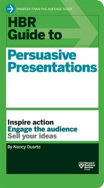
Her new book HBR Guide to Persuasive Presentations is different from the previous two (Slide:ology and Resonate): it is far more practical. Out goes the glossy paper, the beautiful diagrams, the client case examples, and instead we have a highly useful list of tips and tricks that can help you make better presentations the moment you put the book down. Almost every paragraph starts with an action verb, a recommendation of something that you can do better.

The book covers a wide range of subjects related to presentation design, from analysing your audience to building an online social media following for your decks, but the core of the book is in story and slide design. Some new ideas that I got out of the book:

  • Create two endings in your presentation, if you run out of time you can always stop at the first one
  • Pick the right type of slide: walk-in slide, title slide, navigation slide, bullet slide, big word slide, quote slide, data slide, diagram slide, conceptual slide, video slide, walk out slide
  • Ideas how to translate words into diagrams.

One point of disagreement, the book advocates using a 10% rule for executive summary slides, so a 50 slide deck needs 5 summary slides (5 minutes), and 45 appendix slides. Pretty much what we tried to do at McKinsey. I increasingly try to shorten that executive summary to one super short summary, and follow it to a slightly longer story that encapsulates the entire story, hoping to be able to hang on to senior management attention for maybe 10 or 15 minutes instead of 5 when the cross fire of questions begins and your slide presentation in the conference room basically ends.


Continue reading →
·Keynote

The exact marketing messages

Marketing messages cannot be translated 1-on-1 into a presentation. Do not forget to make the translation. The language translation requirement is obvious (everyone can see that marketing jargon does not resonate with a consumer). Sometimes though, you have to further than that and cut messages out, or move them from the explicit text, to the implicit part of your presentation: in between the lines, or told in the verbal explanation of the slides.

Image found on Things real people do not say about advertising.

·Keynote

Is it really about the presentation?

“My boss wants me to make a presentation about our strategy next Wednesday, help!”.

What does she mean? In most of cases (especially for an internal audience), she probably does not want you to focus all your energy on making the slides as pretty as possible (that would be a nice-to-have).

Instead, she needs to have the strategy itself ready and nailed. And the process of designing the presentation-that-presents-the-strategy might reveal holes, inconsistencies, and ambiguities in the strategy itself.

Your boss wants the strategy to be ready by next Wednesday. (Help!)

·Keynote

Uniform logos

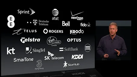
A page full of logos in different colours can look cluttered. Apple re-did their partner logos in white on black in their recent product presentation. I am not sure whether all the graphic designers that were behind the logos would agree to this, but it sure looks better. I would have taken the slide design one step further though, and organise the logos in a rigid grid.

·Delivery

Light or dark background?

For big audiences, you need to get the entire look of the stage right, not just your slides. Below you see that a dark background works better. A light background on a huge screen overpowers the presenter. For small conference rooms, a light background will do fine, and for reading on screen, a light background is actually better.

·Keynote

Presenting to your CEO

You are the country manager of one of a company’s 100 territories, and the CEO is coming to visit. You probably have a deck somewhere that you can use to Frankenstein the all encompassing presentation about your country organisation.

But maybe it might be better to start from scratch for this new audience.

Some content can go, all the tactical details about combatting that local competitor really excites you, but is not that interesting to the CEO.

Some extra content is required. What is special about your country compared to others? You never had to worry about that before when presenting inside your own market. It might be good to take a step back and go further back in time than the last 2 quarters to show the evolution of your market. Your staff knows it, but the CEO does not. Adding some pictures of staff, or some examples of marketing material will add even more flavour to your story. Maybe it is necessary to  convert all financials in a different currency.

In short, Frankensteining is not enough.

·Images

How to position a logo

Many logos come with tag lines and/or ® or ™ attachments. When positioning a logo on a page, ignore these and focus only on the main text or graphic to align the image on a slide (even better: violate the logo style rules and crop them out). For horizontal alignment of a number of logos in a row, draw a temporary line and make sure the text of all the logos sits right on it.