

SlideMagic Blog

Frequent updates about all things presentations since 2008. Subscribe to never miss a post.

RSS
all posts

Category Keynote

·Delivery

Making the emotional case

President Obama’s key influencing strategy for convincing the audience of the need for tougher gun control laws in the US was appealing to shared values, the values of parents in the audience and in front of television and YouTube screens.

And it is interesting to see how he did it; taking time to let the point sink in, emotionally. The President elaborated about the process of raising a child, letting it separate from you with pain in your heart. In the end he came back to that emotion by mentioning the first name of each child that was killed. If he had just put in the elevator pitch “we need to protect our children”, it would not have been convincing. We have heard it too many times from too many politicians.

The same is true in business presentations: just giving the sound bite is often not enough to let the audience feel the point you want to make.

·Delivery

Touching your nose

Scientist do not yet agree whether lying makes people touch their nose, but the popular belief is so strong that you better avoid getting rid of that annoying twitch at critical moments in your presentation: “… and this is how I will save the company! ” [scratch] [scratch]

·Gadgets

Google Presentations review

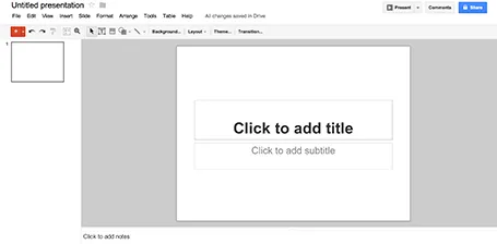
As part of my attempts to write a PowerPoint killer I am researching all the presentation apps that are currently available. Today, I have Google Presentations a test drive.

Web apps have come a long way, and the overall user experience is pretty much the same as local software: snappy and fast (that is, if you are connected to the Internet). Right-clicking, dragging, drop downs, it all works. Google Presentations is integrated into the Google Drive environment which makes accessing and sharing files really easy.

While I think that PowerPoint is too bloated with features, Google Presentations is still at the other extreme of the spectrum. Here are the things I a missing:

  • Big, big problem: you cannot crop images
  • Poor integration of data charts (you need to create the chart in a Google Spreadsheet and then copy it across as an image
  • If you create custom templates, everyone can see and use them

Google is making huge improvements in the design of its software, gmail, Google+, mobile apps all look fantastic now. Google Spreadsheets are already a workable alternative to Microsoft Excel sheets. With some additional features, Google Presentations can be come a credible PowerPoint alternative as well.

·Keynote

Subtle textures

The majority of my presentations have either a pitch black or bright white background. But now that monitors are getting Retina-like resolutions, it becomes possible to add a tiny, tiny texture to the background. Here is a site that has a few candidates: subtlepatterns.com. (Update 7 April 2017: new link https://www.toptal.com/designers/subtlepatterns/

On the average crappy VGA office overhead projector this effect will not come out though.

·Keynote

Wireframing in Keynote

I have started to wireframe my PowerPoint/Keynote killer in… Keynote. Presentation design software is excellent to make mock up web sites or mobile applications, no need for special software. You have all the shapes at your disposal and can add basic interactivity with hotlinks that point to other slides in your deck. You can design icons yourself or use standard packs such as these, or these to make things look even more real.

·Data visualization

The Meeker deck 2012

Mary Meeker has updated her deck about the state of the Internet:

The slides inside are typical examples of investment banking/consulting visuals with lots of information, they are best read offline rather than presented in front of a live audience. Record the eye movements you have to make in order to absorb all the information on the slide below:

When presenting, you can simplify the chart, but shortening/cutting titles and subtitles, making sure that a few really stand out, and that the rest is put on the chart in small print visible to the reader, but not really to the live audience.

A more general point about this presentation though. I have followed many editions of it over the past few years (going back to the time when she was still an equity analyst), and actually find that the current one disappoints a bit in terms of content. But maybe that is the state of the Internet today, little surprises?

·Delivery

Alanis Morissette

I attended a concert by Alanis Morissette the other day in Tel Aviv. A critic of the local Israeli newspaper Haaretz found she did not sing well, but despite that everyone in the audience loved her performance.

This presentation design blog is not the right place to go into technical artist reviews. What is interesting however, is to see how Alanis managed to win the crowd over simple by being her natural self. No professional crowd pleasing techniques, no real eye contact into the audience, just pacing back and forth staring in the distance left and right of the stage. She actually came across as shy.

The audience wants you to succeed, and preferably using your own natural style.

·Keynote

PowerPoint killer?

Now that my book is nearing completion I am switching attention to a much bigger side project, I might have the initial idea for software that can be a PowerPoint and Keynote killer. Many have tried before me, and all of them have more or less failed, so I need to be careful. I keep the idea under wraps for the moment (sorry), but what I can reveal are the fundamental flaws in slideware that I want to take out:

  1. The bloated programs have their roots in 1980s mouse-based drawing software
  2. Templates are technology- or graphics- rather than business content-driven

Things are very early at the moment, and I am trying to get a handle on the budget and timing aspects of a project and start to look into possible design partners (UI, backend). Let me know if you think that there are design studios out there that I should be aware of, especially those that have experience with visual/slide apps on desktop and mobile. You can send me a message via the contact field in my website.

I hope that this post will be the beginning of a solution for death by PowerPoint, rather than a note in the margin like Fermat’s last theorem

·Keynote

In this ever changing world...

Please do not use that sentence in a presentation.

·Keynote

CEOs get used to slides

If you want to make a dramatic difference to the look of a presentation, do it early in the design process. After a number of iterations a senior executive gets used to the look and feel of a slide, even if it is not a pretty one. The CEO sees a placeholder (no longer a slide with content) as the back drop of which to tell the story. Changing the design of a placeholder her makes her feel she has to redesign her story from scratch.