SlideMagic Blog

Frequent updates about all things presentations since 2008. Subscribe to never miss a post.

RSS
all posts

Category Keynote

·Investor presentation

So, in short?

This is a great question to ask yourself after you finished designing the presentation.

“Well, what I really want is raising a bit of extra equity to de-leverage the company (slide 12, yellow bars). I think it is a really good deal for investors, since it looks like the stock is undervalued (slide 24, bottom right). Management has delivered on all its promises over the past 5 years (slide 15) and no one in the industry has a scale that is even closely to ours (slide 37 on the left), so it looks like our advantage will hold out for the foreseeable future.”

 Your presentation can be shorter: focussed slides upfront, with extra info in the appendix.
·Concepts

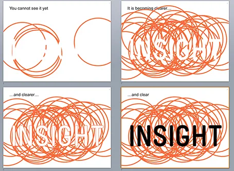
White on white

White letters on a white background enable you to make a nice slow-reveal slide. I used it for a client in BI (business intelligence) that creates insight by overlapping multiple analyses.

·Keynote

Custom fonts - redux

Custom fonts (fonts that are not installed as standard on most computers) give your presentation a nice distinctive look from the rest of the world that uses Calibri and Arial. It comes at a price: viewers who do not have your font installed on their machines get a poor experience.

For these practical reasons, I leaned towards sticking with standard fonts in business presentations. Things are changing though:

  • PDF is now my preferred format for sending presentations to people: it can easily be viewed on mobile devices and has a nicer, more permanent feel to it than an editable file. Once a PDF is created, fonts will display correctly on any device
  • There are more and more free fonts available that make it technically easy to download and install a font quickly, without having to count the number of seats that use the font in order to get in trouble with the license I paid for.

So, when do I consider using a custom font?

  1. Smaller organisations that are relatively tech-savvy. The big traditional Fortune 500 company is still locked into Calibri for the time being I am afraid.
  2. When I can use an open source font, not so much to save money, but to save the hassle of having to deal with license seat counts
·Images

Project pictures

Many business presentations contain pages with images of projects: real estate, solar farms, factory installations. Usually, they are small, low resolution, many on a page, and backed up by a dense paragraph of explanation.

To make your presentation look better: do the opposite. Stretch them across the full page, use high res images, use 1 image per page, and set a brief explanation text over the image.

The audience will not notice that you clicked through 7 slides when discussing your project portfolio. For them, it is just one slide.

Another way to show off your portfolio is to use the images throughout the presentation on separator and title pages that mark the beginning of a new section in your story. So, you have 1 image on your portfolio slide with the explanation that is 1 of 35 buildings. The audience gets a sense of the other 34 throughout the presentation without talking directly about them.

·Keynote

Using Prezi sensibly

For people bored with PowerPoint, Prezi can be an alternative presentation design platform. It is web-based, has powerful zoom effects and enables non-linear presentations. I would suggest to keep the following in mind when using Prezi for a business presentation:

  1. Stick to a linear story line, especially for larger audiences. If you have 20 minutes in front of 500 people, it has hard to get your message across using a random and unpredictable flow.
  2. Use the Prezi zooming and moving effects where you really need it, and not just for spectacular slide transitions. The audience will get motion sickness, or worse, will start giggling when you discuss your very serious business topic.
  3. Try to bring the look and feel of your Prezi in line with your regular PowerPoint colours. You will not have time to design Prezis for every presentation you do.
·Keynote

Deck inertia

In the beginning of a presentation design project, things are fluid. You are open to different approaches to tell the story, the look and feel of slides. But once you created a good first draft, you become hesitant to change it, even when smart people give good advice. I have seen many decks that started with an apology: this was the slide deck that they used since last year, but now we tell the story a bit different. Have the courage to change your presentation as your story evolves.

·Keynote

What is that font?

I get this question a lot. My logo is set in Futura Condensed Extra Bold. Other major brands have followed me…

·Images

Cheating with headshots

Pages with headshots of people are always a pain to design: the names and titles of people can vary greatly in length.

I spotted this neat trick in a promotion email for this book. People with long titles have been moved to the bottom where a 2 line job title does not break the grid. Also, the right column looks a bit wider than the first 2 to me, again creating a bit more breathing space for long names and/or titles.

Now, hopefully your CEO has a short name (she always wants to go first).

·Data visualization

Data chart consistency

There are many options to format a data chart: write million or m, put percentages in columns or not, a thin baseline or a fat baseline or no baseline at all, tick marks or not, grid lines or not grid lines, drop shadows or flat, you can go on and on.

Whatever you choose, choose the same preferences on every page so your presentation will look consistent.

·Data visualization

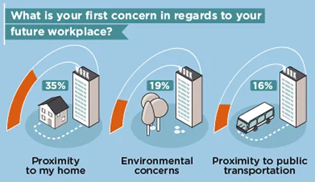
Infographics that try too hard

Many (maybe even most) infographics focus primarily on a cute visual concept and forget about the data they need to communicate. The result: pretty pictures that are impossible to understand.

First, focus on the data and think what you want to show: a trend, a comparison, a ranking, a contrast. That should be the basis for the design of your graphic.

Then, remember that cute icons can be as hard to understand as a bullet point: sometimes it can be more effective to write down the words “home” and “work” than trying to come up with illustrations of a house and an office.

Clients often request a cool infographic to get their message across. My response is to stuck to a more traditional presentation format, but if they insist on an infographic look, to go more creative on colors, shapes, and especially fonts at the expense of technical compatibility and the ability of everyone in your organisation to edit the slides for their own needs.

The WTF Visualizations blog is full of bad infographics, enjoy! (Via Daria)