SlideMagic Blog

Frequent updates about all things presentations since 2008. Subscribe to never miss a post.

RSS
all posts

Category Keynote

·Keynote

No audience is the same

A company presentation will be used for many different audiences: investors, Board meetings, sales meetings, people who know the company, people who see the company for the first time. There is the temptation to start working on a different presentation for each different audience. Resist.

First of all, I hope your story is the same for all these audiences. I have seen companies that want to change the story depending on who they pitch to. I think it is very hard to build a successful with an inconsistent market positioning and purpose. So let us assume that there is one story.

Even though different audiences require different amounts of detail for specific parts of the story, each audience still needs to put everything in that overarching framework. Leaving things out will break the flow of the story. So, even for highly a knowledgeable scientist audience, I would still put in one (place holder) chart to remind us all of the very basics of a certain medical condition.

From a practical point of view, it is also very difficult to maintain multiple versions of the same presentation. A small correction on page 10, needs to be duplicated everywhere.

The bottom line, I create one overall master deck and sit down for before every presentation meeting to cut down the presentation to size.

·Cartoons

Cartoons need to be huge

Everyone loves reading cartoons, and they can make great content for presentation slides (watch the copy right). But for an audience to get the cartoon, they need to be able to read it. And given the scribbly nature of cartoon fonts, fonts sizes in the bubbles need to be bigger than what usually works on a regular slide (i.e, font 20 or up). If the bubble text has to be 20 points, that means that the overall image needs to be pretty large, often you do not have enough space for it.

When creating slides that are meant for emailing in advance and reading on a screen, font size is less of an issue.

To get the audience to focus on the cartoon, chop out all the usual slide clutter (titles, footers, logos), just a plain page with a cartoon graphic. Cartoons are usually busy graphics.

·Keynote

Stories need fewer slides

Many clients come to me with fact-packed presentations full of dense bullet point slides, I recommend to break up each slide into multiple visuals that carry just one message. The result: slide count can go five fold, but the time to present them stays the same.

Some clients come to me with stories (much more effective than dry business content), but again, they are written out in bullet points. Here, I advise to do the opposite: cut the number of slides. Put up a picture of the person, situation, place, you are taking about, and give the story verbally. We can read a fiction book without a single illustration and build a rich visualisation of the story right in your head.

If you need to send this presentation full of stories without you having the ability to explain, you might consider adding a small point 12 text box at the bottom of your image with the slide narrative in full sentences.

·Data visualization

Boring frameworks

If your business has 15 sales channels, it makes sense to review their performance using the same framework: easy to compare, and you make sure that you are covering everything that needs to be covered.

If you work with management consultants, you will notice that they love this approach. You get presented with a framework, asked to fill it out and then - here is the mistake - the 15 analyses are put on the overhead projector for a nice morning-filling channel performance review session.

Analysis slides are not the same as presentation slides. Keep the boring, structured deck as reference material. But, when presenting: try to break the logical structure. Focus on what is different, remarkable, requires attention. And since each of the 15 channels are different, you will find that these stories do not fit into one framework.

·Keynote

How did she spot that?

When I just started out as a junior analyst at McKinsey I always wondered how my project manager was able to spot a mistake or inconsistency in my slides in a second. I had been working on this all night (sometimes literally), build all the spreadsheets, mastered all the detail, and in she comes and says after a few seconds: “that number looks wrong to me”, and yes, there was a bug in my analysis.

The secret is take some distance from your work. Look through the slides without connecting them to your Excel sheet. Sales numbers on page 3, should be the same as sales numbers on page 16. A soft drink can is unlikely to cost $50. Simple checks and a cool head.

If you do not check your slides, your manager, or your client will for sure.

·Data visualization

Monthly reports in PPT

Many technology providers need to write some sort of monthly report with statistics for their clients. The bare output from their applications is too rough and does not contain conclusions, insights, follow-up actions and quantified $$$ savings.

So writing this report is a manual process: data gets uploaded into Excel, analysed, put in graphs in then all of this is put into: Microsoft Word.

Microsoft Word (or any word processor) is not a good tool for creating data reports. It does not have the page layout capabilities of Adobe Illustrator (have you ever tried to move a picture or graph around and see the surrounding text move in unpredictable ways?), and it does not have the graph editing capabilities of Excel.

The solution: create you monthly reports in PowerPoint: managing images and data graphs is much easier. And now that you have left word processing territory, why not cut the amount of blah blah text and force yourself to get to the point with fewer words. If people do not feel like reading long, dense presentations, do you think they have the energy to digest dozens of monthly report prose?

First, the type writer left the enterprise world, and now it is the time to say goodbye to the word processor and leave it to authors of books.

·Images

Movement in stills

Putting an image smack in the middle of your composition often kills the sense of action in your slide. Experiment with cropping to make things more interesting and dynamic.

·Data visualization

Word repetition

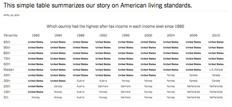
Some busy charts can still be highly effective. See the one below about the declining relative income of wealth classes in the US. The repetitive “United States” could have been replaced with something visually calmer, but the current works actually pretty well.

See that this charts presents other information as well (which countries did well), but the viewer is unlikely to take notice (and she does not need to).

The original article in the New York Times can be found here.

·Data visualization

Funny

Most infographics are a bombastic compilations of overcomplicated, trying-too-hard, visualisations of facts that are not always that insightful. These simple graphs by Danish writer/artist duo Mikael Wulff and Anders Morgenthale are well executed and actually pretty funny.

A compilation of charts here on the Zero Hedge blog, and here is the web site of the original creators Wumo.

·Delivery

Where is that chart again?

The majority of slides in an average presentation are the bubble wrap that protects the real content. These slides are summary pages, set up pages, and lists of bullet points to remind the speaker what she should be saying next.

One indication that a slide is really needed is that you often look for them in one on one meetings. “Hey, wait, where is that email, with that attachment, with that special slide that I made a while ago.”

Spend more energy making slides like these.