

SlideMagic Blog

Frequent updates about all things presentations since 2008. Subscribe to never miss a post.

RSS
all posts

Category Investor presentation

·Investor presentation

Quarterly performance summary: lots of different KPIs on a page

I often use the slide below in quarterly investor presentations for large corporates. How to give a quick overview of the key financials in one chart?
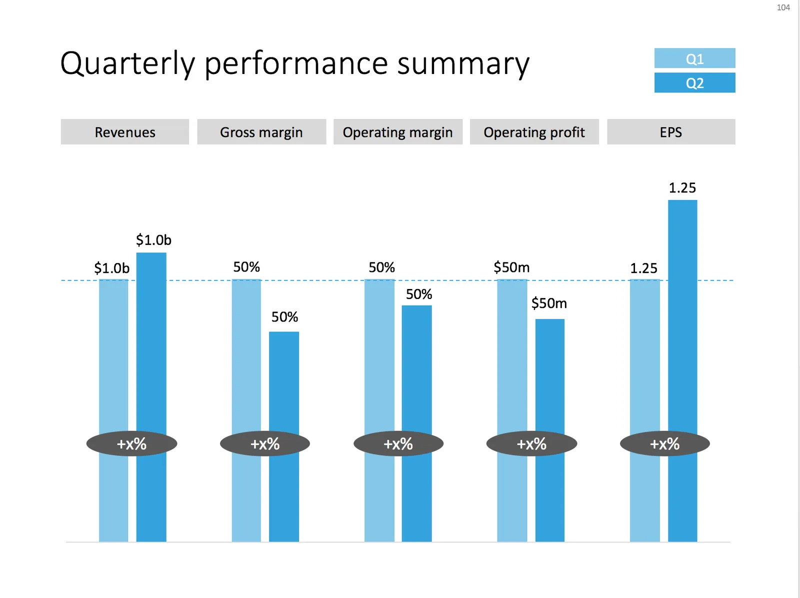
 A chart with an overview of the main financial indicators of the last quarter

A chart with an overview of the main financial indicators of the last quarter

This chart is an example of why often a “manual” chart is much more powerful than a simple copy and paste from Excel:

  • The chart contains values that can differ vastly in range: sales can be 100s of billions of dollars, EPS can be less than a dollar. Margins are percentages, not dollars.
  • Despite this, I forced the Q1 column of each of these values to be the same. In the underlying spreadsheet, they will all say “100”. The other values are calculated as a relative value compared to this 100. To accentuate this in the chart, I connected the left columns with a dotted line.
  • As a result, all labels in the chart need to be filled out by hand, the same for the growth bubbles which I placed over the columns (again a bit unusual)

You can download this KPI chart from the template store.

Photo by Sabri Tuzcu on Unsplash
·Investor presentation

Presenting your team

Team slides are tricky: there is so much to tell when you have 3 people with a 20 year career. Where to start?

I tend to split the problem in 2: put complete bio slides in the presentation appendix, and focus on a few messages about what makes that team special in the main presentation. What is the story of the team?

  • Do they have diverse, complimentary backgrounds?
  • Have they worked for very famous companies?
  • Have they founded and sold a lot of businesses before?
  • Do they have very unique scientific knowledge?
  • Do they have a particularly long work experience?
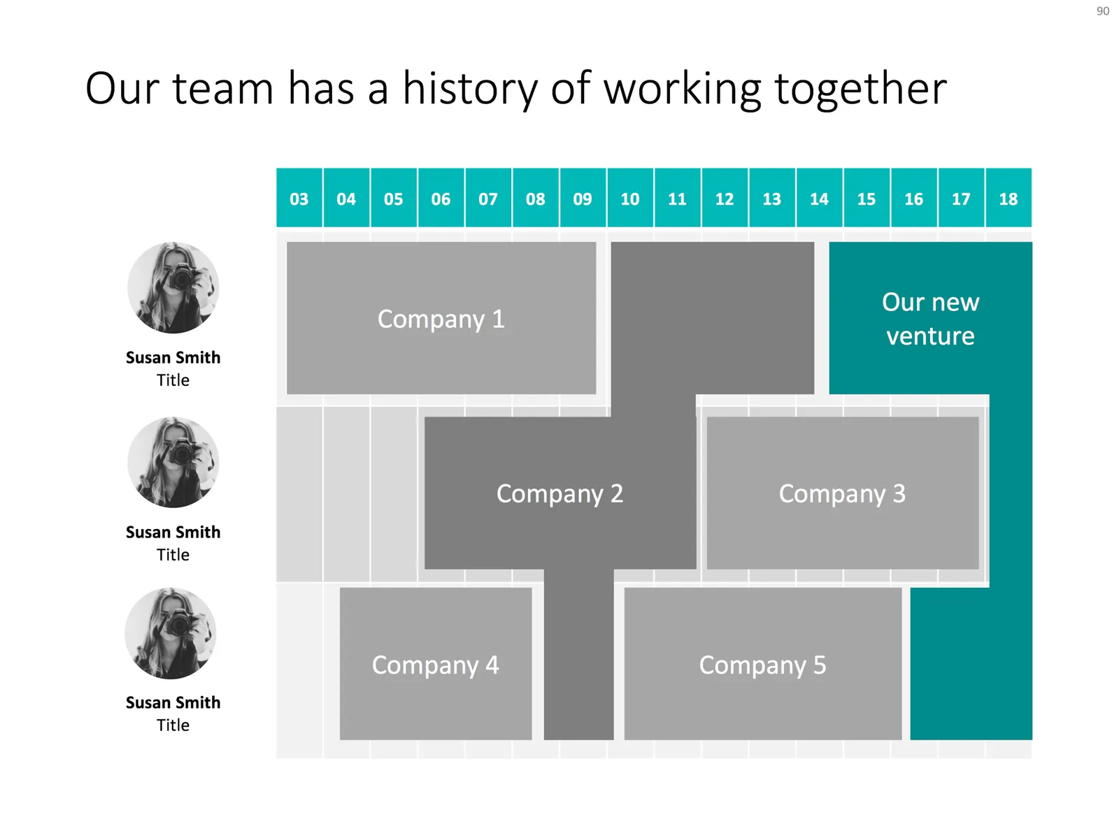
  • Are they a proven team, that has worked together in the past?

Each of these messages merits a completely different slide. The slide below would be an example that covers the last of the above points, a team that goes back a long time together. Rather than dry bullet points describing their background, I laid out the “CVs” horizontally on a timeline, and make very strong visual connections for periods where people overlapped at a company.

Feel free to copy the design, or download the slide from the SlideMagic template store.

·Investor presentation

We only have 5 minutes...

Looking back at more than 10 years of presentation design work, I noticed that my best decks are often the ones that were designed for very short time slots, usually pitch competitions where a speaker would have 5-10 minutes to give it all.

Why?

  • These requests would often come after the client and I completed the “regular” presentation: I went through the process of getting to know the company in-depth, but, and this is important, I had given the content some rest, and when coming back to something after a couple of weeks, you often get an even better perspective on how to tell the story
  • The all-or-nothing 5 minutes makes the client more confident to take visual risks: bolder, simpler slides
  • The client would rehearse more (it is easy to run through a 5 minute story twenty times) and as a result would stumble on imperfect story flows more often

So maybe there is a natural evolution in presentations:

  1. The internal strategy/board deck where you lay out your company’s ideas and make strategic decisions (management consultants stop here)
  2. An attempt at a bullet point story line for a pitch (most pitch presentations stop here)
  3. The properly designed company pitch deck (my projects often stop here)
  4. The “let’s give it one more go deck”

Photo by Mitchell Hollander on Unsplash

·Investor presentation

The "deck for sending"

The focus of my design work has shifted over the past years. The most important objective of my client’s presentations is to make a good impression as an attachment to a “cold email”. What is a good summary presentation that you can send ahead of a (possible follow up) meeting?

It is not a dense “Executive Summary”, one page of dense text (10 point font or less), full of buzz words and jargon. In fact, it might not be a summary at all. Investors say a huge number of deals each day, and don’t want to have to sit through a full presentation to understand what it is you are actually doing. The main purpose of that live presentation is to get an impression about you, the CEO, not to understand the business better. So in 2017,  your presentation needs to be able to stand on itself, convey the story without you being there to explain it. A teaser deck that creates interest is good, but it should not be so mysterious that the investor does not have an idea what you are doing.

Having said that, just attaching your full deck and hit “send” does not work either. I usually suggest to take certain bits out. These are usually the “admin bits” of the presentation, detailed financials, company milestones, go-to-market strategies. This is the more dry content that can be discussed after the investor has bought into the big idea. Also, some of this information might be confidential and not suited to be emailed out to investors you do not know very well (yet). So, the summary presentation is actually the full presentation with certain sections left out.

Continue reading →
·Investor presentation

A list of presentation mistakes

Looking back at recent client work, the V1.0 briefing decks I saw, here are some of the mistakes I encountered. Not a complete list, not in the right order, just some examples that came across my desk the past few weeks.

  • Without even reading a single slide, some presentations have an incredibly dated look & feel: standard PowerPoint colors, old, low res, cliche images, even clip art. Look at a presentation you think look good, and simply copy the style elements with the colors of your logo and your presentation will dramatically improve, without changing one bit of its content. And by copying, I mean copying. Look at the positioning of titles and boxes, the amount of white space that is used. With an example design in front of you, your page should be able to look exactly the same, no excuses!
  • You have gotten used to the strategy review slides that have been in all the decks since you started out a couple of months ago. The audience sees them for the first time. Charts you used to evaluate your strategy, and not charts that can be used to pitch investors or customers. These presentations look highly professional, are loaded with content, say all the rights things, but do not change heart and minds.
  • Some presentations look too cute, minimalist infographics, icons, and cartoon characters. It is maybe nice and funny for a 1 minute product video, but people need to feel that there is a proper business behind this. If it fits your brand, it is fine to use the “cute” story as a sales presentation inside your investor deck, but the other slides should provide a bit more gravitas.
  • There are presentations which take too long to get to the point. Endless series of charts with market backgrounds, often providing statistics for trends everybody pretty much agrees with. Cut to the chase earlier, and if required, put a quick placeholder slide to remind the audience of the market context you are working in
  • Most of the time, I am not to strict with structure in a presentation (yes, I am an engineer who used to work for McKinsey). In 20 minutes, a story that flows nicely is more interesting that a highly structured presentation full of tracker pages and sections. Having said that, some companies actually need it. If you are a biotech with a significant portfolio of drugs in development, the audience need to stay on top of what we are actually talking about right now.
  • Dwelling forever about your technology, or doing a very long product demo does not help, but the other extreme is equally worse: summarizing your product in 2 sentences. The audience need to “feel” what the current pain is, how brilliant your product is, and how clever the underlying technology is put together. Each individual case has a different balance of these 3 points.
  • Certain businesses are basically apps. When the app is still in development, crafting a grand pitch deck might be overkill. Money could be better spent on some great-looking screen mock ups to explain investors or potential partners what it is you are actually doing. Graphics quality is not super important here, you can include 1-2 screens that show that your company is able to produce a good looking product. What is more important is the flow of the application demo you are showing. In these cases, designing the app experience, and designing the pitch deck can go hand in hand.
Continue reading →
·Investor presentation

The purchaser vs the investor

Tech product pitches are different for a enterprise IT purchase officer and an investor.

The purchasing department might be interested in the full list of user benefits, a detailed description of the features, all written in a language that sounds familiar and resembles the one that is used by the billion dollar tech giants, creating a sense of security that they are dealing with a stable product company that knows what it is doing.

The investor is probably too impatient to read through long tech marketing copy highlighting benefits such as productivity, efficiency, scalability, central dashboards. Yes, there is one box to tick whether the company is able to sell to corporate IT departments, but the bigger question is whether this technology fills a big enterprise need that should be very easy to explain. On the back of that, it should be logical to understand why existing players have not/could not have solved this.

Marketing pitch <> Investor pitch.

Image via WikiPedia

·Data visualization

Consistency in financials

Financial projections of new business ideas are totally made up / not accurate, so being of by a few million here and there would not matter? We can make quick changes in our financials in the presentation slides, and then “forget” about updating our financials spreadsheet with the new information.

While the absolute numbers of your financial model might be totally pulled out of the hat, it is the thought process of how you got to them that is still valuable for investors. How does your business model work? What would I have to believe in order for your year-5-dream-scenario to come true?

And that model should be consistent across all your documents: presentations, spreadsheets, budgets, everything:

  • Discrepancies make you look sloppy (a little preview of things to come when you need to work together with an investor on a Board)
  • A consistent model of totally made up numbers makes sure that everything is, well, consistent. If you just slashed sales & marketing cost by 50% but maintain the same amount of sales people, something goes wrong.
  • Inconsistencies make it harder to understand your story for an outsider. If sales are $50m on one page and $49m on another people get confused. You established “$50m” as a mental shortcut for year-5-sales-in-the-most-optimistic-scenario, and all of a sudden you create a new shortcut.

So, even if nobody can predict the future accurately. there is still value to create a consistent financial model the same way as you would for a business in which you know every single detail (next year’s budget of an established company for example).

Continue reading →
·Investor presentation

Checklist for a VC fund investor presentation

A VC fund who is raising money itself asked me the other day to give some example slides of other VC fund decks I have been working on. Showing slides is not possible because of confidentiality, but I could jot down the usual pieces of content after browsing through a dozen recent ones. Here we go in random order:

  • Bios of the investment team, emphasizing different things: investment exit record (if present), how long people have been working together (in and outside the fund), the diversity of skills the team has (including running operations in a business), the big brand employers they have been working for in the past
  • Examples of deal flow they saw last month (sanitized of course)
  • Their perspective on the particular geography they work in (which sectors are hot, where valuations are reasonable, how things have changed over time, how things compare to Silicon Valley)
  • Their perspective on which technology sectors are attractive, which ones not.
  • The network to potential acquirers of companies they have
  • Returns, investment track record, big exits
  • The story behind how the partners in the fund met
  • What sort of deal flow funnel they want to build (how many companies they see, due diligence, investment, etc.)
  • The legal and organization structure of the fund
  • Quotes from entrepreneurs they invested in about them
  • Social media follower stats
  • Pictures of events for entrepreneurs they organized
  • First page screen shots of industry articles they have written, interviews that were published, images of TV appearances
  • Some sort of competitive map of all funds in the same space, highlighting how they are different without “thrashing” their colleagues
  • A list of achievements they had with their portfolio companies, which clients they introduced, which hires they were involved in, which companies raised follow-on investments
  • Which famous LPs invested in their funds (very confidential stuff)
  • Profile pages of portfolio companies
  • Some sort of BCGmatrix not about products but about portfolio companies, which ones are OK, which ones are stars, which ones are write offs
  • List of advisors
  • A slide with legal terms of the fund (fees, carry, etc. etc.)
  • And: evidence of how uniquely “hands-on” the investment team is with their portfolio companies (every fund says this)
Continue reading →
·Investor presentation

Signing NDAs?

As a professional presentation designer I deal with highly confidential information in almost every presentation I work on. Let’s look at NDAs (non disclosure agreements) from different perspectives.

As a founder, inventor, entrepreneur, you have every incentive to get people to sign an NDA before sharing confidential information. You have this fragile idea that anyone could just steal and replicate. Also, NDAs are important when applying for patents. If someone can prove that your idea was “out in the open” without NDA protection, you could lose your claim as its inventor.

Investors see thousands and thousands of deals in a year. Signing an NDA for each single one of them creates some practical problems. You would have to thoroughly check 4 pages of dense legal text for each one of them, you need to keep track of all the agreements over time in order not to forget the thousands of legal obligations you entered into over the course of 20 years. That is the reason most investors won’t sign an NDA.

Since investors hold the check book, they are in a pretty strong negotiation position versus the inventor. What to do? In most cases it is possible to explain an idea without signing an NDA. Simply leave the very specific bits out of the pitch. When the due diligence process advances, you might have a chance to get the investor to sign later on, as the probability of making an investment increases.

Even if the investor had bad intentions, it is pretty hard to copy a startup idea after glancing through an investor deck. You need to have the required technical know-how, the team, etc. etc. to make it happen. And even if you have all that, you need to put in the sweat to make it actually happen.

Continue reading →
·Investor presentation

Getting through to busy people

Most of the presentations I design are to support a 30 minute discussion with an investor. The hardest part of the fund raising effort is often to get to that 30 minute meeting. Some thoughts on elevator pitches via email.

Most people understand that these emails should be short. But people make the mistake of making the email short by cramming in the entire pitch in as few words possible. The full story gets put on a boiler plate, but the fire is left on too long until there is nothing left: big market, great team, strong user traction, multiple business models.

You don’t need to put the entire pitch in 2 lines, your objective is not to land the investment, it is to be invited to a phone call. You want to intrigue enough that it is worth 15 minutes on the phone.

Start with a strong connection. “Your portfolio company CEO [x] thought you might be interested in this.” “We are in a complementary field to your other investment”

Bring a new insight, or a surprising fact, without going into the details. “In 2017, nobody pays for dating sites anymore, but 90% of our users do”. “Everyone knows that electrical cars will only sell if you can get 500 miles on a charge, our batteries could just enable that”. “Google just spent $400m on acquiring a company that we can beat easily”

Avoid empty buzzwords, generic statements, superlative adjectives (300% month-on-month user growth). Keep it human and surprising.