SlideMagic Blog

Frequent updates about all things presentations since 2008. Subscribe to never miss a post.

RSS
all posts

Category Investor presentation

·Investor presentation

Look like a company that gets funded

When you are going on your first fund raising round, you need to stand out from the crowd in 2 ways: 1) investors need to remember you, 2) investors need to remember you as a company they want to invest in.

Creating an over the top, crazy, original, cutesy, pitch deck will score you point 1, but it is a risky bet, 1 does not automatically lead to 2.

I can’t find the exact blog post to link to, but Seth Godin always preaches to look like the company you want to be. And in startup fundraising, it is pretty much the same. Early pitch decks of successful companies that got funded just have that look of companies who get funded. Yes, a tautology.

It is very hard to copy a certain look. Try and copy the look & feel of a famous poster in your presentation, and it almost always comes out differently. It is very difficult for the brain to look and reproduce things objectively. Yes, the margins are a bit smaller, the fonts are different, what is wrong with using black instead of dark grey. Each change is small, but they all add up.

Don’t copy an old pitch deck slide-by-slide, but step back and put yourself in the shoes of an investor, and reverse engineer why she decided to put in her money after reading/seeing the slides.

Cover image by Markus Spiske on Unsplash
·Investor presentation

The follow on deck, 2nd impressions

The question “can you give some more info on this” after your first pitch almost always gets answered by another slide deck. These “follow on decks” have a different purpose and context than your main pitch deck:

  • The audience knows/has bought into the main idea of your story, so no need for “emotional story telling drama” here, the recipient just wants to get specific questions answered here.
  • The content of the slides will be more factual, data-intense
  • The substance of the deck is likely to be very specific for this particular requester, and you are unlikely to have time to invest 2 weeks of design effort in follow up slides to dozens of investors / prospects.

Some design guide lines for these types of decks:

  • Answer the questions asked in a focused way, don’t just dump more slides from the appendix in a new file. You can even set up the deck in a sequence of alternating trackers with the question, plus a slide with the answer.
  • Don’t stick in the exact same slides as you had in your first deck. People can read/hear, and apparently they were not clear enough the first time around. If you have to, use an existing slide that she already has seen, but add big circles, or bright explanation boxes with the required clarification
  • Use a sober, down-to-earth format (like the one used here at SlideMagic), that makes you look credible and professional, transparent (no flashy graphics are needed to clarify your points), and efficient (you did not waste a lot of time/money on over polishing a deck that is basically just a quick memo).
Continue reading →
·Investor presentation

Send decks, not links

A short summary of Mark Suster’s blog post where he argues that startups should send VCs the entire file, not a link:

  • Tracking, tracing, monitoring, of who read what where and how long actually discourages people
  • He likes to file his documents to come back to them later to look at development and self-destructing links to not allow that
  • It adds friction to an already short 3 minute process
  • (And I would add: do what the VC is used to, and most of them have been dealing with decks since the 1990s)

What is a good deck for sending? Well, one that does not contain confidential information: product pipelines, salaries, etc. Assume that your competition will read the slides sooner or later, and there should be no harm when this happens. I have seen it on the other side with my clients, they would forward me a deck of a competitor and we would actually not get any info out of it, but rather admire that powerful pitch that the others created. So, it might actually be a benefit if your competitors see your slides :-)

Cover image by Dmitry Ratushny on Unsplash
The "deck for sending" becomes more important

You used to design a deck for presenting live, and then tweak it a bit to make it suitable for sending / reading in an email. More and more, I end up doing the opposite (at least for fund raising pitches). You create a deck that can be understood without a live presenter, and then make adjustments for an in-person pitch.

  • Business communication gets more efficient in general: fewer, shorter meetings, informal communication
  • People (think they) know how to read a fund raising pitch, in a sense their structures are very similar
  • More and more pitches happen between fund raisers and investors in different locations (lots of pitches to Asian investors)

Your old enemy was the audience falling asleep, checking out by opening the smartphone, the new enemy is the mouse click (page down, or worse: “close”). Given this, it is as difficult to design a good deck meant for reading than it is to create a TEDTalk-style deck for stand up presentations.

Cover image by Kristina Tripkovic on Unsplash
·Investor presentation

Pitch deck alternatives

Venture capitalist Fred Wilson describes 3 alternatives to the traditional pitch deck:

  1. Short video
  2. Short podcast interview
  3. A well-written letter

They are all great suggestions, some observations:

  • All these are substitutes for the “first shot” pitch deck, where the VC is absorbing your idea for the first time, as Fred says to find out: “if they are a fit with our thesis and of interest to me and my colleagues at USV” He will spend a few minutes max on these pitches. You still will need other, more elaborate materials in the next stages of due diligence.
  • See how important information about you, the founder is: videos and podcasts give away a lot about you as a CEO, entrepreneur, people manager, Board Member
  • All of the above are as hard to get right as a good traditional pitch deck (especially the letter is really tricky). Just recording a video in itself will not give you a better chance to succeed. Seeing the first 10 seconds of a poor video, or reading through the first bullet of a poor slide deck are equal turn offs.

Cover image by Daniel McCullough on Unsplash
·Investor presentation

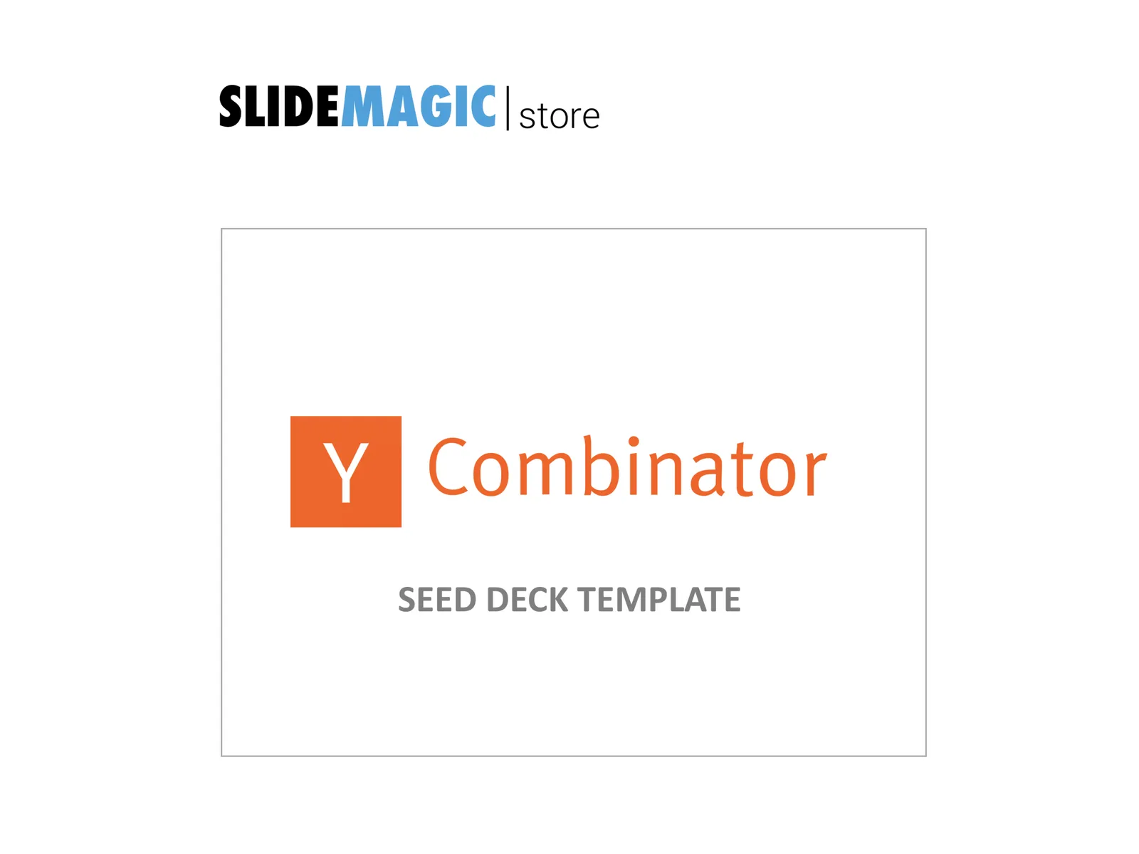
Quick reformat of the YCombinator Seed Deck Template (free)

The application deadline for the next YCombinator is coming up and the incubator posted a suggested seed-stage investor pitch deck template. I quickly ran the template through a make over process using templates available in my store. The resulting pitch deck template can be downloaded free of charge.

Some comments:

  • This is a seed stage pitch deck for an investor which has very specific opinions/requirements about sourcing investments: early stage, seed stage businesses are extremely fluid and change/pivot so many times that there is little point in long-winded elaborations, given the volatility of these extremely early stage businesses, the team is the biggest indicator whether there is a chance that the company will be successful.
  • YCombinator is proud that they can see through fancy-looking decks, you probably even get points for not wasting time on PowerPoint slides, and instead focusing your efforts on the company (pretty much the philosophy behind SlideMagic). This might not work with all investors (hence the slide upgrade in look & feel in my remake).
  • The big selling point in this deck is obviously the placeholder for traction and growth, not many early stage companies will be able to produce the numbers for that “hockey stick” (yet).

All in all, these are good guidelines for crafting a pitch deck for a highly knowledgeable investor. I would up the graphical finish just a notch to make it look more pleasing, without overdoing it. That’s what my template tried to do.

Cover image by Evan Kirby on Unsplash
·Investor presentation

Pitching your startup

Here is a nice post on the Stripe Atlas site about pitching your startup. It is written from the perspective of a very early-stage startup pitching for a seat in an incubator such as Y Combinator. (If the entrepreneur is not yet that experienced, an achievement like having climbed Mount Everest adds a datapoint about persistence).

Here are some quotes that struck me from the post:

  • “Explain assumptions in your pitch like you would to a smart friend in a different field.”
  • “The investor is not your user, so pitching users and pitching investors are completely different.”
  • “This pitch says nothing, in 18 words: COMPANY will help e-commerce stores sell more products using cutting-edge AI-enabled algorithms and machine learning.”
  • “Clarity is particularly important when you’re tackling recently popular ideas, like blockchains or machine learning”
  • ‘Your reviewer will read literally thousands of data points today–the average pitch includes more than 10. No one can remember that many arbitrary numbers, so reviewers compress them to “zero”, “non-zero”, and “impressive.”’
  • 'Nobody has ever written in their comments on a company “Wow, their sign-in screen blew me away. I want to invest in that sign-in screen.” ’
  • “Risk-taking is encouraged in startups; stupid risks are not. Walking into the office of a person in a position of authority without a meeting scheduled is a risk, but it suggests ambition and sales ability. Describing crimes you’ve committed generally suggests poor judgment.”

The people evaluation bit of this Y Combinator screening process seems very similar to the way we were on the lookout for new talent in McKinsey. Especially for young hires with little work experience, you had to comb for indicators of possible future success, fit. In every interview you really wanted the candidate to succeed. And the dialogue with the candidate, the way she responded and thought was very important.

Continue reading →
·Investor presentation

"Familiar" investment ideas

Investors keep on insisting on simple and short pitches, cut pages, cut time, simplify. I don’t think that there is a problem with the investor’s IQ, there is not reason to dumb down your story.

What might be happening is that your business actually is very familiar to the investor. She has heard similar stories a thousand times before. A gig economy idea in a new market segment, a me-too business in a different country, a new Internet security technology, semi conductors that are a factor 10 faster, a new private equity fund that promises to be really hands on with portfolio companies.

While your business is new, the investor has learned 90% of the context in previous presentations. Talking 10 minutes about how successful Uber is and how this idea can be applied to other sectors is a waste of time.

Simplify/shorten your deck means: I understand already a lot, let’s go to the interesting bit.

Cover image by Dan Gold on Unsplash
·Investor presentation

First attempt at a generic startup pitch flow

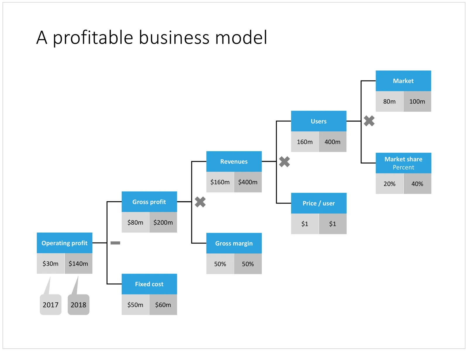
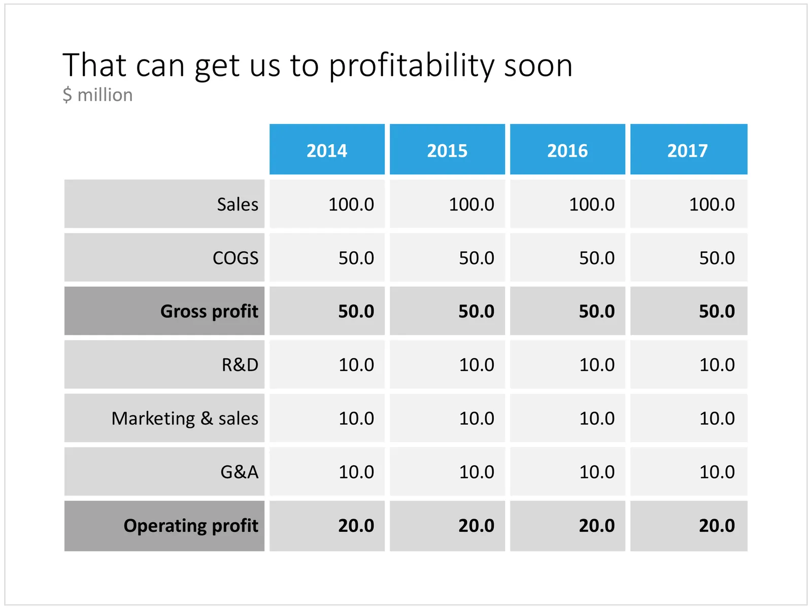
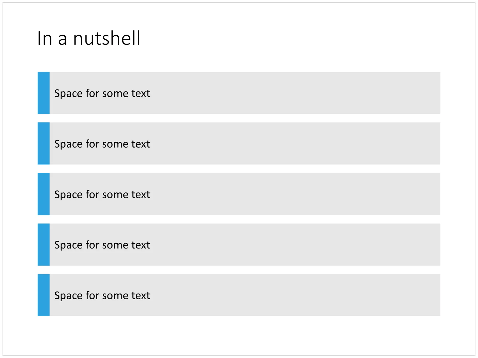
Below is an example of how you could stitch (I don’t want to call it “Frankenstein”) a startup pitch deck together using the slides that are available in the template store. It is tricky to design a generic startup up, the upfront bit of these decks is highly specific to the company and the marketing it is operating in. Towards the back, things get more generic (team, financials, pipeline, roadmap, etc.).

I will give this template a bit more thought, and I will also turn my attention to other standard presentations such as quarterly results presentations, kick off documents, Board meetings, etc.

The deck above can be pieced together from individual slides in the template store, or downloaded in one go here (4:3 PowerPoint only for the bundle). Have a close look before you do to make sure this is the flow that fits your company. Subscribers can download at no extra cost and experiment freely.

Cover image by Jomjakkapat Parrueng on Unsplash
·Investor presentation

Should you send a short "teaser" deck to a VC?

Here is an interesting reply on Quora:

The answer seems like common sense. “Short” and “long”, “tease” and “bore”

  • Don’t send a “short” 3 page slide deck crammed with font size 8 text
  • Don’t send a 3 page deck that is so vague and mysterious that the VC does not understand what it is about (“do you want to share our journey that will revolutionise personal finance?”)
  • Don’t send a super looooong slide deck does not get to the point even on slide 15 because you are still setting the market context and ticking of the hottest buzzwords
  • Don’t send a long slide deck full of (confidential) details about your finances, product pipeline and roadmap, competitive strengths and weaknesses and the last Board decisions

“Short” and “long”, “tease” and “bore”, the smart approach sits somewhere in the middle. VCs are usually reasonably intelligent, and have likely seen many, many pitches from companies that operate in the same field as you do.

You could almost compare this to you checking out a web site of a new competitor to your business in your industry. After a few seconds, you either utter a sigh of relief, or get that feeling, “hmm, this could actually be pretty good”. The VC will look at your deck in pretty much the same way.

Photo by Paul Dufour on Unsplash