SlideMagic Blog

Frequent updates about all things presentations since 2008. Subscribe to never miss a post.

RSS
all posts

Category Images

·PowerPoint

Accurately cropping images

Cropping an image accurately can be tricky, especially when PowerPoint is trying really hard to suggest possible cuts alongside snap lines it thinks are useful. My solution, drag the image to a huge size (without distorting its aspect ratio), crop, and shrink it down again.

Photo by Morgan Harris on Unsplash

·Images

Flying through

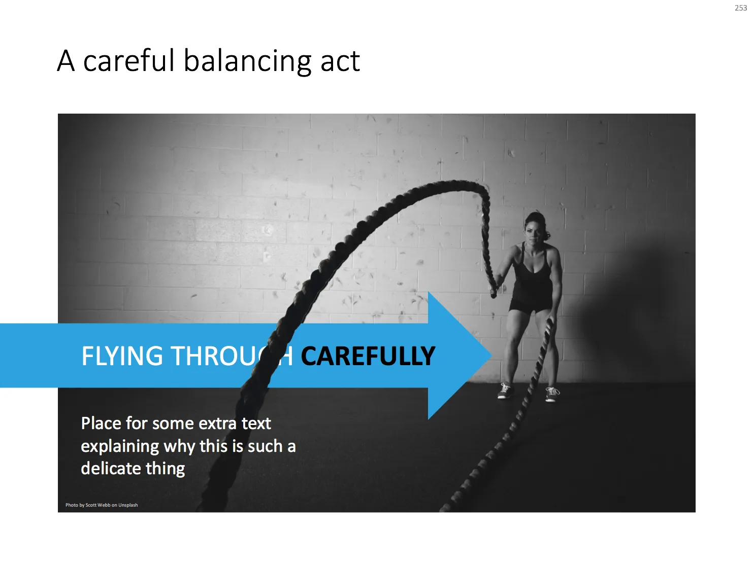
With a bit of Photoshop editing you can create an effect of a PowerPoint shape flying through some loop. I uploaded a new slide to the template store that uses this effect. Over the arrow, I positioned a second layer of the image, but just with a piece of rope with its background isolated. The arrow expanding outside the frame of the image (yes, I look those), adds to the motion feel in the slide.

Click the image to find the slide on the template store, subscribers can download it free of charge.

Cover image by Blake Wheeler on Unsplash

·Images

Cartoons in presentations

Want to use a cartoon in your presentation? Here are some things to consider:

  • Humor in a presentation can work, but be careful what sort of jokes you pick. A cartoon that was very funny late last night when you prepared the slides, could not fit the meeting context the next morning after that earlier remark that did not go down well. If you hardwired the wrong cartoon in your slide deck, make sure to click-skip really quickly.
  • Do you have the copyright for the cartoon you just found on Google Image search?
  • Does the cartoon actually add something to the presentation, or is it a business cartoon cliche?
  • Can the audience actually read what is written on the cartoon from the back row?
  • And finally, do you give the audience enough time to read it? As soon as you put a cartoon on the screen, everyone will start squinting to read what Dilbert has to say, and no one is listening anymore what you say at the same time. It might be best to pause your presentation until the first giggles start emerging from the audience. And remember the audience reads the cartoon for the first time, and needs more time than you to understand it. If you have to, you might have to read out the cartoon to the audience.

Cover image by Samantha Lorette on Unsplash

·Images

How to cut out shapes out of images in PowerPoint

PowerPoint can do Photoshop-like tricks. One of them: cutting shapes out of images. Here is how to do it:

  1. Drag your image on the slide
  2. Draw a shape on top of it (the freehand shape allows you to create a very precise shape)
  3. First select the image, then select the shape (shift click)
  4. Now select the Shape Format menu
  5. Click Merge Shapes
  6. Click Subtract

That’s it. Below is a slide from the template store that uses this technique (you can download the ready-made slide if you want)

 The final template slide

The final template slide

 The making of

The making of

Photo by Joanna Kosinska on Unsplash

·Concepts

Popping out of the box

Unlike many designers, I actually like framing my slides, leaving white space around the edges. Stretching your picture all the way to the slide boundary looks nice on one page, but creates inconsistencies with more traditional data slides, and reduces the readability of slide titles.

One advantage of the frame is that you can make things pop out, a trick that is often used in magazine design. See below an example I made using that approach.

Feel free to copy the design above, or buy it ready for you to use from the SlideMagic template store.

·Images

App demo slides

Doing a live app demo in a 20 minute pitch meeting is risky, the technology might go wrong, and probably more than half the time you spent in a 2 minute app demo could be things that are not really interesting: logging in etc.

Instead, I usually prepare a series of screen shots with big explanation bubbles in my presentations. No technology risk, no loggin in, setups, and I can set the exact flow I want. The added benefit is that I can zoom into parts of the screen that are hard to do when showcasing the app live in an actual device.

Most of the time, I use page filling images to demo an app, to get as much screen real estate as possible. If I want to introduce the app in a general way, I use a background of a mobile phone or desktop to give the slide a more interesting context. As a result, the the screen itself will hardly be readable by the audience, and becomes a background image.
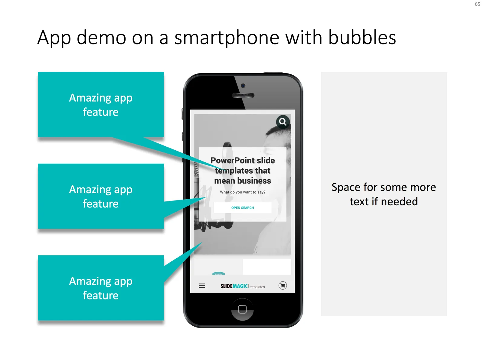
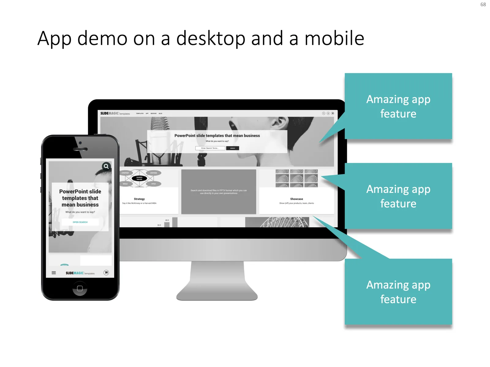
I added a few examples of app demo slide layouts to my template store.

·PowerPoint

Size creep

Super high resolution images of small slide elements can inflate the size of your PowerPoint or Keynote file without you noticing. A common culprit is an innocent looking page with 30 customer logos. Compress your images often to keep file sizes in check.

Another common file size mistake is to include high resolution images in the slide master to make it easer for people to understand template slides that are meant for photos. As a result, even a simple text slide will create a huge file as the slide master gets saved as an integral part of the document. This can add up in a company with 10,000 employees.

Image compression in PowerPoint can sometimes produce unpredictable results, especially when you tick “apply to all” and you have a presentation with a lot of photographs. I often see cropped images going haywire, the only rescue is to compress images one by one. Always save a copy of your file before attempting to compress the file.

Handy link: how to reduce file sizes in Office

Image via WikiPedia

·Images

Dramatic reduction in stock image use

Stock image sites were a great discovery when I started getting into the presentation design business in the early 2000s. In fact, they might have pushed me over the edge in becoming a designer. All of a sudden, I discovered that combining McKinsey-style professional slides with carefully chosen stock images you could make some powerful sales and investor decks.

All of this happened at the same time when very fundamental books by the likes of Garr Reynolds and Nancy Duarte were published, TED talks were taking of, presentations were changing!

Looking back, and looking forward, I see that my presentation style has changed. The biggest change: far, far fewer (premium) stock images. How come? Post-rationalizing:

  • I got much better and assessing the setting in which the presentation would be delivered. And very rarely do I design presentations for a massive keynote or TED Talk. Most of the time, these are decks that will be presented in a small conference room, to a small audience. And more importantly, the first “punch” that these decks need to deliver is in the email inbox, when an investor or potential customer decides to keep on clicking (or not). More and more, I am starting to design these presentations for the impatient attachment clicker, and less for the live audience. This means: fewer images, and yes denser content. It is cumbersome to maintain 2 versions of a document (one for sending, one for presenting), so in practice the live audience is suffering a little bit at the expensive of the email attachment reader.
  • Investor and sales audiences have evolved. Pitches have a high degree of similarity, they all follow a similar pattern, companies are addressing similar types of problems, pitching similar types of technologies (investors are increasingly specializing), so I see less need to “wow” the audience with dramatic new concepts (self-driving cars) but rather focus more on the nuts and bolts of an innovation. Investors are clued up, and look for the substance, quickly clicking through the pretty pictures.
  • The premium stock image sites are collapsing under their own success. Image banks are diluted with designs that are somewhere between an actual clean photo and a finished design concept. Quality is technically good, but artistically “cheesy” and staged. Opening these sites as a designer makes you instantly feel that you are “in the wrong part of the Internet” And I am sure that even the layman designers gets totally confused when browsing these image sites.
  • Free alternatives to paid stock image sites are popping up everywhere. If you need an image of the tip of an iceberg, you can find pretty decent ones on Google Image search (use the labeled for re-use option), WikiPedia or one of the many free stock image sites (that try to lure you into buying premium images that are often not better).
  • And finally, I think it is a matter confidence and experience, where I somehow found a personal design style that involves fewer images.
·Images

Build your image library

It is surprising to see that most of my clients have very few images of their staff, their products, their client installations. The result: very poor product image shots, and a set of inconsistent headshots of the management team in the presentation.

Make it a habit to build your image library constantly using your smartphone. Snap a picture of the management team meeting (when everyone is in the same room together), the product demonstration, the big shipment of product that goes out of the door, maybe the strategic partner visiting.

In that way, you always have a rich library of images to chose from.

·Images

Robo photo shoots

I was always wondering why it is that whenever I look for images of the exact same person, in the same outfit in different positions, I always end up with a search screen full of Asian models. Via Petapixel.