SlideMagic Blog

Frequent updates about all things presentations since 2008. Subscribe to never miss a post.

RSS
all posts

Category Images

·Images

The genie is out of the bottle

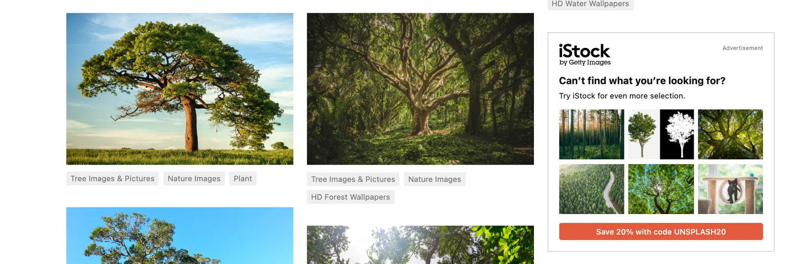
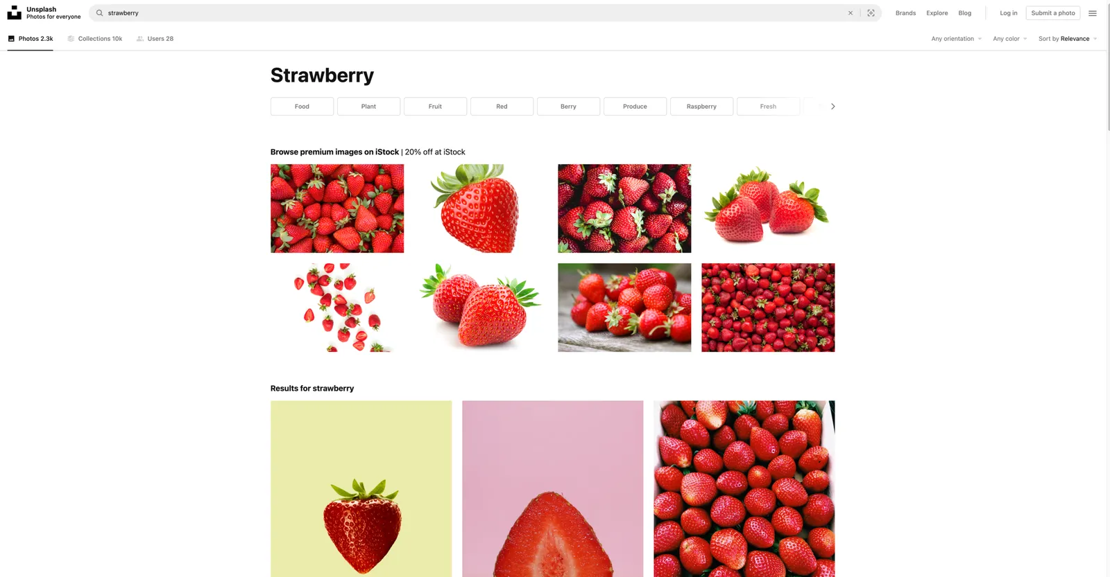
I wasa bit worried about Unsplash after the Getty acquisition, and the current home page of my favorite photo site confirms some of these worries, 50% of the space above the fold is devoted to promoting iStock (scroll down and they take another chunk at the bottom of the page). I think the genie is out of the bottle when it comes to free, open source images. And this page actually shows that there is no quality difference at all between images for which you pay, and images that are free. Unsplash has a responsibility to all the photographers that made their images available under a certain expectation of the spirit of the site. Hopefully it can find a suitable business model that will work for everyone. If Unsplash does not succeed, a new Unsplash will emerge somewhere.
·Images

Selecting the right photos

The photo shoot from a few weeks ago delivered almost 900 images. We are still selecting the ones to use. Here is the approach I take to go from 900 to 10…

I uploaded all images in a good photo organizing app (I use Google Photos). This enables me to scroll really fast through lots of images. (Desktops are slow to generate thumbnails). Also, it easy to mark images and share those. Trying to copy file names is a pain. Finally, I uploaded all images in full size, so that the photographer can download them in case touch ups are needed.

The I take different zoom levels: zoomed out, which ones have a great composition that pops out as a small picture, without seeing the fine details. Which images have lots of white space that I could use to overlay text. Zoomed in, which images instantly “speak to me”, where is the camera gaze just right, without paying too much attention to details. In a short period of time, I mark a lot, a lot of images.

Then the selection process switches to the “favorites folder” and it becomes a matter of “deselecting”. Take out the obvious mistakes (closed eyes, etc.). When images are similar, force yourself to pick one. If you really like an image, go back into the big pile to get all the images that were made around that time to get the best one. Step by step, you get closer to your 10 final images…

If possible do all of this on a desktop machine with a very large monitor and mouse with fast scroll wheel.

·Images

A team photo shoot in 2021

My wife and I organised a team photo shoot for the web page of our upcoming business. It had been a while since I did one.

Nice pictures can add greatly to the quality of your web site and/or presentation. Head shots are up to date, all look consistent, and best of all, you have an opportunity to take an image of the entire team together, given you the opportunity to show the energy that you are radiating as a group of people.

We decided to bring the professional photographer into our home rather than venturing out to her studio. Luckily, she was flexible enough to bring the required equipment. A photo shoot at home has the advantage that you feel more comfortable, and that you unlimited access to your wardrobe incase certain outfits/colours do not come across very well.

Ten years ago, many professional photographs were taking in front of the “gradient grey” screen. Fast forward to 2021, with Zoom calls in front of blurred bookcases, these backgrounds look very staged and dated. It makes the photo look like a high school yearbook picture.

They key thing the photographer brings is no longer the camera. It is the ability to engineer a relaxed pose of you, and even more importantly, get the correct light. A was amazed by how a modern “umbrella flasher” can give great image results in pretty much any lighting condition (so no longer the need for the studio).

While a woman can still dress up in a great outfit, I find that for men (me), wearing a full suit looks awkward, you get the “wedding groom” look on your corporate web site. Jacket/no tie, or a turtle neck work great.

Continue reading →
·Images

"Empty" images

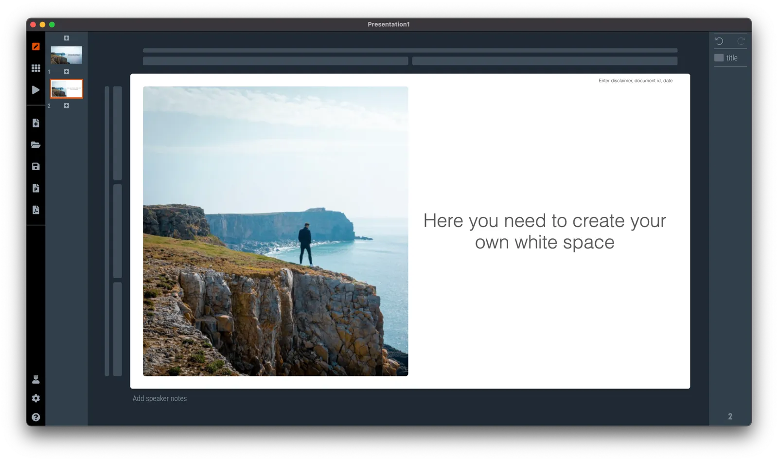
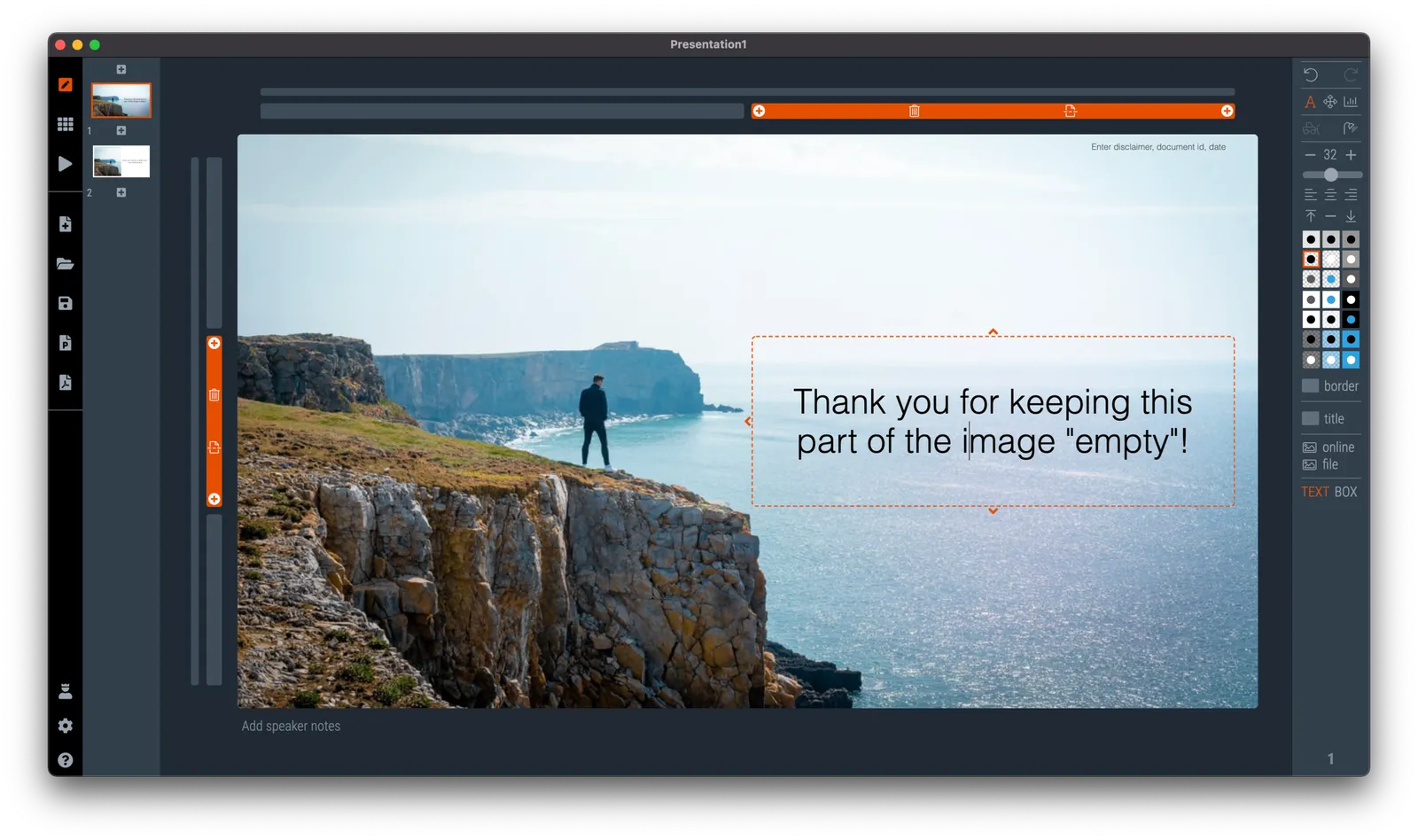
When looking for images for your presentation (SlideMagic has a great built-in image search engine), consider searching for images that are relatively “empty”, i.e., images with a lot of white space. This allows you to set them as the background for your entire slide. See the example below.

Pick your keywords to find these type of layouts: empty, background, wallpaper, sky, cliff, horizon, etc. etc.

Photo by Zoltan Fekeshazy on Unsplash

·Advertising

Using brands in presentations

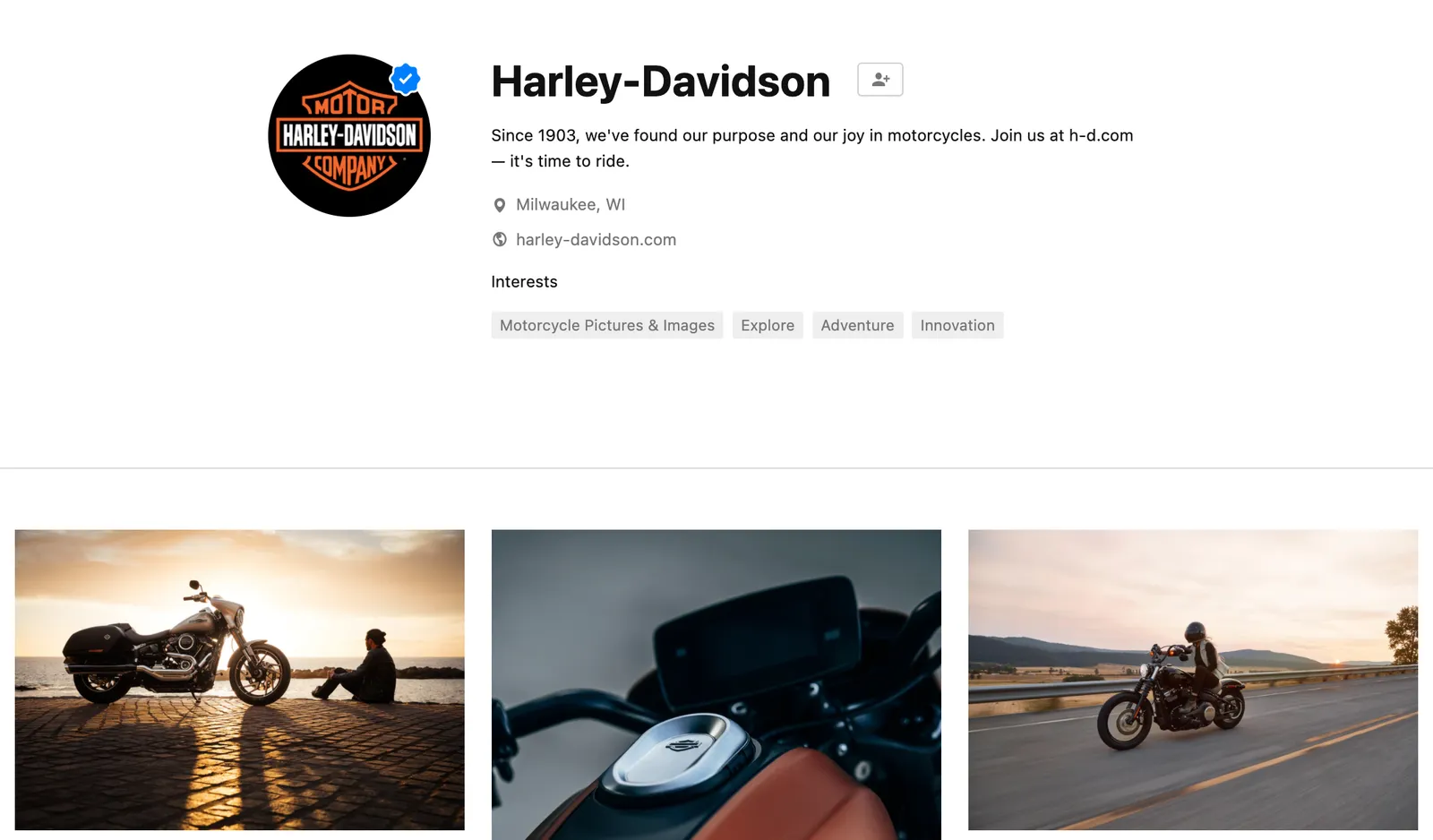
It is usually hard to find good images of products made by well known brands that are of high quality, not obstructed by advertising copy and free of copyrights. Free photo site Unsplash is trying to change that by building up a revenue model where photographers post (and get paid for) posting images with brands in it. (Curated for quality by Unsplash and endorsed by the brand in question).

This is very useful for presentation designers. Looking for a nice Harley-Davidson motorcycle? Here you go.

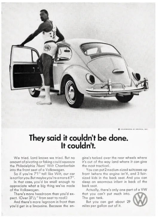
I agree with Unsplash’s observation that advertising has deteriorated in quality over the years.

But on their own web site, they can do a bit better with ads for their new shareholder/investor….

Photo by Harley-Davidson on Unsplash

·Images

Why do the Bidens look so huge in this picture?

Something does not seem right in this photo:

The Bidens look gigantic compared to the Carters. What happened? The photographer used a wide angle lens to fit everyone in the frame, but was standing very close to the subjects. The result: distortion. Look at Jimmy Carter’s shoes, they seem at the scale scale as Jill Biden.

This is the opposite effect of the “Corona crop” where taking a picture of people with a zoom lens, and then cropping a small shot, suggests a very dense crowd when people are not that close to each other.

If you are not an honest journalist but rather need a picture of a dense crowd for your presentation, you can use the “Corona crop” effect to your advantage, the resulting image might not reflect the truth, but it does not look weird. The “Carter crop” on the other hand, will always look distorted and unnatural.

·Images

Getty buys Unsplash

Getty Images who is in the business of licensing photographs to professional media is acquiring Unsplash, the open source image library (which is also powering the image search on SlideMagic). I remember how Getty acquired iStock as well back in 2006. With VC investors coming on board in the Unsplash Series B financing an exit would eventually happen.

The press release states that Unsplash will remain an independent unit inside Getty. Only the future will tell how this pans out. It would be a shame to see “suggested” (maybe more cliche) Getty or iStock premium images alongside Unsplash search results. Or open source photographers being lured in some sort of licensing-only revenue model.

Two things make me optimistic:

  • The current photographers on Unsplash submitted their images under an understanding about how they are allowed to be used, it is not possible I think to change that across the board retrospectively
  • Now in 2021, it is very easy for “another Unsplash” to pop up if the culture and spirit of the current site changes.

But some well-known photographers on Unsplash think differently:

Let’s see what happens.

·Images

Making Bernie memes, and image positioning in more serious presentations

Everyone is super imposing the image of Bernie on other photos at the moment. Why do certain images look realistic, others not? Some pointers that might help with your Bernie creations, but can also be useful when you need to make more serious presentations.

  • Think of the size of Bernie versus reference objects close to thim. Putting him next to other people makes it easy to get it right. In the absence of reference people, focus on other objects to compare the size to. The size of Bernie versus objects that we know the size of, tricks the brain in getting the perspective of the image right.
  • See at what angle the image of Bernie is taken. The legs of his chair show the angle at which the floor should run. Bernie’s image is taken from a long distance with a zoom lens, therefore you will see that most compositions that you took with a phone (lens 1.7m above the ground, subject probably 5-10 meters away) will not work.

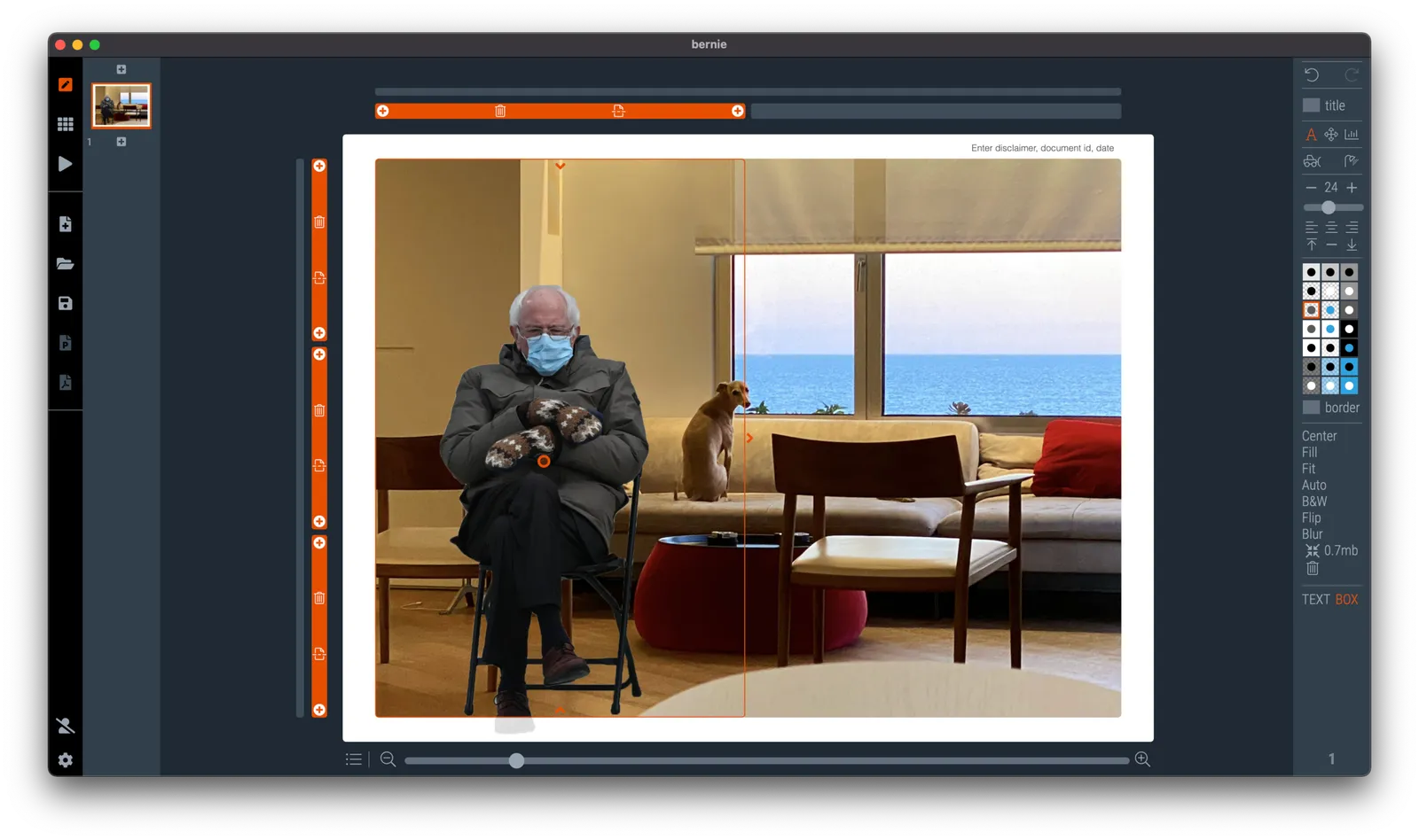
It is hard to get these right. Simply move and zoom the image around a lot until you see that it fits right. Here is Bernie in my living room keeping Grifin company, In SlideMagic I put the living room as a ‘frame’ image, and made one big grid box as the foreground for Bernie. Then, I switched off the titles.

(@taber has already done the hard work for you, download a Bernie image with transparent background here).

·Layout

How to crop headshots in your presentation

The ideal design for a slide that shows your team is a group picture, all taken together. Unfortunately, these are almost impossible to produce. Teams change, and people are hardly ever in the same room (especially now with the virus).

The next best thing is a collage of headshots. Professional graphics designers have a specific approach to line these up properly:

  • Make sure that the eye line of all the head shots is more or less the same (at 25-33% of the image height
  • Make sure that the sizes of the heads are more or less the same

In PowerPoint and Keynote, this is an absolute pain to do. Getting different images to have the exact same size is tricky. Cropping images to position eye ines is tricky to do, and might undo part of the work that you did to get them to be all the same size.

In SlideMagic, things are easier, because it works with fixed shapes and smart cropping.

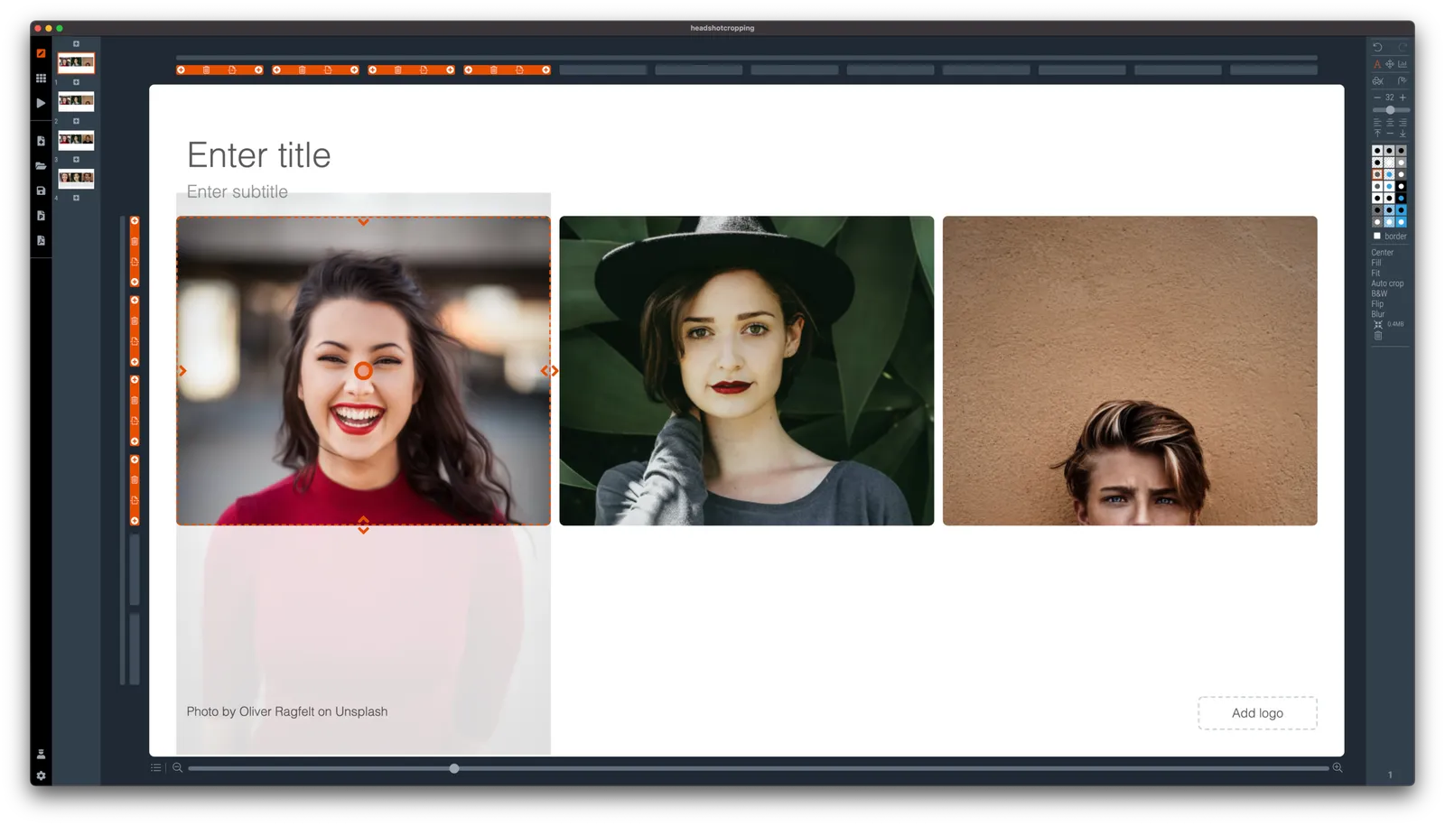
Below I plopped in 3 portrait images from the built-in image search engine of SlideMagic. In 2 of the 3 cases, the “AI” smart cropping algorithm did already a reasonable job, in the last case, totally not. But first things first, all images have the exact same size, and are spaced out absolutely perfect.

Next, we are going to drag the central dot at eye level for each of our team members and drag the images inside their boxes so the eye lines line up.

Continue reading →
·Layout

Focal point cropping!

********* UPDATE: The new focal cropping is now out of beta and part of the regular SlideMagic release **********

Happy new year to you all, 2021 has already an important feature update.

I am testing an exciting new feature for SlideMagic: focal point cropping. (I first spoke about this back in August.) For each image in SlideMagic, you can set a focal point, a dot on the most important part of the photo. This can be a face, a feature of your product, a quote on a screen shot for example. If you subsequently change the size or shape or zoom level of the image, SlideMagic will re-crop the image so that your focal point appears in the right spot.

I have seen many examples of focal crops in other applications, but no one did get it completely right. That small house on the mountain you focused still disappears on certain screen sizes, or pictures get completely stretched and distorted when resizing screens or changing the composition of your slide. In SlideMagic, everything stays in place.

A particular design decision in web technology standards made it particularly hard to do (without having to divide by zero). Over the winter break, I rewrote the entire image rendering engine of SlideMagic, which was a bit like replacing the foundations of a house while people continue to live in it.

A lot is going on here, in terms of underlying math and how the user interface works. I won’t spell it out in detail here, the app should respond naturally without you having to think about it. The basics are in place now, but I still see a lot of improvement opportunities to the image cropping algorithm including automatic object detection.

Continue reading →