SlideMagic Blog

Frequent updates about all things presentations since 2008. Subscribe to never miss a post.

RSS
all posts

Category Images

·Images

Icon images

What do I mean by an “icon image”? A direct visualization of the title or a concept. For example: a small image of a wallnut on the summary “In a nutshell” slide, a photo of Albert Einstein on the page that reads “Smart product architecture”, a bag full of $100 bills on the revenue model chart.

These images are similar to icons that people use in computer software or web sites. They quickly remind the viewer what it is that you are talking about. But these icons are exactly as inefficient as text in getting your message across. When the audience sees the word “smart”, or sees the small image of a brain, it still does not understand why that product architecture is so smart.

You can find a better visualization.

·Images

Movie posters

The site of the IMP Awards has an excellent database of movie posters, searchable by year, title, actor. Useful inspiration.

·Images

A call to stock photographers

For most images I use in PowerPoint, I use Photoshop to extend the background and create more white space for type. You can only do this when the edges of the image have a nice neutral pattern background.

Stock photographers crop their images to get more interesting compositions. The result is that many images will have hard cut offs that cannot be extended. Here is my call to stock photographers: let the designers of the final products do the cropping for you and make the full version of your file available as well.

Maybe stock photography sites should do for images what they already do for vector files: offer a ZIP file for download that contains multiple items: one example crop that creates a nice thumbnail to drive sales on the site, and the original that designers can work with.

Image via iStockPhoto.

Update: Linda Lor linked in the comments to her video on how to extend images in PowerPoint without the help of Photoshop. I am embedding it here:

·Images

But you cannot see the building features!?

Recently, I designed an investor presentation for a real estate developer. Most PowerPoint presentations designed by people in this sector look like a real estate catalogue: page after page of small images of buildings with square meter indicators.

I did something different. One property per page, one page-filling photo of a close-up of the building, with a short story about the property in a subtitle at the bottom. You get the feel of the quality of the building without seeing the entire structure. Similar to a fashion catalogue where it is actually hard to see a full photo of a suit.

Remember your audience. This presentation was for institutional investors, not for architects or property buyers.

·Images

We need a replicator in PowerPoint

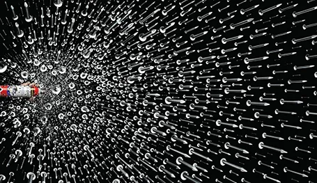
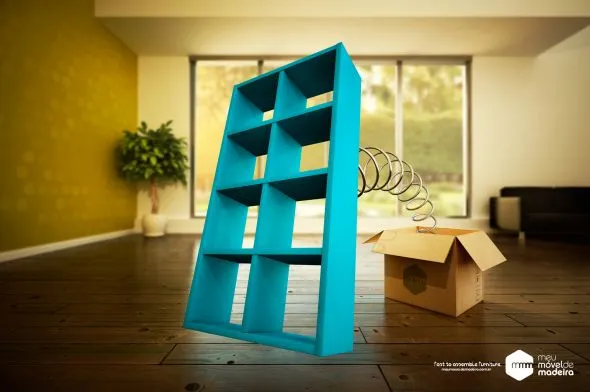
I am making a second attempt to master the art of motion graphics, this time through Apple software. It is much easier to use than Adobe’s. The more I think of it I come to realize that the ability to replicate objects infinitely and from different 3 dimensional angles could be as useful as flying and bouncing text in presentations (regular readers know what I think of over used animation features). With a good replicator, PowerPoint could produce slides like this:

Via Ads of the World.

·Images

Using hand drawn graphics in slides

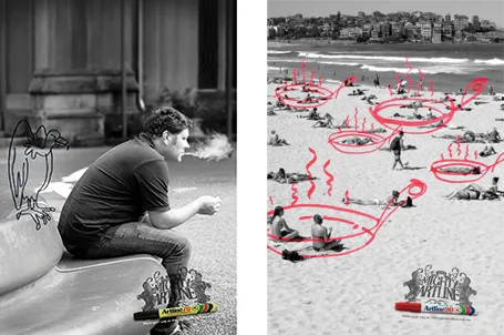
Hand drawn graphics can work great together with images in slides. As an example, see these ads below. (I am not sure whether these ads do a good job in selling markers, they are great though in warning you to take care of your health).

It is possible to draw shapes using a mouse or a drawing pad in PowerPoint, but I always find it hard to replicate that marker effect. Instead, I scan in real hand writing using a scanner, and then kill the white background with the Photoshop color range filter.

·Images

White frames or not?

Most slides with images work best when you scale up the photograph until it bleeds of the page.

Making the image a bit smaller leaves a distracting white border around your slides that does not look good when projected on a big screen.

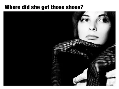
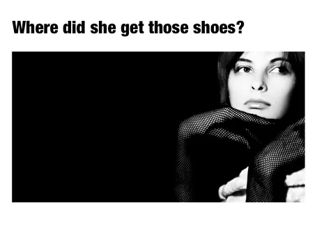
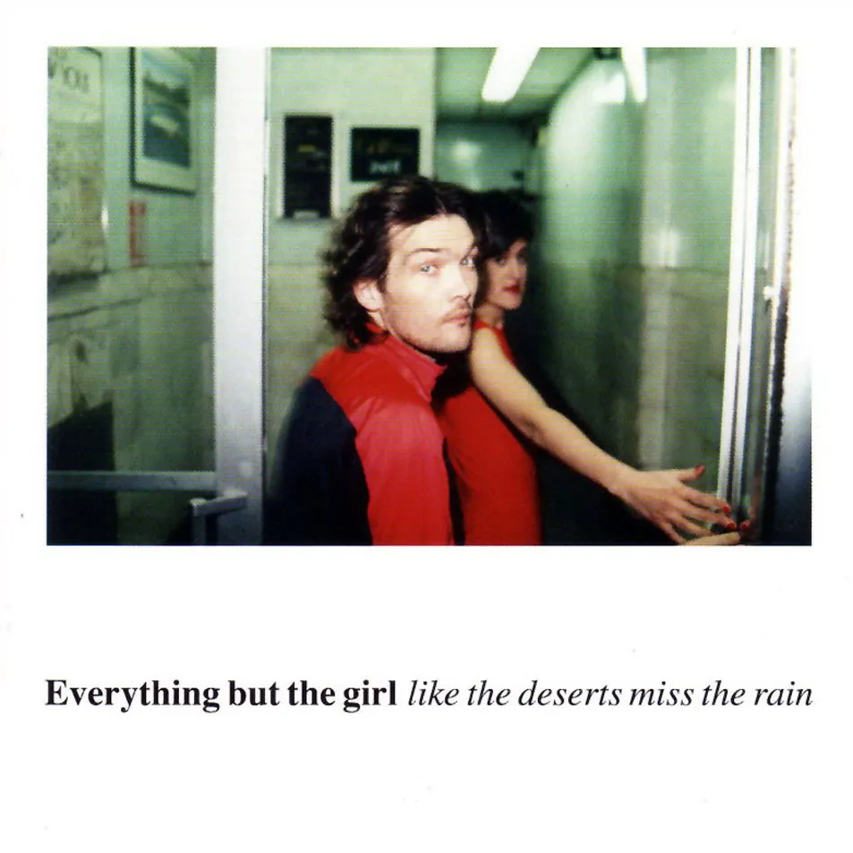
However, recently I started using a layout that is very often used in print advertising. An image which is more horizontally cut and more white space above and below the image. It is maybe not the best for large on-screen key note presentations, but it looks great for corporate decks that are discussed in a smaller setting.

This layout is often used in CD covers, see Similar to this album cover of a 1990s hit by Everything but the girl:

·Art

Art Authority for Mac

I reviewed Art Authority, this great art catalogue for iPad earlier, and I just bought the same application for the Mac.

The bad news, the user interface is a lot worse than the iPad. You browse art in finder windows, sometimes via HTML pages.

The good news, working with the images is a lot easier. Since a good keyword search mechanism is still missing, a very large monitor makes it easier to browse icons of paintings. You can have multiple thumbnail windows open, and leave them open for a long time.

Ten dollars well spent. Twenty dollars well spent if you buy the iPad app as well.

·Advertising

Photo compositions that hurt the eye

Photo editing software can do a lot, and it is getting increasingly used in advertising. This ad however shows its limitation. When you try to be photo-realistic and it is not 100% right, it just hurts the eyes. The concept behind the ad is good, the execution not.

Via Ads of the World.

·Images

Images from Chernobyl

The current crisis at Japan’s nuclear plants triggered this morning’s NYT article about Chernobyl, which will need to wait for another 300 years before it can be inhabited by humans again.

The confusion and uncertainty experienced by the people in Japan must be similar to the surreal experience I went through here in Israel while unpacking government-issued gas masks and constructing a biological/chemical shelter in one of our bed rooms just before the 2nd Iraq war in 2003. I remember taping the windows during live TV coverage of Tony Blair’s speech in the House of Commons advocating military action.

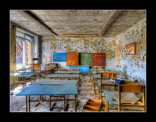
This photo set on Flickr by Tim Suess is both scary and beautiful at the same time.