SlideMagic Blog

Frequent updates about all things presentations since 2008. Subscribe to never miss a post.

RSS
all posts

Category Images

·Images

But we are a serious company!

I get that question often when presenting my deck loaded with impressionist paintings to a big corporate. Serious companies cannot make presentations like these.

Wrong. Visual presentations without bullet points can be highly professional, and highly serious. Just take a different theme than impressionist paintings.

Right. I do agree that being serious adds a design challenge. Everyone can Google image search a bunch of funny page-filling images together and add some outrageously big wacky fonts to them and call it a visual presentation.  The challenge is to add some aesthetics, but it is an easy step to make once you have made the big leap of leaving bullet points behind.
·Images

News photos for bargain prices

Prices for celebrity and news photos are incredibly high (check some of them on Getty Images). Why? Because the licensing options are set for high-volume print runs or web sites. Usually, presentations are different. The audience is relatively small (rarely above 100) and most presentations are a one-off event. So, producers of news and celebrity images are missing out on the presentation design market.

Enter a new web site: slideshots.com. It is a database of AFP images with EUR 2 licensing options for use in presentations. A great alternative for over-sued and cheesy stock images. And the license looks pretty flexible, even for use online on platforms such as SlideShare.

·Images

Stress-inducing cover image?

A frightening, dramatic, stressful image can greatly enhance your message. But I would not use it on the cover page of your presentation. That page usually sits on the projector for a long time while the audience is walking in and you do not want to destroy their mood before your talk started. Use the stressful slide at a key moment inside your deck instead, it could even be one page 2, just not on page 1.

·Images

Putting things in perspective

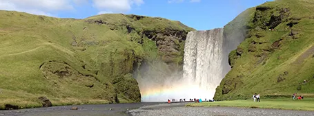
It has hard to grasp the magnitude of something with cold statistics. For example, this waterfall that I recently visited in Iceland drops 60m, but it is hard to imagine, unless you pay attention to the tiny people standing next to it.

Another example is this TED video by Ramesh Raskar, about photographing light traveling through an empty Coke bottle at a few trillion frames per second. At 3:50 the key statistic comes out: it would take a bullet fired from a gun 1 year to travel through the bottle if it was slowed down as the same rate as the light beam.

Do the same in your presentations. Tell stories with analogies to make it easier for people to understand big (or small) numbers.

Off topic: when photographing landscapes I usually resist the temptation of making that completely clean shot without any evidence of human presence in it. That small house, car, or person adds that critical sense of size to an object. When making a shot of a long-distance view, keep something close to the camera in the composition (a tree branch or something) to maintain the sense of distance.

·Images

Crappy paste-as-image

If you use a custom font just on one page of your presentation, it is better to use the text as an image, so viewers of your presentation do not have to install that font on their computers in order to see it. Microsoft PowerPoint gives the option of paste special, past as image but - at least on a Mac - the resulting graphic looks horrible. I simple make a screen shot of the text and paste that in.

·Images

Replicators

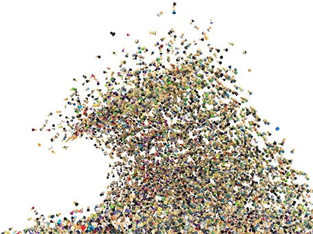
I have never been a fan of stock image photographers making pre-fab slide compositions, but in one area they can add value: digitally replicating items to infinity. See the attached image by higyou on Shutterstock. It is worthwhile visiting multiple stock image sites for these type of renderings, since they often can only be found exclusively on one site. Have a look at Filter Forge if you want to try to create these types of effects.

·Advertising

Everyone can design

Advertising agency RPA made a bunch of Apple-style ads for common products, probably intending to show that the world would be boring of all ads looked like this. I actually disagree, and would welcome to see the clutter in advertising go.

You see how easy it is to create professional looking slides by just applying a bit of white space and picking the right crop for your images. You do not need to be an advertising professional to do this, you do not need sophisticated software to do this.

Via AdFreak.

·Images

Keynote discoveries

I am a PowerPoint veteran who only recently started to design presentations in Keynote. Here are some of the little things that were hard to find:

  • Connecting shapes with a line: select both shapes go to the insert menu and select connecting lines
  • Remove an image background: go to the format menu and select instant alpha
  • Edit an image (make it B&W for example): select the image and click the tiny button with the levers (next to the stroke buttons).
·Images

Smartphone screen shots

The best way to make a slide with a smartphone screenshot:

  • Get a stock image of a smartphone without the device maker brand (using Google Image search might get you into copy right issues)
  • Take the actual screenshot on your smartphone, in my case I use my iPhone browser to go to the web page and press the home and on/off button at the same time. Email yourself the image
  • And here comes the trick: apply a subtle inner shadow to the image. You see the difference in the image below, the left side one looks a little bit bland, the right side looks much more natural

·Images

Cropping a composition

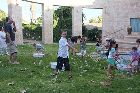
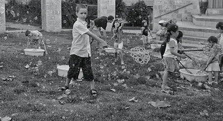
The 2 photos from a birthday party below show what an impact cropping a good composition can have on the quality of your images. I used the iPad app Snapseed (affiliate link) to do the following:

  1. Cut out the eating man, cut out the light/bright parts of the image at the top to focus on the boy in the foreground and the girl reaching fro the bubble in the back
  2. Take out the color since the composition of the greens and the clothing of the kids does not really look interesting. The B&W image enhances the texture of the bubbles, leaves, and grass
  3. Selective up the brightness around the faces of the boy, the girl, and the boy back to the left
  4. Up the sharpness and structure of the image

The result is a transformation from a bland image to one that looks like a Matrix-style freezing in time. I am constrained here by the 455 pixel limitations of Blogger, the final image looks better at its proper resolution.