SlideMagic Blog

Frequent updates about all things presentations since 2008. Subscribe to never miss a post.

RSS
all posts

Category Design

·Design

iPhone business idea

I stumbled across these web sites recently. Poolga let’s you pick artistic wallpapers for your iPhone, Tseventy gives a collection of hand-picked photography that you can download to your iPhone. Strange that all images seem to be portrait though.

The iPhone opening screen is a waste of screen real estate. Why not have a new image everyday, a useful quote or an interesting stat, or a word of the day? We need a (presentation) designer and an iPhone app programmer to get together…

It reminds me a bit of the early 1990s when Internet-powered screen savers clogged up corporate networks (remember Pointcast?). Leaving network performance aside, it did not work for desktop screens because people are staring all day at these. The mobile screen in your pocket might just be suited though.
·Books

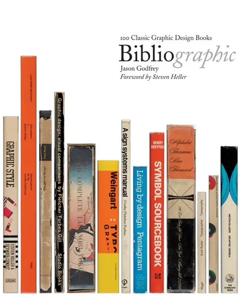
Book review - "Bibliographic"

I stumbled on this book: Bibliographic: 100 Classic Graphic Design Books in a Tel Aviv book store the other day. The vast majority of recent books on graphics design are meant to be “eye candy”, sitting on coffee tables without being read in detail. What a joy it is therefore to go back to older titles.

This book lists 100 important books on graphics design and typography. Each book is discussed, put in its historical context, and highlighted with an image of the cover and  a few page spreads.

It is striking to see how only a few decades ago, graphics and type still looked so basic. But equally important is the realization how the current overdose of computer-generated images and decorations detracts from the basic purpose of a poster or a slide: convey a message. When people just had type and basic shapes as design tool, it forced them to make the most of them. I find myself in a similar situation, armed with PowerPoint, fonts, images but without the graphic artillery of sophisticated Adobe Illustrator designs. Looking some of the designs from the 30s or 60s convinces me that I can do without this back up.

Some books discussed in the book are still in print, and I have added a few to my wishlist:

Continue reading →
·Design

Simple shapes, powerful message

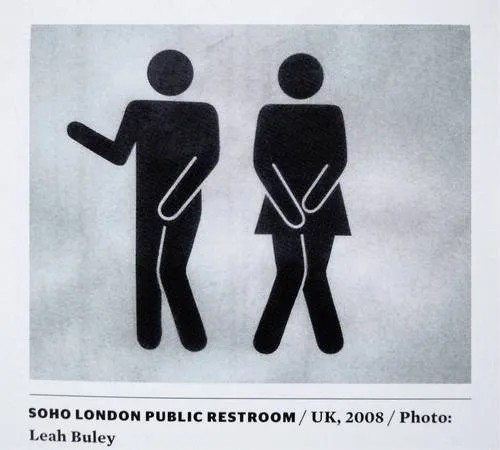
This image tells 2 things:

  1. Have the courage to deviate from standard visual cliches
  2. Simple shapes can still convey a powerful message

The image was added by Robin Benson and taken from this book:  Graphic Design, Referenced: A Visual Guide to the Language, Applications, and History of Graphic Design (affiliate link)

·Data visualization

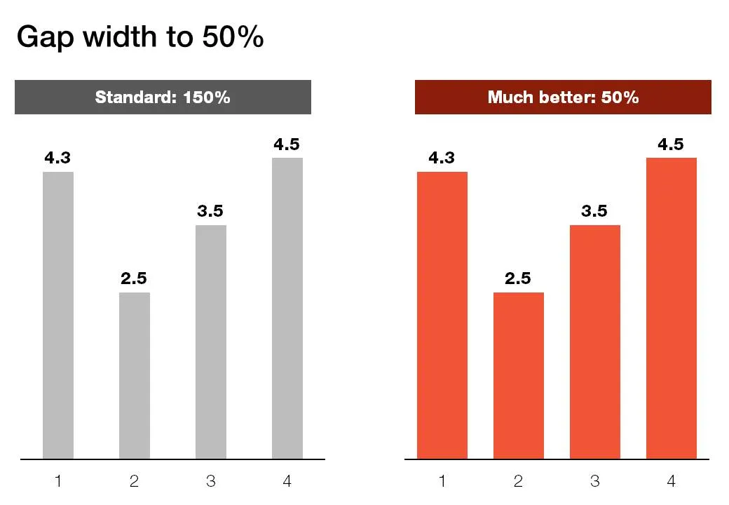
Gap width to 50%

Microsoft PowerPoint sets the standard gap width between columns or bars to 150%. Graphs look much better if you set it to 50%. Right click the columns/bars in your chart, select format data series and lower the gap width value.

·Design

Showing versus describing

Describing is an indirect way to convey a message:

  • We have systems in 3 countries
  • They are maintained on different time schedules
  • Five different departments are interfering with maintenance

In short, it is a mess. The bullet point chart above does not convey the message very well. Why not show the mess and create a chart with boxes for each of the countries, the departments and connect them with arrows color-coded by time to show what’s going on.

The chart will be busy, the chart will be dense, the chart might even be incomprehensible, but hey, you wanted to convince your audience that it is time to do something about this? No better way to do it.

Image credit: Mr. P

·Design

Do fonts display correctly?

I have changed the fonts on this blog to Helvetica Neue, they look great on every computer/browser that I have tried even if you do not have these fonts installed on your computer. Every, except for one computer/browser combination: my own Chrome browser on my own desktop (IE works fine)… Please let me know if you are experiencing garbled fonts on this site.

·Design

Graphics design overload?

I have been browsing through a number of books on contemporary graphics design recently and I must say: “more is better” seems to be the motto of many designs. Adobe Illustrator is powering complex gradients, elaborate ornaments and sophisticated hand-drawn effects. Maybe graphics design is ready for a “Zen revolution” similar to presentation design? (Or I simply have been reading the wrong books?).

·Design

Original PPTX files from my posts

Now and people comment that they would like to receive the original PPTX files of the slides I discuss here on the blog. I am hesitant to put them up on a regular basis, but will respond to a request by email or in the comments.

·Concepts

Chart concept - negative lettering space

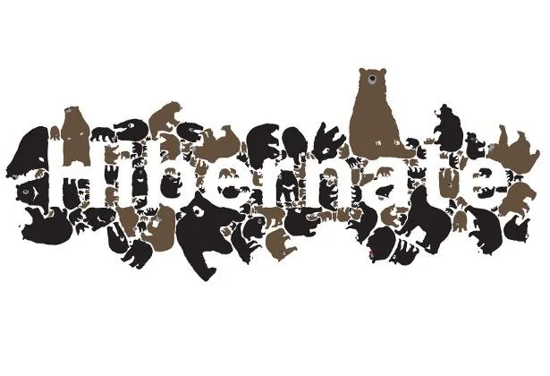
Here is a cute idea for a slide: negative lettering space. Computerarts.co.uk has a full tutorial how to create this effect here. It is easy to copy in PowerPoint: start with a word in a huge font on a page, set the font color light grey (or another color with a light contrast to your background), fill the page with the images you want, and as a final step delete the text or color it the same as your slide background.

Here is a search for earlier posts with a “can’t see the forest through the tress” type of concept.

·Design

Getting the best creative commons images via Flickr

Stock images are often staged, not natural, lacking spontaneity. Images with a creative commons license on Flickr are an excellent alternative, with one drawback: it is a bit harder to find the right image.

Here is what I do. Now and then I take a Flickr “deep dive” and just randomly browse/search images not using a functional key word such as “chair”, “pilot”, or “apple”. Rather use characteristics that a photographer would use to describe an image. As an example, see what a range of beautiful images comes up when searching for “focus”.

Browse through the images and bookmark them or save them to a tool such as Evernote for later use. An example, a very detailed image of the Manhattan Bridge by See-ming Lee.