SlideMagic Blog

Frequent updates about all things presentations since 2008. Subscribe to never miss a post.

RSS
all posts

Category Design

·Design

Forget about that last presentation "summary" slide

I have seen too many of these:

  • Introduction slides that give away the entire story of the presentation (and the speaker spends 20 minutes on it)
  • Summary slides that repeat the entire story of the presentation (and the speaker spends 10 minutes on it)

Delete them both.

The first slide should just cover what you are about to say, but not say it. The last slide should be an uplifting graphic reminding people about your key messages. Repeating these messages will just bore your audience.
·Design

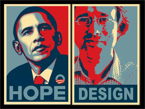
Humor - your own Obama icon poster

The Obama poster by Shepard Fairey is the icon of 2008.

Here is a tool to make your own. You see, there is still some work to do before I can make it as a presidential candidate.

Jokes aside. Icons can be powerful visual tools to use in presentations. Famous historical moments, famous historical pictures, famous historical posters.

An earlier post about real historical images from LIFE magazine available on Google.

·Advertising

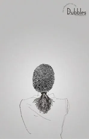
"Signature" advertising for a hairdresser

Unusual. An well-designed ad for a more or less local hairdresser/spa. Like a good slide:

  • You get the point instantly
  • Understated, elegant, and lots of white space

I like the small light-source-behind-the-model effect, I will experiment with it in my next presentation using a radial-gradient with very close color shadings.

Still, there is something “criminal” associated with a finger print (as people suggest in the comments of Ads of the World, where I found this image).

·Design

A global presentation design community is emerging

Olivia Mitchell is the person behind the Speaking about Presenting blog. She is one of the true leaders in the global presentation design community and collected and synthesized input from 40 presentation experts, bloggers, and other enthusiasts into one blog post: PowerPoint design in 2009: does design matter?.

Well done Olivia.

And well done presentation design community. Over the past few months a group of people around the globe really started to work together, comment on each others perspectives, exchange ideas. There are not that many blog subject areas in which this happens. Great. Join in if you want. See my improvised blog roll (I forgot many names there, or go to Alltop Speaking to get a flavor of who is out there).

·Design

"Everyone can draw" - clean and simple shapes in PowerPoint

“Everyone can paint” used to be the name of a Dutch toy set when I was a child.

With really basic drawing skills it is possible to make useful “iconic” charts. The umbrella below was used to highlight how a strategy has shielded one of my clients from the full effect of the 2008 economic meltdown.

Image no longer available

Look at shapes and see how they are decomposed in very simple elements: a few ellipses and some rectangles. On the right I gave them a different color to make them visible. Make sure that everything is neatly spaced out and symmetrical. The background image was purchased on iStockPhoto.

The key lesson: simple drawings do not have to look simplistic.

·Design

Chart concept - the audience as the patient

Some images can literally make the audience feel that they are the patient. Suffering, helpless. Other variations on the theme: a dentist with a buzzing drill, or less medical, someone “zapping” you away to another channel with a television remote control.

Image via BigStockPhoto. The good thing about a medical picture is that the most of the faces of the models in the image are covered, hiding that this is not a “real” image.

Update, here a version of the remote control image:

·Design

Experiment with typography - slice up those paragraphs

Typography is a major under-utilized tool in PowerPoint. On the right a standard PowerPoint display of a large 100pt text. Wide distances between lines, not very interesting. On the left, I cut it up in 3 pieces and started to re-align characters vertically. I am only starting to learn.

·Design

The problem with design and computers

I just watched this entertaining TED presentation by John Maeda, president of the Rhode Island School of Design, reflecting on his career as a designer (more information about him in the linked TED post).

The most interesting bit comes mid-way in the presentation. John shows a video how he orchestrates an excercise where people need to get other people to draw things on white board using their “voice commands”. After some miscommunications the groups starts designing a coordinate or grid system (similar to a PowerPoint canvas). The maximum output of the excercise was a completely boring, 2-dimensional drawing of a house.

I often feel the same. How to make this 3D composition? How to add quality hand-drawing or artwork? How blend different images? Computer constraints determine the majority of my slide designs. Something is still missing in the human-computer interface.

·Design

Make big things look huge by adding something small

The 2 tiny people, and their 2 tiny shadows make the whole dam look huge. You probably remember your highschool physics teacher explain: “if the nucleus of an atom is a strawberry, its electrons would be flying around the football field”.

Something to think about when making your next slide composition. Image purchased from iStockPhoto

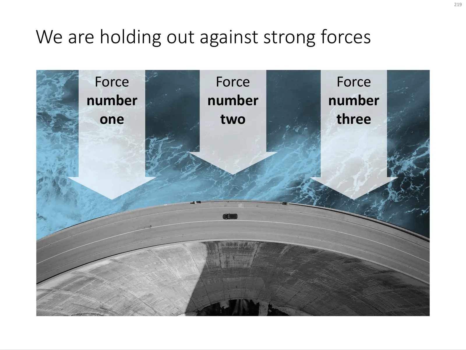
UPDATE: I have now added a chart concept featuring a dam in the SlideMagic template store, you can download it here.

 A PowerPoint slide template featuring a dam

A PowerPoint slide template featuring a dam

·Design

How to recreate a realistic looking chalk board in PowerPoint

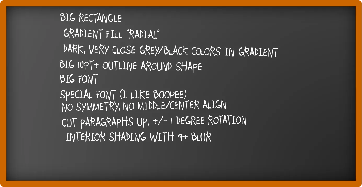
After graffiti, now the less permanent graphics of the chalk board. I scribbled some suggestions on a black board below (click image for a larger picture):

Now that we are on the subject, check out my favorite Bart Simpson chalkboard generator as well.