SlideMagic Blog

Frequent updates about all things presentations since 2008. Subscribe to never miss a post.

RSS
all posts

Category Design

·Advertising

So hard to do - "real" art in PowerPoint

PowerPoint effects, PhotoShop, and a bit of typography/fonts enable an amateur to create PowerPoint slides that start approaching the capabilities of a graphics professional. Not so fast.
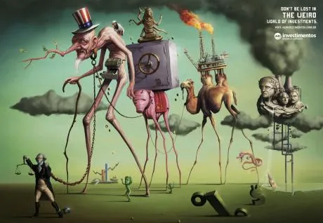
This ad for a financial services firm shows that good artwork cannot (yet) be matched by a PowerPoint slide.

  • Taking someone like Dali as the inspiriation for a slide
  • Creating the characters and the elaborate backgrounds
  • Insert the detail and small “jokes”

You immediately “get” this ad. Another one I took from Ads of the World (larger image here).
·Design

Squeezing more text inside a PowerPoint shape

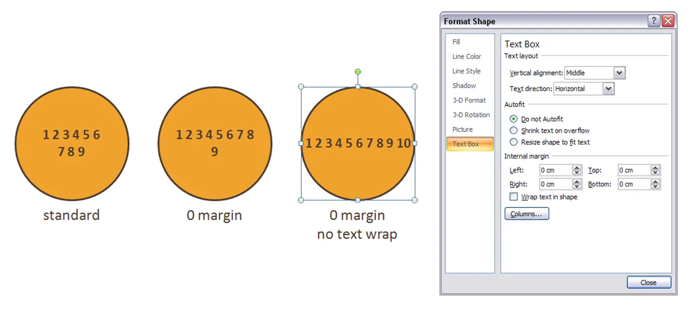
Circles are beautiful shapes to work with. Unfortunately, PowerPoint’s standard settings make it hard to fit in text. To get a bit more space, got to “format shape”->“text box”:

  • Set the internal margin to zero
  • Switch off automatic word wrap

·Design

Symmetrical shapes - hold shift while drawing

Symmetry should be avoided in slide layout. Symmetry in shapes on the other hand is beautiful. Hold-down shift while drawing to create a shape with equal hight and width, and in the “size ribbon” click the box to lock the aspect ratio.

·Design

Almost all presentation bloggers are introverts

A little fun on January 1. I ran the typealyzer test on a number of presentation, speaking and communication blogs tonight.

In case you are unfamiliar with Myers Brigs personality types, you can catch up here, and do a test here.

ISTP - “Mechanics”

Me (!!!) [a bit different from my test results]

Slide:ology

Speaking about presenting

Breaking Murphy’s Law

Speak Schmeak

ISTJ - “Duty fullfillers”

David Padani

Xplane

INTP - “Thinkers”

Presentation Zen

Bert Decker

Guy Kawasaki

Mike Pulsifer

INTJ - “Scientists”

Seth Godin

PowerPoint Ninja

All of these great communicators are introverts? And now for the only extrovert in the pack:

ENTP - “Visionaires”

Empoweryourpoint

It is great to have so many excellent presentation blogs around. I am looking forward to exchanging ideas with you in the new year.

·Design

2009 - looking ahead in the world of PowerPoint presentations

It is the time of the year to look ahead. Here are some thoughts where the world of presentations and PowerPoint might go in 2009. A start for debate:

  • The bar is rising to make your presentation stand out. More and more people will get exposed to Presentation Zen and other books, more people will know how to find good stock images, and will be able to produce Zen-style presentations.

  • People will recognize presentation design as a “serious” business discipline. Presentation gurus like Garr Reynolds will become general “business celebrities”, who can reach audiences beyond those people who are just interested in graphics design or public speaking. They will be selling many books, doing many public speaking events, just like experts in other functions such as marketing (Seth Godin) . Congratulations Garr! This will further grow the tribe of people who want to change the world of business communication.

  • Slideshare will become the dominant online presentation sharing platform, defeating many rivals in this area. Big corporates will start using it to upload their official presentations (quarterly results etc.), pretty much in the same way that YouTube has become a mainstream platform for sharing ideas. Online presentation tools that rely on learning a new user interface will not be among the winners.

  • Huge file sizes will drive more and more presentation development work and collaboration into the Internet cloud

  • Slideshare-style presentations meant for online sharing will become one of the most used formats. Almost too simplistic for my taste: “1 word a page”, often accompanied by cliche stock images, to be clicked through at very high speeds, often abandoned mid-way. Better than bullet points, but not necessarly the best presentation form either.

  • Typography and fonts are tools that will be exploited more in mainstream business presentations, beyond the world of advertising

  • More daring creativity will be accepted in the (often “boring”) board room. People suffer form information, PowerPoint overload. Using provocative images, formats, fonts, informal language (i.e., the techniques a billboard designer would use) will become acceptable forms of communication.

  • 3D will be used better, enabled by PowerPoint 2007, bringing “the technology to the masses” people will start to think how to use shadings, gradients, perspective in a way that is more than just adding a (useless) dimension to a bar chart

  • Data visualization is still relative virgin territory. More data is available. More processing power is available. It becomes easier to integrate things like maps. Etc. Etc.

  • Gradually doing away with the overhead projector heritage: one slide per subject, title in the top-left, source at the bottom. Instead slides will become more fluid as they transition into each other. New technologies enabling zooming in and out of areas will be leveraged. A great PowerPoint presentation become more similar to the supporting graphics that are often used in TV documentaries.

Continue reading →
·Design

Images with emotion - Flickr versus stock image sites

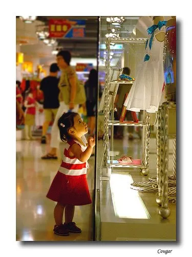
Stock images can be cheesy, staged, unnatural, cliche, especially when it comes to getting a shot of “real” people with real emotions. Try Flickr or other image sharing services as an alternative to stock image sites.

Here is a great, spontaneous and real image that caught my eye today. Look at the emotion in the girl’s eyes, great light coming from below.

Original (in larger size) here on Flickr, picture taken by Studio Cougar. Always check copy right and license restrictions before using Flickr images in your presentations.

·Advertising

Too much - "painful graphics"

Before I argued that slightly irritating the audience’s senses could support your presentation. Two cases of overdoing it:

More details about these ads on Ads of the World: Nycomed and Eurostar. I recommend adding this blog to your RSS reader.

·Design

A better solution for using custom fonts in PowerPoint

PowerPoint Ninja is essential reading for improving your technical PowerPoint skills.

The most recent post is about embedding non-standard or custom fonts inside a PowerPoint presentation so that you can be 100% sure your presentation will come out as you intended it when using on another computer. Custom fonts are a major untapped designer resource for PowerPoint presentations. Over the past years people started using a number of graphical tools in PowerPoint. First enabled by technology, then “abused”, after which a “Zen-oriented” tribe of people developed the common wisdom about how to use each of them correctly, elegantly, and most importantly in such a way that it helped the purpose of the presentation

  • Bullet points
  • Colors (my pre-2002 presentations were almost all B&W)
  • Clip art
  • Boxes and diagrams
  • Animations
  • Images: Google image search, stock images

I think fonts and typography are next.

·Design

One more quick post: Kawasaki on Santa's perfect VC pitch

An example of a “perfect pitch” by Santa according to Guy Kawasaki. An overview (of more serious) web resources about writing pitch presentations to Venture Capital firms can be found here.

·Advertising

Visuals - 30 Christmas ads from around the world

Not much time to write elaborate blog posts over the holidays. Some interesting visuals on Digg Design - 30 unforgettable Christmas ads today (here is one to them):