

SlideMagic Blog

Frequent updates about all things presentations since 2008. Subscribe to never miss a post.

RSS
all posts

Category Design

·Art

Become a great graphics designer

I am reading the book How to Think Like a Great Graphic Designer (affiliate link) by Debbie Millman (picked up at Rizzoli in New York, a great place to find design books). The book comprises of a series of interviews with famous graphics designers. Here are some common themes in all the discussions.

  • The process to getting to a good design is messy: you try, try, try, and then all of a sudden it happens (or not). Different from churning out analysis and data charts one after the other.
  • The standard career path for a graphics designer (start at the bottom in a big studio) inhibits success later on. Multiple designers spoke about finding a career setup that frees you from a big corporate structure in your formative years (a financial challenge).
  • You need to find time to do work away from the day-to-day pressure of a client. Again, this is a financial issue. Designers quoted lucky family situations and/or a large steady client as the enabler for creative freedom.
  • Pro-bono work often brings out the best in a designer, since “the client who is not paying has no right to interfere with the work”
  • Many designers are introverts, like to work by themselves, and stay in the front line of design work, i.e., they do not move into the management ranks.
  • Almost every designer talks about art versus design. I think deep in their hearts they regret not having made it as an artist.
Continue reading →
·Design

Office for iOS - yawn

The column by David Pogue in the NYT says it all: the long-expected launch of Microsoft Office for iOS is a non-event.

As I am slowly progressing with the design of my own PowerPoint alternative, I start to realize that phones and tablets require a fundamental rethink of what a user actually wants to do in a presentation design/delivery context. I have not cracked it yet myself either but am trying hard to solve the problem by trying to disconnect my thinking completely from how desktop presentation design applications have been set up over the past 30 years.

·Creativity

The importance of starting

You have that big presentation coming up in a few weeks from now and you are a bit scared. It is easy to put off working on it, forgetting it, until a few days before the event. Wrong strategy.

Start the design process early on even if the brilliant ideas do not flow, then put it away for a while. Your subconscious mind will continue to grind on the presentation and you will be surprised what you can come up with later. If you start this process 48 hours before the event, this creative energy will never be released.

·Design

Substance in TED

Many people claim that they now design TED-style presentations. They understand that bullet points are bad, and hey, it is actually very easy to put a word in white type on a black background (maybe even add that stunning image).

What many forget though, is that the substance of these TED talks is in the narrative, the story. Just having 10 slides that look like TED does not mean that your performance is TED-worthy. Sorry.

·Data visualization

Lots of them

If that is your message, you can write the sentence “There are 45 applications” with a cutely formated 45 on a background of a stunning image. The other solution is to write out the applications in 45 boxes that are nicely spaced out over the page. The latter solution is more cluttered, but actually makes the point in a more convincing way.

·Design

New look? Don't forget PPT...

When I get the brand guidelines from a client (explanations about logos, colors, fonts), the PowerPoint section is usually at the back, put there as an afterthought after brochures, business cards, and letterheads are being discussed.

Designers usually do not pay much attention to PowerPoint (PPT is uncool for serious designers) and you end up with fonts, shapes, and concepts that are 1) hard to incorporate in presentation design software (no, most people do not have Frutiger installed on their machines) and 2) - more importantly - are very hard to understand for the layman designer.

The face of a company used to be the letterhead, but today it is the website, and yes, the PowerPoint presentations that are cobbled together by the amateur designers and shown to customers everywhere, all the time.

So, when designing a new corporate look, think about those amateur designers, and the best way to do that is to design your look for PowerPoint, then adjust it to other canvases. Sorry.

·Creativity

The hard bit

There are 3 levels in presentation design understanding:

  1. Spotting that a presentation looks really good (99% of people can do this)
  2. Spotting that a presentation actually does not look good (this is still relatively easy, although a surprising number of people, including some who call themselves designers, are unable to do this)
  3. Creating something that looks good, this is the really hard bit

A bit of modesty here: I too find myself stuck in level 2 often with my own work, pulling my hair out why it just does not come out right. In the end it is usually good, but it takes effort.

·Design

Review of the live pitch to Mark Suster

Venture capitalist Mark Suster has a blog with a large following, and is also active in producing video about venture funding and startups. A few days ago he hosted a live startup pitch for funding on his show. As I said before, I am a big fan of making (at least part of) the fund raising process more public. The 53 minute video is embedded below, I watched it and give some of my thoughts.

I have great respect for these entrepreneurs to be vulnerable and go with their pitch on video, and they were probably a lot more nervous than when sitting a conference room without a camera. I have made the comments below a bit sharper on purpose, in the hope that other people pitching for VC money can learn from them. In part I am helped by my Dutch/Israeli cultural environment where people use a slightly more direct style than in the US.

Look how Mark is forming an opinion about the business right in the first seconds. What is it that we talking about? Many investor presentation deck hold off the answer for too long.

The opening sentence full of buzz words gets cut short. Mark starts paraphrasing “Right, so you are a sort of eBay/Etsy widget for blogs”. It is indeed a better way of saying things, but hidden in this comment, Mark is already hinting at his major concern about the business. The presenters could have come out with a snappy/high-energy “OK, that you call it like that for now, but we have something amazing under the hood that makes us stand out in the middle of all these eCommerce giants, advertisers, and affiliate programs.”

Continue reading →
·Art

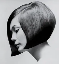
Lessons from Vidal Sassoon

I am continuing my quest through the long tail of Netflix design movies and stumbled on this one: Vidal Sassoon the Movie (affiliate link) about the famous hairdresser. In itself, his story is very interesting, growing up poor in an orphanage, and becoming a global celebrity.

For me, there were two things that I found especially interesting.

  1. It took him 9 years to find his signature style that would change the way women looked (and thought of themselves) in the 60s. Design is hard work, even for the best and most talented among us.
  2. He says that it is easy to see when something is wrong, but very hard to come up with something that is right.

This is exactly the case in slide design as well (at least for me). Learning to design is going through lots of your own failures, eliminating stuff that is not right, leaving you with the things that do. One way to accelerate the process is to plough through design books and absorb anything design around you. It increases the odds that you will bump into something that works.

·Design

A collection of sticky slides

I have frankensteined (what?) together a slide deck of around 50 slides that were used in blog posts here on Sticky Slides over the past 2.5 years. All completely unrelated, and out of context but maybe good enough for some creative inspiration.