SlideMagic Blog

Frequent updates about all things presentations since 2008. Subscribe to never miss a post.

RSS
all posts

Category Design

·Design

Your own style

After years of design work, many of my presentations start to develop a similar signature style or look-and-feel. (Secret: it looks remarkably close to the templates in SlideMagic). I think there is nothing wrong with that: you can easily recognise the work of famous poster designers, painters, architects. Presentation designers should be no exception.

I would encourage you to find your own signature style. Once you have figured out a distinctive way to make any chart look good, you are free to focus on its content. No need to worry about fonts, image crops, data chart layouts, and all the time to worry about composition, content, what image to put and what data to visualise.

Art: detail of Gustav Klimt, The Kiss, 1908
Click here to subscribe to the blog

·Design

How did you get there?

Many people who read this blog are considering a career in the world of presentation design themselves, I get many questions about how I got to be who I am today professionally.

The answer: it happened somehow over many years, there was no deliberate career planning. Once I was free from a big corporate structure, you can shape the projects you choose to work on. Finding the first projects was hard, and the work I did closely resembled my strategy consulting work at McKinsey.

When you build up your initial base of happy clients, words start spreading and you get increasing freedom to pick those project that interest you. There is a reinforcing loop here: you do your best work in the type of projects you like, which gives you more demand for more projects you like. In my case, I loved presentation design work, and the prize was: more pie.

But. This transformation took years. It required a certain skill base to start off with (10 years of work experience in consulting in my case). At first, you get highly unpredictable income. As a freelancer, you need to like working on your own. A super-specialised freelance business is hard to scale beyond increasing pricing. (See Seth Godin on dumbing down/scaling up, I smarted up and scaled down).

·Data visualization

Focus on the differences

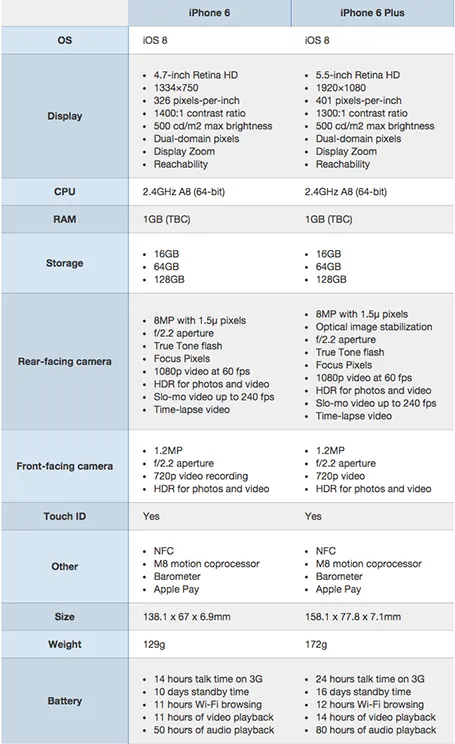
A nice side by side comparison of the new iPhone 6 and 6 Plus on the Cult of Mac. I see many of these tables in business presentations: columns with almost identical content. Why not focus on the differences instead and leave all the other clutter out?

·Design

License plate design

There is a parallel between the decline in license plate design as discussed in this article by William Morgan on Slate, and presentation slide design. Digital printing technology allows the addition of (background) graphics and unlimited use of colour. The result is a license plate that is unreadable and an ugly blob of graphical clutter on your car.

·Data visualization

Place holder and data charts

I realised that most presentation slides I create fall in two categories:

  1. Data charts that have information in them that would be impossible to convey verbally (a graph, a table with financial information, a ranking of competitors)
  2. Place holders with some powerful visual (picture, typography) and is merely a placeholder for the story told by the presenter

Things go wrong if you mix them: showing hard core data with a cute picture will not work, putting up a detailed consulting framework as your place holder will not work.

·Creativity

The big idea slide

I usually start a presentation design project by digesting all the available information, listen to a verbal version of the pitch, Google for market and competitor information, create a slide template based on a straightforward slide (the profit and loss account for example), and let the whole thing cook in my mind for a while.

I know when I leave the “cooking” phase when I am able to draw up the key idea of the presentation in one slide. That one takes a long time to design, but when it is done, all other slides follow really quickly.

·Design

TL;DR or TB;DR?

Seth Godin notices how - because of information overload - we have stopped reading/absorbing things with the full nuances, referring to “TL;DR”: too long, did not read.

You as a presentation designer need fight against this behaviour as well. Dense boring slides do not get attention, instead people apply their mental models and think they already understand what you are gong to say.

The obvious approach to this is to design visually attractive slides to grab people’s attention. But visually striking images is only half the work. Your story itself need to have interesting and unexpected turning points as well. An unexpected fact, an unexpected contradiction.

People do not really think something is too long: they think something is too boring to read: TB;DR.

·Design

Leading

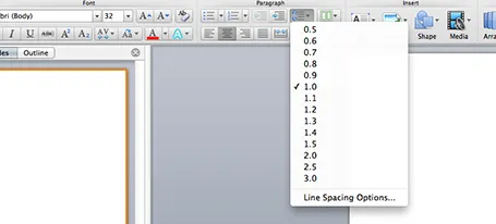
One of the typography elements I play with all the time is leading, the space between 2 lines of text. PowerPoint sets the leading standard to 1.0, or 100% of the typeface size. What leading looks good depends on:

  1. The typeface you use
  2. All caps, sentence caps or lower case
  3. And most importantly: the size of the font, bigger fonts need less leading

There is no general rule here, you need to fiddle and see what looks best. On a Mac, there is a button that controls the leading of your paragraph, see the screenshot below. It is one of the buttons I use most.

·Design

Designing a good logo page

Most sales presentations contain some logo page to show off your impressive client list. Make sure that the page looks impressive from a graphics point of view as well. An unstructured clutter of low-res logos makes an impression of an amateurish startup best to be avoided for serious business.

  1. Check whether you got the latest logo of a client (visit the home page)
  2. Use high resolution images
  3. Where possible, use the logo that has a white background
  4. Do not distort aspect ratios
  5. Make sure the logos are more or less the same size
  6. Distribute things evenly horizontally and vertically in a nice grid
  7. Keep the page simple: just logos
  8. If things look too busy, you can consider moving all the logos to black & white
·Design

Look serious

It is difficult for a startup to sell to a big company. Even if your solution is really innovative, large companies prefer to work with financially stable, large companies.

The look and feel of your sales presentation can add to that nervousness in the under belly of a big-corporate purchasing officer. Looks to avoid:

  1. Amateurish layouts with childish colours and water cooler fonts such as Comic Sans.
  2. Overly cute, touchy feely, retro look and feel, especially when selling in a male-dominated corporate culture (sorry).

Now we all know that the a slick visual deck full of stories and very little text will do great in these meetings (option 3), but, there is one surprising other option (4): the big corporate, lots of bullet points, serious, boring slide deck. Purely from a look and feel perspective, you will fit right in with all the other technology vendors, unlike option 1 or 2.

If you cannot pull off option 3, option 4 is still preferred over option 1 or 2.