SlideMagic Blog

Frequent updates about all things presentations since 2008. Subscribe to never miss a post.

RSS
all posts

Category Design

·Art

Frans Hals: 27 shades of black

It is thought that Vincent van Gogh once admired the Dutch painter Frans Hals (1580-1666) for using 27 shades of black in one painting. If you study the works of the Dutch masters carefully, you can see that they actually do use very little color. (Here is an example from Rembrandt: black, red, yellow) Part of this is due to space limitations on the color palette. Pink skin tones take a lot of space, leaving not much room for other colors.

Painting above: Frans Hals, The regentesses of the Old Men’s Home in Haarlem, 1664, Oil on canvas, 170.5 x 249.5 cm

There is a similarity to designing presentation slides here. You use shades and tints of the same color to create a calm background visual, while directing the eye of the viewer with bright highlight colors to the important information on the slide.
·Design

Just listen to yourself

We’ve all been there. You’re stuck. Analysis-paralysis. Writer’s block. Structure-overload. Where to start? How to break the deadlock?

Imagine you’re sitting in front of a really experienced investor (Warren Buffett?). You have 10 minutes.

Press record.

Just tell your story. There is no time for buzz words. There is no time for complicated frameworks to structure your story (first we do a SWOT, then we leverage our core competences to differentiate from our competitors and make sure we reach critical mass before the window of opportunity closes). Just tell from the heart why someone should invest in your business.

Press stop and play back.

What did you say? In what order? When did you feel the need to take out a pen and scribble a simple diagram on a piece of paper? When did you “see” Buffett frowning and felt the urge to explain something again? What metaphors did you use to explain the technology?

Now let’s go back and re-do that PowerPoint presentation completely.

·Design

Why does Helvetica look so great on a Mac and so poor on a PC?

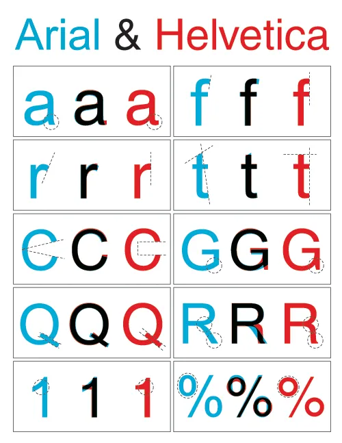
I like the clean Helvetica font in print material. I like the Helvetica font in presentations designed on a Mac. Somehow, the PC version does not appeal. The answer is: it’s not Helvetica. To save on royalties, Microsoft included the look-alike Arial with its Office software suite. The fonts look similar, but there are subtle differences. And they make all the difference.

Image designed by the ragbag, found via Swiss Miss.

I have not solved the problem myself. I think none of my clients have Helvetica installed on their PCs, and despite workarounds, I hesitate to create font issues with my presentations.

·Animations

Motion graphics done right

Two days ago I posted about a motion graphics video that was designed beautifully but relied too much on text bullet points to compare quantitative data, the brain had to do too much work in too little time (before the next piece of information shows up):

  1. Read sentence
  2. “Visualize” numbers internally
  3. Interpret them

This is a better example of the use of motion graphics. Zooming is used to visualize the enormity of the number 1 trillion. It comes at a price though: this video is almost a full-blown animation. A bit of PowerPoint/PhotoShop skills and After Effects are not enough to produce it (unfortunately).

Trillions from MAYAnMAYA on Vimeo.

Video by Maya Research, found via Core77

·Design

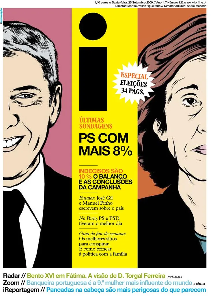
Portuguese innovation in newspaper design

An interesting article in the NYT the other day: the Portuguese newspaper “i” that’s breaking the rules of newspaper design. An example of a front page that I found on the “What’s next: innovation in newspapers” blog.

Some interesting lessons that could also apply to presentation design:

  • Big images draw the attention of the reader
  • Interestingly, the newspaper abandoned the typical grouping of newspaper articles around specific categories. Research showed that people just scan for interesting headlines and do not need the structure of a detailed content categorization. Newspaper design does not need to resemble the organization structure of the editorial staff.

With regard to the second point: more and more I start to abandon the use of formal structures in presentation design. Simple use the structure or slide sequence that supports the way you want to tell the story. The brain is capable of dealing with a more creative story structure, as long as it is not bored. Novel writers are the ultimate masters in story line design creativity, but I agree that might be overdoing it a bit when designing your next pitch deck.

·Animations

Motion graphics overload

Xplane continues to develop beautifully animated presentations using motion graphics. After Did you know 4.0, there is now another video developed in cooperation with the Economist: The carbon economy.

I really like the effects, textures, typography and animation of this presentation, but I think we still have to learn how to use all this technology effectively. The video is relying heavily on text to explain and compare quantitative data (similar to what bullet points do). The pace is so fast, that I have difficulty processing it all (and I had my 10,000 hours of data processing training).

My early thoughts on how to make the most of motion graphics:

  • Be careful with background music
  • Use text animation only to highlight quotes with non-quantitative information
  • For quantitative data go back to the good old simple data charts, but feel free to leverage those beautiful textures and typography
  • Beef up the animated character animation: things morphing into another shape, things growing/shrinking (the rising water levels in this video is a good example), the blend of animated film design and presentation design is great
  • Think about pacing of animations like you think about pacing of words. Have the courage to pause, accelerate, talk loud, talk softly, pause again. The entire video does not have to be an information roller coaster.

I am curious to hear your thoughts.

·Design

Zooming in down to cell-level

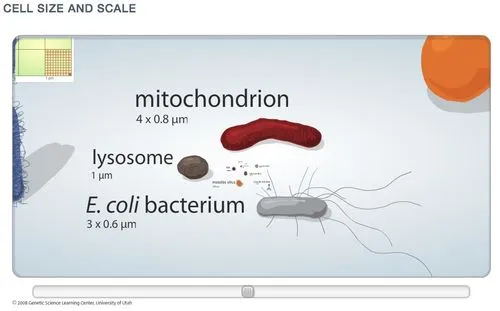
I really like zooming presentation formats such as Prezi, but I am still struggling to find useful application areas. Steve Johnson pointed me to one: to put proportions in perspective. Have a look at this amazing visualization of the relative size of biological cells.

·Design

Dusting off the McKinsey business system

McKinsey has been posting a number of classic consulting frameworks under the title “enduring ideas” on the McKinsey Quarterly site. I discussed before: consulting frameworks are great for solving problems, but often less good at communicating solutions.

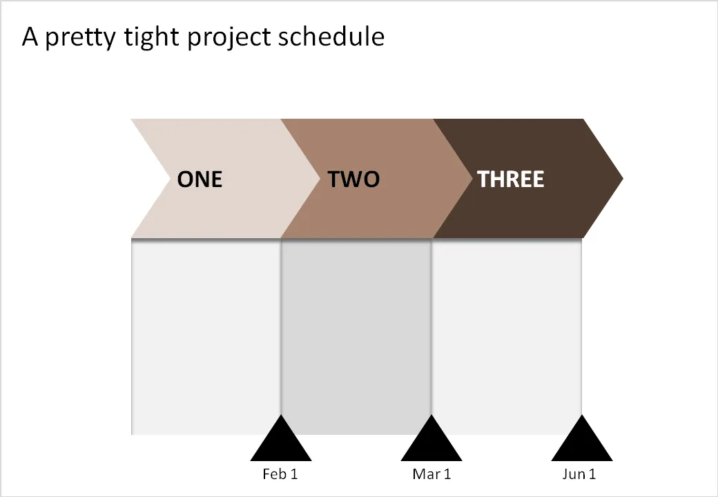
Recently, the business system was discussed. At McKinsey we used it to analyse the value chain of an industry (manufacturing, sales, distribution, etc.). The basic graphic concept of it (simple arrows) can also be used in another context: communicating a project schedule. See the example below.

Related reading:

·Design

The "what have I done in the past year" slide

This slide always comes in somewhere in the annual management review. Here are all the activities of me (or my department) over the past year. The bullets are coming out:

  • Organized the annual consumer event
  • Biz dev trip to Poland
  • Created a new planning tool
  • Put a trade symposium together

These slides do not justice to your efforts. Break each bullet point up into a separate slide and go through them really quickly, but add something interesting to each slide:

  • Slide: an overview picture of the 80,000 visitors of your consumer event (a rock concert)
  • Slide: an image of you having a flat tire in the middle of Poland on the site of a major new potential customer
  • Slide: head shots + name of the very well-known people from the trade that were present on your symposium
  • Slide: sceen shots of the new sales budget planning tool

Stories make the achievement look much more impressive and people will remember them better (“hey, was that you who did this?”).

A second implication: always have camera (or a photographer) at hand during important events, maybe even a better one than the one built in to your phone. Think ahead about next year’s annual review presentation.

This same technique is also really useful when making presentations that need to present your company and its activities to a major (international) customer or business partner. The only pictures of the company that usually makes it in these type of presentations are the one of the lonely receptionist waiting for a call to come in.

·Concepts

Chart concept - lost in translation

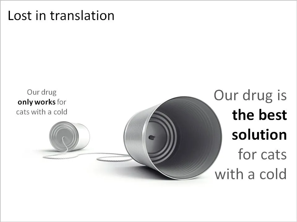
A client in the pharmaceutical industry had this problem: a competitor managed to turn a relatively weak clinical fact and turn it upside down into a forceful message that took over the market. The good old tins cans are great to visualize this. See the example below (sanitized to maintain client confidentiality)

Related reading: an earlier post about classic miscommunication in a project.