Off topic - amazing Rube Goldberg-style video
I have always dreamt of using a Rube Goldberg-style animation in a presentation (earlier post). Watch this video.


Frequent updates about all things presentations since 2008. Subscribe to never miss a post.
I have always dreamt of using a Rube Goldberg-style animation in a presentation (earlier post). Watch this video.
The more you practice, the more you rehearse, the more you get on top of your story. And the more comfortable you get with your material, the more confident you get in delivering it. Confidence goes beyond getting rid of fear of public speaking, confidence enters chart design and story telling as well.
It is a bit like the abstract painters of the last century: having the confidence to communicate emotions and ideas without relying on realistic techniques. For example Piet Mondriaan’s Broadway Boogie Woogie painted in 1942-1943.
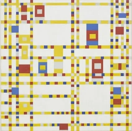
The pulse of a Jazz beat, and the energy of the New York traffic squeezing its way through the city’s grid all captured in one painting without showing Jazz bars, Times Square neons, and/or New York traffic jams.
What a wonderful advertising campaign: if 4 pixels can tell a story, imagine what millions can. Here is one example, but there are lots more on Ads of the World (click the previous and/or next buttons).

I like using iconic images in presentations, an endless repertoire of visual shortcuts stored in the brain of almost any person on the planet.

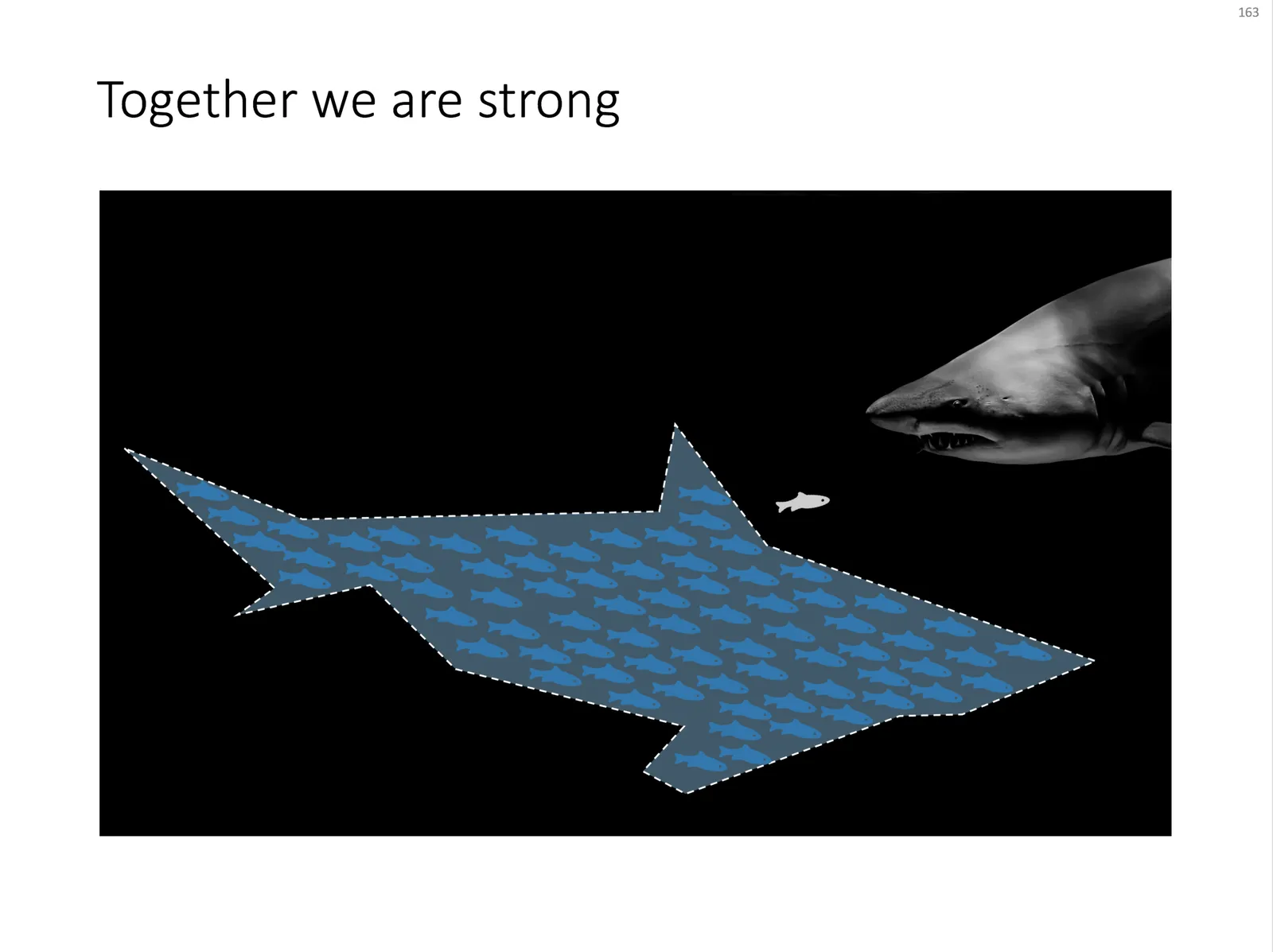
Some might consider it a cliché, but I found it still useful: the school of fish swimming in formation to create the illusion of being a shark. For when you need to visualize how many smaller/weaker entities can work together to become very strong as a group.
An image like this can easily be created by searching for “fish silhouette” or “shark silhouette” in a stock photo site. Resize the small fish, paste them over the shark’s silhouette, and off you go.
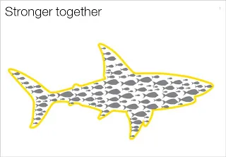
Inspired by a scene from the movie Finding Nemo:

UPDATE: I have now added a slide with many fish forming a shark on this concept in the SlideMagic template store.
This presentation that I found today on SlideShare is not about about presentations, but about application design for the iPad. Still, it deserves a mention on this blog because of the fundamental philosophy of the designer: each user interface deserves its own kind of design approach: the iPad is not an iPhone, is not an iPod.
Stanford CS193P - Designing for iPad
The same is true for presentations, different audiences, different settings, require a completely different presentation (earlier post): cosy meeting room, big audience keynote, SlideShare document for online viewing, one-on-one with a venture capitalist, etc.
I think iPad-like user interfaces (like the one Tom Cruise uses in the movie Minority Report) could turn the world of presentation design upside down. Early thoughts here.
The infographic below released by the Obama administration (here) is a good example of using the full arsenal visual techniques to make your point stand out.
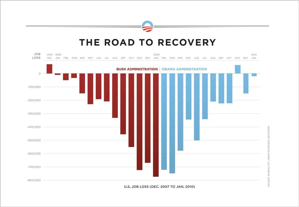
On the Fast Company site, Prof. Charles Franklin put out a second graph depicting exactly the same data, but using a different metric, cumulative job loss:
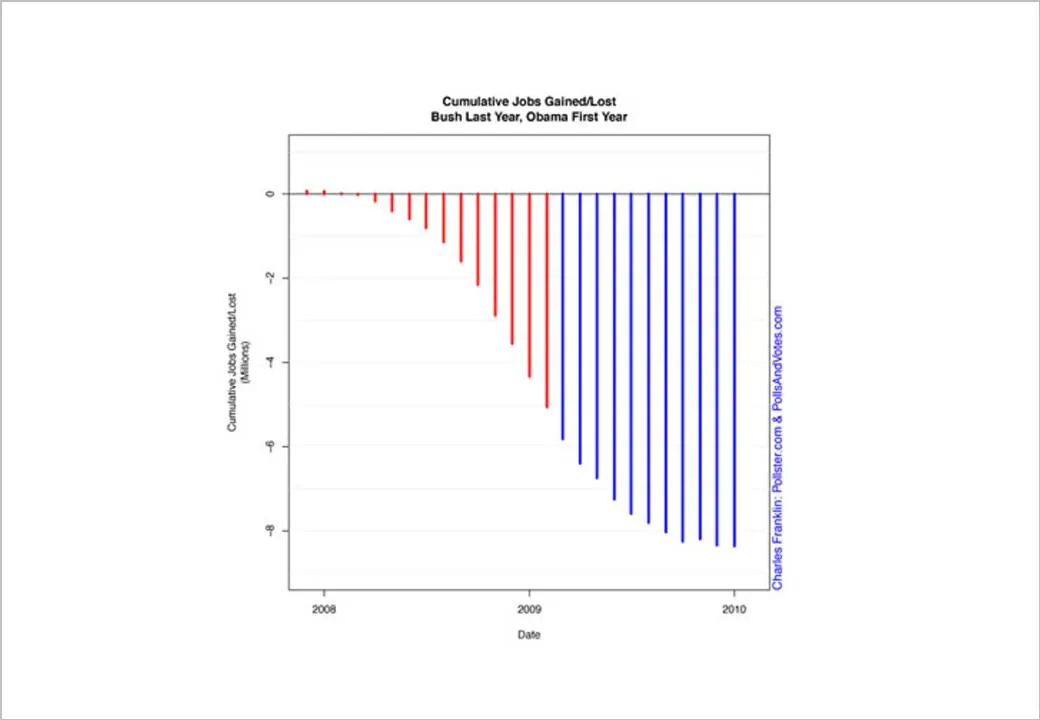
The formating of the graph is a bit improvised, but it shows the power of picking the right metric. Someone speed-reading a newspaper first notices the sea of blue, and a trend that does not seem to reverse.
Fast Company seems to have taken down the story, so I had to source Franklin graph from Google chache. Thank you Ellen Daehnick for pointing me to this.
Late again in discovering an amusing video (1.3 million people saw it before I did over the last 3 weeks). Charlie Brooker is making fun of your typical TV journalist video report.
Some presentation lessons:
Thank you Joe Mako
I came across two interesting links about clichés last week.

I now realize that I have been reinventing the wheel over the past few years. I am guilty of using many of visual concepts, and even have posted many of them on this blog. I agree that some of the images are really worn out (#1 example the handshake), but not all 100 other images are equally bad in my opinion.
Especially in everyday corporate presentations, getting people to use images instead of bullet points is a huge win, even if the images that are picked are somewhat obvious. It is the beginning of a path moving away from bullet points. I was there 5 years ago, but every day more and more people join the movement. Clichés are a good way to start. A cliché is a visual shortcut that can prove useful in corporate presentations when used wisely. “Wisely” means picking a beautiful image. (Yesterday I was guilty of a tunnel with light at the end for example).
Obviously, the big keynote address is a different story from tomorrow’s management review meeting.
Another technical post today, giving another approach to creating Venn-like diagrams without the color limitations of semi-transparent shapes.
Blog visitor AdamV provided a link to this Microsoft PowerPoint 2010 feature that will make it very easy to combine, intersect and subtract shapes.
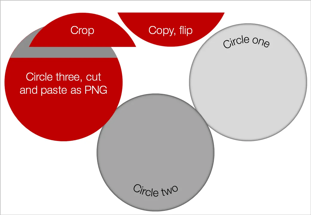
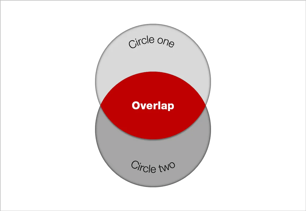
UPDATE February 2018: I have now added several designs for PowerPoint Venn diagrams on the SlideMagic template store that make use of PowerPoint’s shape intersect function.
As a child I already loved flicking through magazines, just to look at pictures. The Internet makes it so much easier to absorb vast quantities of visuals. Simple add a huge amount of photography-focussed RSS feeds to your Google Reader and hold down your finger on arrow-down, only to lift it when an image instantly touches you.
Not that I am hunting for images to use in presentations, often they are not right, often they have copy right restrictions. But still, immersing yourself in images improves your slide design skills. It is a bit like the best way to learn a language: surrounding yourself with it (maybe Hebrew is the exception to the rule though).
The most interesting images are often not the most professional ones. Stunning sun sets, volcano eruptions, can be beautiful but do not touch you on an emotional level.
I recently added the RSS feed for ffffound to my Google Reader: a community image book marking site with a large readership. Images are picked by random users (most of them with a good eye for photography), as a result you get a frequently updated image stream full of surprises. As an example, here is an image I found today on the site:

Yay!Everyday is another example of image highlighting site, worth following.