SlideMagic Blog

Frequent updates about all things presentations since 2008. Subscribe to never miss a post.

RSS
all posts

Category Data visualization

·Data visualization

Word repetition

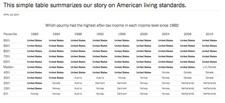
Some busy charts can still be highly effective. See the one below about the declining relative income of wealth classes in the US. The repetitive “United States” could have been replaced with something visually calmer, but the current works actually pretty well.

See that this charts presents other information as well (which countries did well), but the viewer is unlikely to take notice (and she does not need to).

The original article in the New York Times can be found here.

·Data visualization

Funny

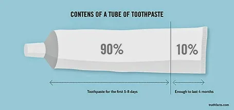
Most infographics are a bombastic compilations of overcomplicated, trying-too-hard, visualisations of facts that are not always that insightful. These simple graphs by Danish writer/artist duo Mikael Wulff and Anders Morgenthale are well executed and actually pretty funny.

A compilation of charts here on the Zero Hedge blog, and here is the web site of the original creators Wumo.

·Data visualization

Place holder and data charts

I realised that most presentation slides I create fall in two categories:

  1. Data charts that have information in them that would be impossible to convey verbally (a graph, a table with financial information, a ranking of competitors)
  2. Place holders with some powerful visual (picture, typography) and is merely a placeholder for the story told by the presenter

Things go wrong if you mix them: showing hard core data with a cute picture will not work, putting up a detailed consulting framework as your place holder will not work.

·Animations

European borders time lapse

This video shows how the political map of Europe has changed in 1,000 years. There is a lot of information packed in here, but the only one that gets across is: “lots of things have changed”. To bring more information to the surface, you need to slow down the pace, and add labels/stickers to highlight the key changes and go into the detail. Both visualisations work, the third option - stuck in the middle - will not.

·Data visualization

Bit by bit

Listing pages and pages of market size numbers that are related to your industry are hard to digest for the novice (for example, a potential investor in your company). This number includes devices, that number is 2011 only, this number excludes Eastern Europe, that one is number of users, that one is in Euro, and this is the percentage growth, but the growth of the average basket size.

An investor who is seriously considering putting money in your company will try to piece this data together to come to some consistent picture. You might as well do the work for her with reasonable assumptions. Size up the 2011 market to 2013, add your estimate for Eastern Europe, convert everything to dollars, etc. etc.

Start with some sort of overall market estimate, compare it to something the investor can relate to, then start adding complexity, break things into pieces.

Obviously your estimate will biased and very optimistic, but your analysis has at least provided the investor with a framework of how to think about your market. Put all the raw data that you used in the appendix so that the investor can do her own homework when she returns back to her office.


·Data visualization

Software needs design as well

I see many enterprise software application dashboards that look worse than the worst PowerPoint slides. My clients begin to ask me to give my input on them as well.

  • People have not thought about what information is important, and what is not
  • People have not thought about how to present the information: numbers are not rounded, column, bar, and pie charts are thrown in at random, colours are picked randomly

Consumer applications have gone through a big design revolution over the last couple of years, now is the turn for enterprise software.

·Animations

Uncovering

When you need a complex animation, it is often easier to uncover objects by removing a white box than build up a shape step by step, especially if the shape includes a data graph (columns, lines, bars).

·Data visualization

Listen to yourself

Most data charts are cluttered with numbers that hide the actual message that you want to convey. So next time, listen to what you actually say when you walk people through the chart. Next, try to design a chart that only contains the numbers and items you spoke about, leave everything else out. It does not matter that you do not have the full comprehensive analysis on the screen, what matters is that your message comes out.

·Data visualization

Powerpoint vs Keynote - redux

It is a question that comes back all the time: PowerPoint or Keynote. I have given my opinion in the past.

After I got my first Mac, I was really excited to be able to design in Keynote. Now, a few years later, I must say that both products are more or less the same to me. Keynote is cleaner, auto-aligns and distributes objects when you drag them, and does not have the problem of drawing guides that you move by accident, and has a tight integration with the iPad. PowerPoint has a more convenient photo cropping UI and a much better data chart engine (Excel).

But workflow is a very important consideration as well. If the people in your organisation find it difficult to get up the learning curve with Keynote, why torture them? This is especially true if people need to do a lot of copying back and forth between Excel and PowerPoint. Probably 90% of presentations are quick and dirty documents to discuss business data, and in those cases tight integration between the 2 programs is a big time saver.

In the end both applications can deliver exactly the same look and feel of presentations. When I tell clients that Keynote presentations do not automatically look better than PowerPoint ones, they are surprised.

So in short, it actually does not matter what software you use, it is your design that matters.

·Data visualization

Icons that try too hard

Icons can work really well if they can be kept very simple, and refer to very simple things like a cog wheel for settings and a 1980s floppy disk for save.

When you try to summarise very complicated concepts into very complicated icons, things get lost. In those cases, a box with a few words will do a better job explaining what you mean.